
Patriotic Palettes | 3 Ways
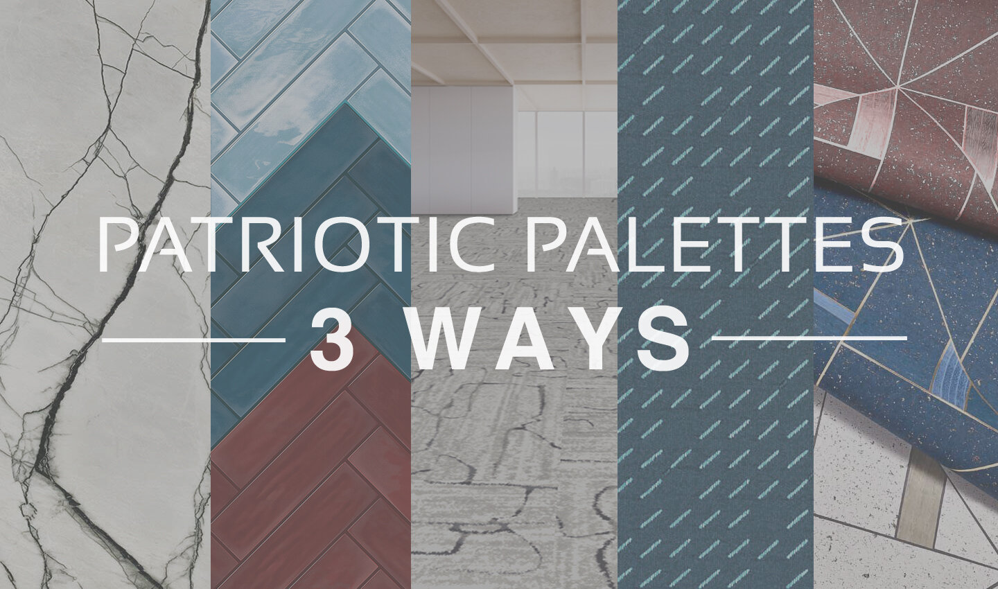
Everyone knows the colors of the American flag are red, white and blue. And at this time of year when Independence Day draws close, these colors seem to be everywhere from decorations, to clothing, to retail displays. And while this trend always fades as the summer holidays pass, there’s no denying that these classic colors aren’t limited to holiday merchandise.
Red, white, and blue is a classic combination. It has both warm and cool tones for interest, with a bright neutral to balance them out. Moreover, this color combination can be interpreted in countless different ways, either by playing with the colors themselves or by adding new textures, materials, and patterns into the mix.
Today, we’re taking inspiration from the upcoming holiday and sharing a few ideas for Independence Day material palettes - take a look below at some of our favorite patriotic-inspired combinations!
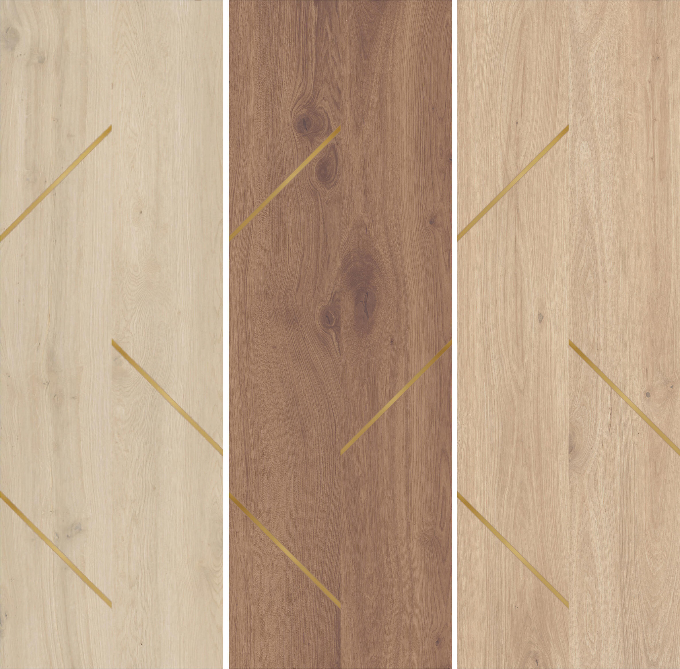
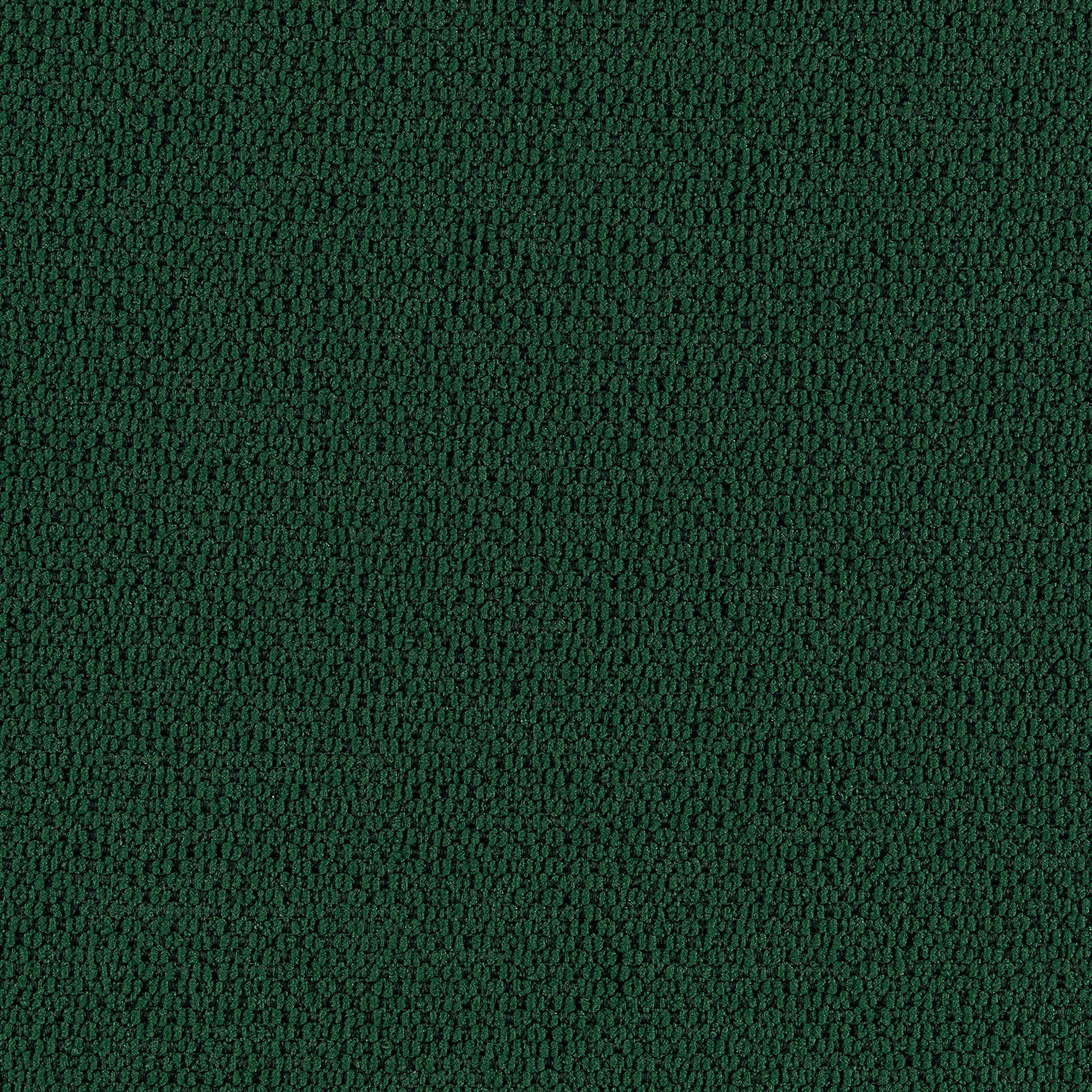
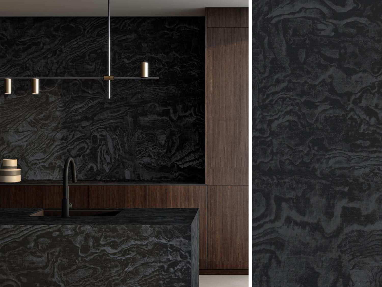
PALETTE 1
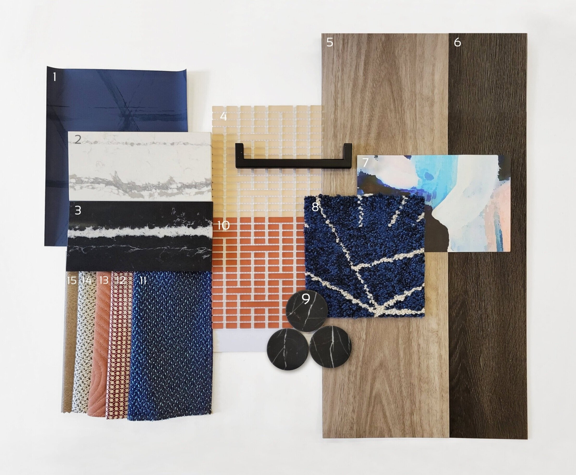
1) Triad, Midnight Blue | @Arc-Com 2) Et Bella | @Silestone 3) Eternal Marquina | @Silestone 4) Mist, Peach | @Mosaico+ 5) Eucalyptus Saligna | @Milliken 6) Woodlands, Ebony | @EF Contract 7) Tilda, Blush Lapel | @Mitchell Black 8) Skyfall, Cobalt | @Flor 9) Nero Marquina Dots | @Roca Tile 10) Mist, Paprika | @Mosaico+ 11) Quill, Swan | @HBF 12) Theo, Dark Red | @Brentano 13) Ms. Quilty, Fickle | @HBF 14) Quill, Goose | @HBF 15) Cow House, Pavement | @Valley Forge
For a sophisticated spin on the traditional 4th of July palette, red can be swapped for elegant peach tones to add whimsey. Including very saturated blues (both light and dark) helps to ground this palette while adding variety. The wood tones bring warmth and texture, balanced by timeless stone materials. When put together, this palette is a playful and sophisticated combination of styles, textures, and color tones.
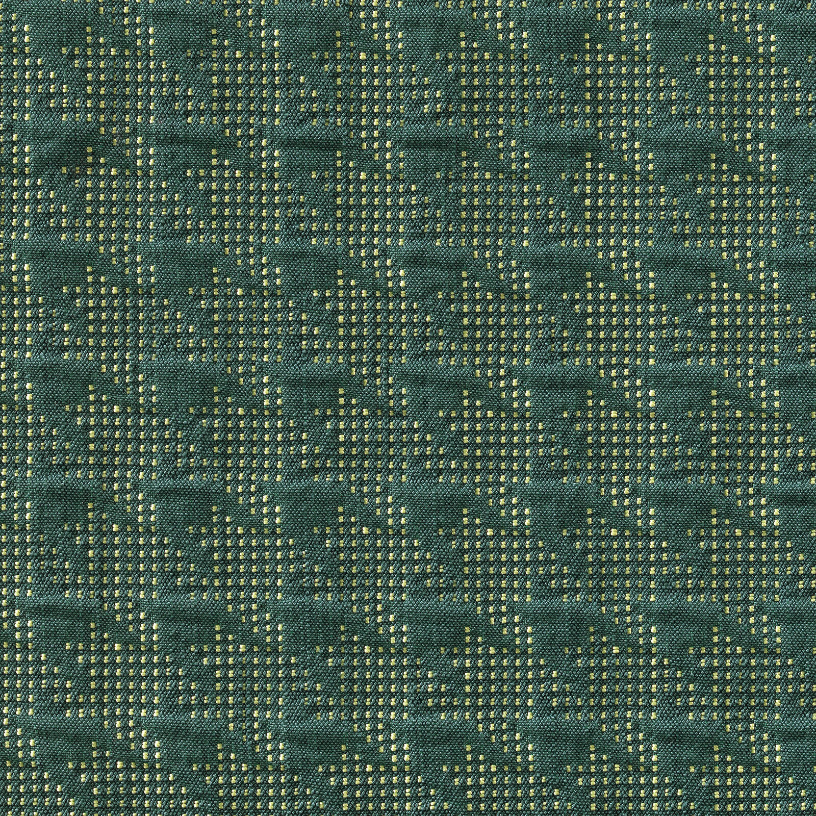
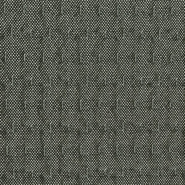
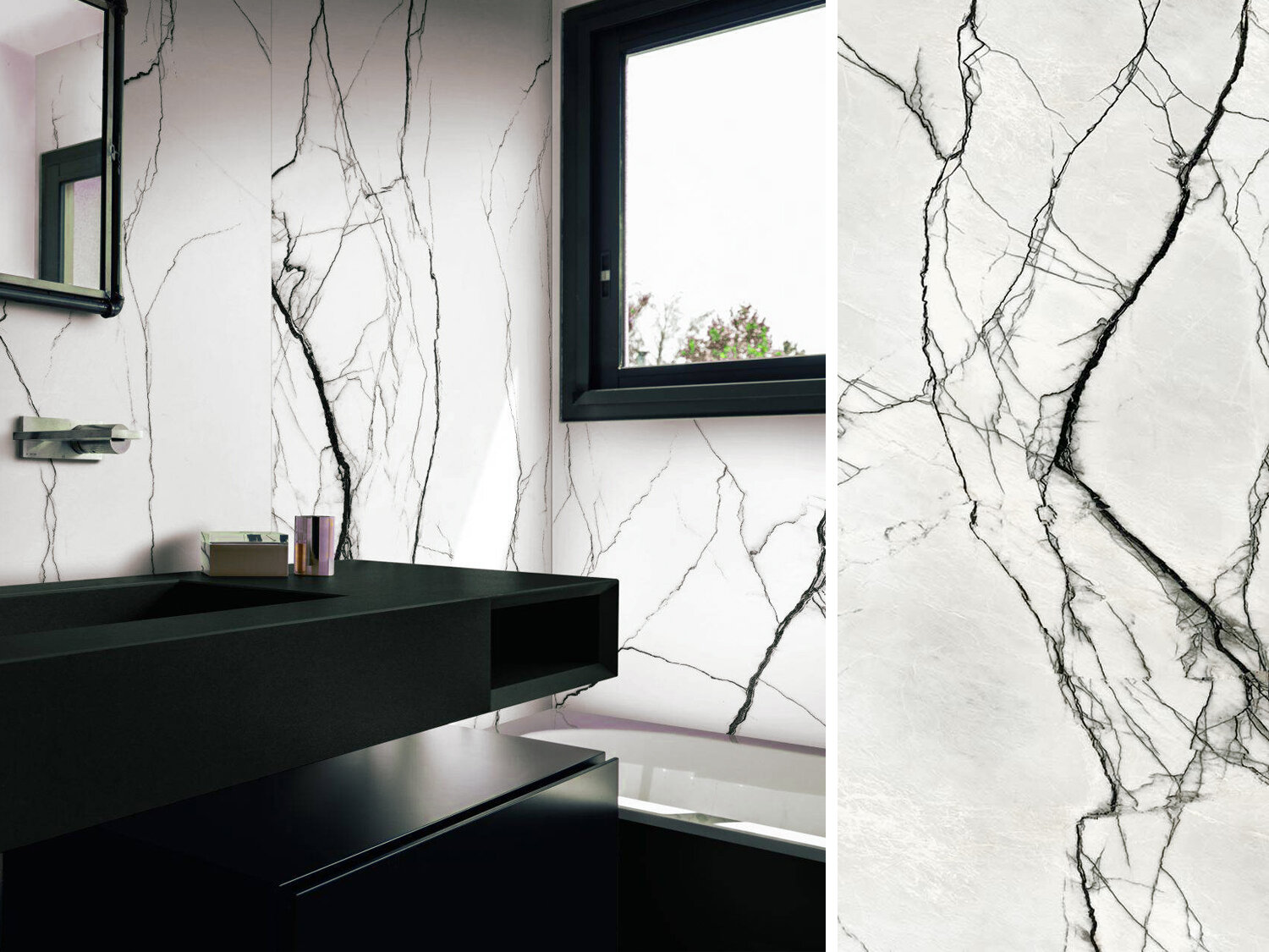
PALETTE 2

1) Sommalier | @Sherwin Williams 2) Yohen Border, White | @Inax Tile 3) Bars | @Audrey Lane 4) Olaria, Blue Steel | @Roca Tile 5) Walnut | @Bacon Veneer Company 6) Skara Brae | @Cambria 7) Duet, Blueprint | @Brentano 8) Merit, Cabernet | @Maharam 9) Sideways, Blanc | @HBF 10) Theo, Dark Red | @Brentano 11) Mist, Avio | Mosaico+ 12) Walnut Tambour | @Surfacing Solution 13) To the Point, All Nighter | @D.L. Couch 14) To the Point, Gold | @D.L. Couch 15) To the Point, Graphite | @D.L. Couch 16) To the Point, Inky | @D.L. Couch
Classic red, white, and blue never goes out of style! This ensemble is an modern take on a timeless palette, with beautiful colors and sophisticated accents that elevate it to a new level. Warm, textured woods juxtapose, sleek, gold metallics to create balance. Stone with a large-scale veining pattern add elegance, while fun geometric wallcoverings add an element of playfulness.
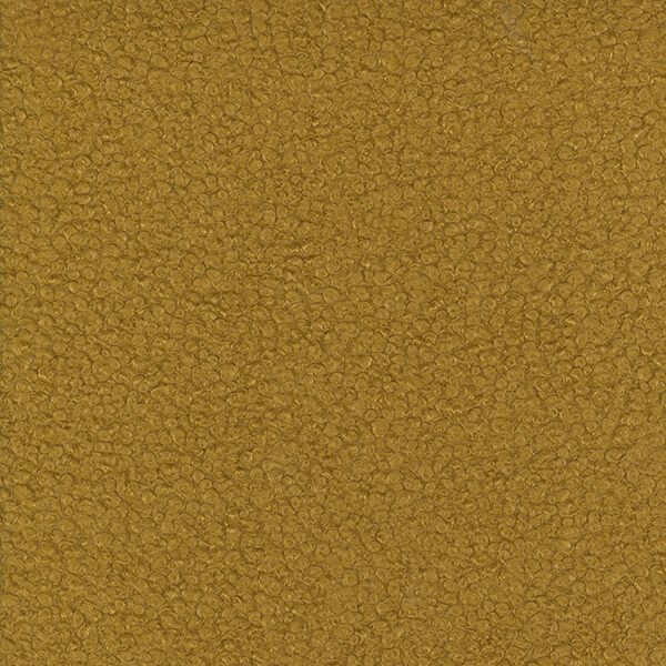
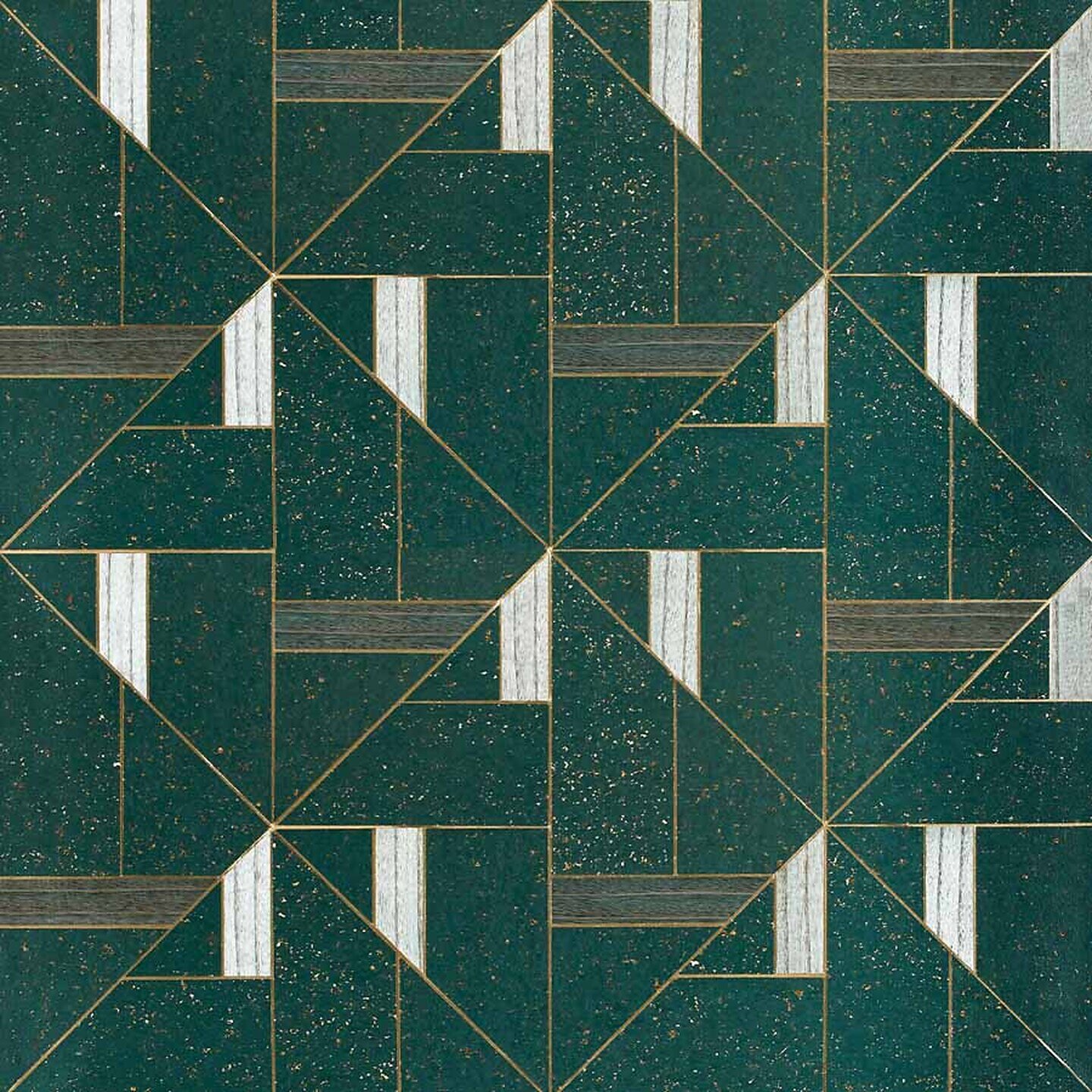
PALETTE 3

1) Maple Tambour | @Surfacing Solution 2) Sunbeam, Matador | @Sina Pearson 3) Prime, Iceberg | @Maharam 4) Gem, Lapis | @Brentano 5) Bright Angle, Cyan | @Maharam 6) Lines, Black & White | @Olivia + Poppy 7) Deconstructed Stripe, Ivory on Black | @Schumacher 8) Maddox Deco, Black | @Stacy Garcia 9) Penny Rounds, Aqua Blue | @Artistic Tile 10) Penny Rounds, Steel Blue | @Artistic Tile 11) Penny Rounds, Coral Red | @Artistic Tile 12) White Oak Planked Groove | @Treefrog 13) Tre Super Jag, Black | @Somer Tiler 14) Marble Breach | @Florim 15) Gem I, Midnight Ocean | @Ann Sacks
Using bold corals and aqua blues, our final concept is a bright and modern interpretation of a 4th of July palette! In addition to the unique colors, mixing in graphic black and white patterns and materials adds a playful element. Geometric tiles, wallcovering, and textiles are balanced by the natural patterns of woodgrains and marble-look stone. Finally, the light wood tones tie the palette together with warmth and texture.
How are you inspired by the colors of Independence Day?
LAB | Logo Applications
Branding is an important part of any commercial space; from the moment you walk in, a business’s interior should reflect the company’s ethos, aesthetic, attitude, and personality, giving you a tangible introduction to what the brand is all about!
We frequently use interior design to help support these efforts, and love collaborating with clients to ensure all design elements in the space (down to the smallest details) work with their brand vision. But sometimes, the space calls for more than visual reinforcement of the company brand through materials, lighting, or FF&E selections. Often, there are spaces that need a more direct implementation of the brand and when that happens, it provides an opportunity for us to explore creative logo applications!
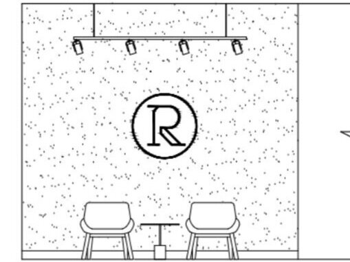
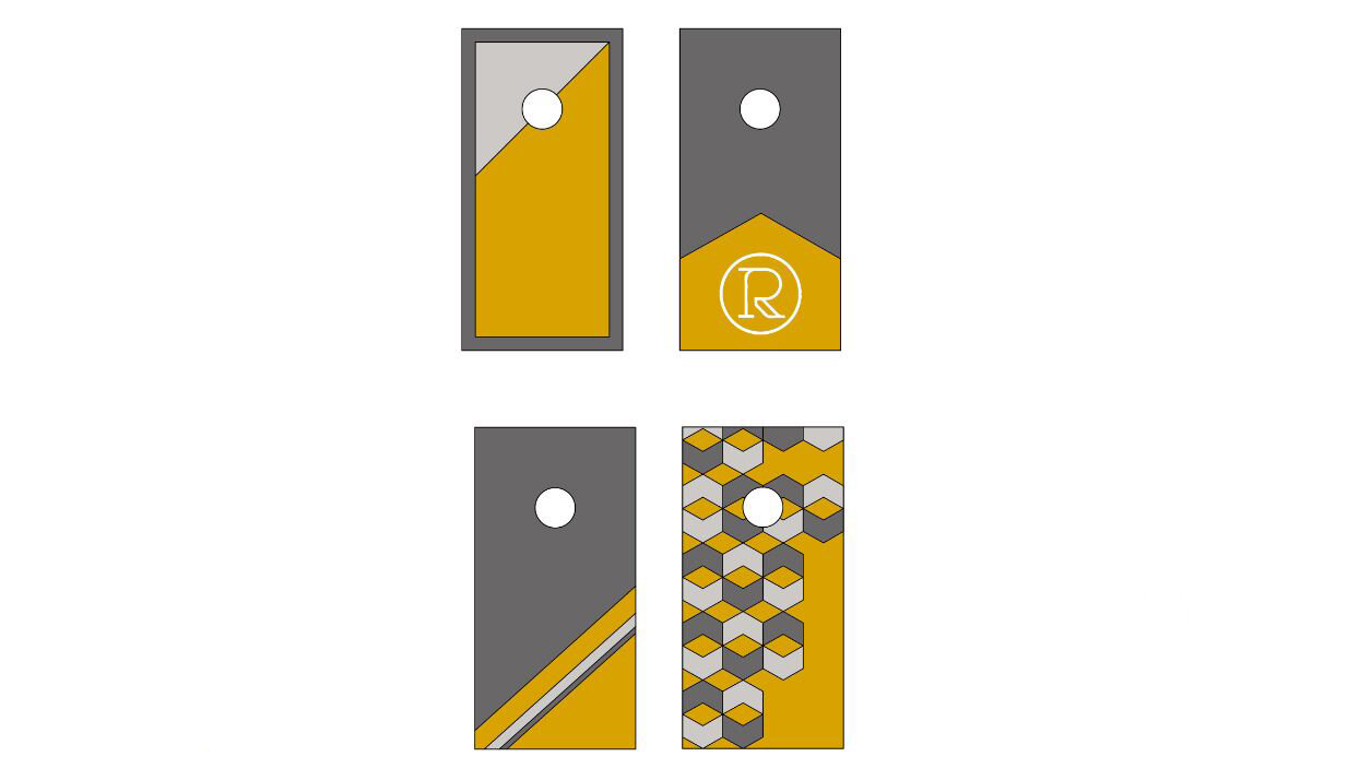
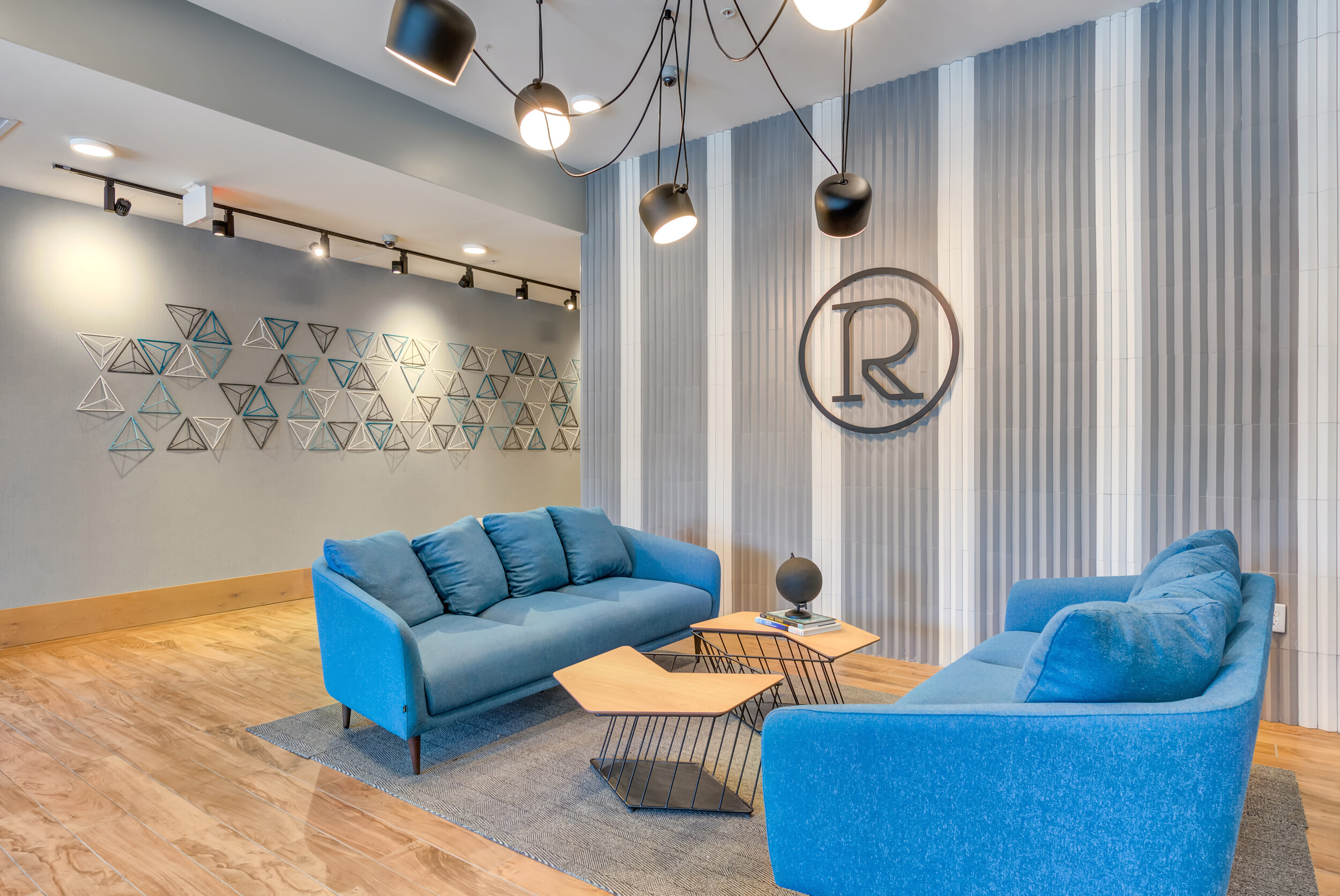
It all starts with a full exploration of the brand - initial concepts, sketches, and a complete understanding of the visual identity are all vitally important parts of the process! Sometimes a logo can be applied throughout a project to reinforce the brand in subtle ways. At Rise on Chauncey, we were able to incorporate the project logo as part of the wall signage, in furniture, and even on outdoor lawn games.
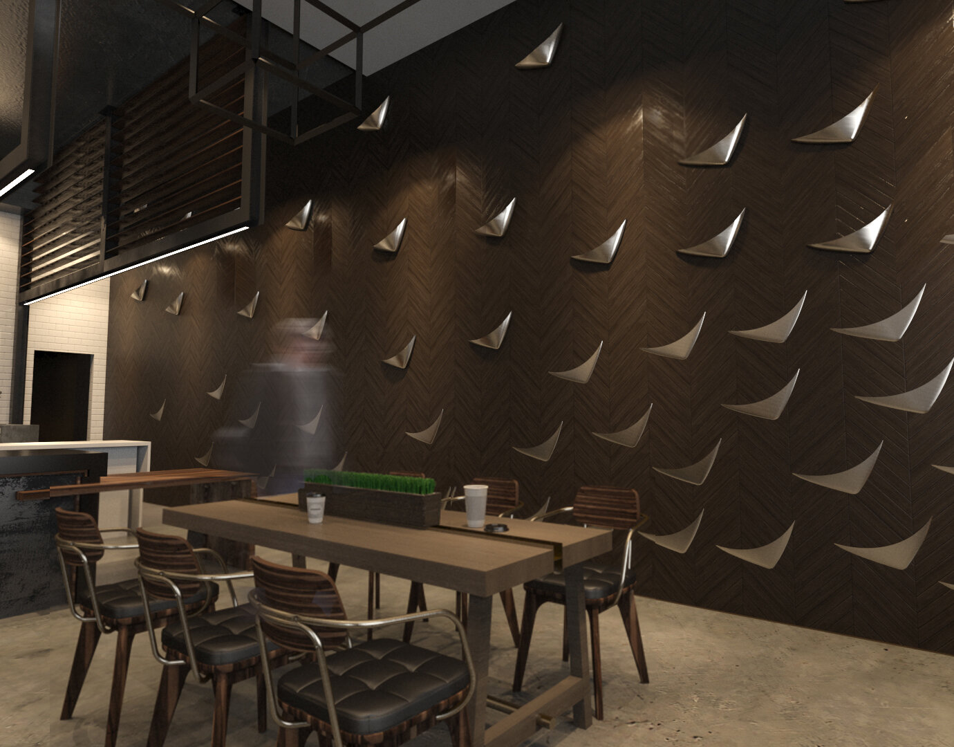


We had an opportunity to fully explore the concept behind Sparrow Coffee when working through the project’s logo design and branding. Everything from feature art walls, signage, and packaging were part of the logo applications utilized in this project, allowing us to reinforce the brand concept in a very unique and tangible way!
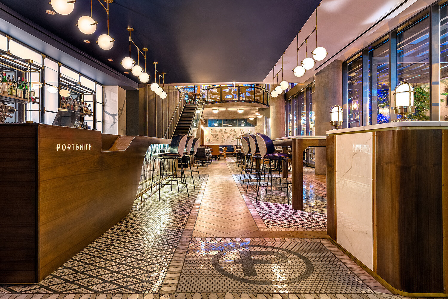
Even the simplest elements from a logo can become part of the interior and reinforce the brand! At Portsmith, we not only incorporated the logo into a custom bar design and floor mosaic, but also integrated the isometric line patterns from logo into a beautiful wood & mirror feature wall.


Of course, there are lots of creative ways to include a logo in a design. But sometimes the simplest applications are the best - a focal area featuring the logo can be a great addition to the design, as well as a way to reinforce the brand!
What creative logo applications are inspiring you lately?
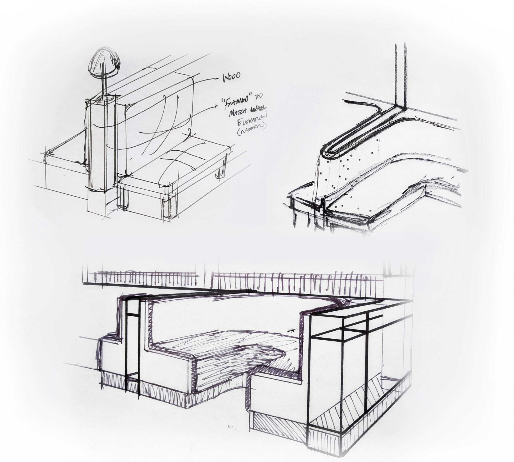
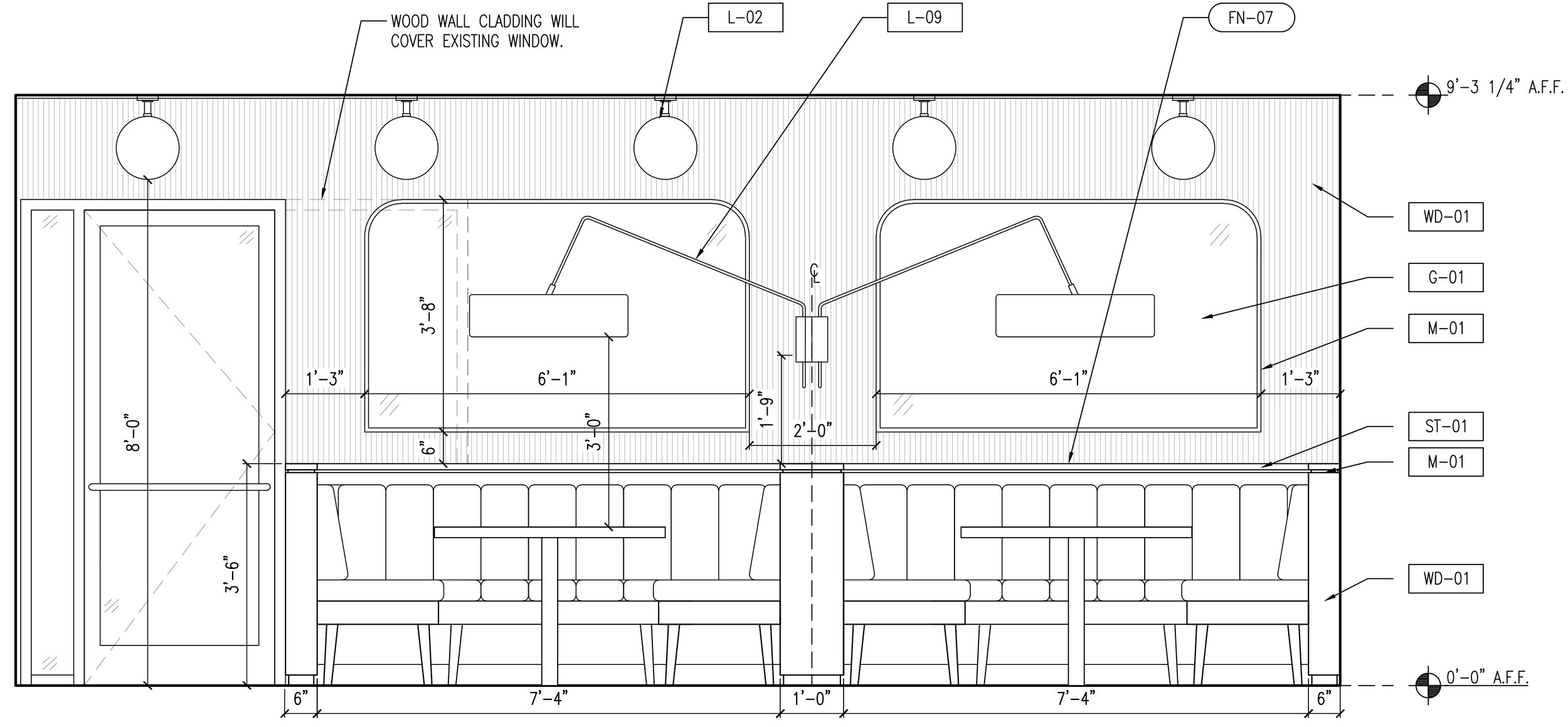
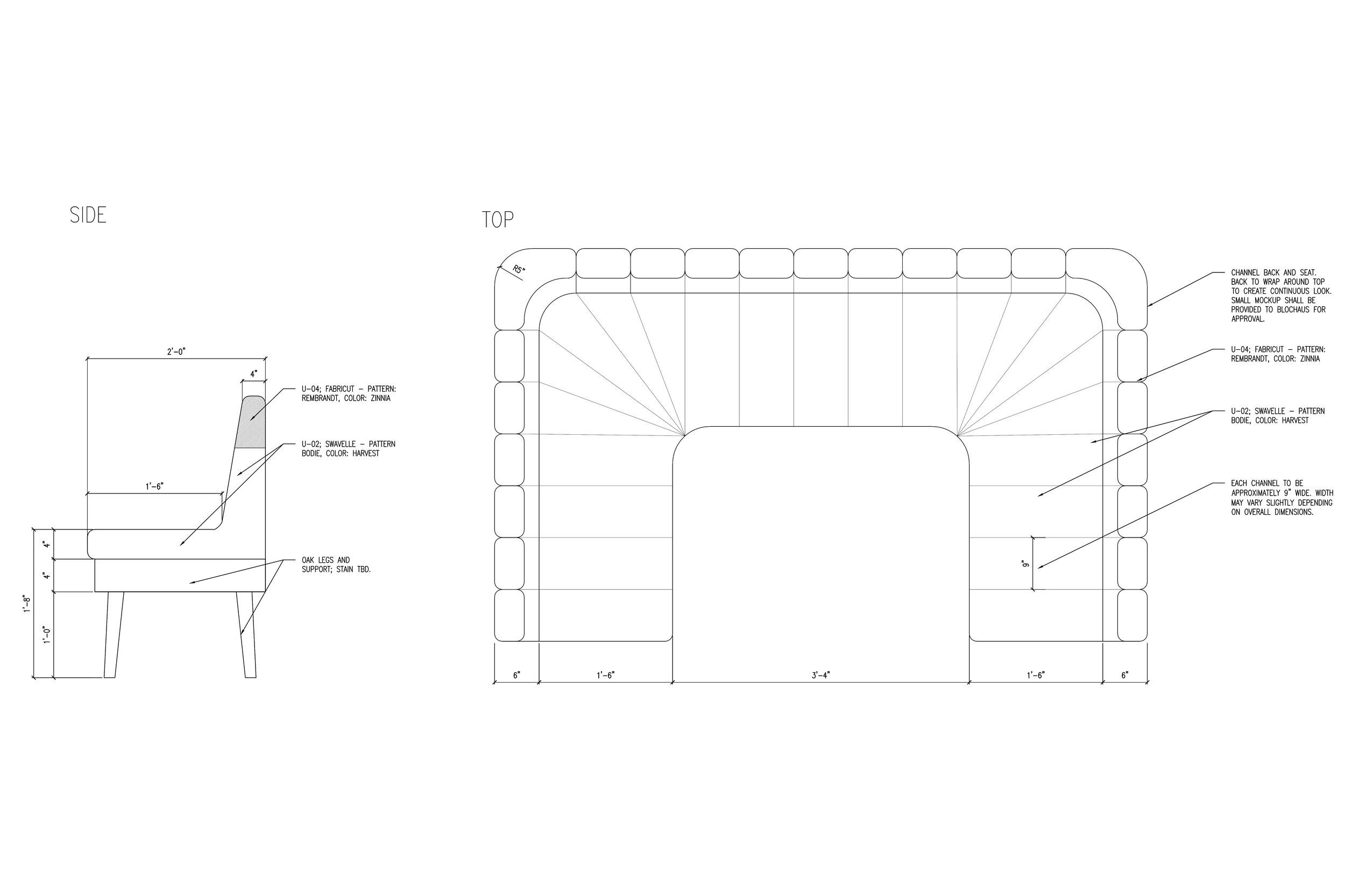
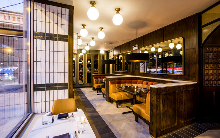
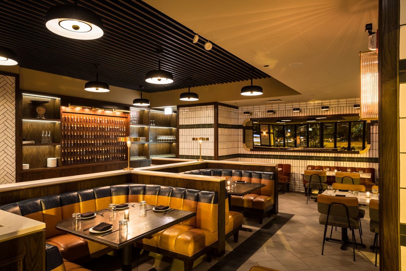
LAB | Custom Seating
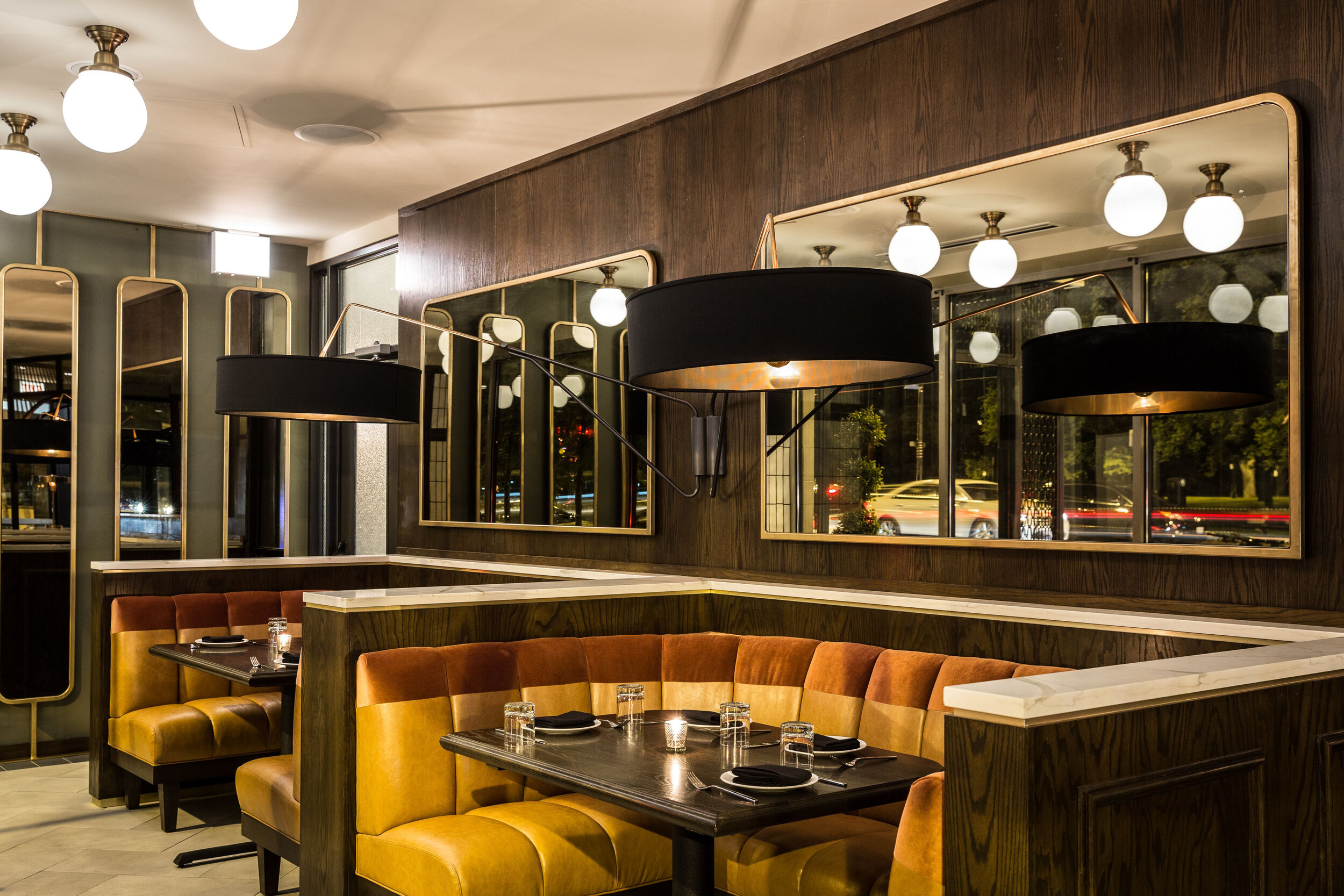
At blocHaus LAB, we strive to find innovative and creative solutions to meet the needs of the space. We love a challenge when crafting a new design, and the booths for The Kennison in Chicago were one of our favorites! Take a look below for an inside peek at the inspirations and process behind this custom seating.

Creative concepts lead to unique custom solutions - the inspiration for The Kennison focused on a nostalgic American revival
![03[1].jpg](https://images.squarespace-cdn.com/content/v1/5eac62f289a3bf4e15a3e27c/1610060245126-ONDRUL91WDZTP1HL7R51/03%5B1%5D.jpg)
Combining straight and curved lines creates balance, and the mix of textures and colors in the upholstery adds interest to the seats. We also love the elegant mix of warm woods, brass details, and stone tops at the perimeter. The final result was a unique and beautiful solution to the space’s seating needs!
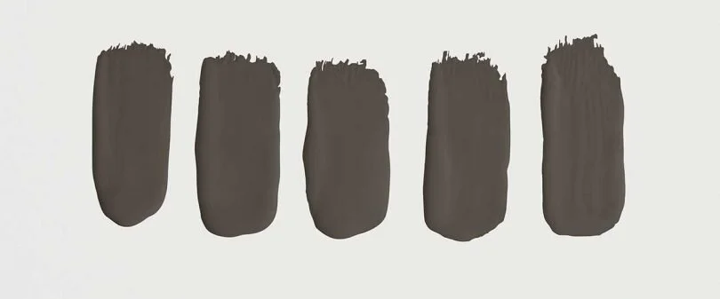
2021 SW Color of The Year
It all begins with an idea.

Sherwin Williams - Urbane Bronze
We saw grey paint hit the trends a few years ago - every apartment, commercial building, retail store, etc. was painted a shade of grey as it was the new “classic”. I still dont think grey paint is out per-say, but this year, we are seeing a return to warmth. These neutrals that we have become accustomed to lack the warm under tones that helps a space feel balanced. Sherwin Williams caught onto this trend too and has announced their 2021 color of the year - Urbane Bronze.
This dark Bronze tone looks like a charcoal, near black, in space but when you look at it next to a true black, you realize just how warm it truly is. As human beings, we all crave warmth and comfort - its part of how we are hardwired. Whether we notice it or not, we naturally gravitate towards spaces that make us feel welcome, comforted and at home.

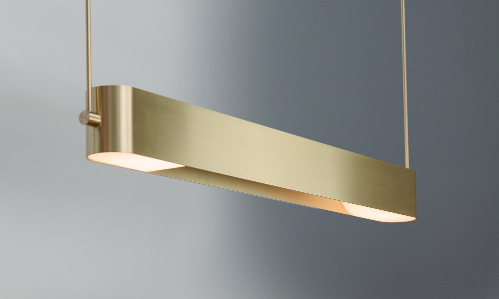
Sources (top left to bottom right):
Chair - And Tradition
Pendant - Ross Gardam
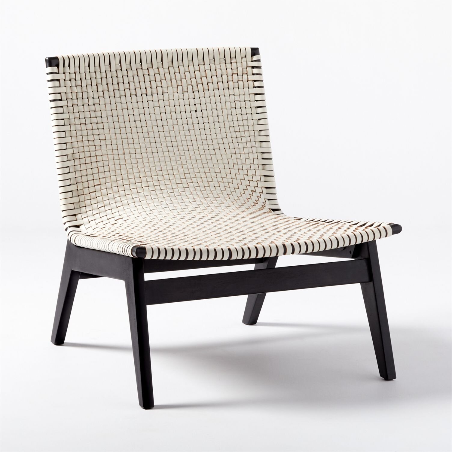
Swivel Chair - Horne
Mirror - Lulu & Georgia
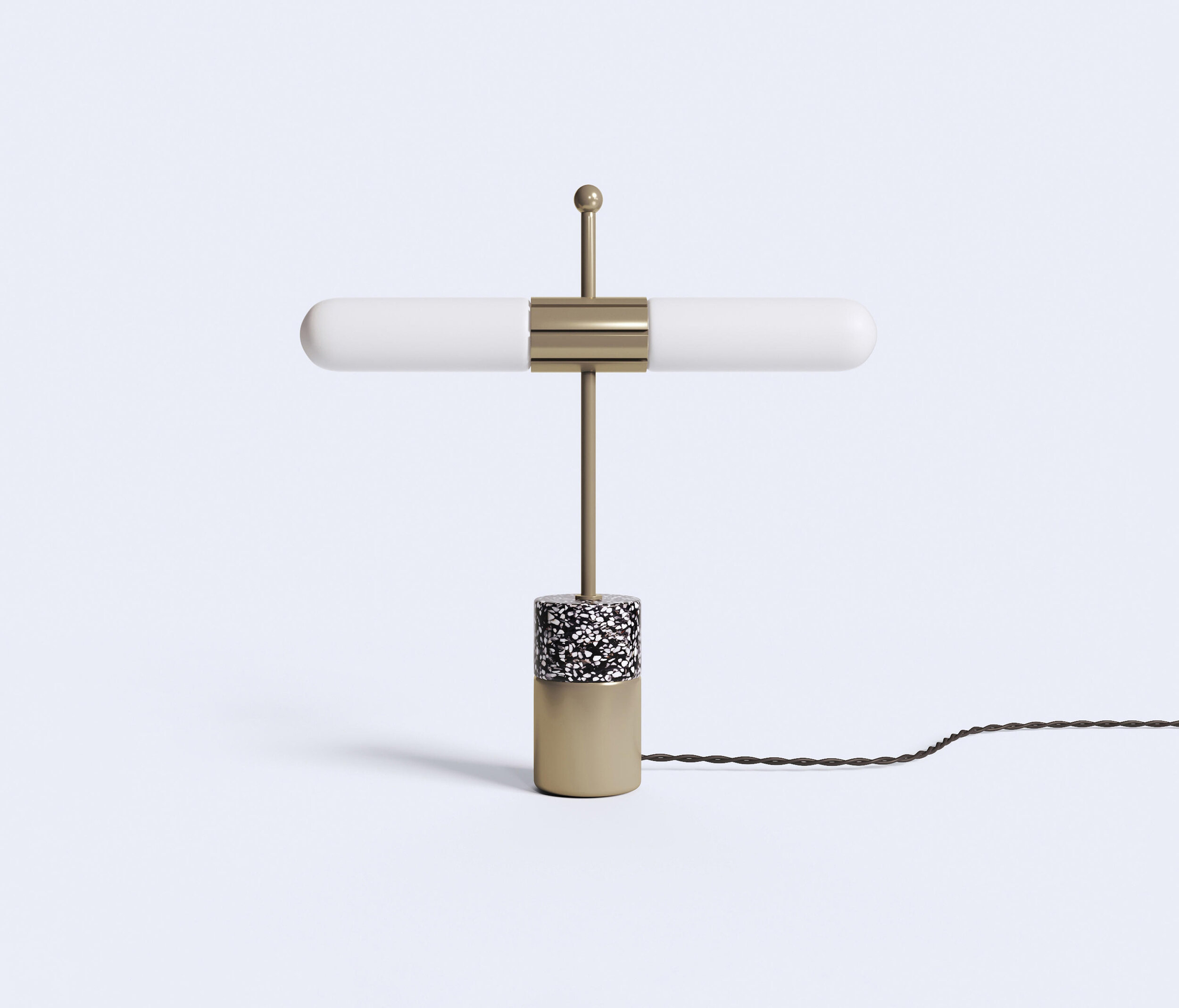
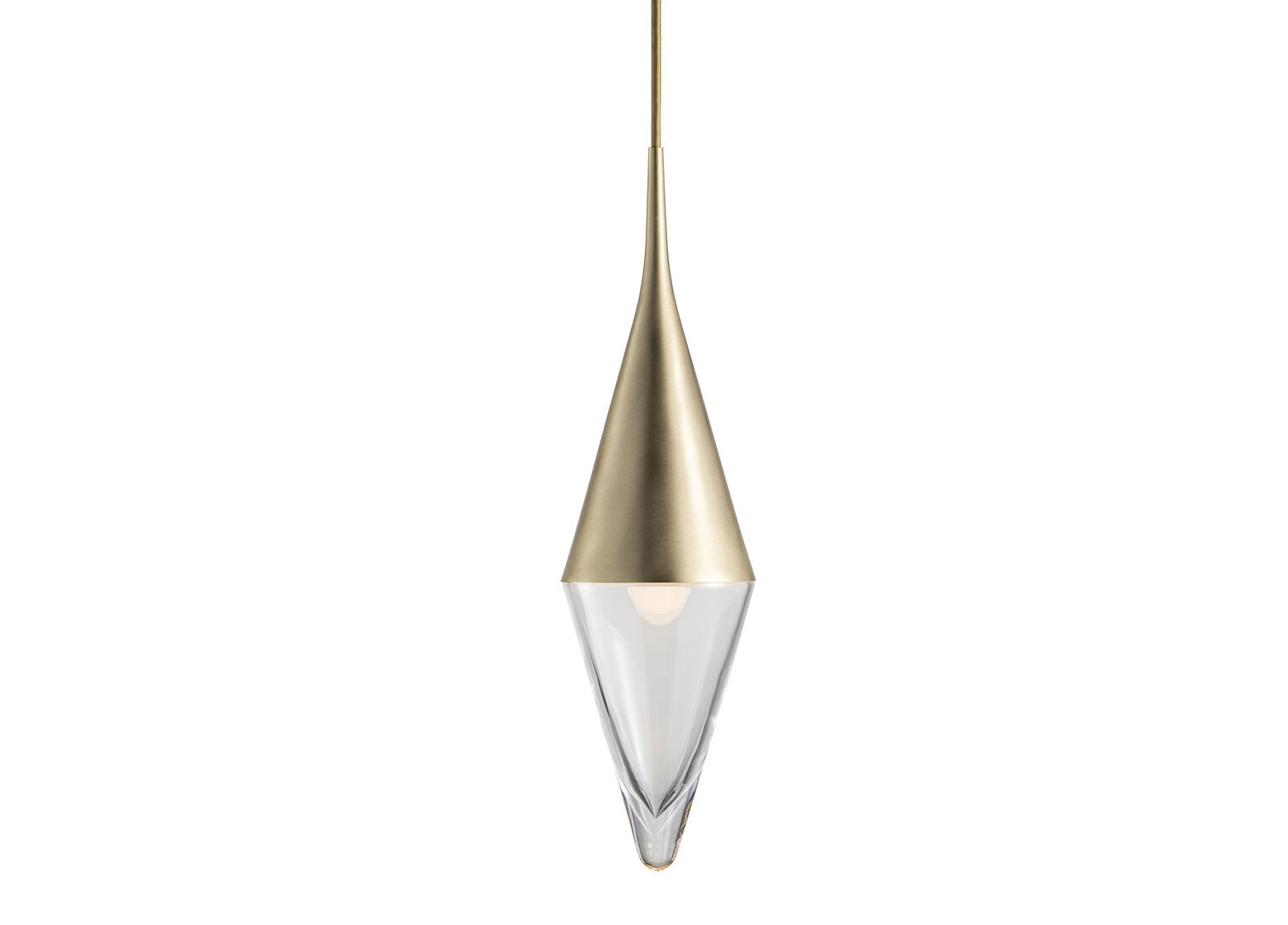
Lamp -
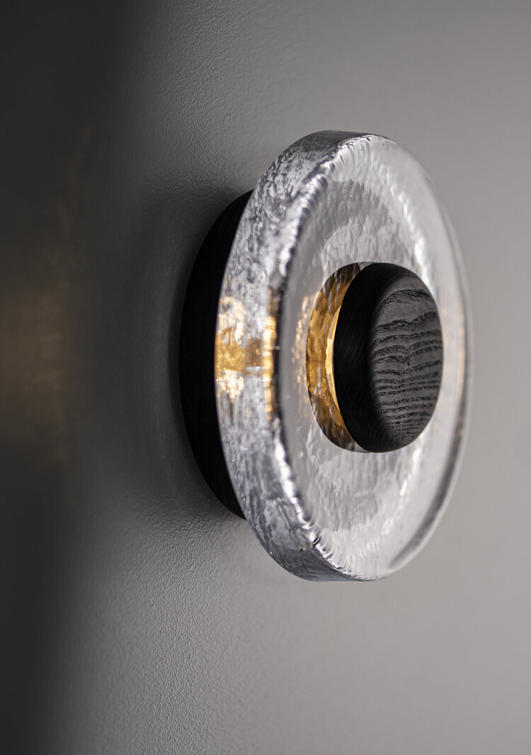
Sconce - Ross Gardam
Ottoman - Lawson Fenning
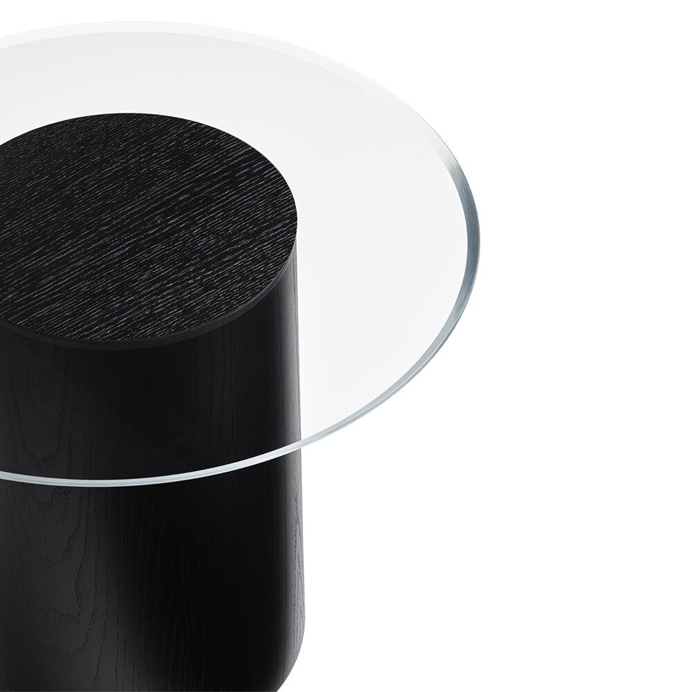
Side Table - Pfeifer Studio
Rug - Linie Design
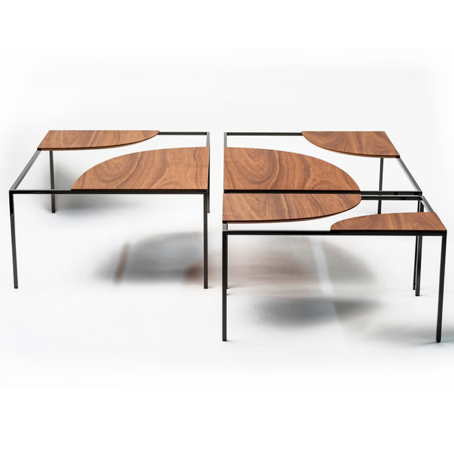
Coffee Table - Hollis + Morris
Planters - Design Milk
Sofa - Hem
Team Picks: 2020
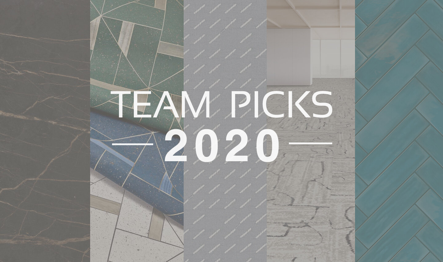
As 2020 draws to a close, we can all agree that it’s been a roller coaster of a year! But while the world got turned on its head, companies still rolled up their sleeves and released amazing new product lines. We all need a little extra dose of creativity sometimes, these collections kept our team inspired - take a look at some of our favorite 2020 product launches below!
T I L E
T E X T I L E S

F L O O R I N G
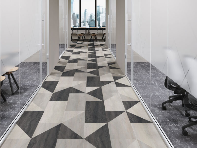
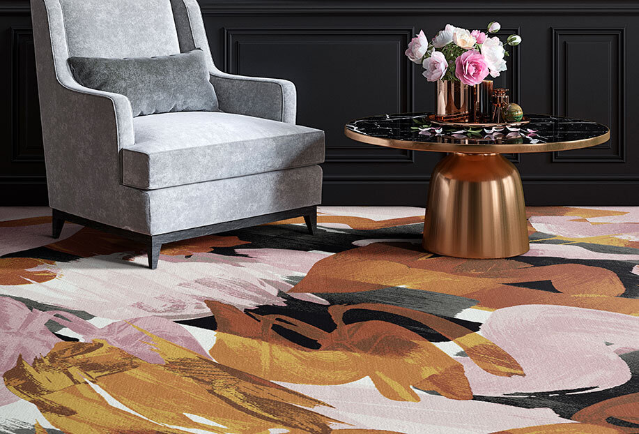
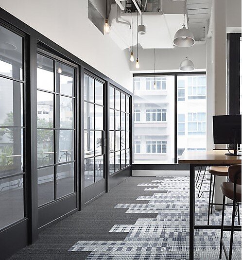
C O U N T E R T O P S
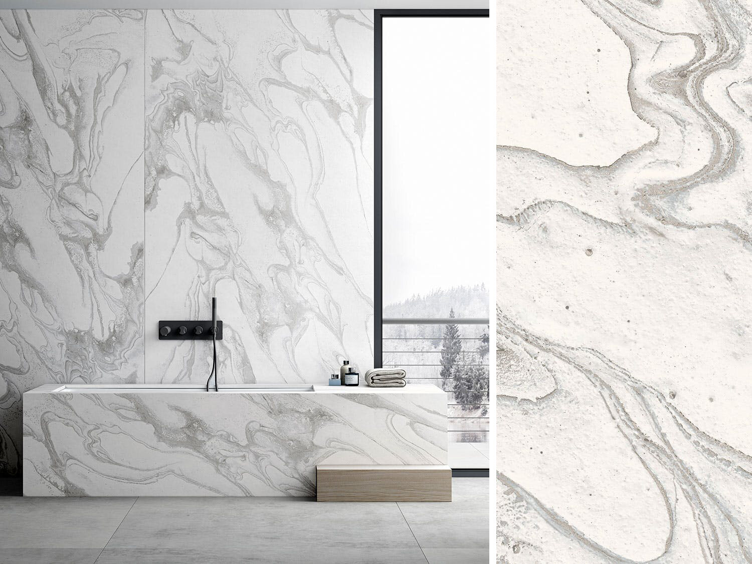
W A L L C O V E R I N G

L I G H T I N G
F U R N I T U R E
What product inspirations have you found in 2020?
Outdoor Spaces

We all know that outdoor spaces became a lot more important this year. And although the trend was initially based on necessity, outdoor dining areas and lounges can be just as creative and design-driven as indoor spaces! Below are some of our favorite outdoor spaces that are inspiring us for next season.
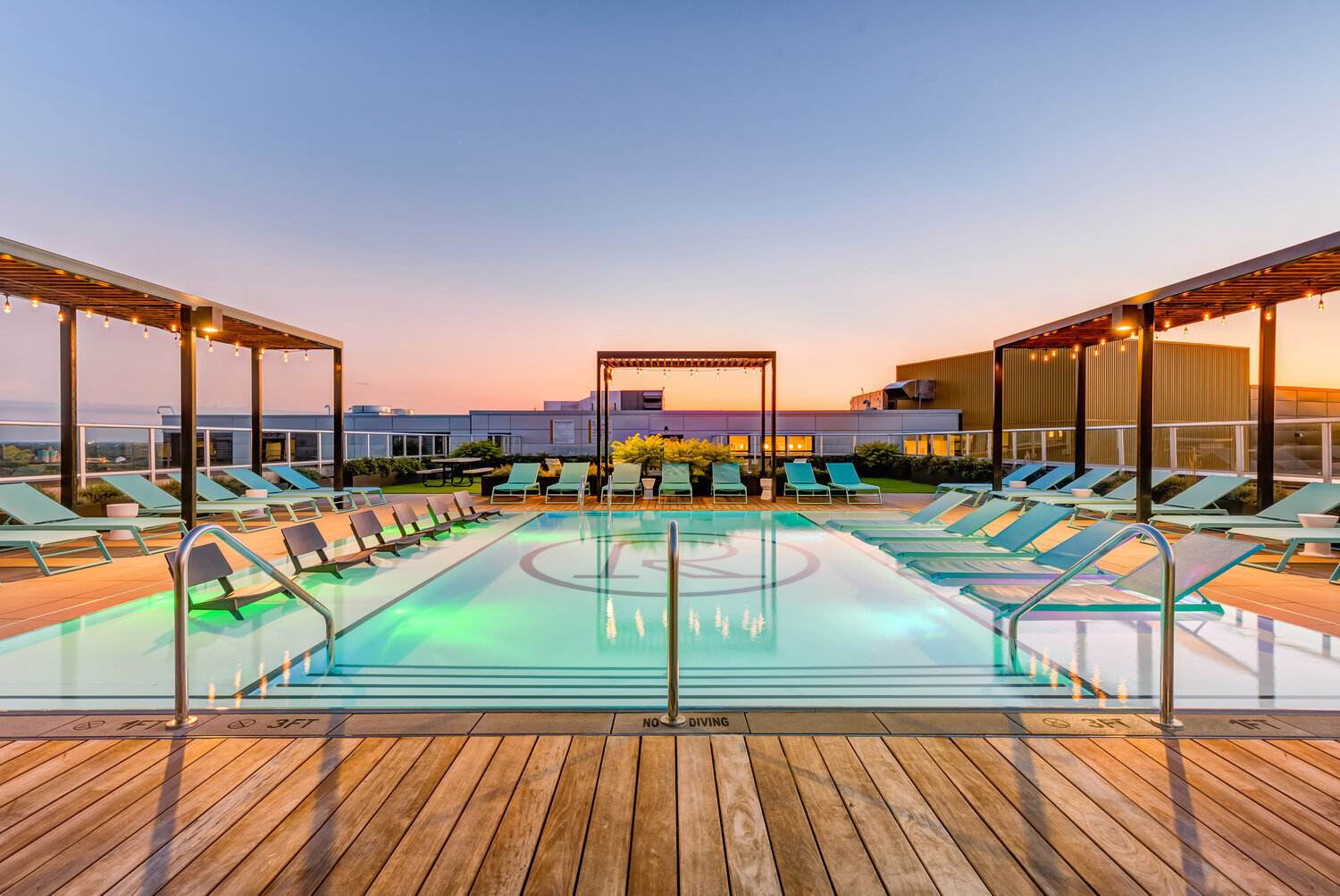
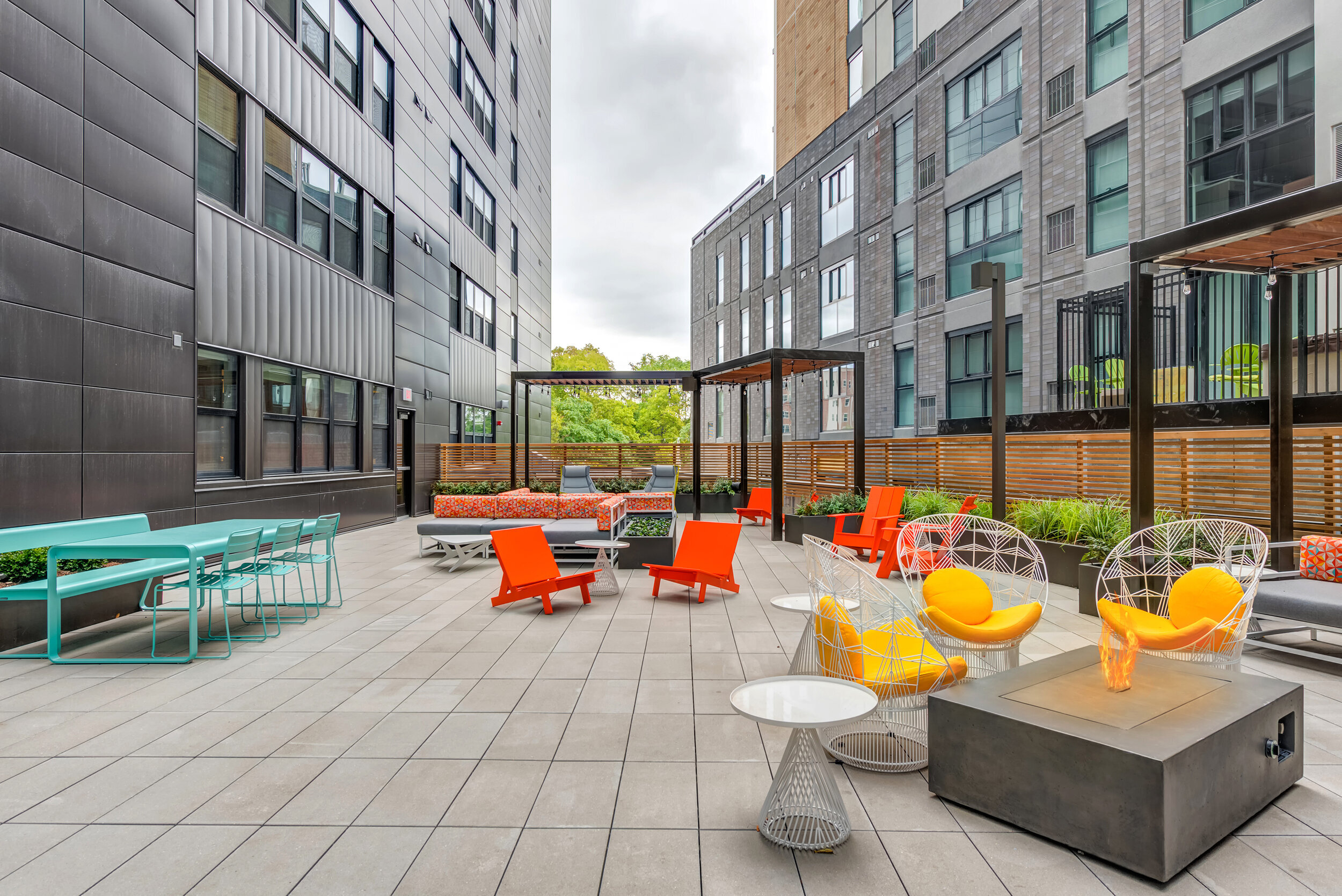
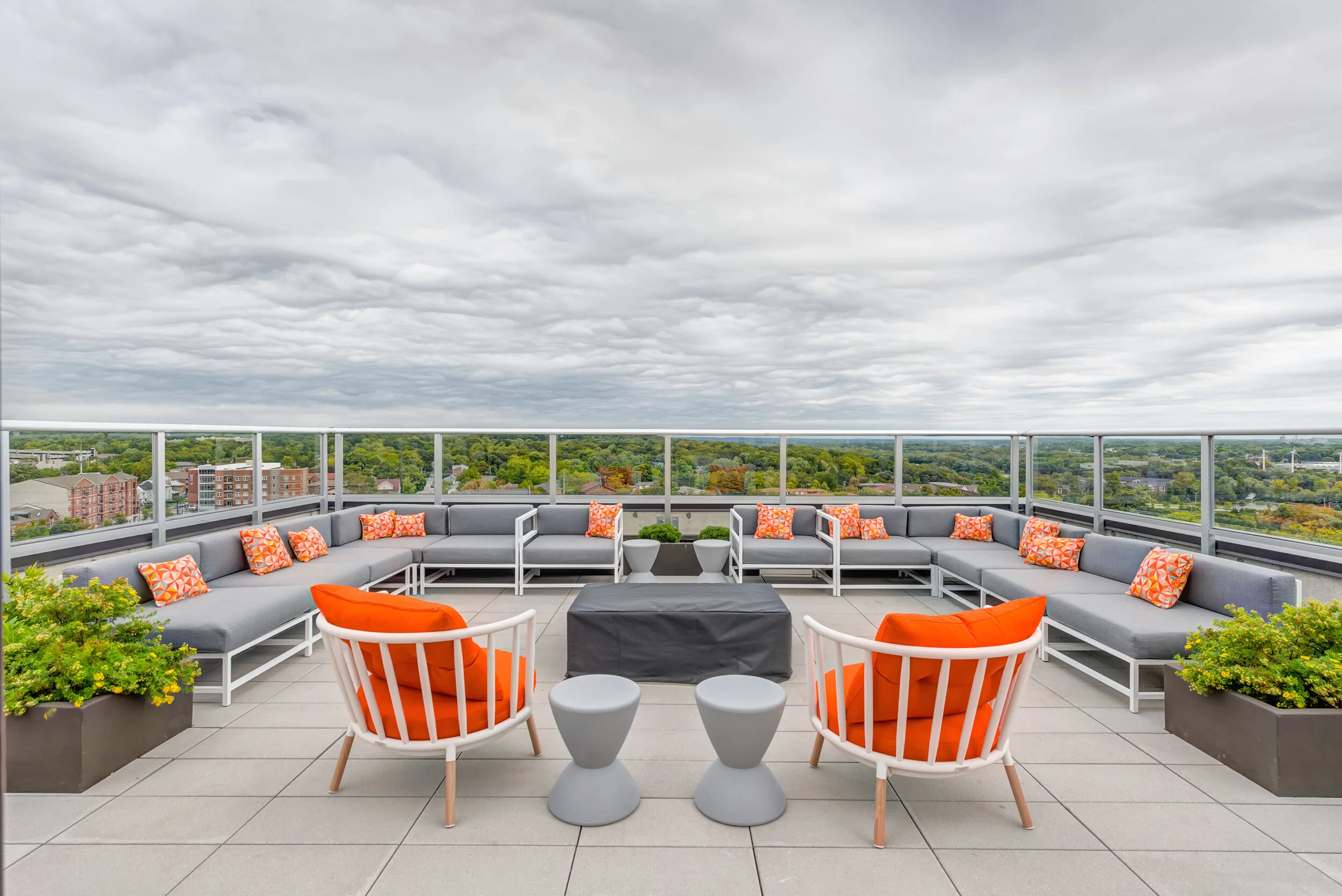
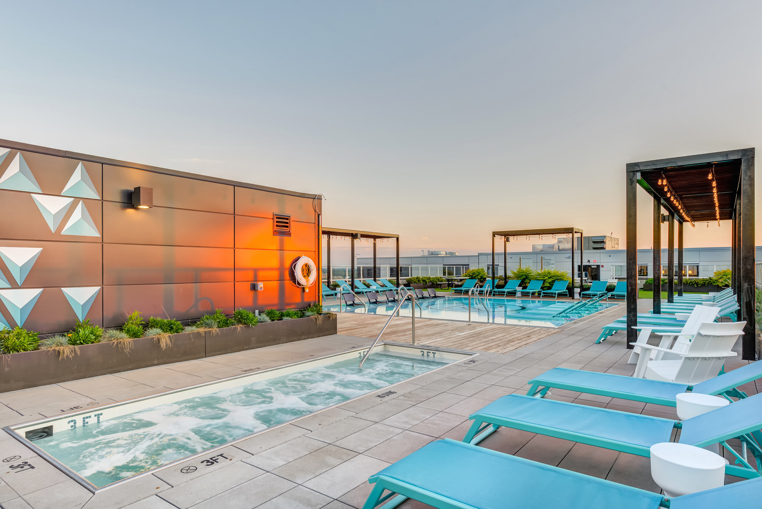
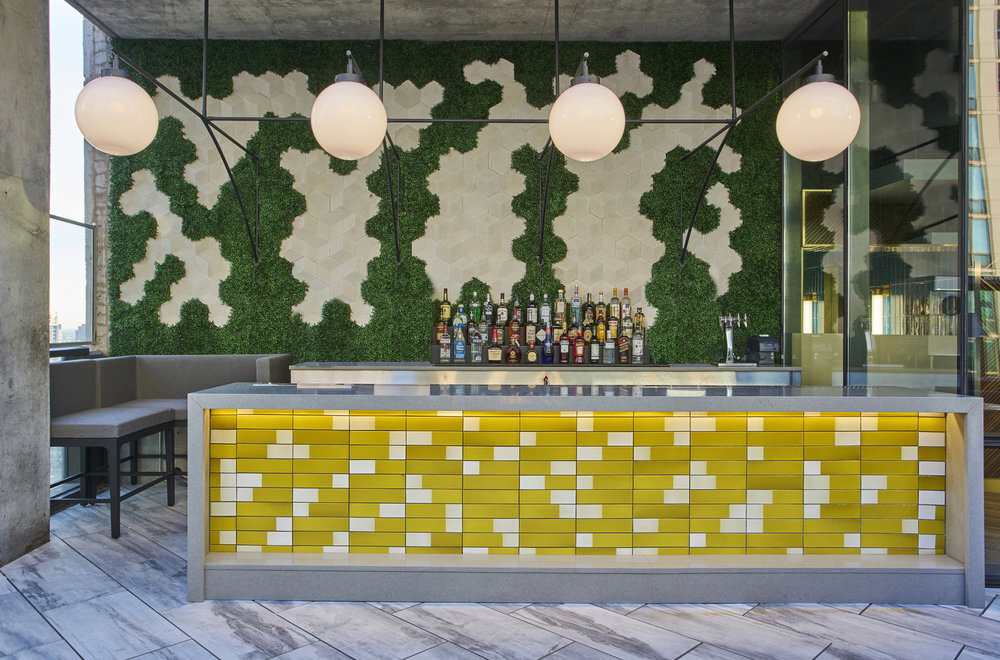
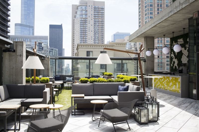
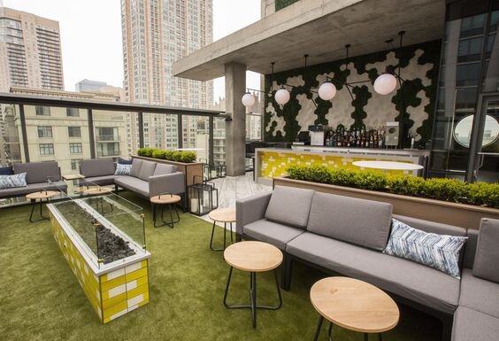
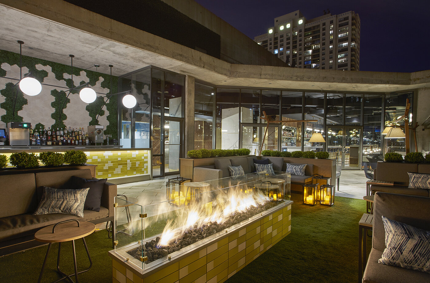
Rise on Chauncey | design by blocHaus
We love great outdoor amenity spaces - bold colors and graphics combined with games, firepits, and outdoor cabanas make these outdoor areas a destination!
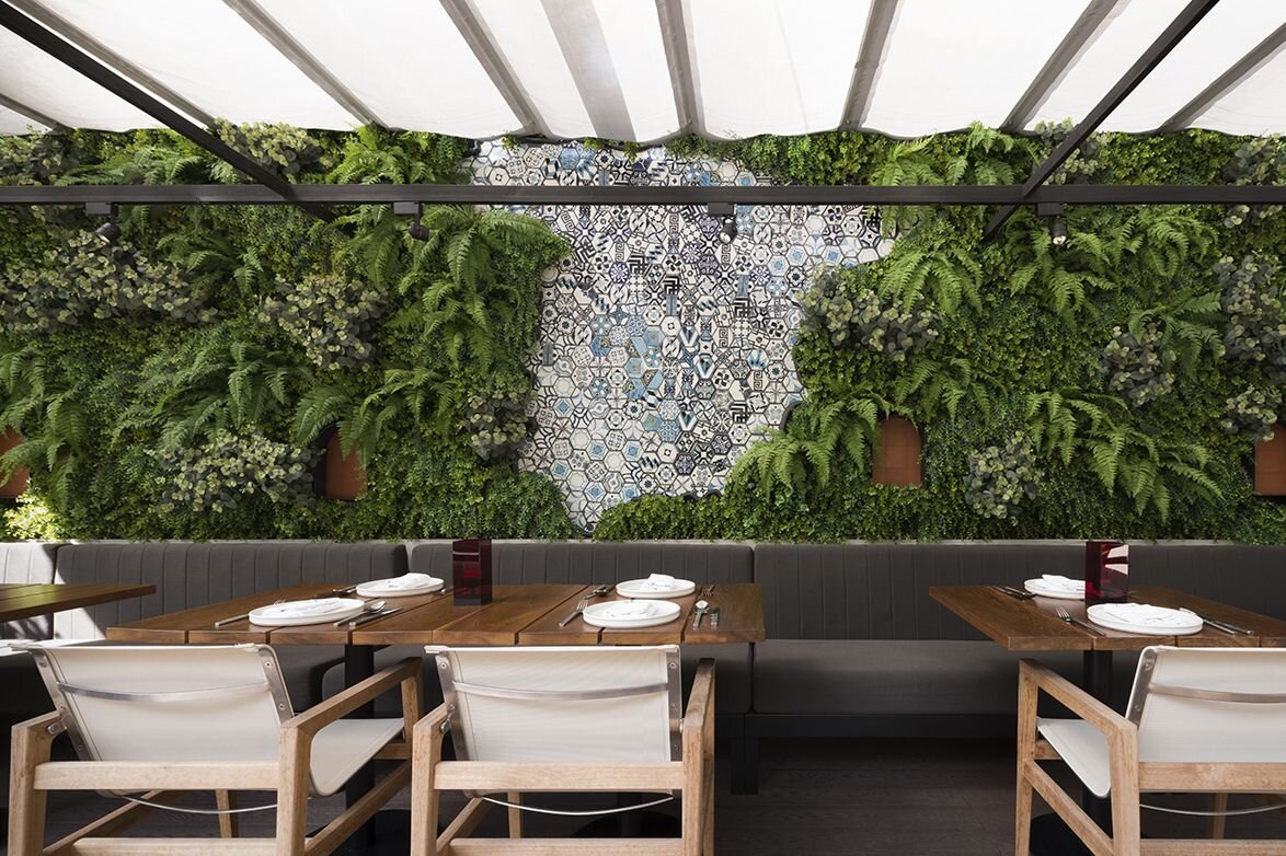
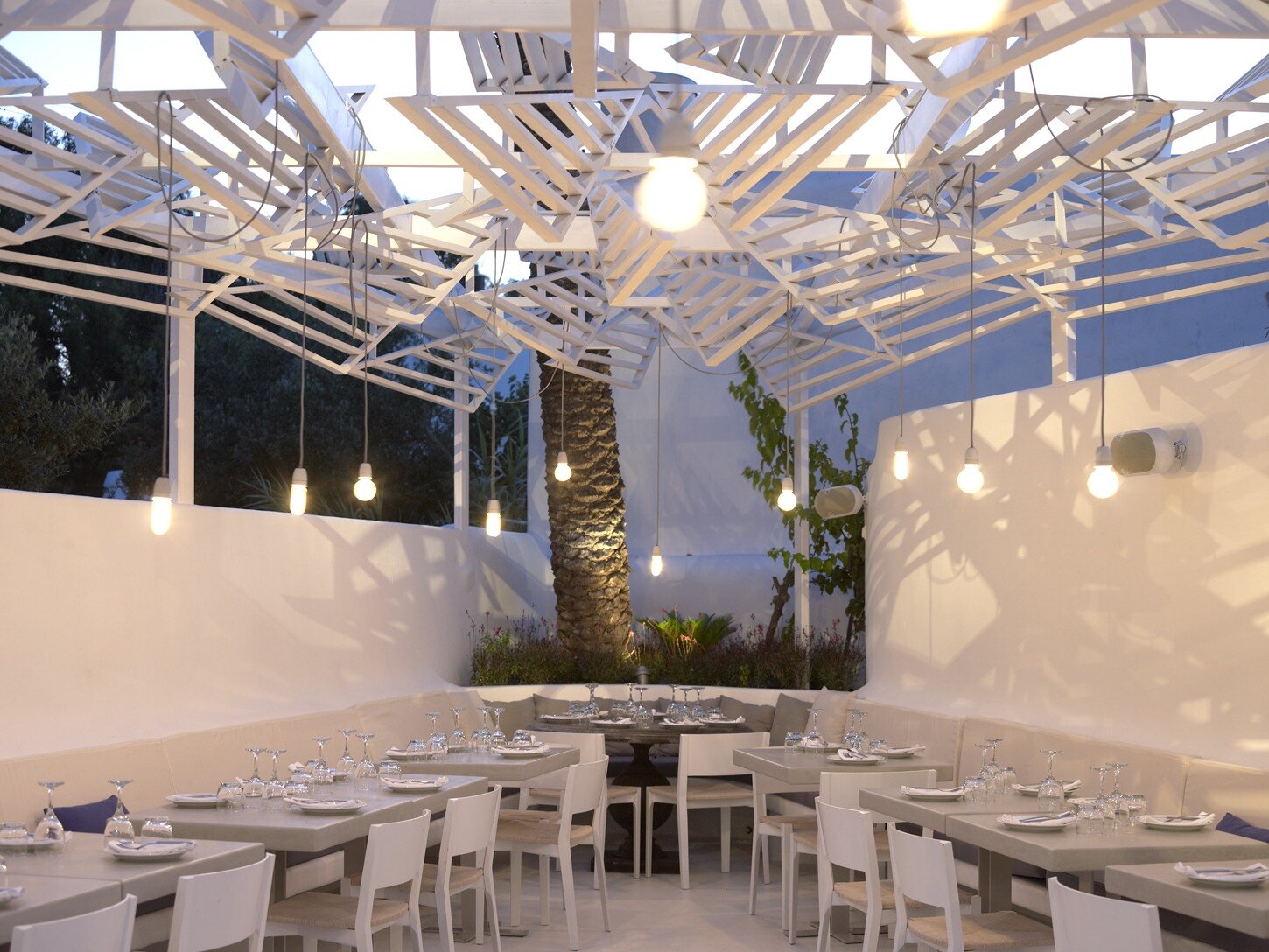
Mixing tiles with a green wall or adding a unique overhead structure add a lot of interest to these outdoor dining areas.
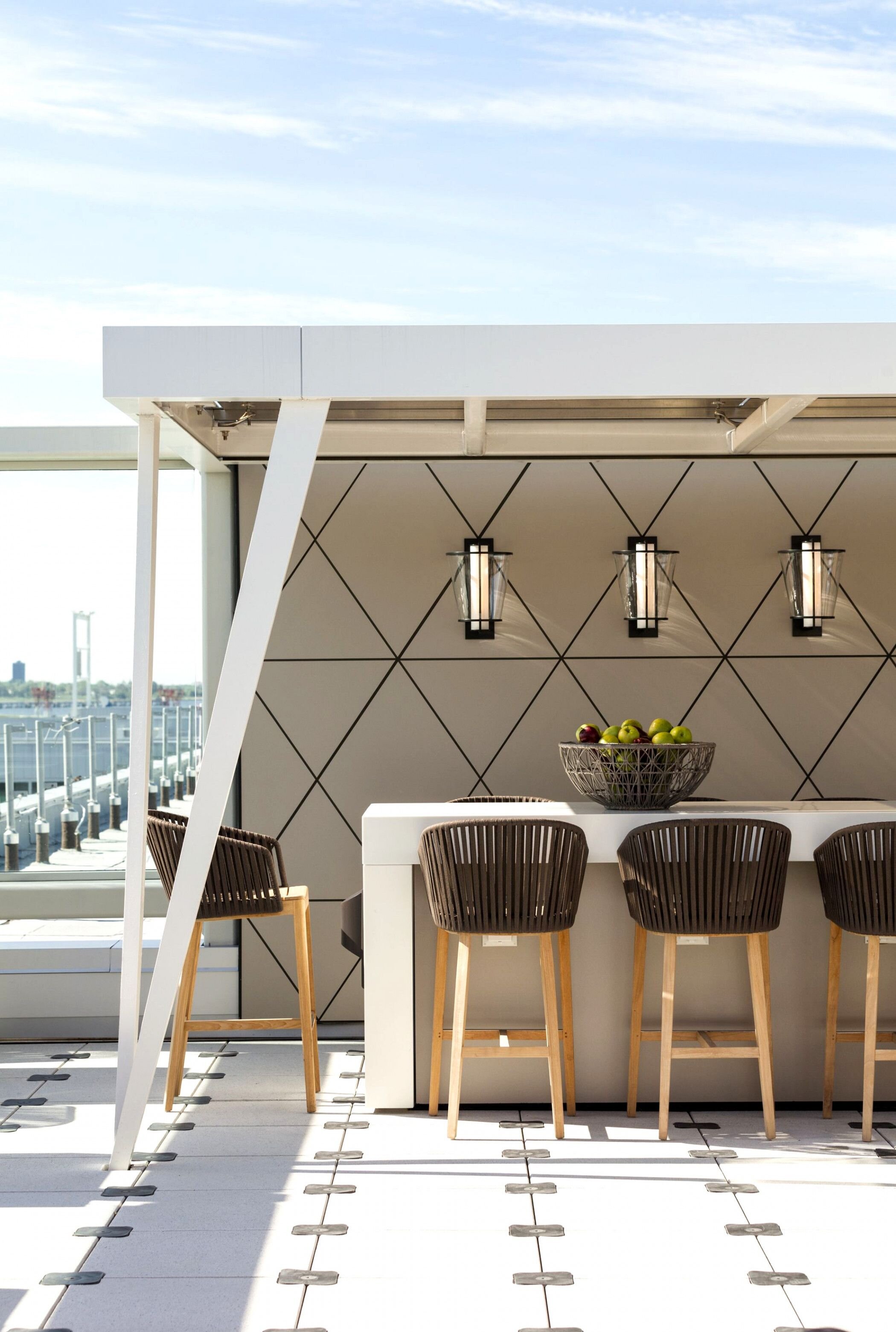
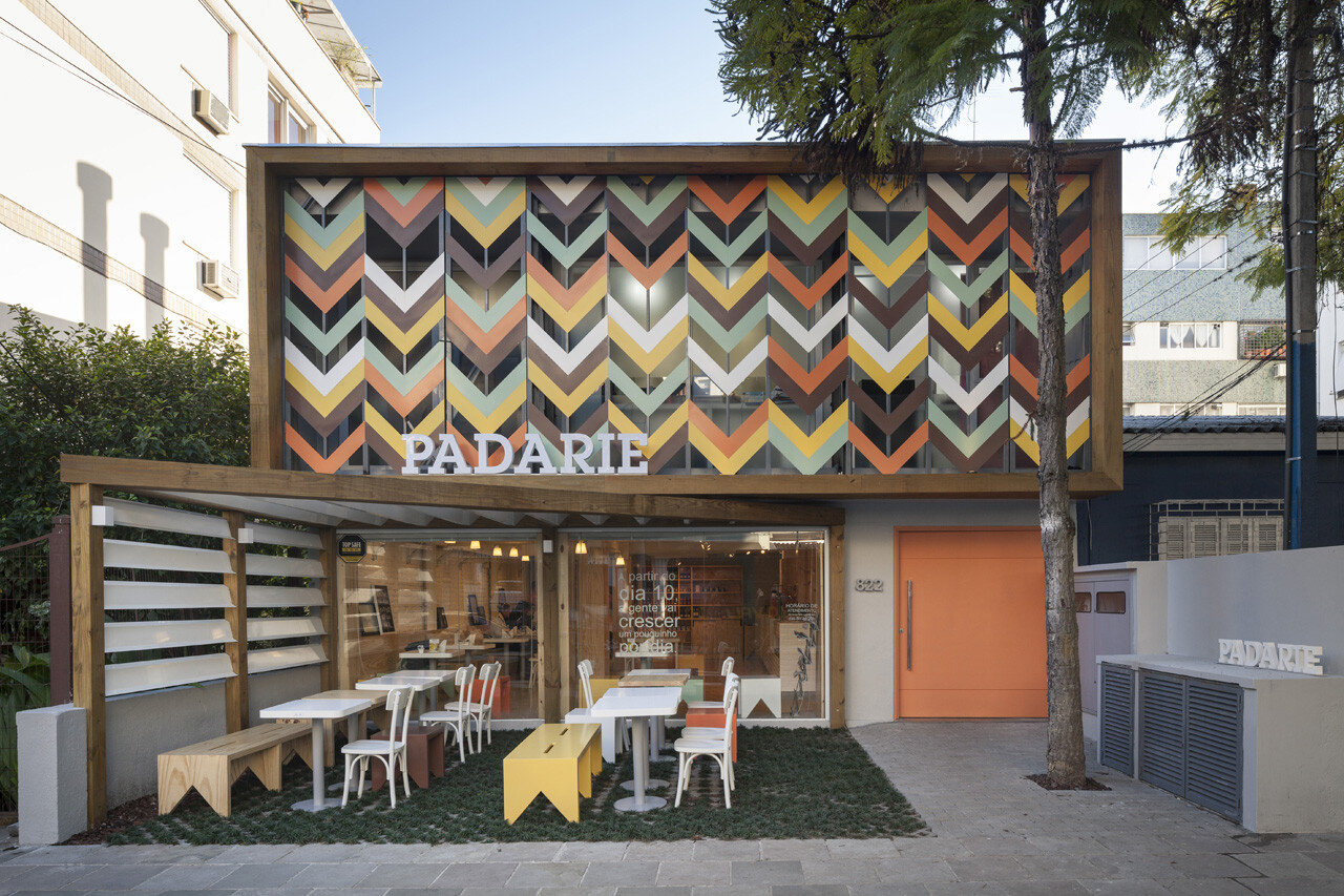
Geometric wall tiles and screens are the focal points of these modern outdoor spaces - we love the bold look of each!
What outdoor spaces are inspiring you for next season?
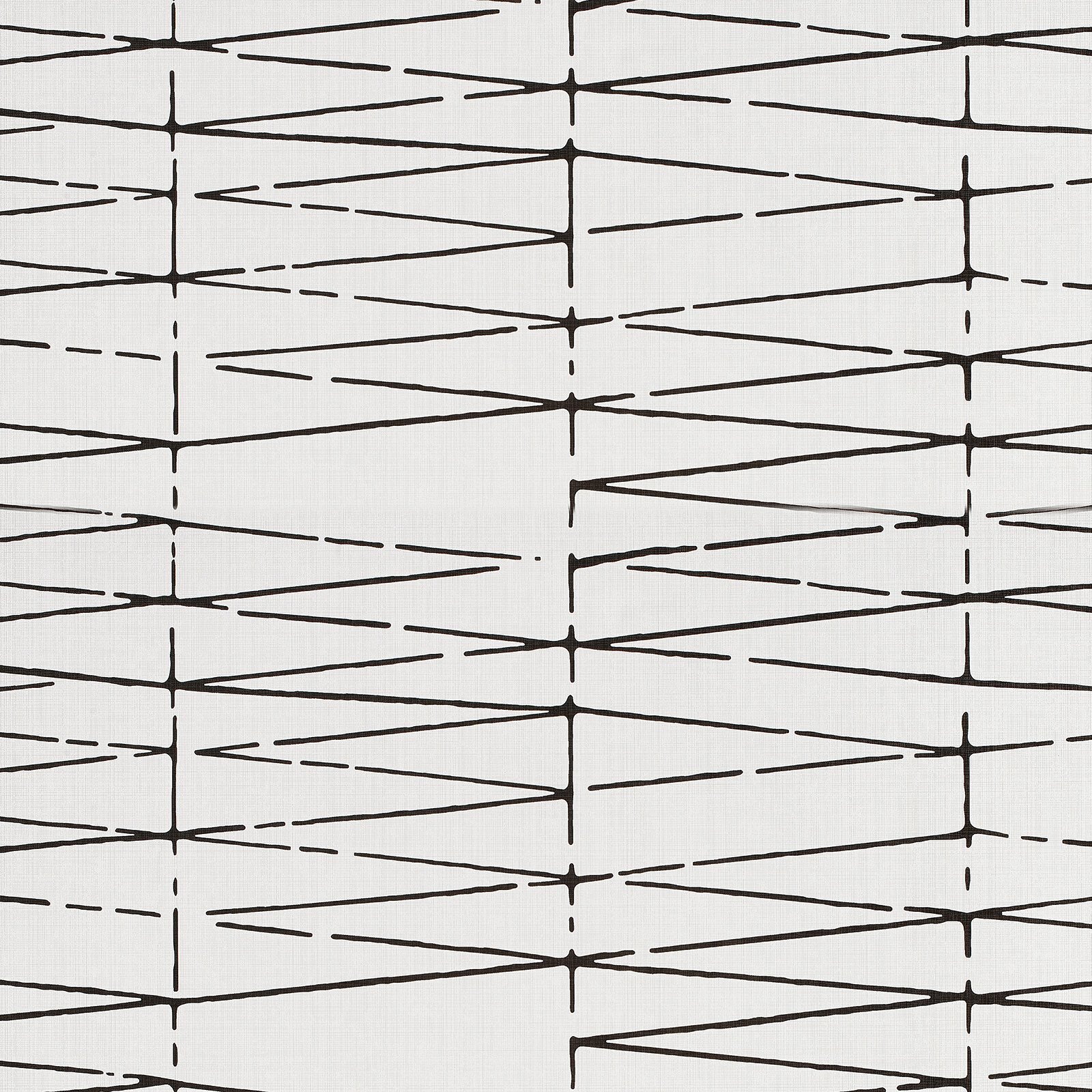
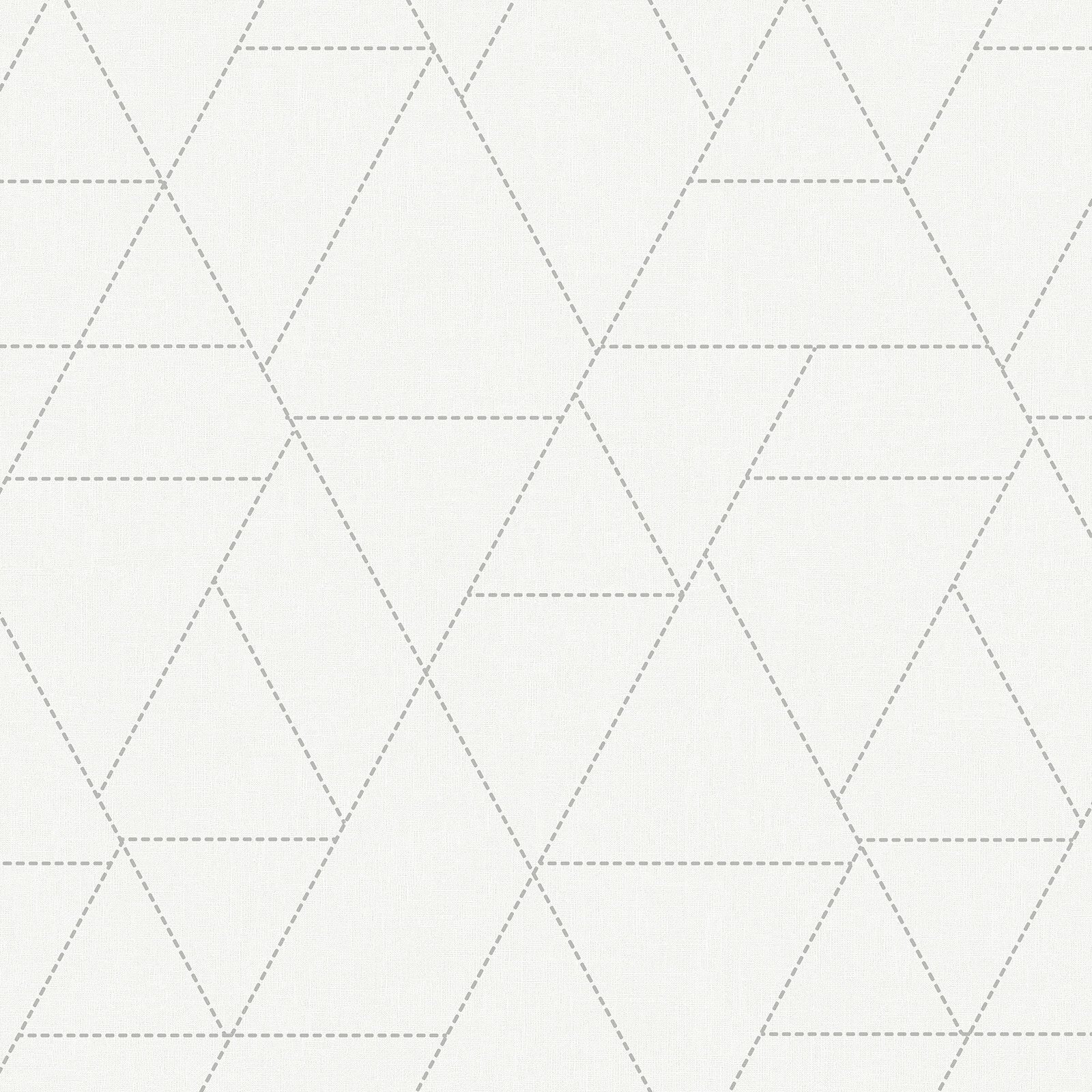
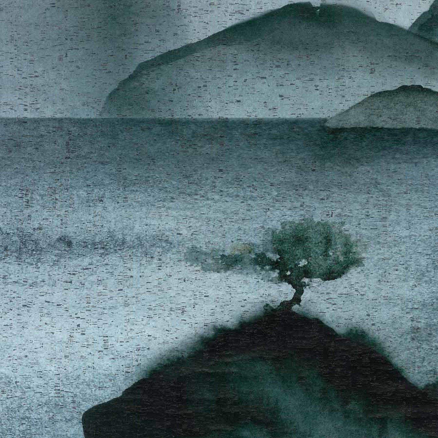
Team Picks: Winter Wall Coverings
It all begins with an idea.

By this time of year, we are used to seeing a lot more frost than 2020 has given us. Don’t worry fellow mid-westerners, it will happen sooner than you think!
Every year in Chicago, we watch the lake evolve with the seasons and it does something quite impressive in the winter. It freezes over and forms these jagged puzzles of art. Each one, inspires an interesting pattern of geometric and organic lines. Take a look at the collection of wall coverings we have curated below that remind us of this unique natural process.


Sources Top Left to Bottom Right
Carnegie Textiles - Mojave
Carnegie - Kaleidoscope
Phillip Jeffries - Sea Spray
Holly Hunt - Dream Weaver
Phillip Jeffries - Fade
Phillip Jeffries - Brushstroke
Wolf Gordon - Luana
Maya Romanoff - Blue Agate
What Metal is Right for You?

Brass may seem like an obvious trend since we are seeing it everywhere; hotels, restaurants, homes, retail… but brass isn’t a new thing. Just because it is “in” now, doesn’t mean that it’s going out. Brass is the new normal in metal finishes. It used to be hard to find modern hardware and finishes in a timeless brass finish, but now its a standard you can find in plumbing fixtures, cabinetry hardware, door hardware, millwork, etc.
To guide you towards the finish thats best for your project, please see our breakdown below!

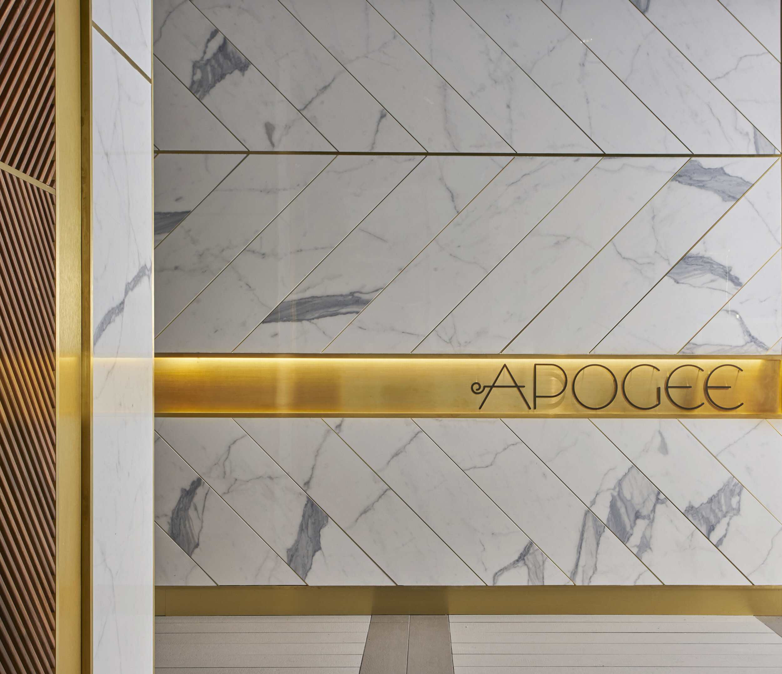
@apogeelounge design by blocHaus
BRASS
Pros: Adds warmth, feels classy and sophisticated. Comes in several finishes. Easily mixed with other materials. Looks like gold, but its less costly. Strong and resistant to corrosion. Very malleable - ideal for casting
Cons: Can patina with age.

Design by Crosby Studios
COPPER
Pros: Adds warmth, and element of playfulness. Strong and resistant to heat. Malleable.
Cons: Will patina with age and can be perceptible to corrosion. Challenging to mix with other materials.
Design by Shea McGee Designs
NICKEL
Pros: Comes in a polished and satin finish. Adds a transitional aesthetic. Warmer than polished chrome. Classic, doesn’t go out of style.
Cons: More expensive than chrome and stainless steel. Requires periodic maintenance.

@sparrowcoffee design by blocHaus
BLACK
Pros: Contemporary, matches everything. Adds contrast to millwork and doors.
Cons: Can be cold, dark. Depending on the material, the finish can be scratched off if not used correctly.
LAB | Custom Lighting
It all begins with an idea.

At blochaus LAB, we are dedicated to the research, collaboration, and
innovation within our industry. We wanted to give you an insider look at what goes behind some of the pieces we design! Take a look at the process of designing this light fixture for Half Nelson.


Fall Colors 2020
It all begins with an idea.
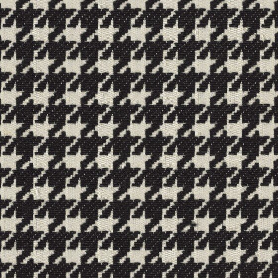
Every fall we see the colors of the trees come and go. Each year they appear to leave faster and faster. This year they lingered for a day or two longer than usual and it has us appreciating this season's art & design color trends.
The funny thing about these colors is they aren't really trends. They are classic colors and patterns we see season after season in different ways. Tweeds and houndstooth jackets in the spring, bubbly boucle give the brightness we want in the summer, colorful plaids in the winter, and of course velvet and corduroys for the fall. How are you using these colors and patterns this year?