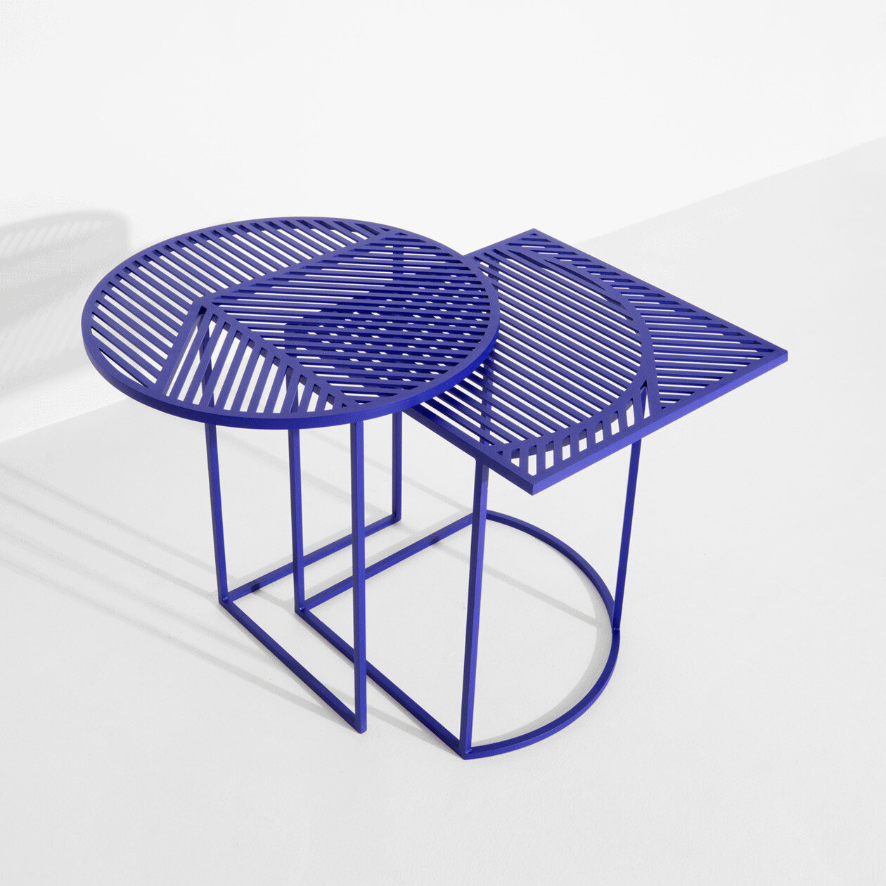
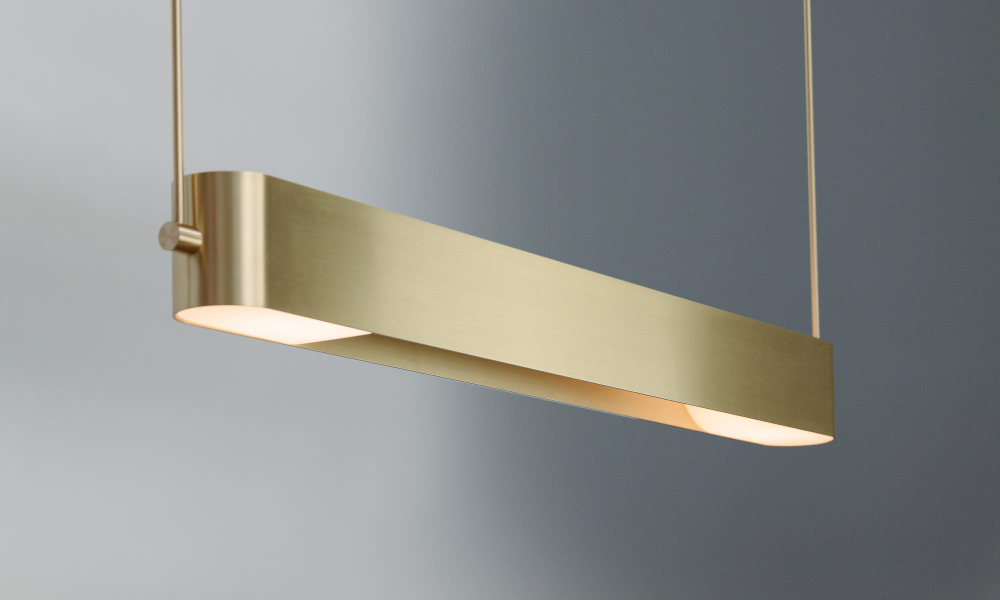
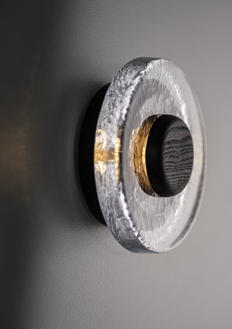
Lighting Installations

Light is Time | @DTG Architects
Humans, like other living organisms, are attracted to light. In plants, this phenomenon causes them to grow towards their light source, reaching and straining to reach the sun. Moths and other insects also seek light, flying as close at they can to lightbulbs.
Like these other living creatures, humans are attracted to light and seek it out, moving towards the source and following along until they find it. This is one of the reasons lighting is so useful in wayfinding, attracting attention and guiding people where they need to go. But light has the ability to do more than just guide people - it can inspire them as well!
Light art installations immediately draw the eye, pulling you in and making you want to see more. They take the universal attraction to light and combine it with an artistic eye, creating experiences of beauty, intrigue, and joy. Today we’re looking at some of the lighting installations that inspire us most - see below for a few of our favorites!

Atmosphere | @Pneuhaus


Space Frames at Coal Drops Yard | @Mieke Meijer

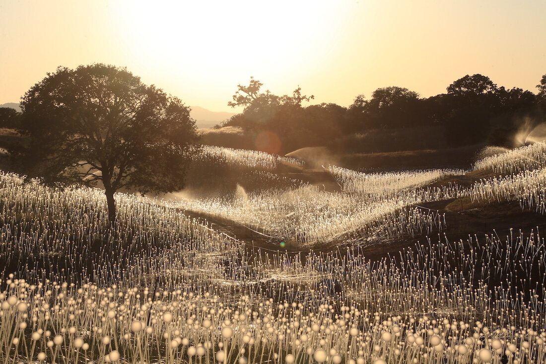
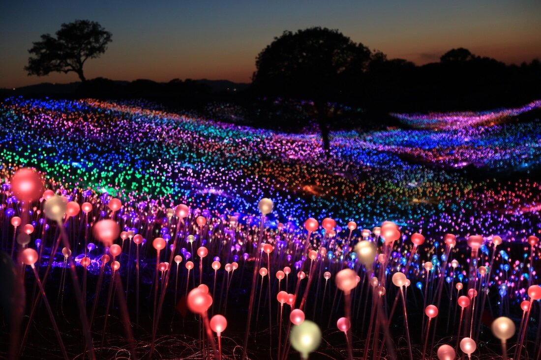
Field of Light | @Bruce Munro

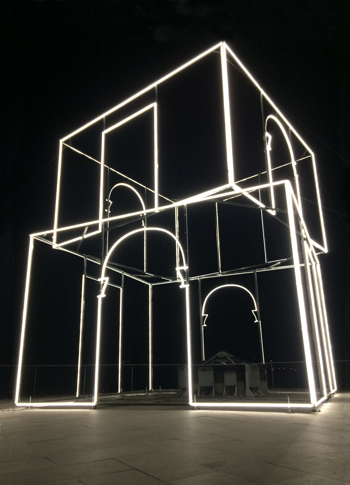
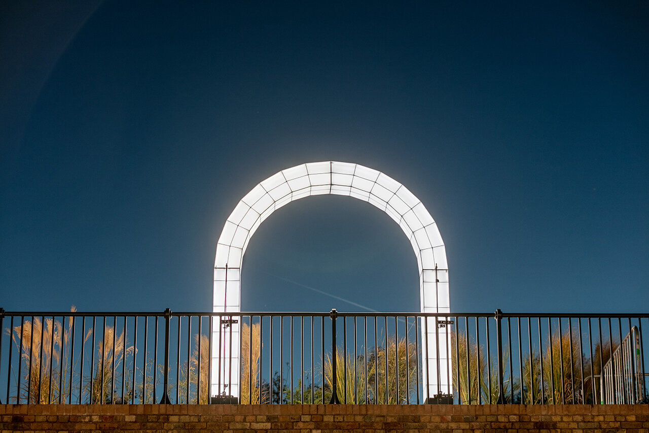
Fulgida | @Massimo Uberti


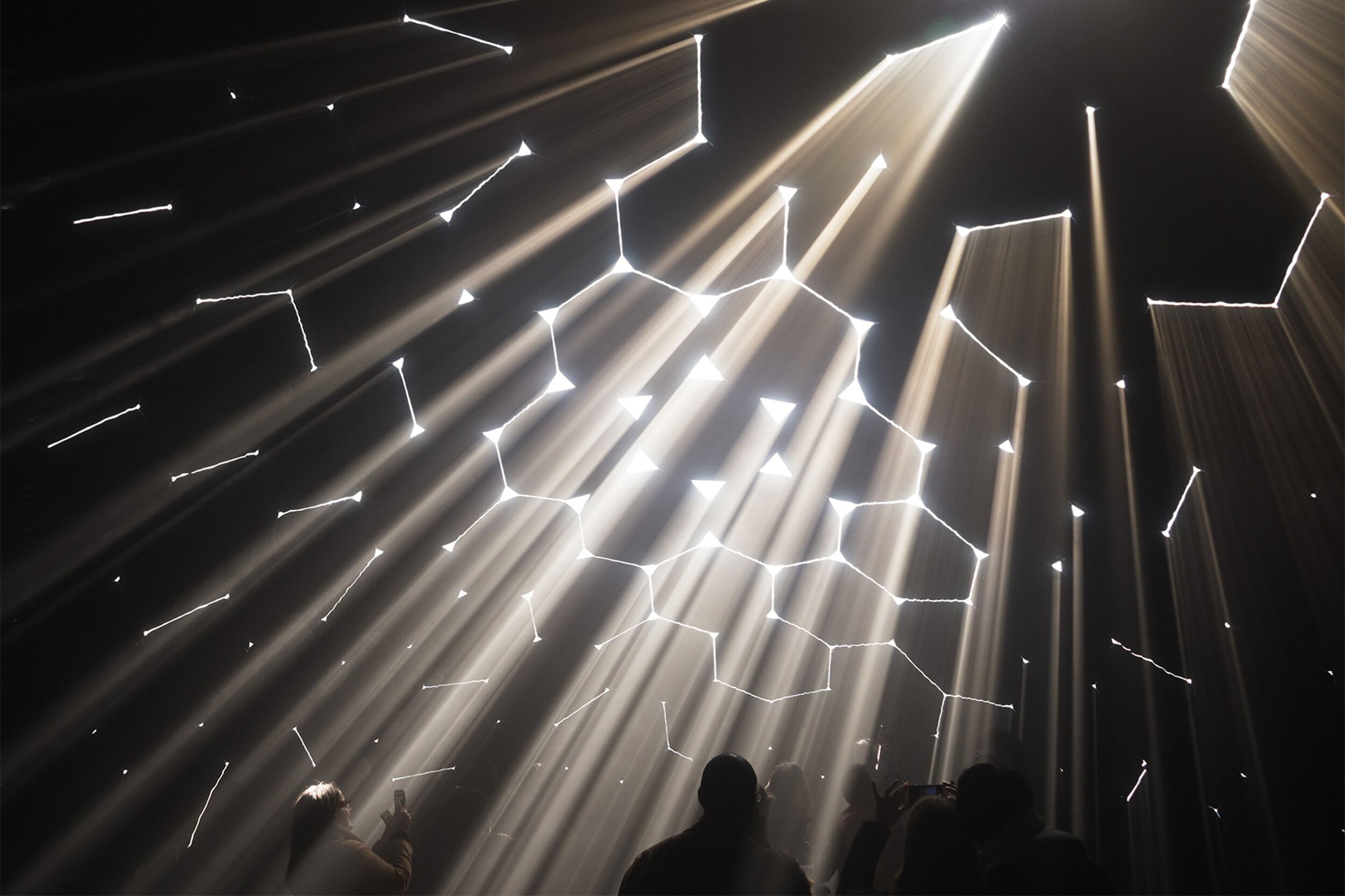
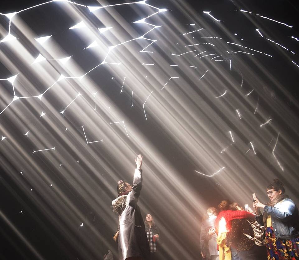
Instance & Star Ceiling | @Leo Villareal
What lighting installations inspire you?
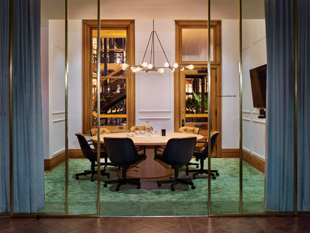
Amenity Spaces

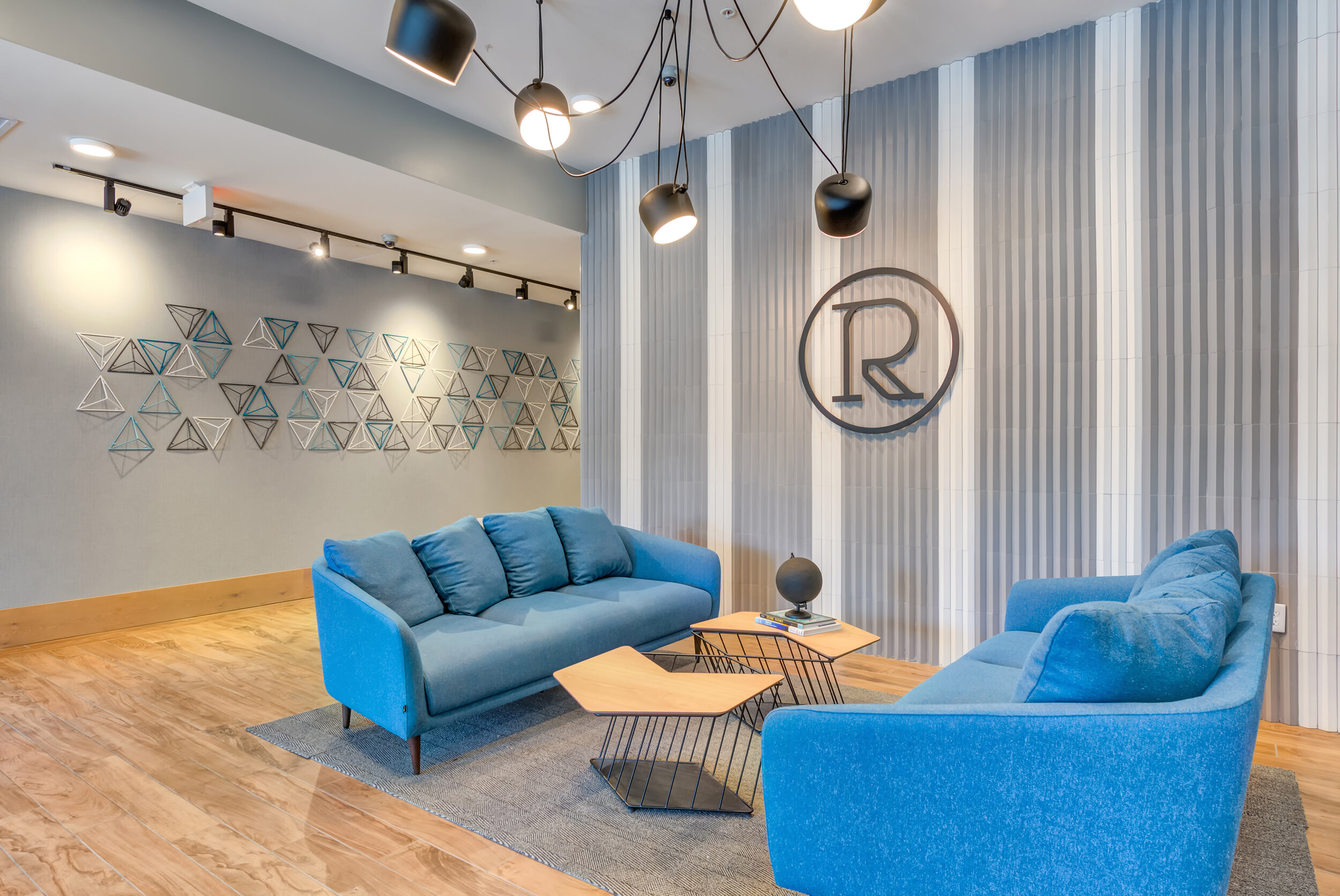
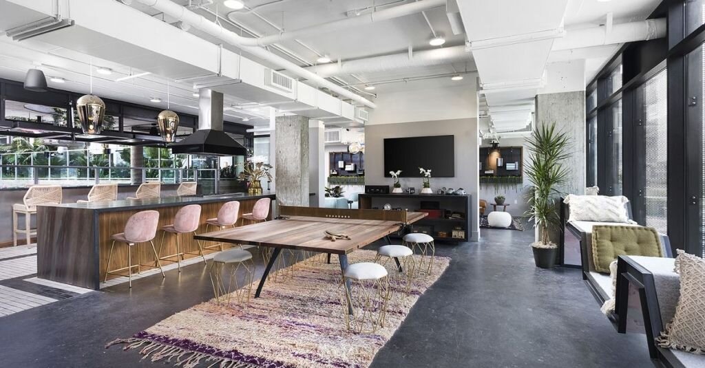
Link at Evanston | @blocHaus
Amenity spaces in a lot of multifamily housing properties might seem like an afterthought. Basic lobby and front desk, standard mailboxes along a corridor; maybe there’s a gym with a few treadmills and free weights, or a small outdoor pool with lounge chairs. While this might describe the amenities in many of the apartment buildings we’re familiar with, the fact is that we’re now seeing multifamily housing projects that put amenities at the forefront and turn these spaces into great features.
In order to attract and retain tenants, multifamily amenities not only need to serve basic needs, but they also need to enhance the living experiences for residents. There are a lot of great ways you can do this when designing amenity spaces, and we love being able to create unexpected and amazing amenities in our own multifamily projects as well! Today we’re breaking down some of the basic amenity types seen most in multifamily interior design, and taking a closer look at how they can be designed be amazing features for any building!
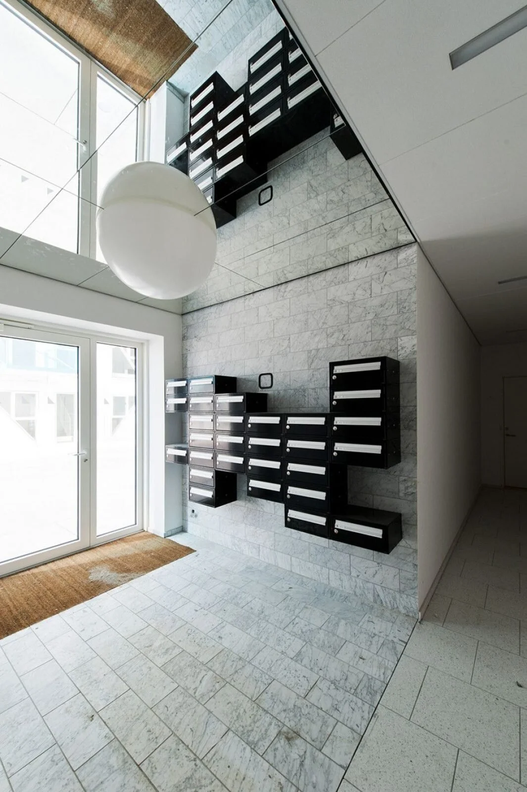
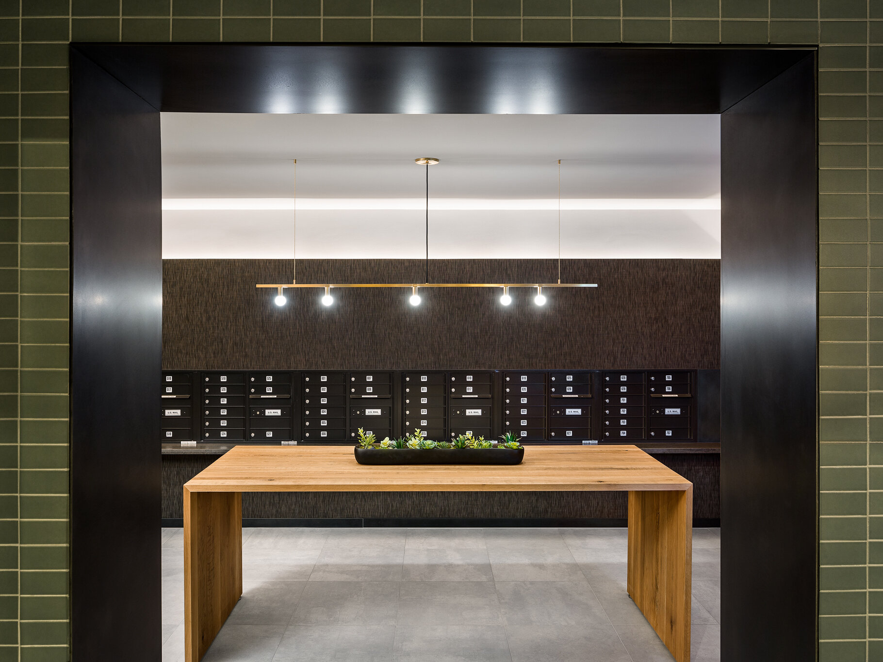
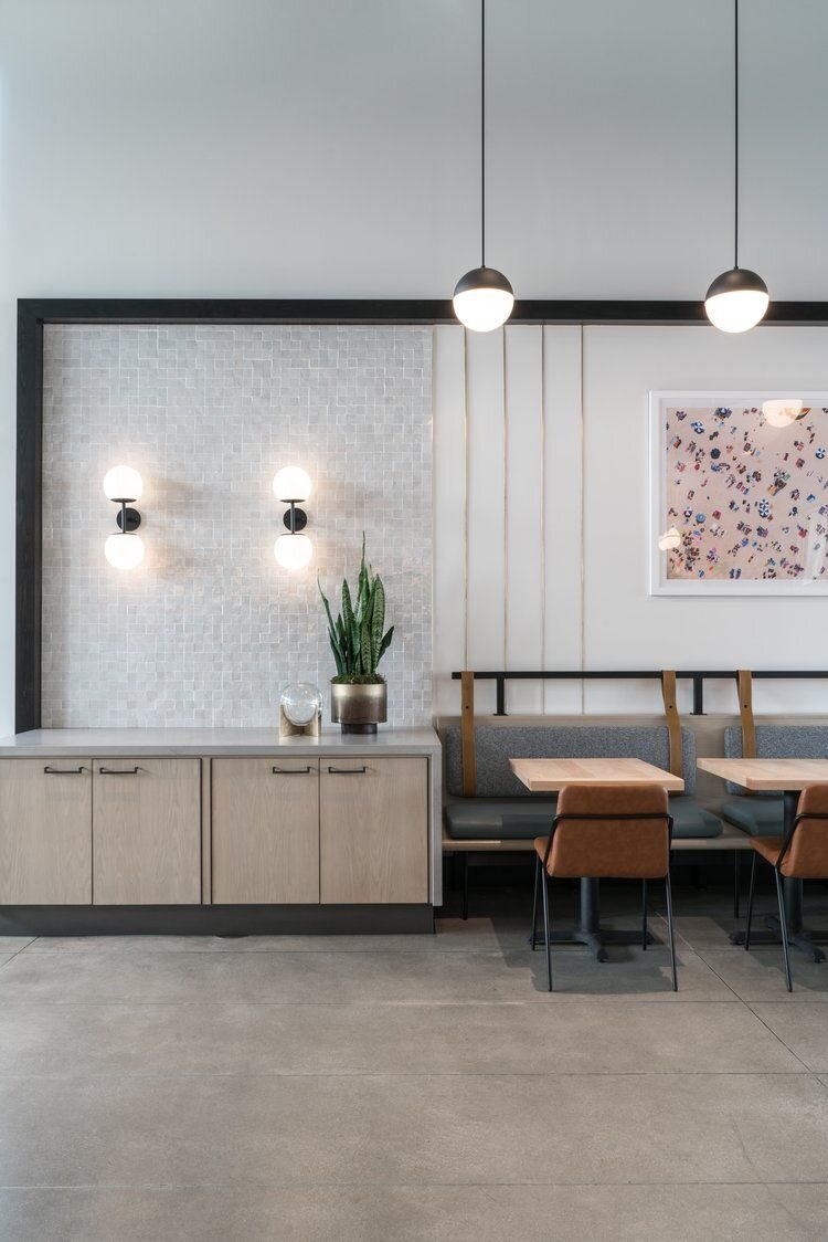
LOBBY + MAILROOM
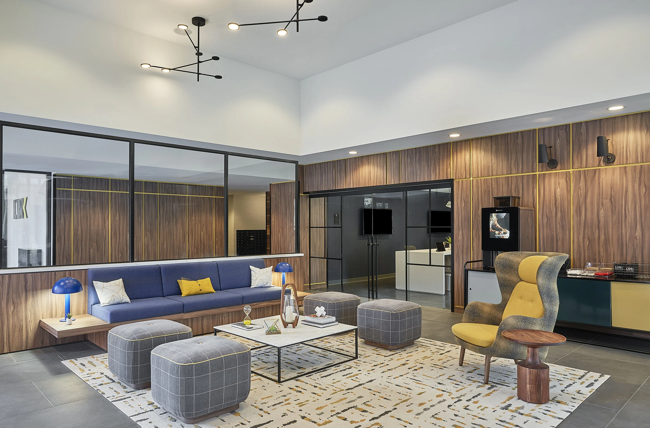
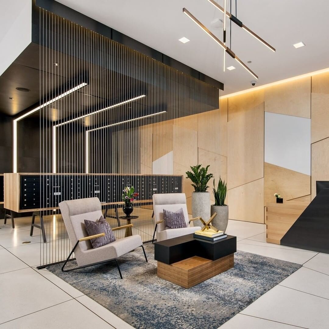
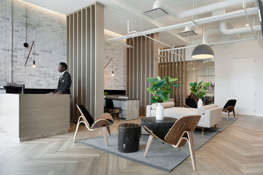
Lobbies and mailrooms may seem like simple, utilitarian spaces, but they are they are the introduction to the building and should provide a great first impression! Not all multifamily projects have a lot of space for expansive lobby area, but even using a small seating group with unique light fixtures and interesting materials can be enough to set the right tone.
Mailrooms are another necessity that are often overlooked from a design standpoint. If designating a separate room isn’t an option, mailboxes can be incorporated into lobbies in unique ways, such as integrating them into custom furniture or by patterning the individual boxes on the wall.
LOUNGE + CLUBHOUSE

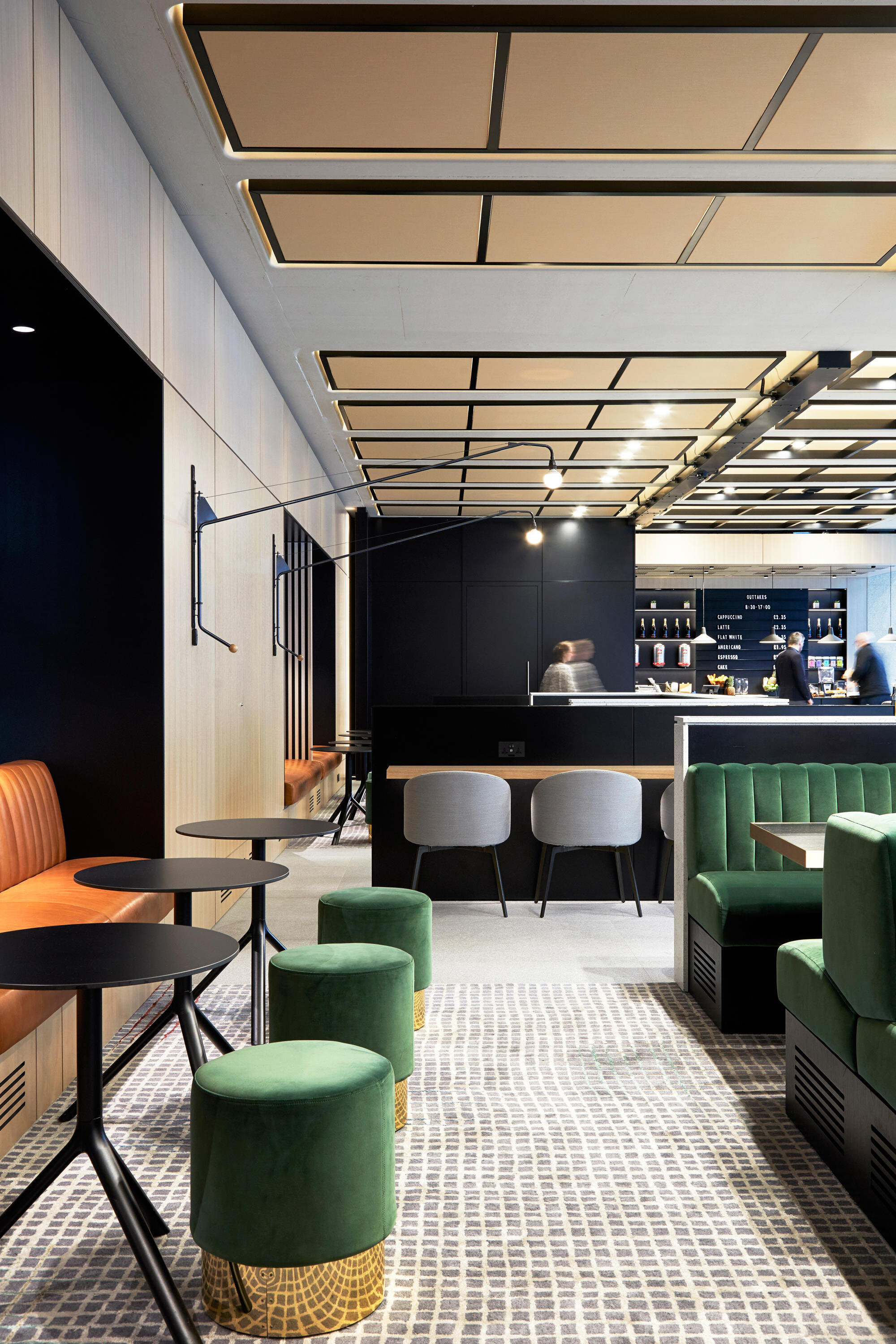
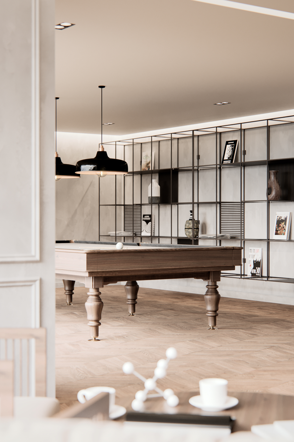


Great community lounges or clubhouses can be a great feature for attracting perspective residents. These can be simple spaces with lounge seating and a TV, or can they can incorporate other elements like games, community kitchens, or even a coffee bar. Regardless of how large it is or how many activities there are, an amenity lounge or clubhouse space should include multiple seating types and zones so different groups can comfortably use the space at the same time. Small additions like board games or unique light fixtures are great ways to round out the space and make it a destination for residents.
FITNESS

@VSHD Design
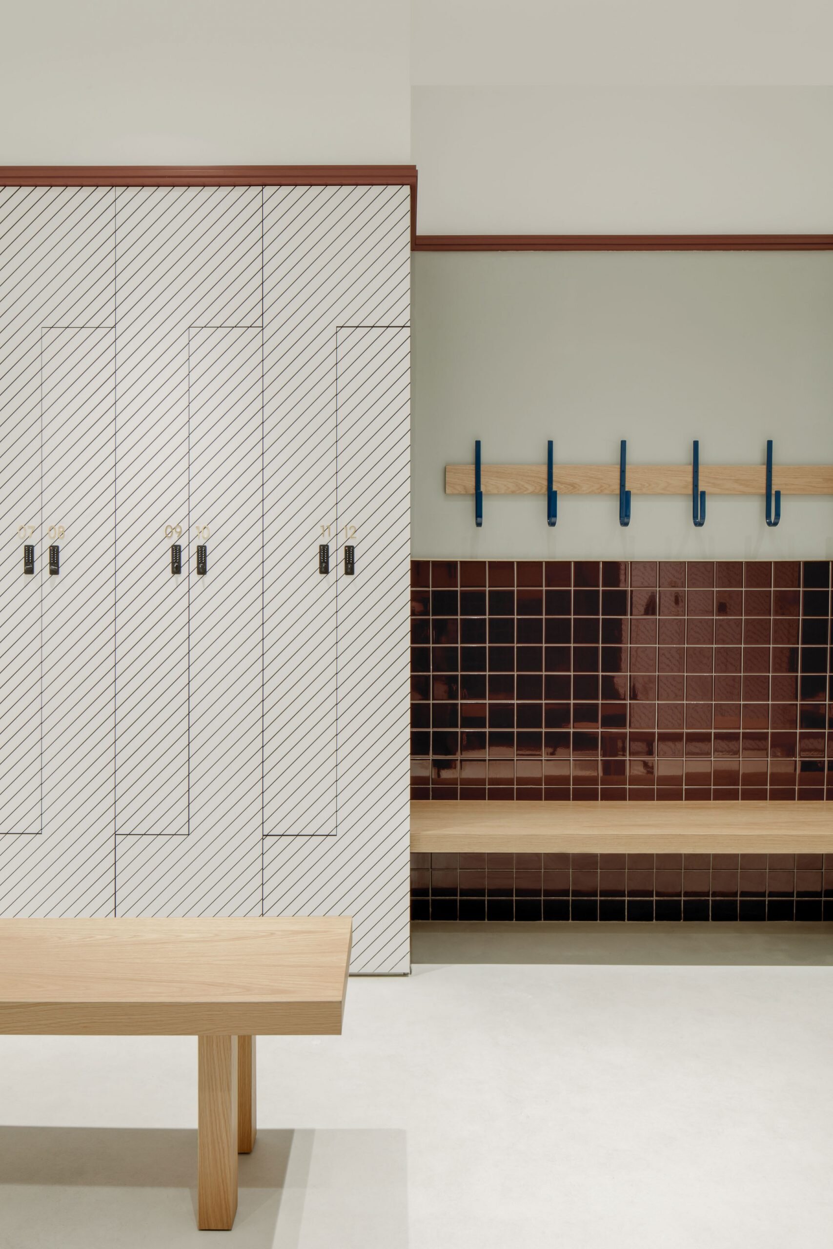
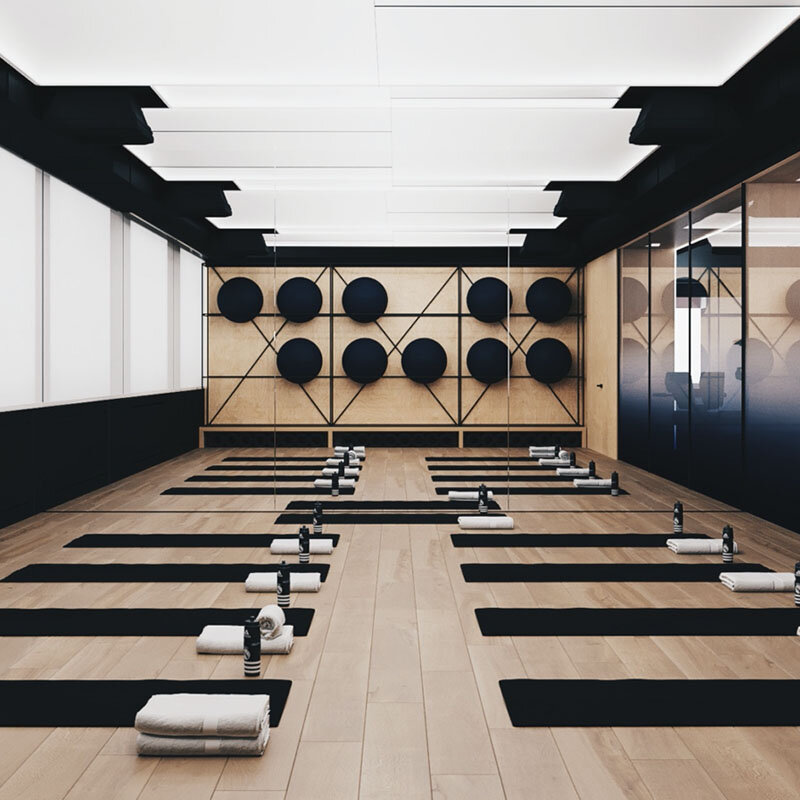
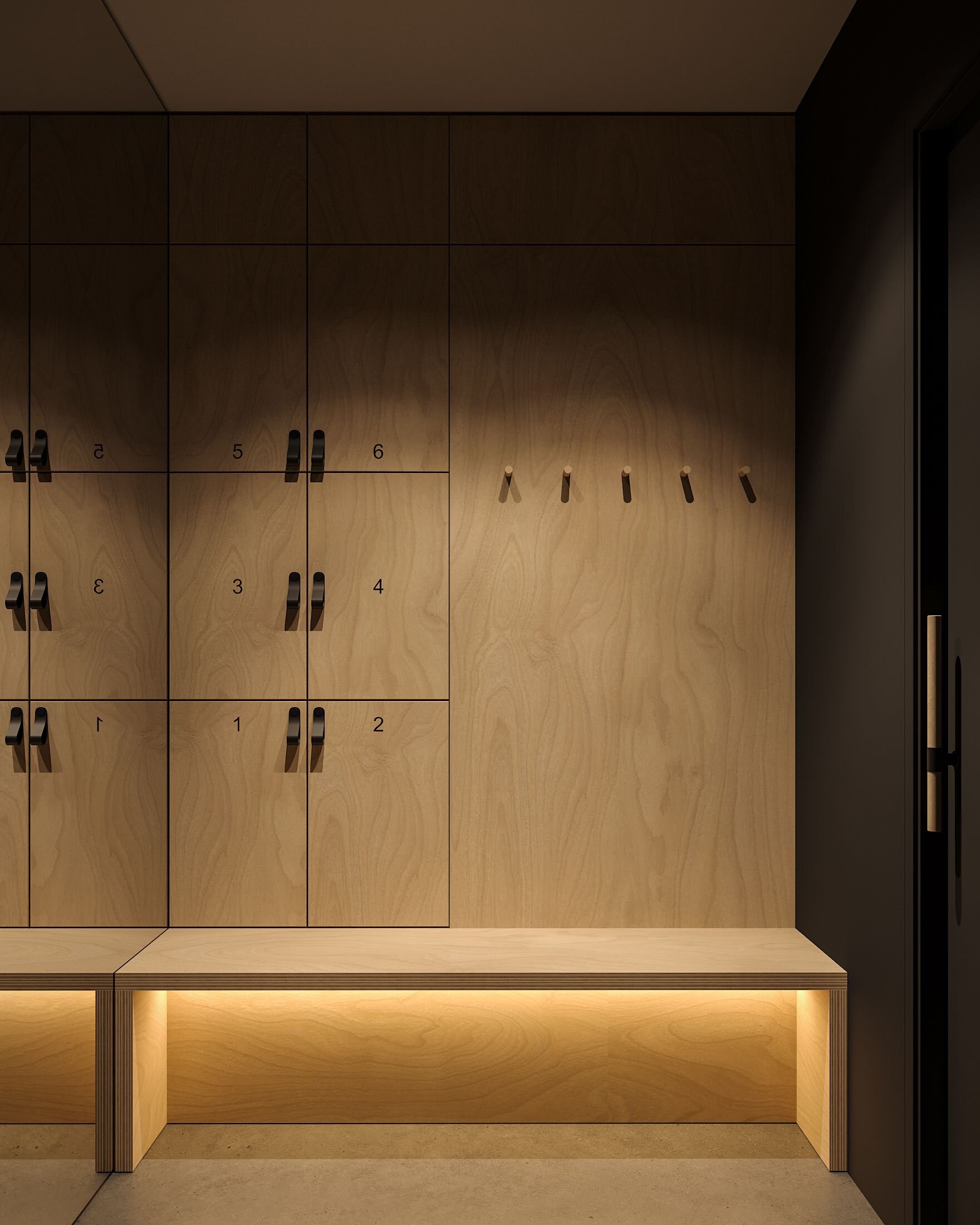
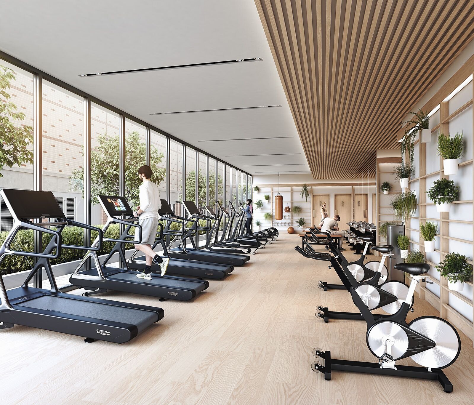
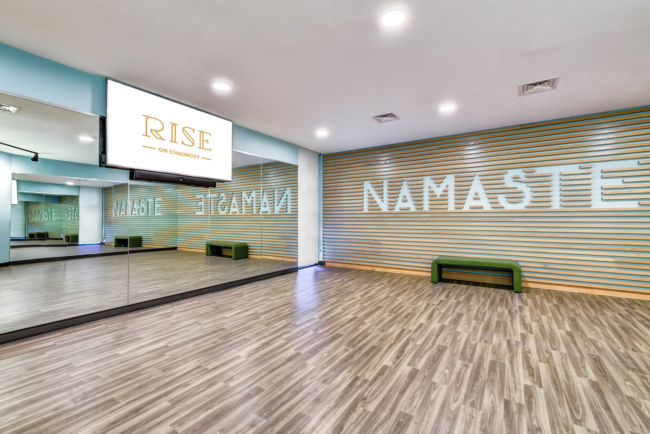
Gyms aren’t a necessity for multifamily housing, but they are another great feature that residents like having in the building. A well-designed fitness center should be more than just a room with mirrors and workout equipment, but a place that people get excited about going - even a small gym and locker room can be great amenities with good lighting, materials, and focal points!
CO-WORKING

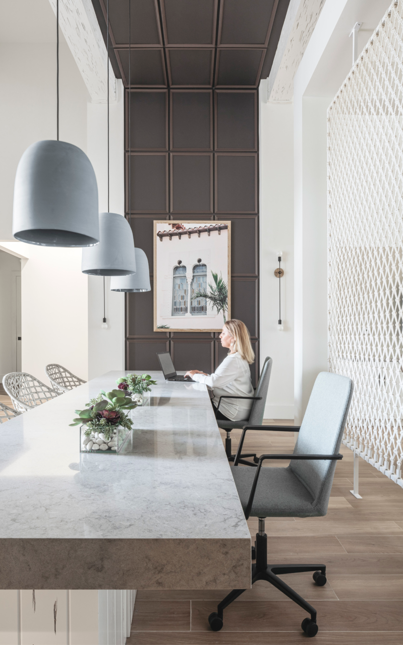

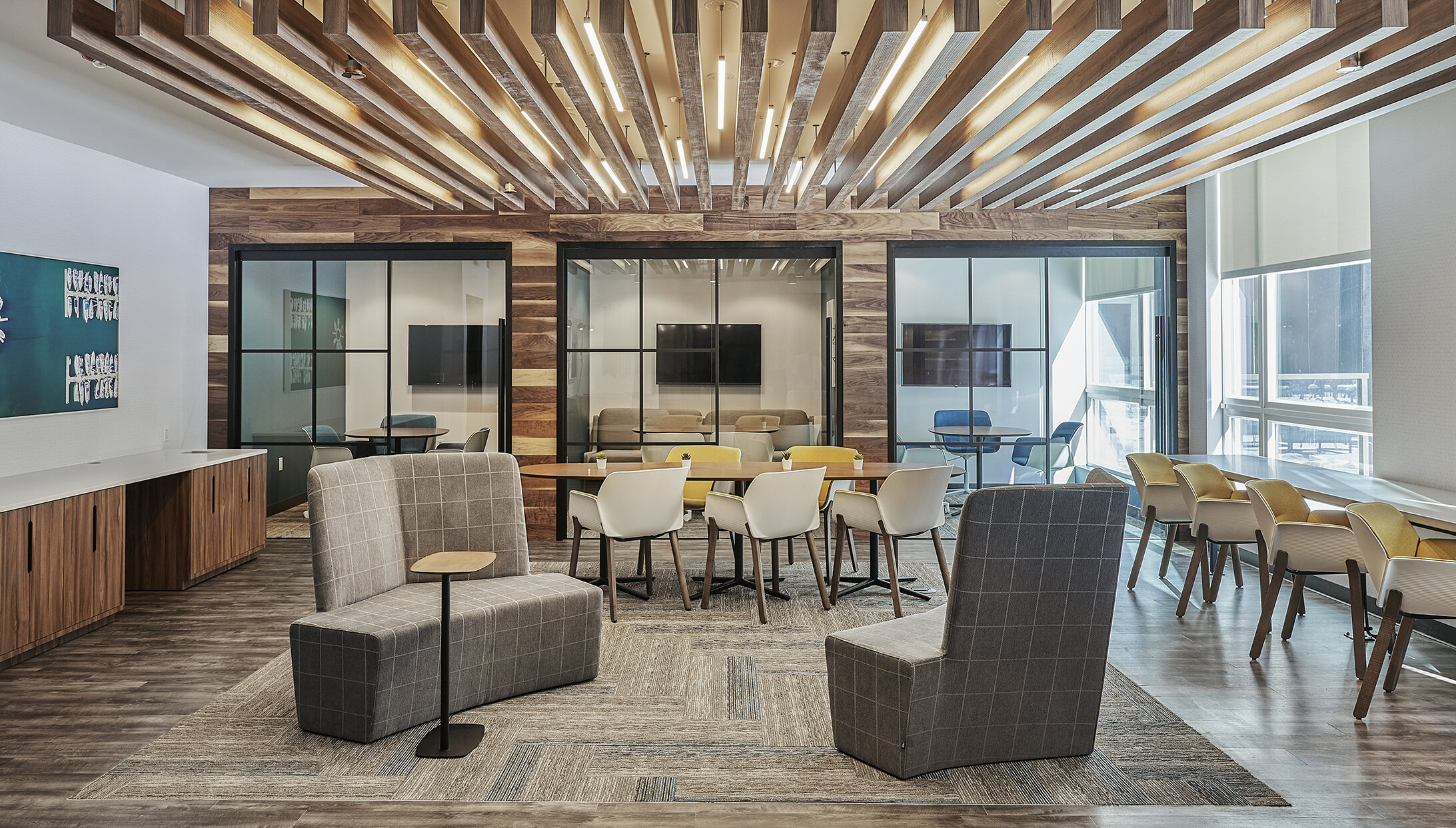
Working from home has obviously become a lot more common over the last year. And as things start getting back to normal and community areas reopen, co-working spaces will be great features for residents who have more flexibility to work outside the office.
These amenities work best when they offer a variety of work settings. Desks, lounge seating, communal tables, private “phone booths” for heads down work, small meeting rooms for groups - multiple options makes it easier for residents to find the best fit and enjoy co-working amenity spaces!
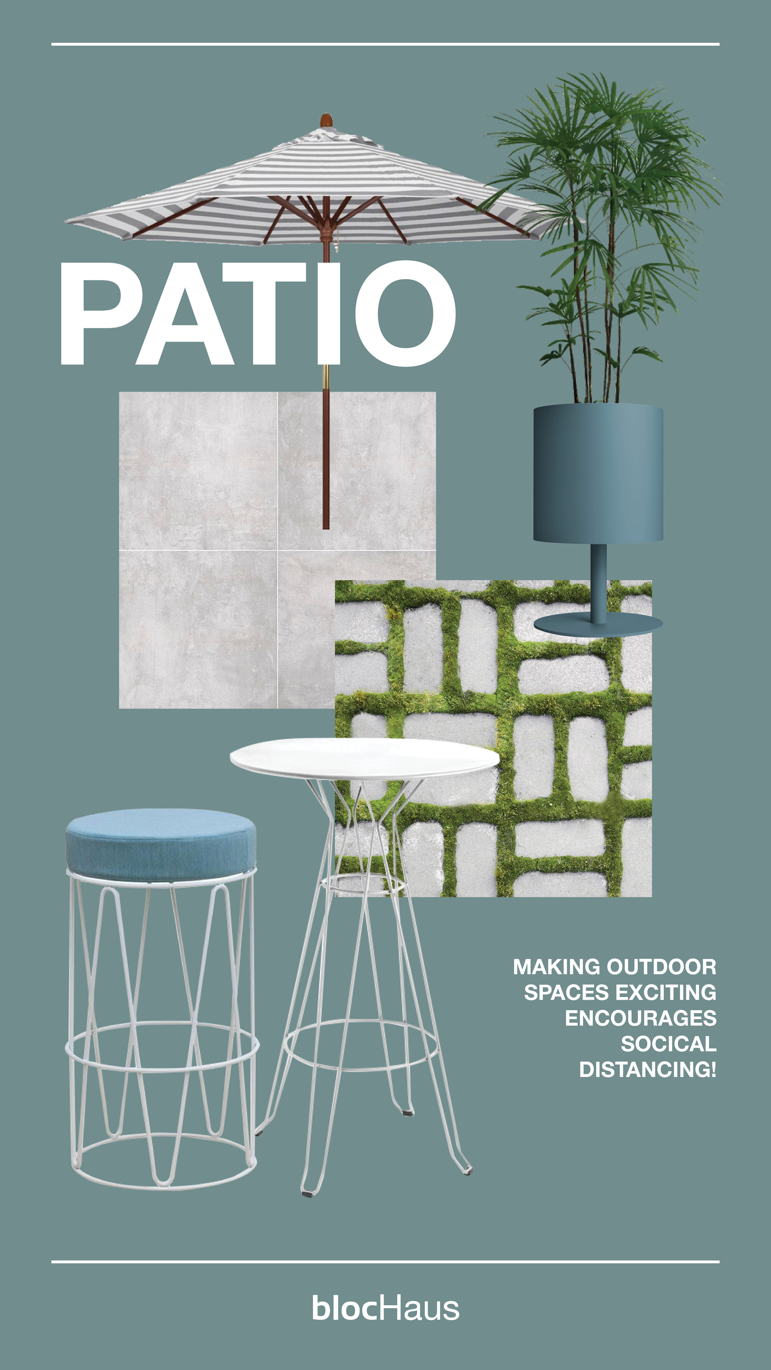
OUTDOOR
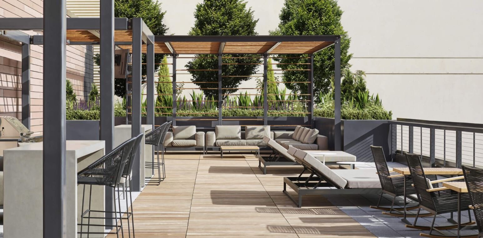
@Instrata Lifestyle
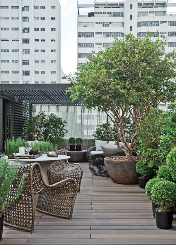

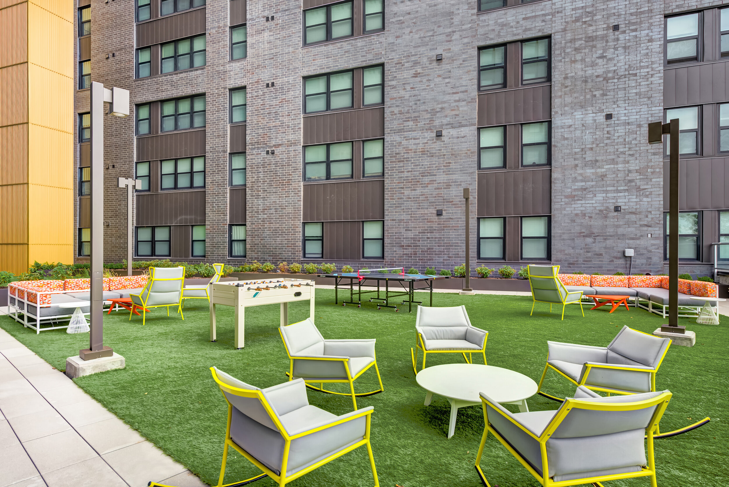
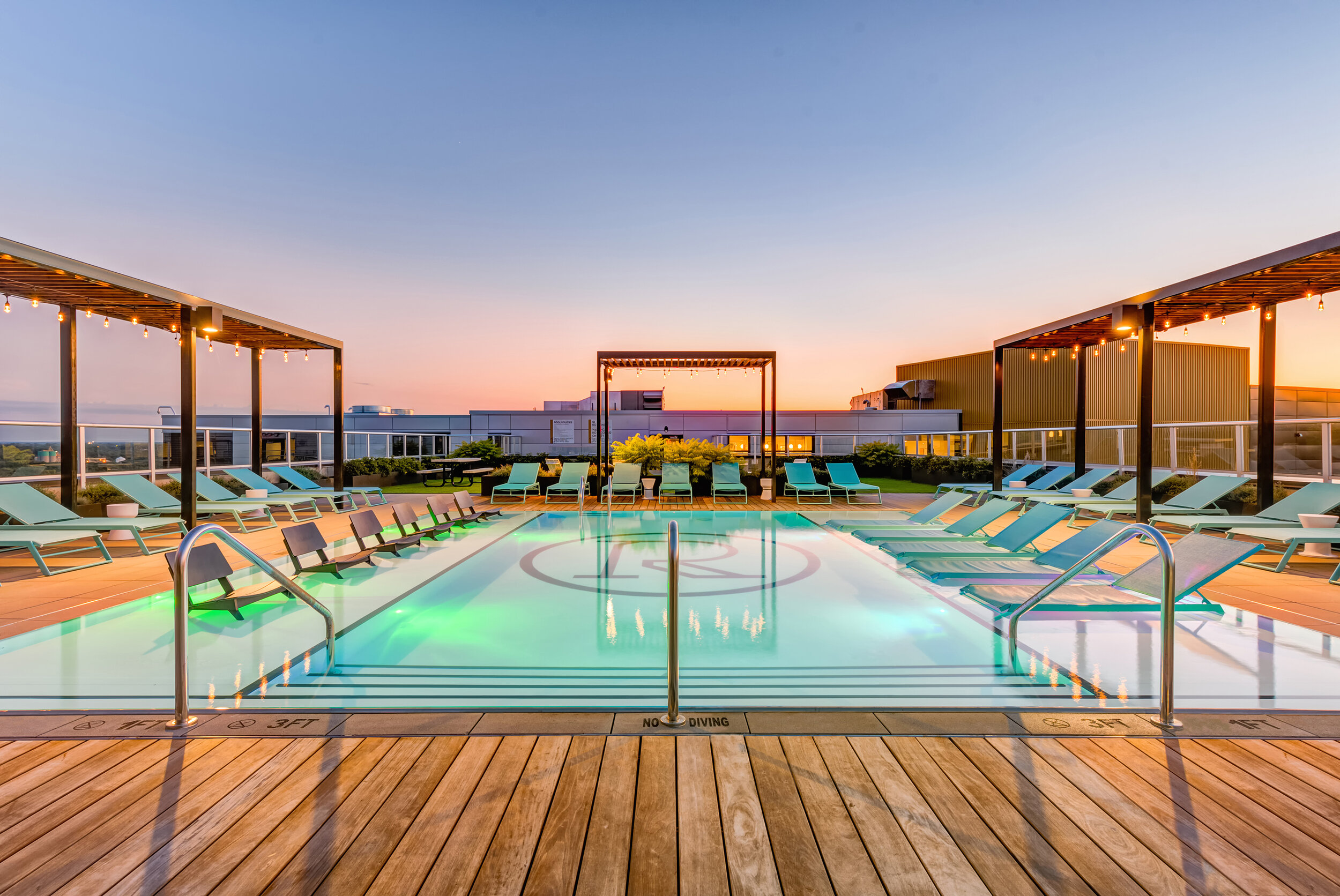
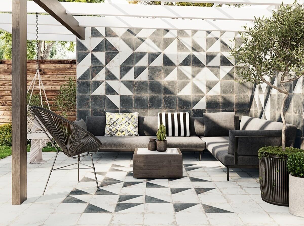
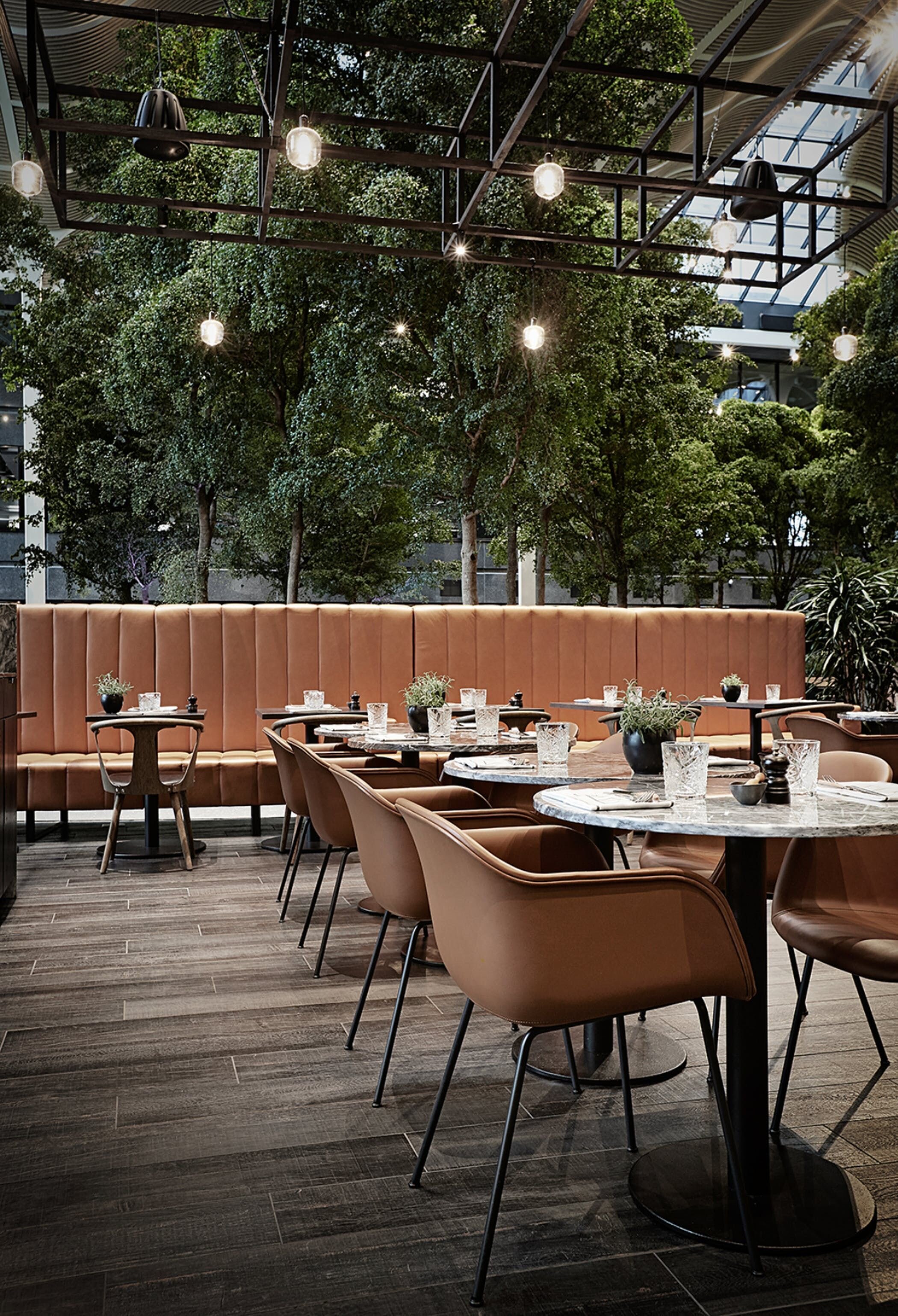
Access to an outdoor area can be a major feature for apartment-dwellers who don’t want to leave the premises in order to enjoy time outside. Outdoor amenity spaces can offer a wide variety of features - pools, lounge seating, cabanas, and outdoor kitchens, are all great additions! We love incorporating bold materials and outdoor games when designing outdoor amenity areas so that they become a destination for residents!
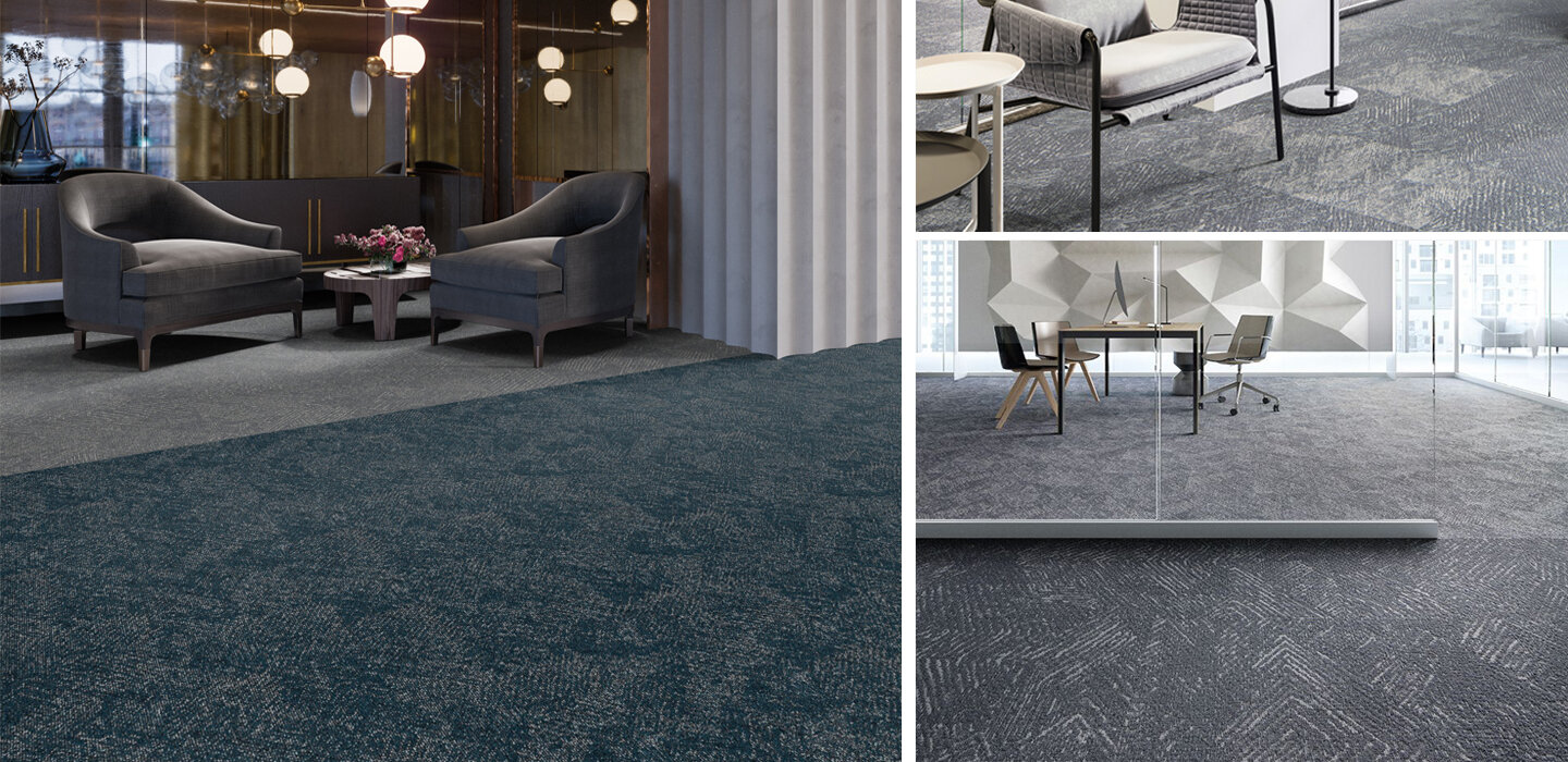
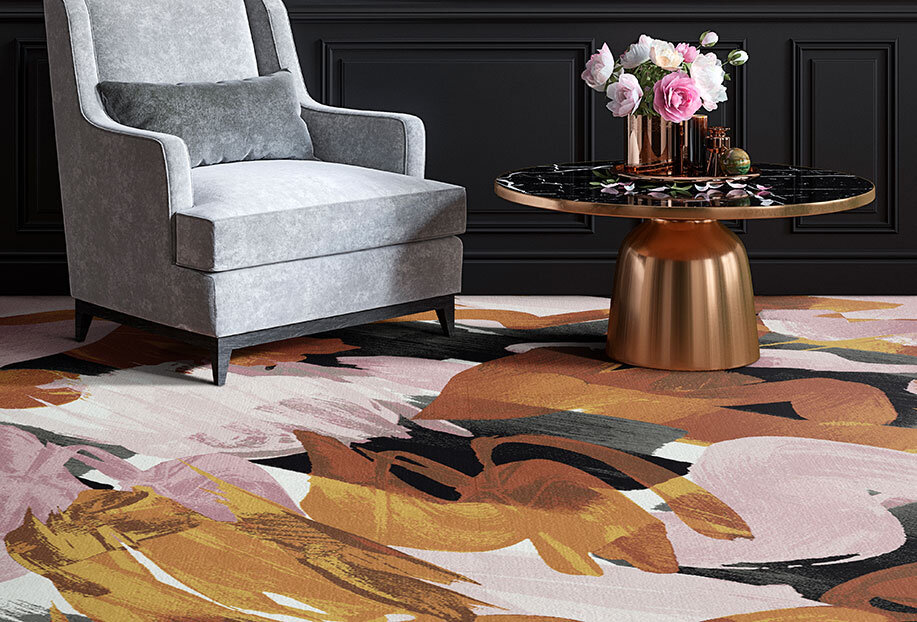
Sustainability | Carpet

As a major contributor to commercial production and waste cycles, the design and construction industry is focusing ever more on sustainability in new projects. It’s an incredibly important factor, and as designers, we love companies that make it easier for us to specify environmentally-conscious products and take part in sustainability programs.
Carpet is a big industry, and it’s installed into millions of new spaces each year. With that in mind, carpet companies can make a major environmental impact based on what materials they use, how they produce their products, and what sustainability efforts they choose to make. We love companies that take eco-consciousness seriously, so today we’re looking at sustainability in the carpet industry - take a look below to see some amazing companies and their products!

We love companies and products that are committed to reducing or eliminating post-consumer waste, and Shaw is doing just that! The company introduced the first Cradle to Cradle (C2C) flooring product more than 20 years ago, and continues to offer C2C products today. Moreover, their Re[TURN] Reclamation Program has allowed Shaw to reclaim and recycle almost 1 billion pounds of carpet since 2006, much of which has been reused in the production of new flooring products!

Mannington not only creates beautiful carpets, but the company produces them using less energy and resources! They are committed to reducing their environmental footprint, and were one of the original 50 Save Energy Now Leaders (now know as the Better Plants initiative). Mannington has 3.3 acres of solar arrays and has reduced energy intensity by 17% since 2007 - all while doubling their manufacturing sites!


Some of our favorite flooring is from EF Contract, and we love their commitment to reclamation! Their R4 Program was started in 2007, and focuses on the ideas of Return, Reuse, Recycle, & Reduce. Each year more than 60,000 pounds of waste are diverted from landfills through this program!
What sustainable carpets are you loving right now?
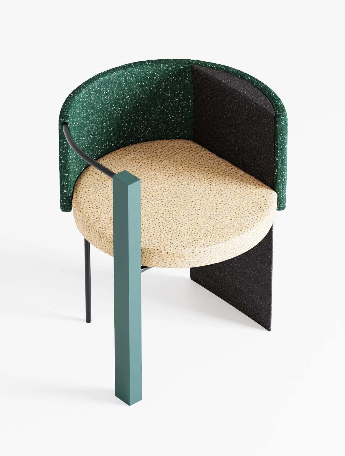
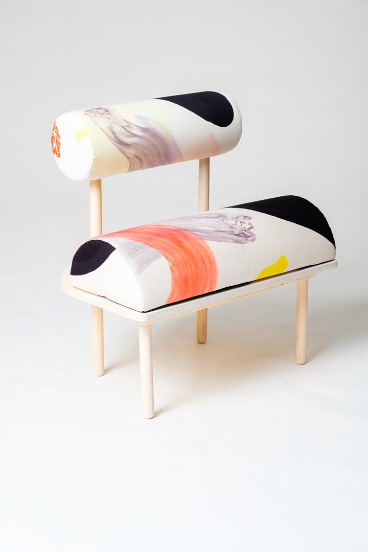
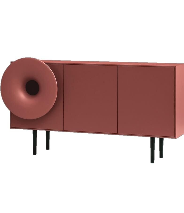
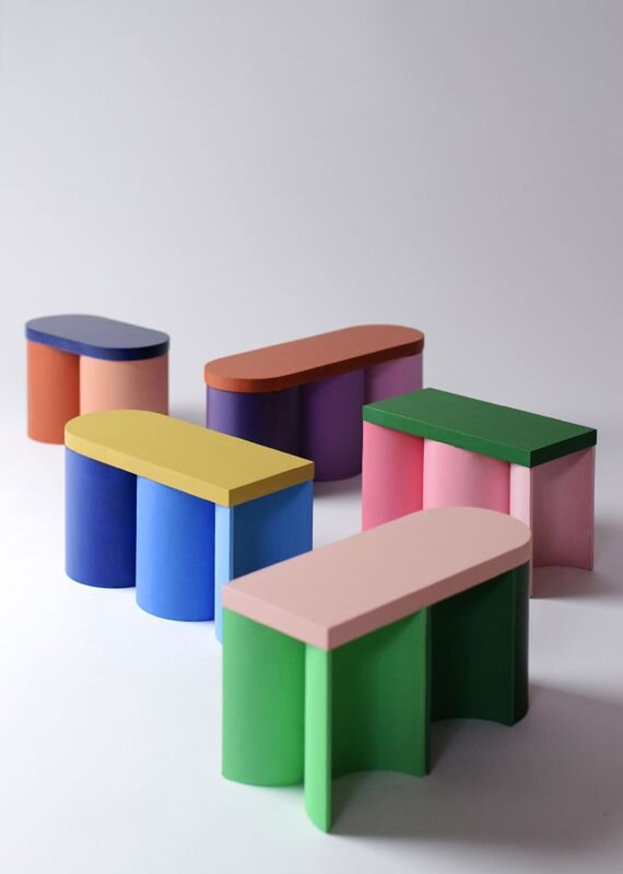
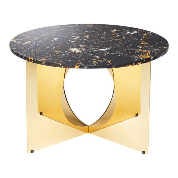
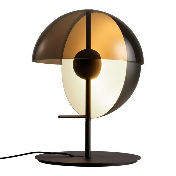
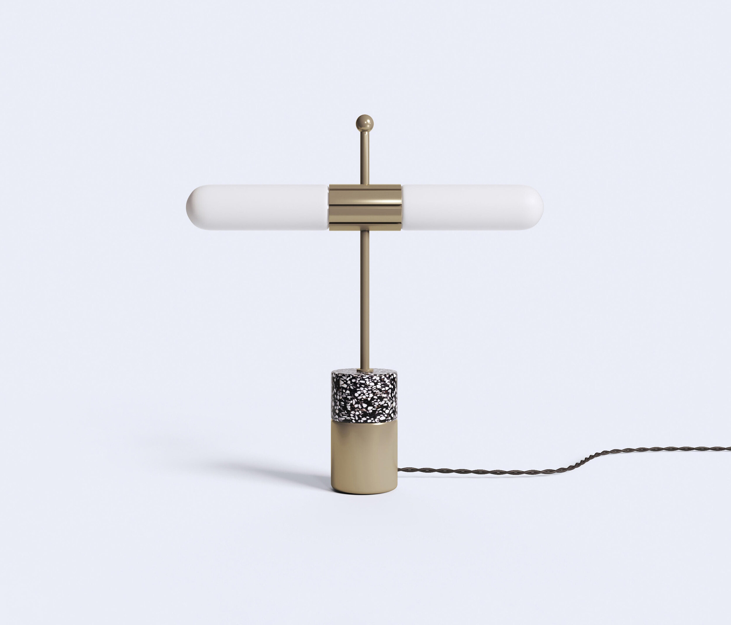
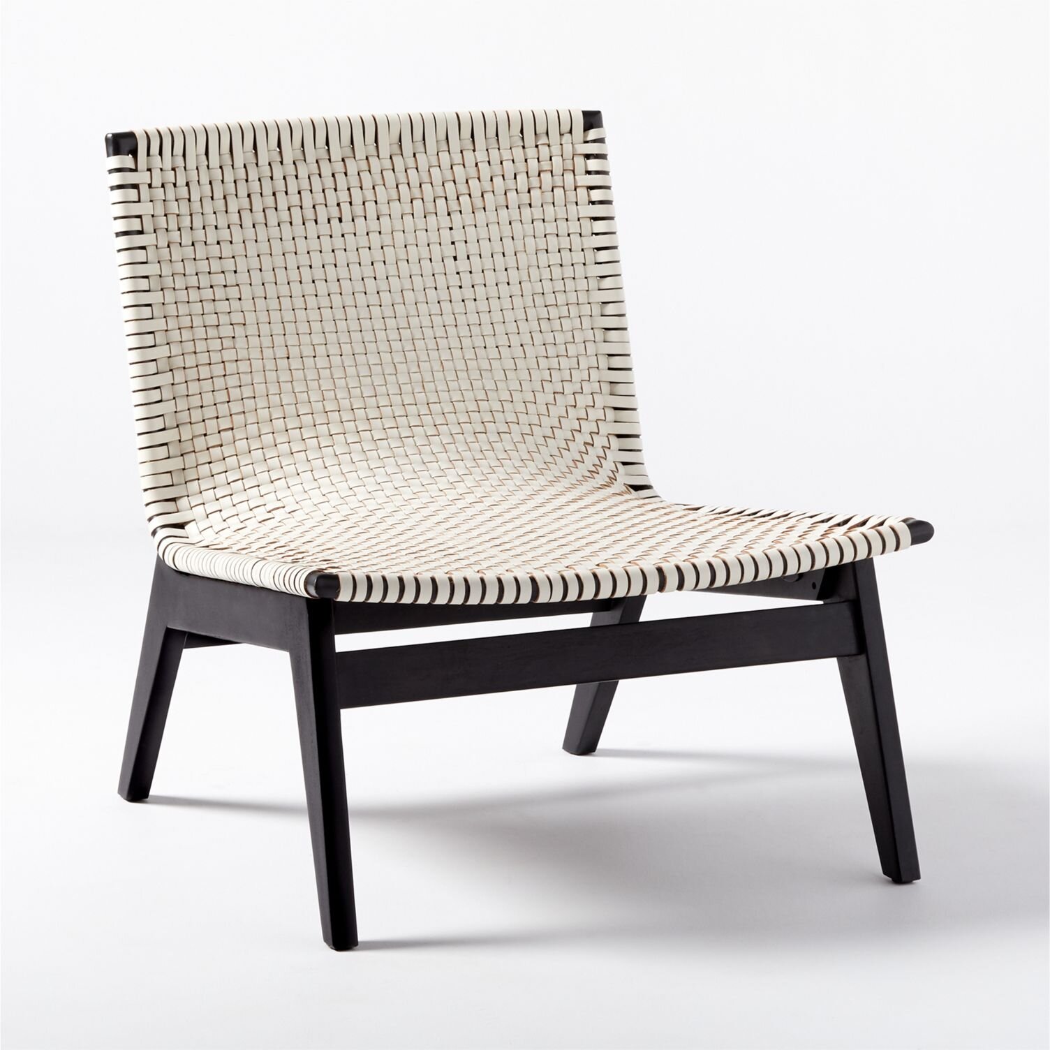
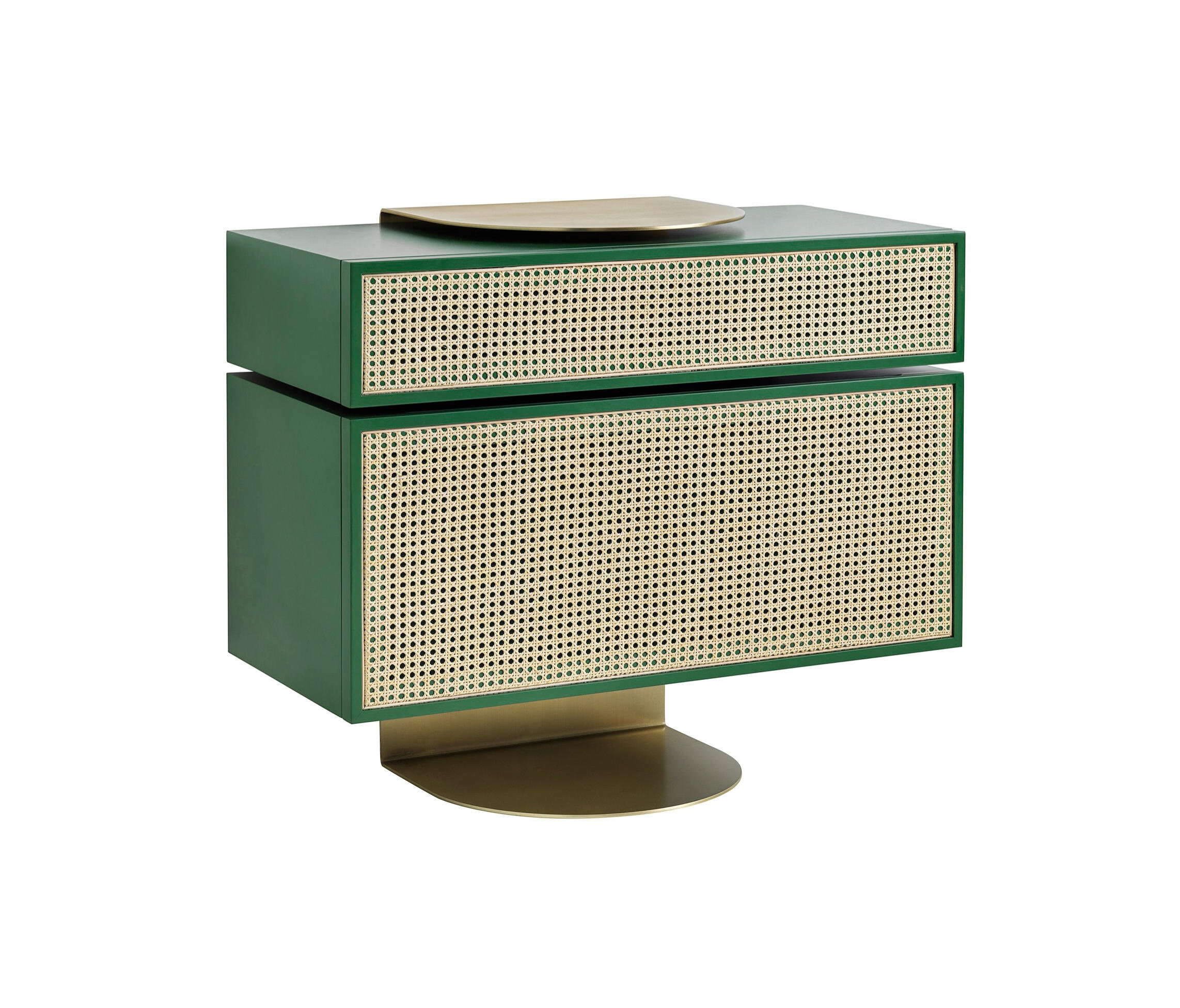
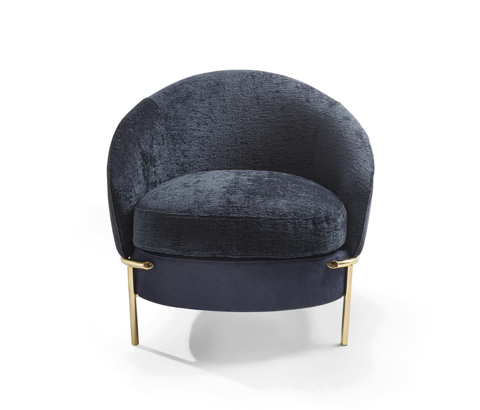
Trend Watch | Modern 80’s Furniture

@Laura Gonzalez
The 1980s are remember for many iconic cultural introductions. Legwarmers, scrunchies, high-waisted jeans - the list of 80s trends is long, and usually inspires a love or hate reaction. And as we keep an eye of emerging 2021 design trends, we can’t help but notice 80s-inspired interior design showing up more and more. Bright colors, geometric patterns, bold color-blocking - we’re seeing all this and more in new commercial design projects, and we’re loving the modern 80’s trend!
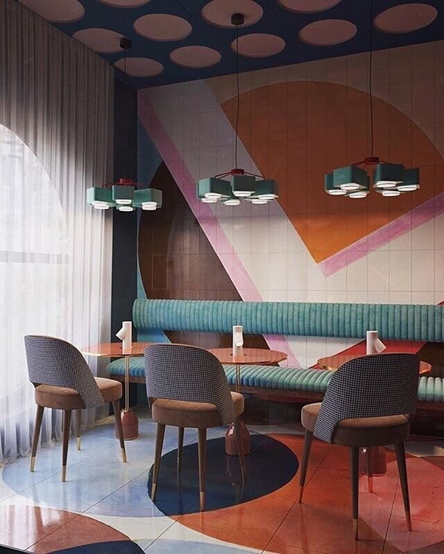
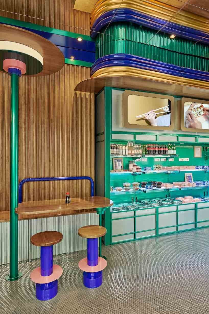
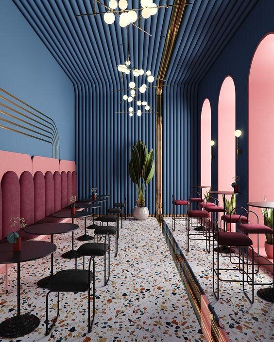
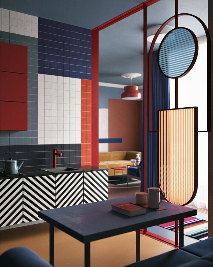
One place we’re seeing the modern influence of the 80’s is in furniture. There are a lot of amazing products reflecting this trend, and we love using these pieces to bring a bit of nostalgia and sophistication to any space. Take a look below to see some of our favorites!
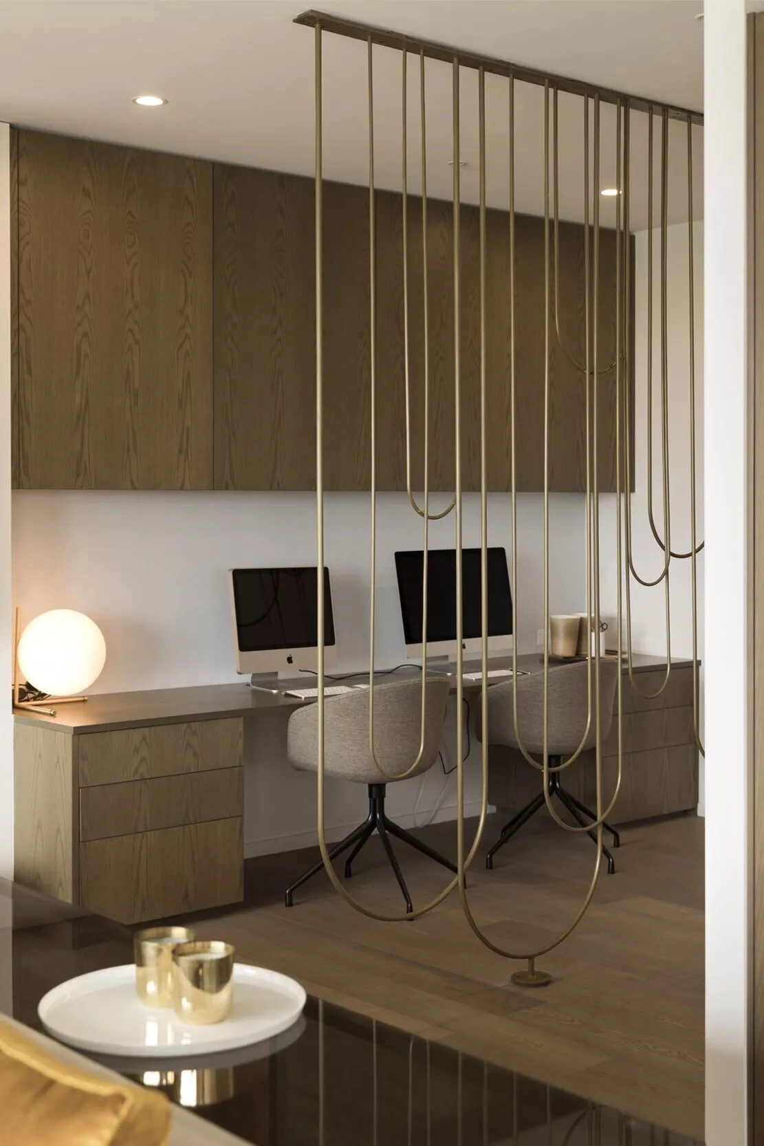
Luxury Minimalism in Hotels

Minimalism can be found in every type of design. Whether it’s residential, corporate, retail, hospitality, or even healthcare, minimalist design concepts can produce beautiful, timeless, and elegant results.
One word that doesn’t usually come to mind when thinking about minimal design is luxury; in fact, it’s easy to think that these concepts would be at odds with one another. But that doesn’t have to be the case! Fusing luxurious elements with minimalist design creates unique juxtapositions - simple and opulent, stark and soft, brutalist and glamorous.
Luxury minimalism has a classic and timeless appeal, and can be a wonderful look for hospitality spaces - hotels in particular. We’re constantly inspired by this aesthetic and love how much variety it offers! Take a look below at some of our favorite luxury minimalist design ideas for hotels!
LOBBY, LOUNGE, & RECEPTION
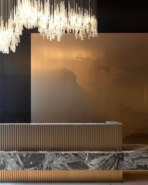
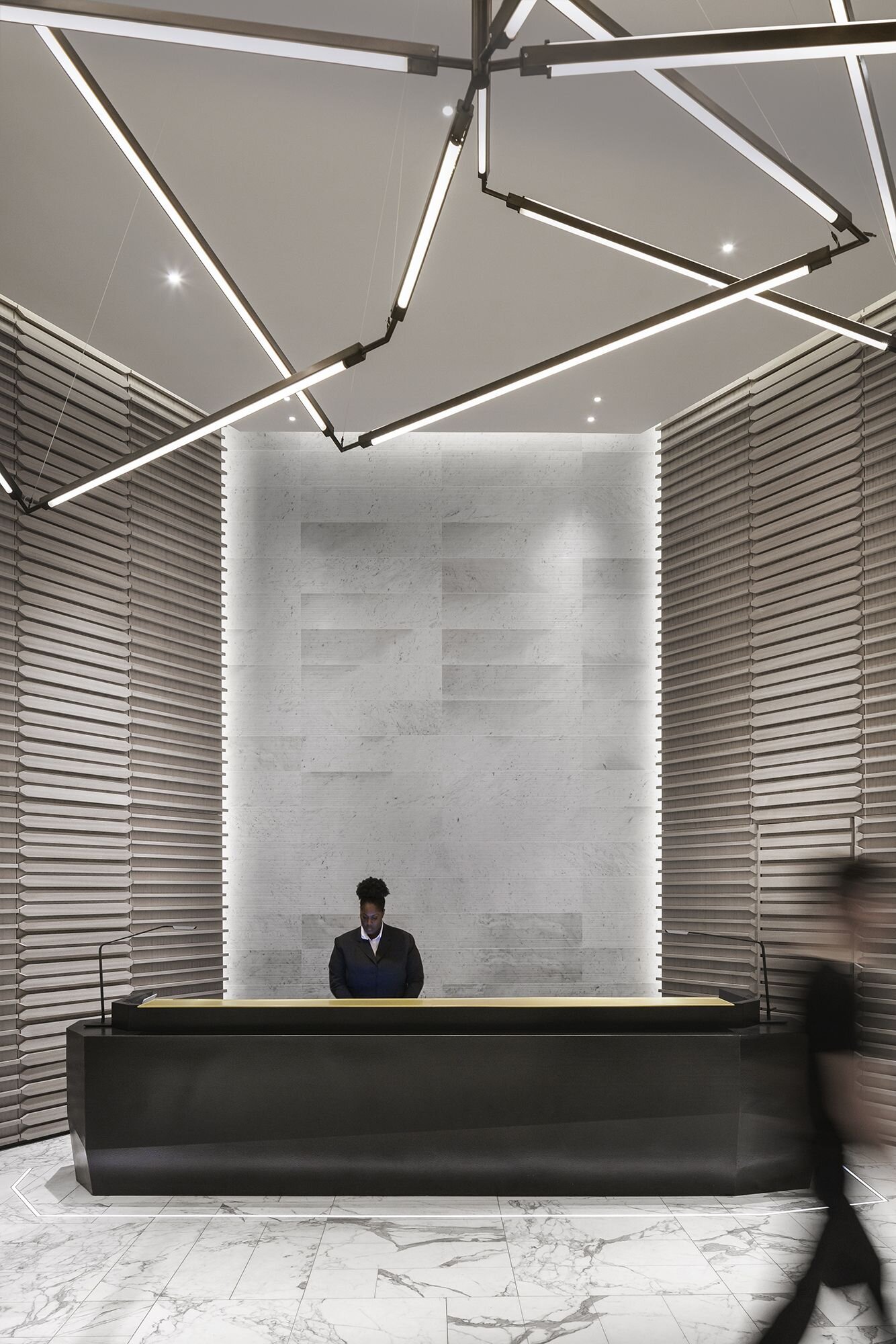
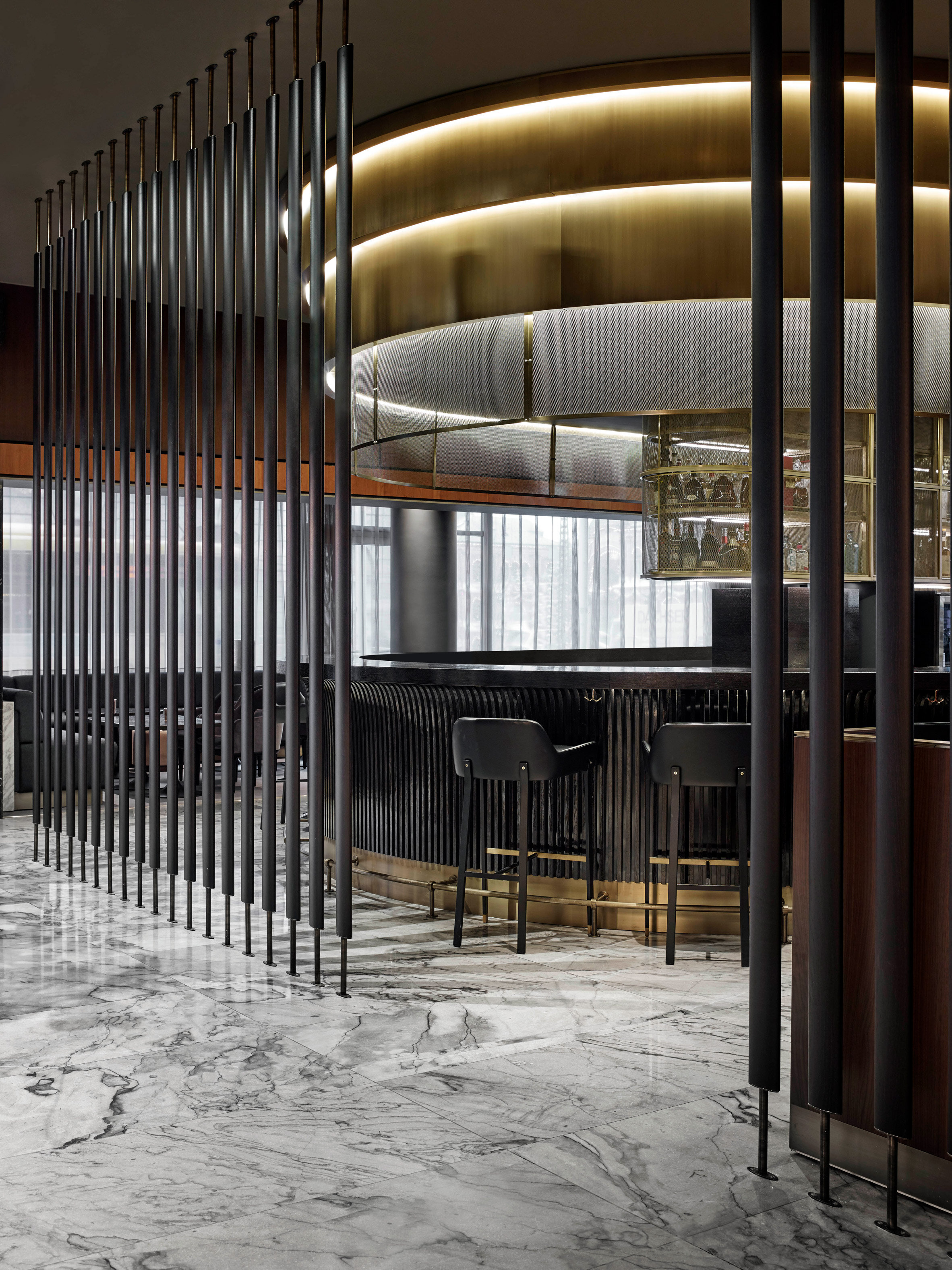

@Mechanismo
GUEST ROOMS
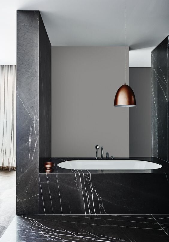
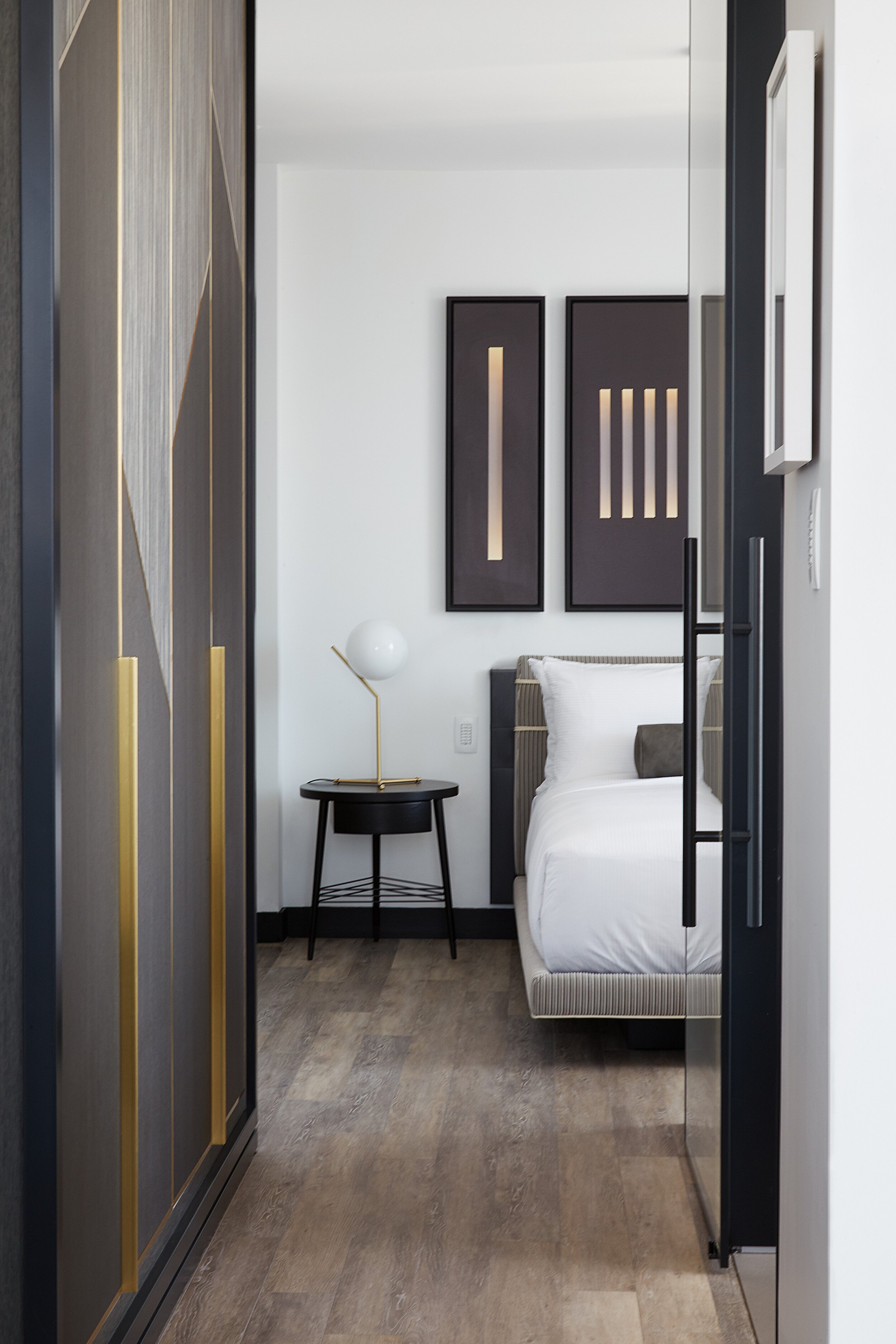
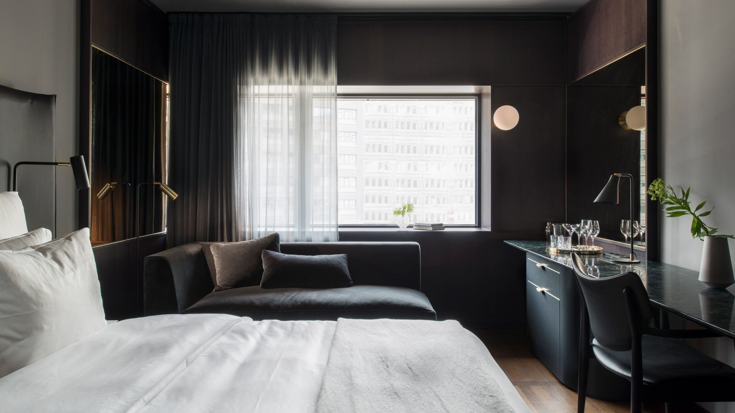
@Universal Design Studio
ELEVATORS & CORRIDORS
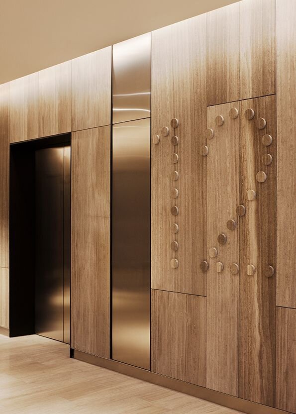
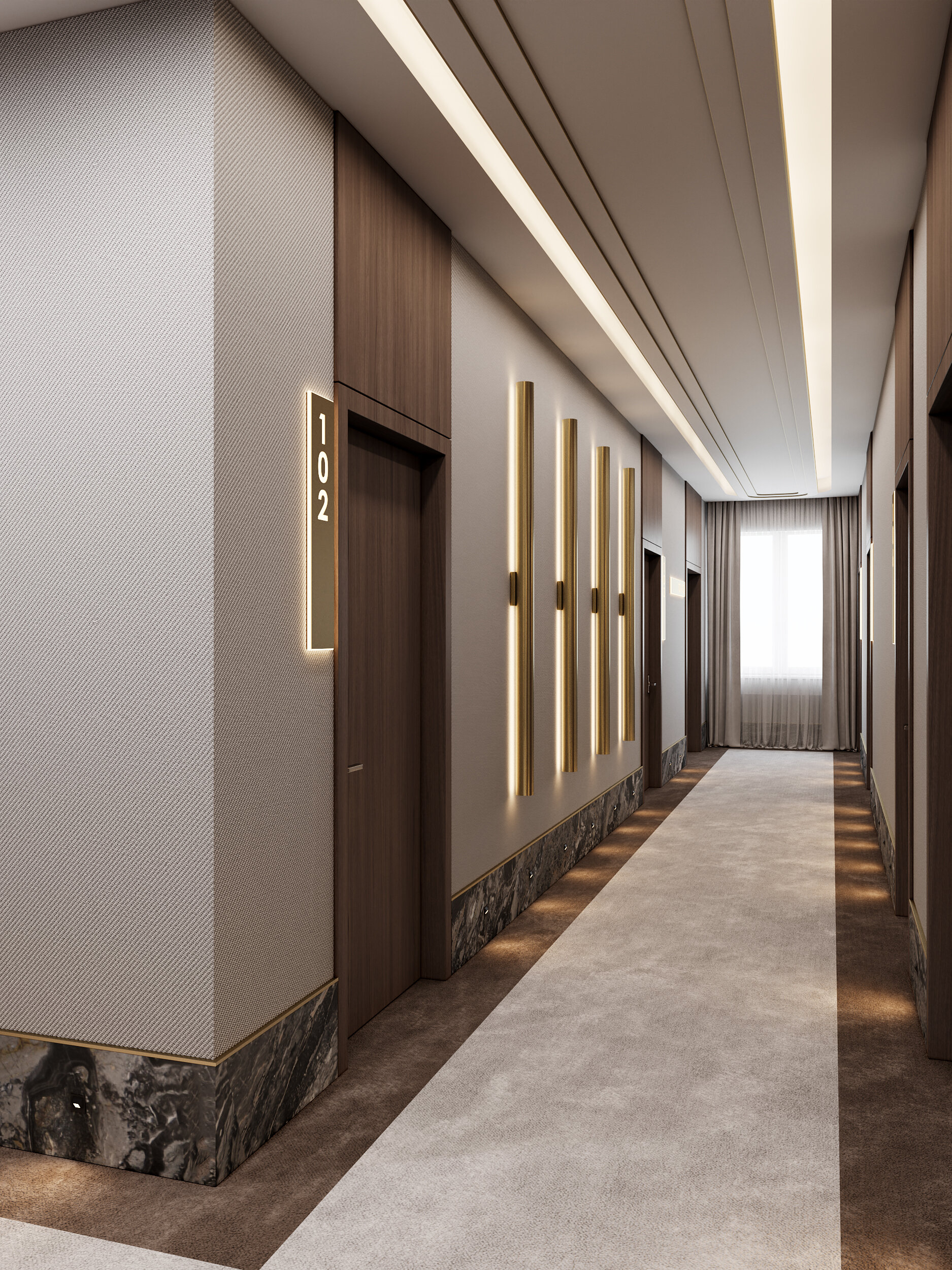
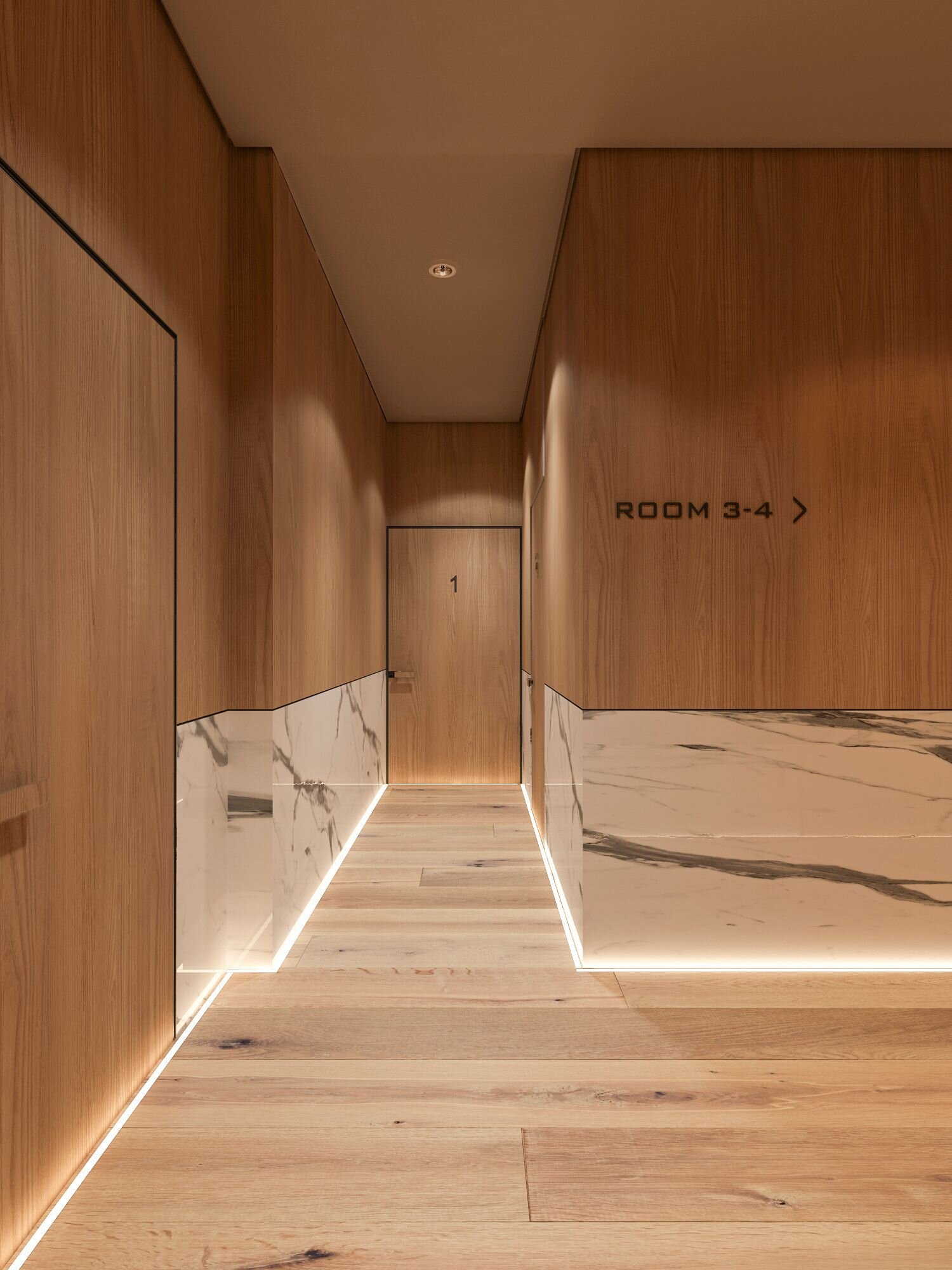
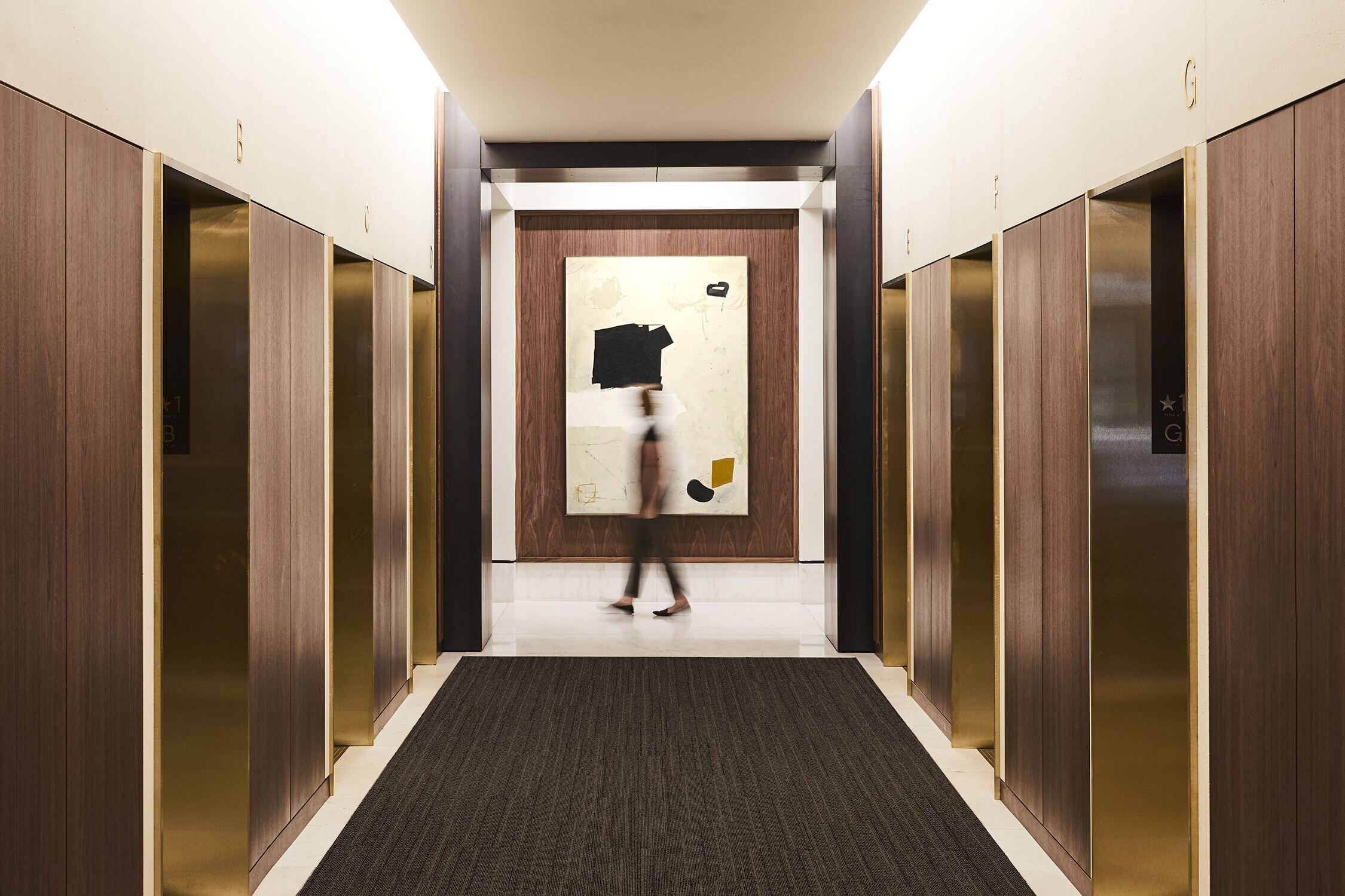
@Atelier Cho Thompson
What are your favorite ways to blend luxury and minimalism?
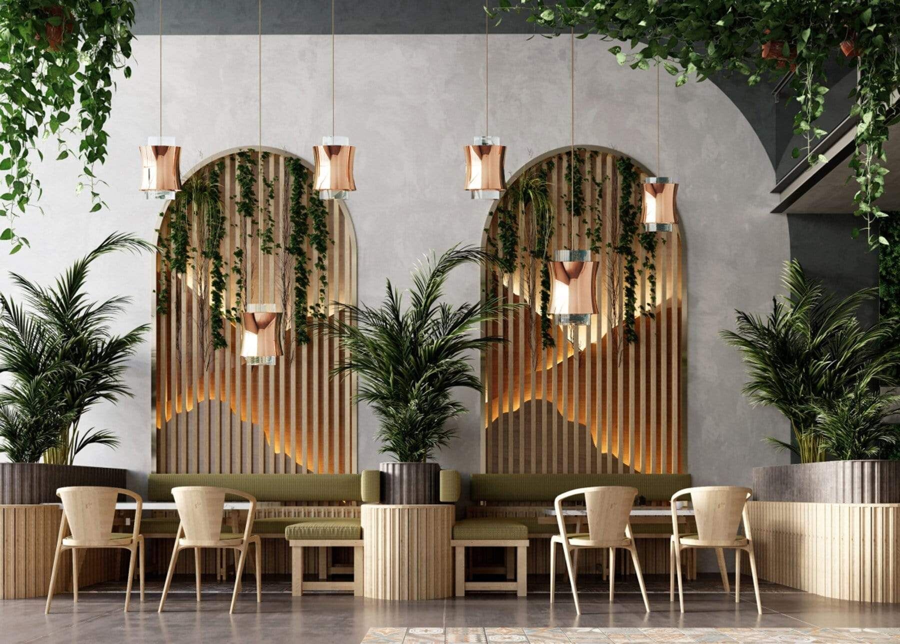
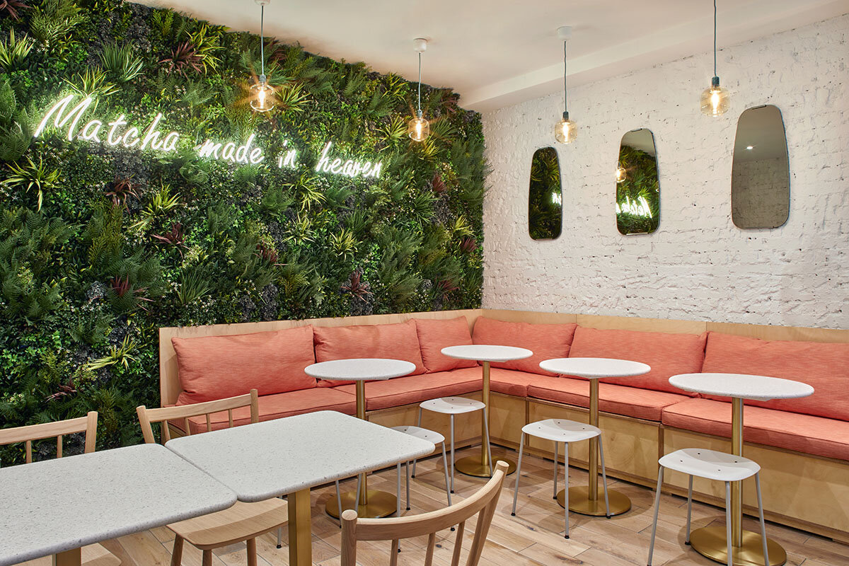
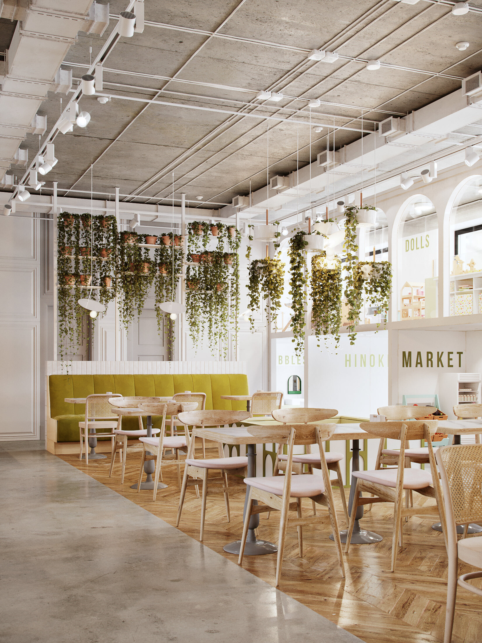
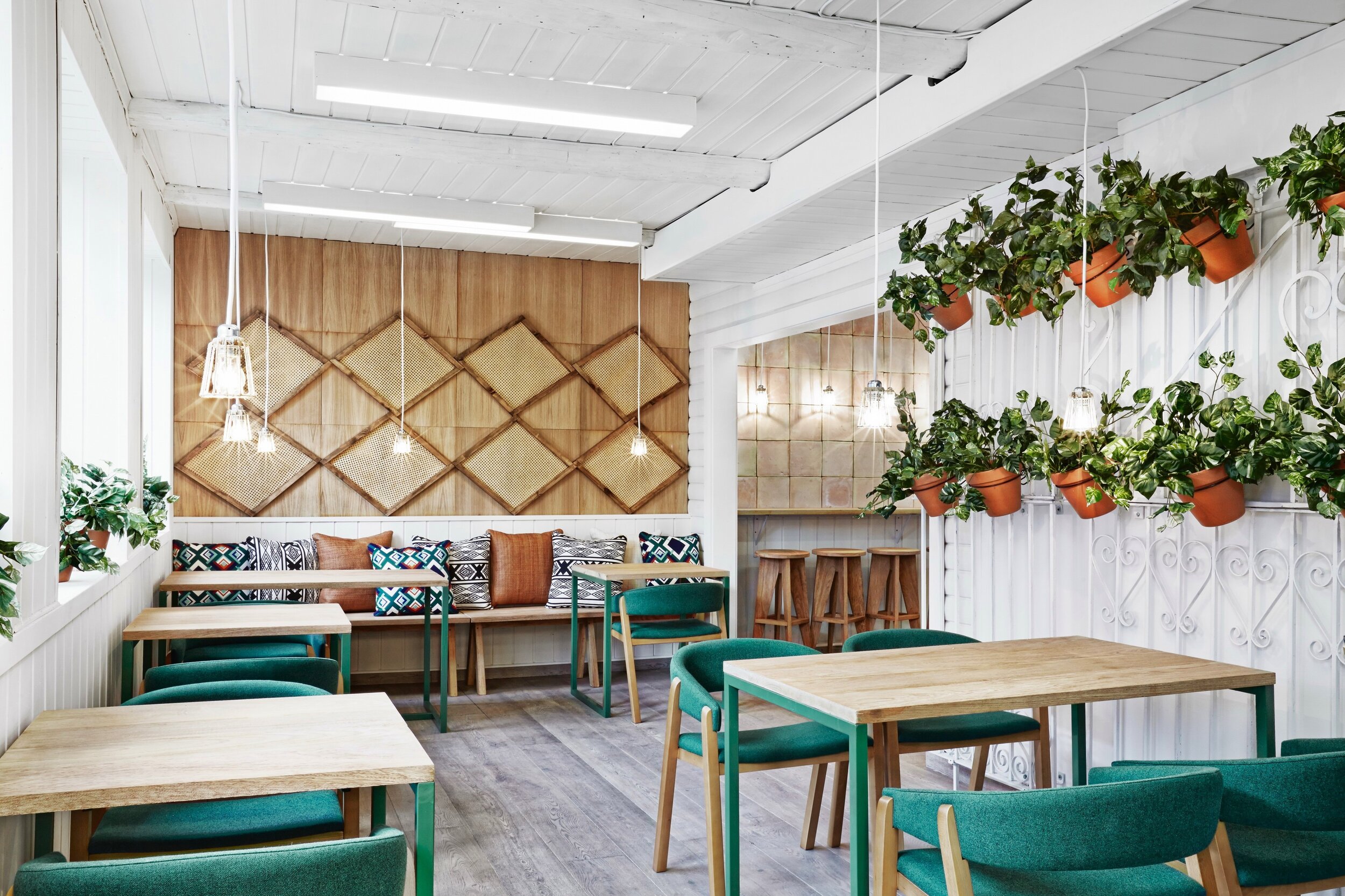
Sustainability | Interior Greenery
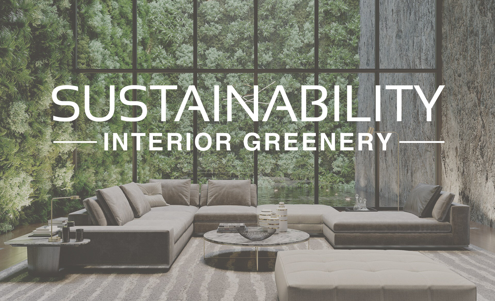
Image | PressRender
Sustainability has long been an important topic within the design industry and its significance continues to grow as part of the larger topic of wellbeing. This can be seen in the popularity of biophilic design, which incorporates nature into the built environment, creating restorative and connective spaces. There are many ways to incorporate concepts of sustainability and biophilic design into interiors. This includes using natural light, views of nature, natural textures, and of course, adding plants into a space!
Interior gardens and greenery have many health and wellness benefits! Live plants release additional oxygen, naturally purify the air, help reduce stress levels, and can brighten up a space. Take a look below to see some of our favorite ways to use greenery in interior design!
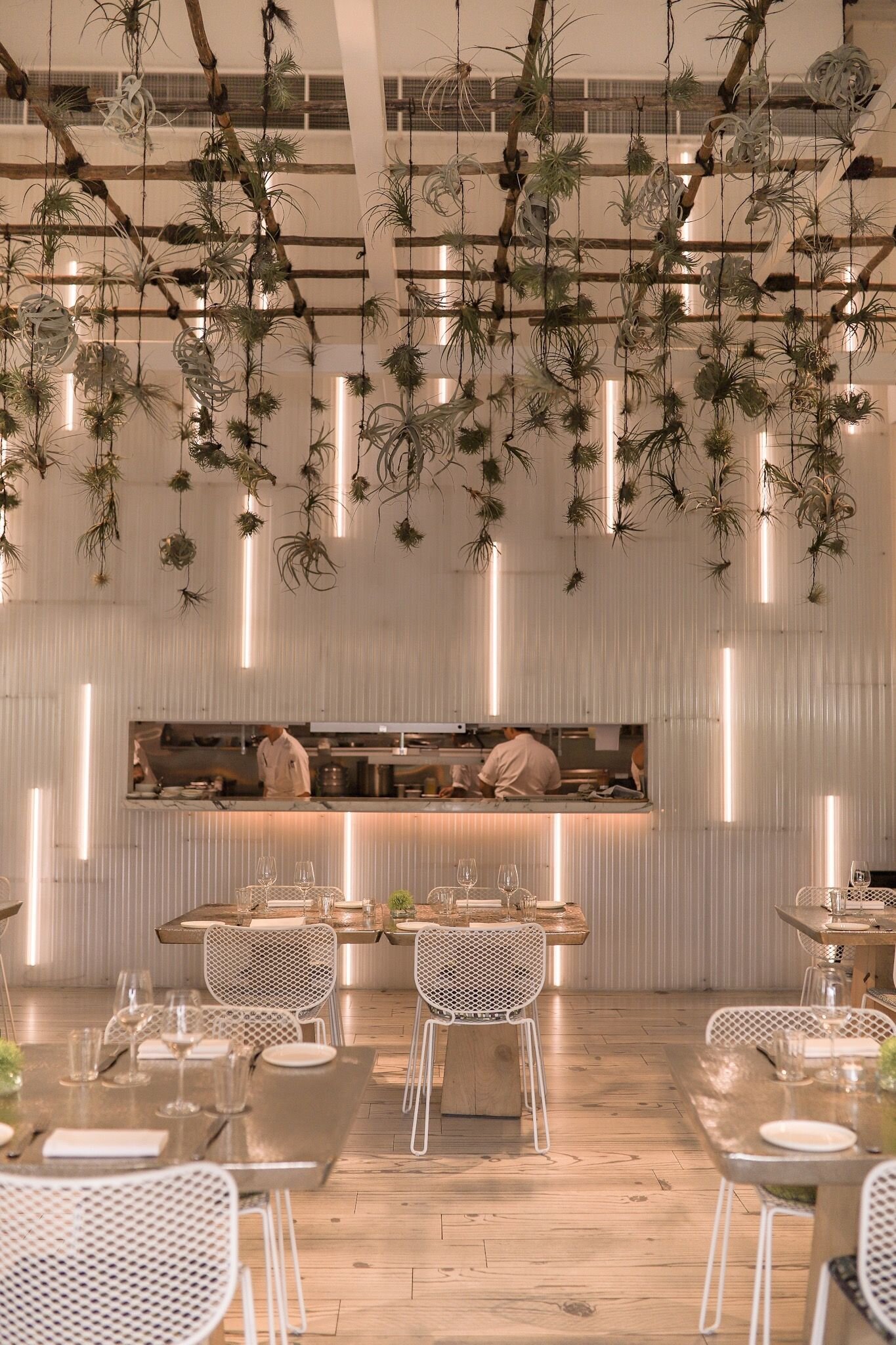
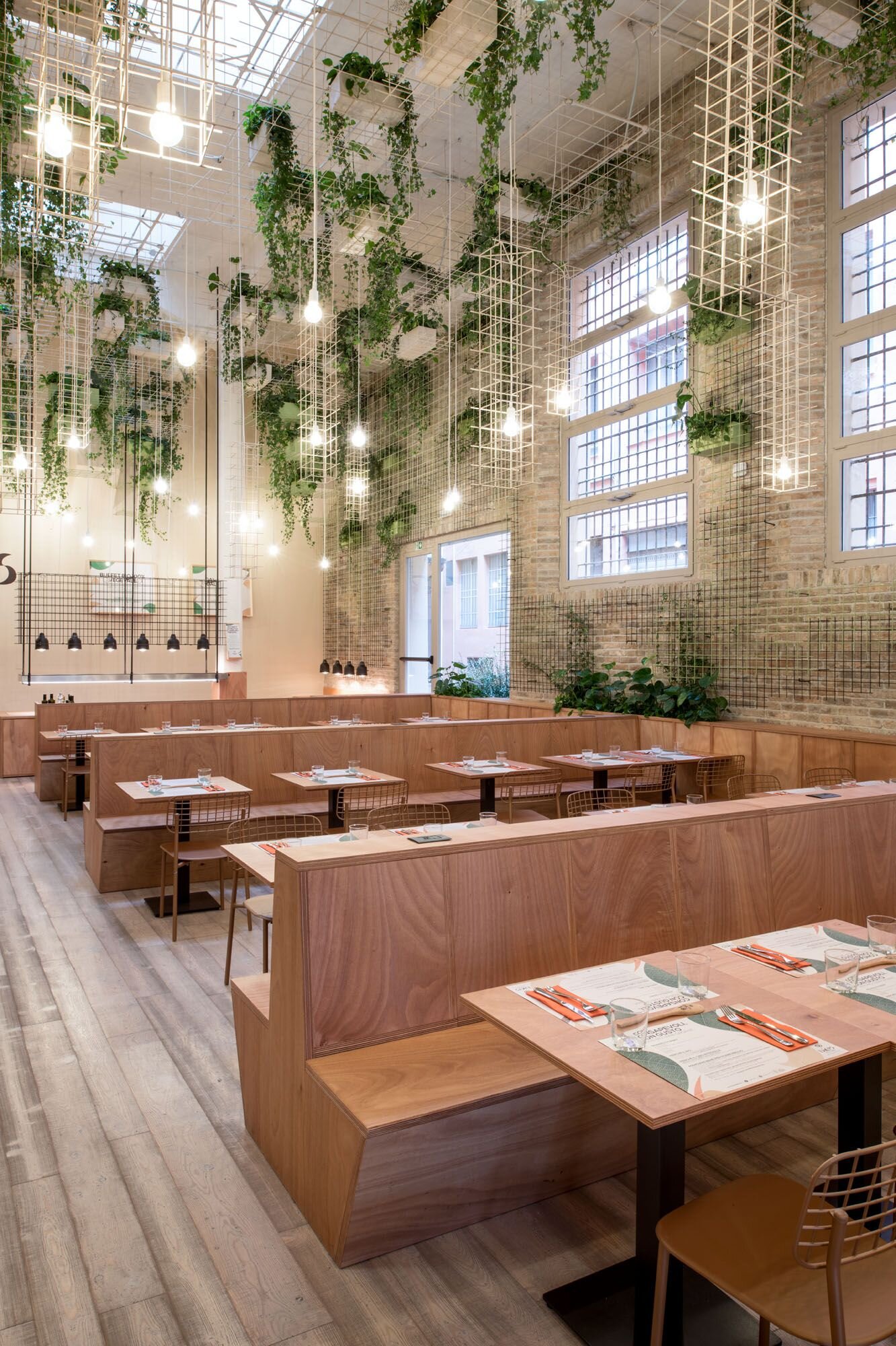
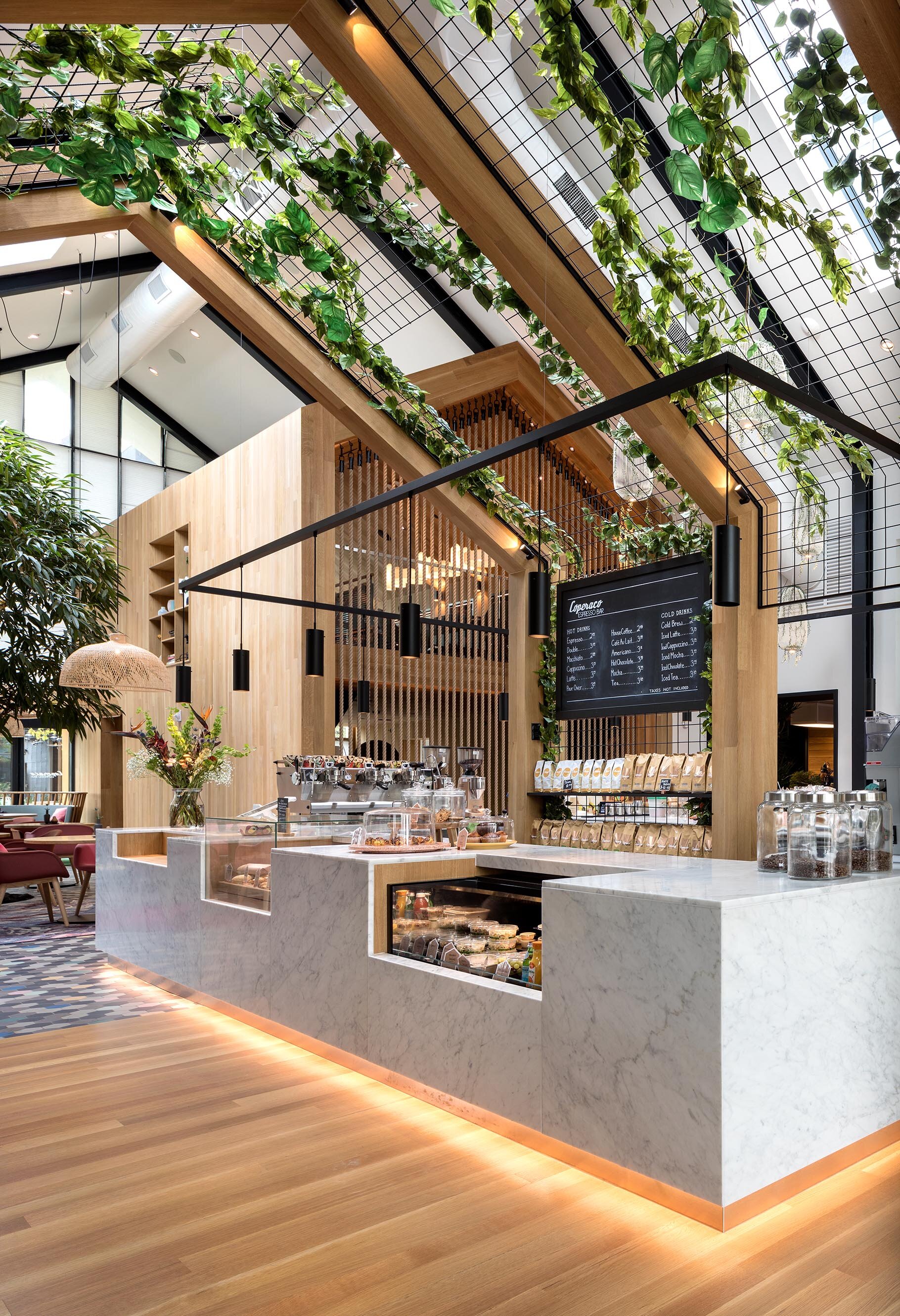
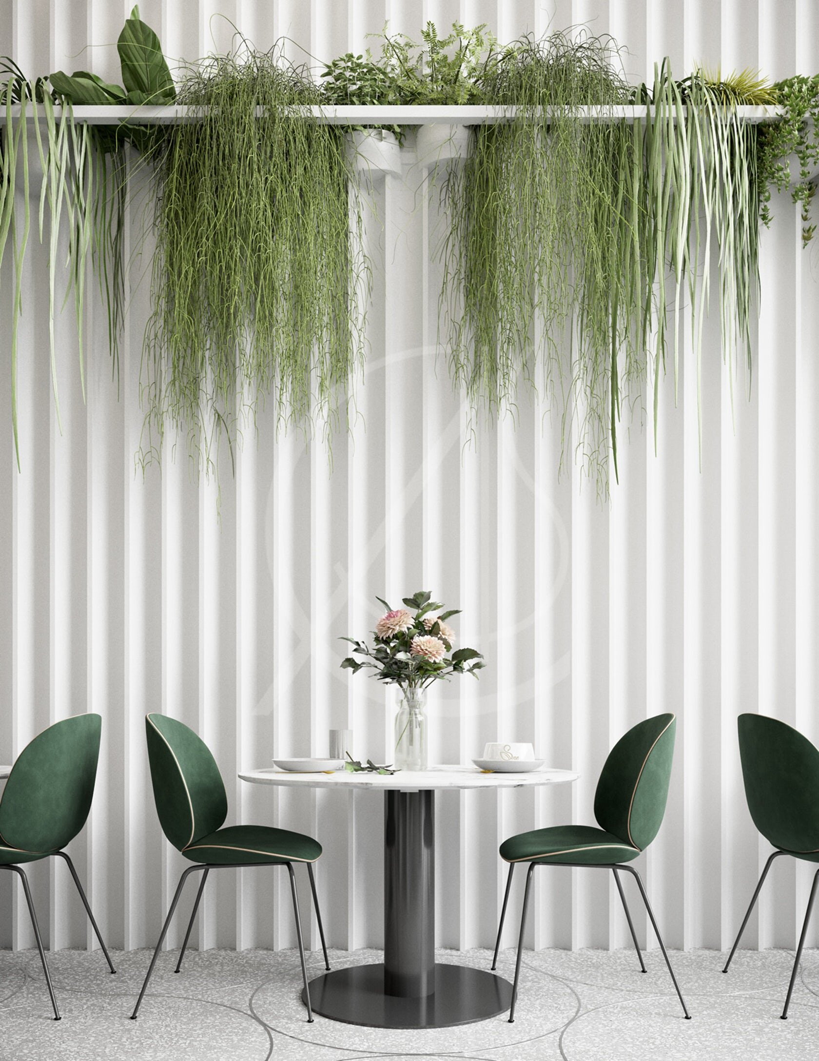
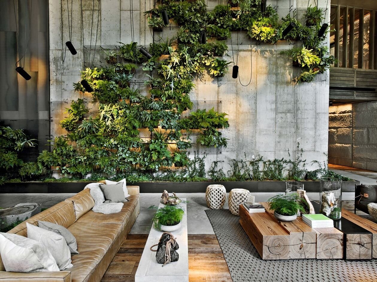
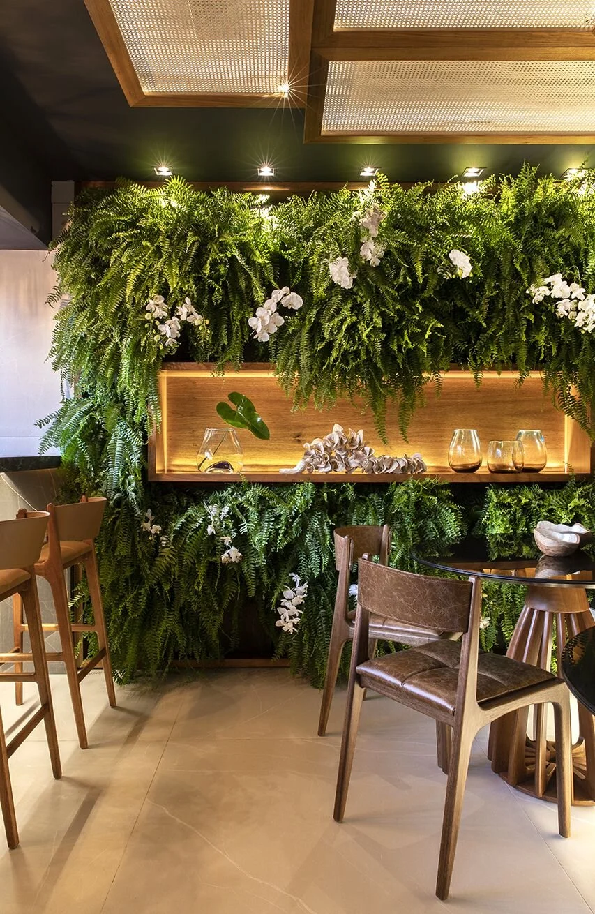
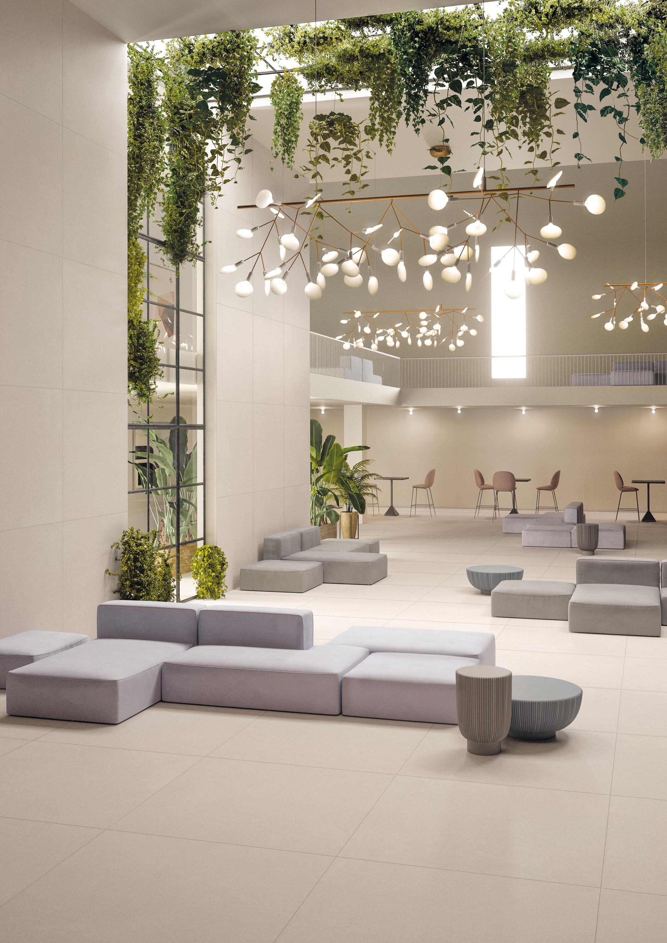
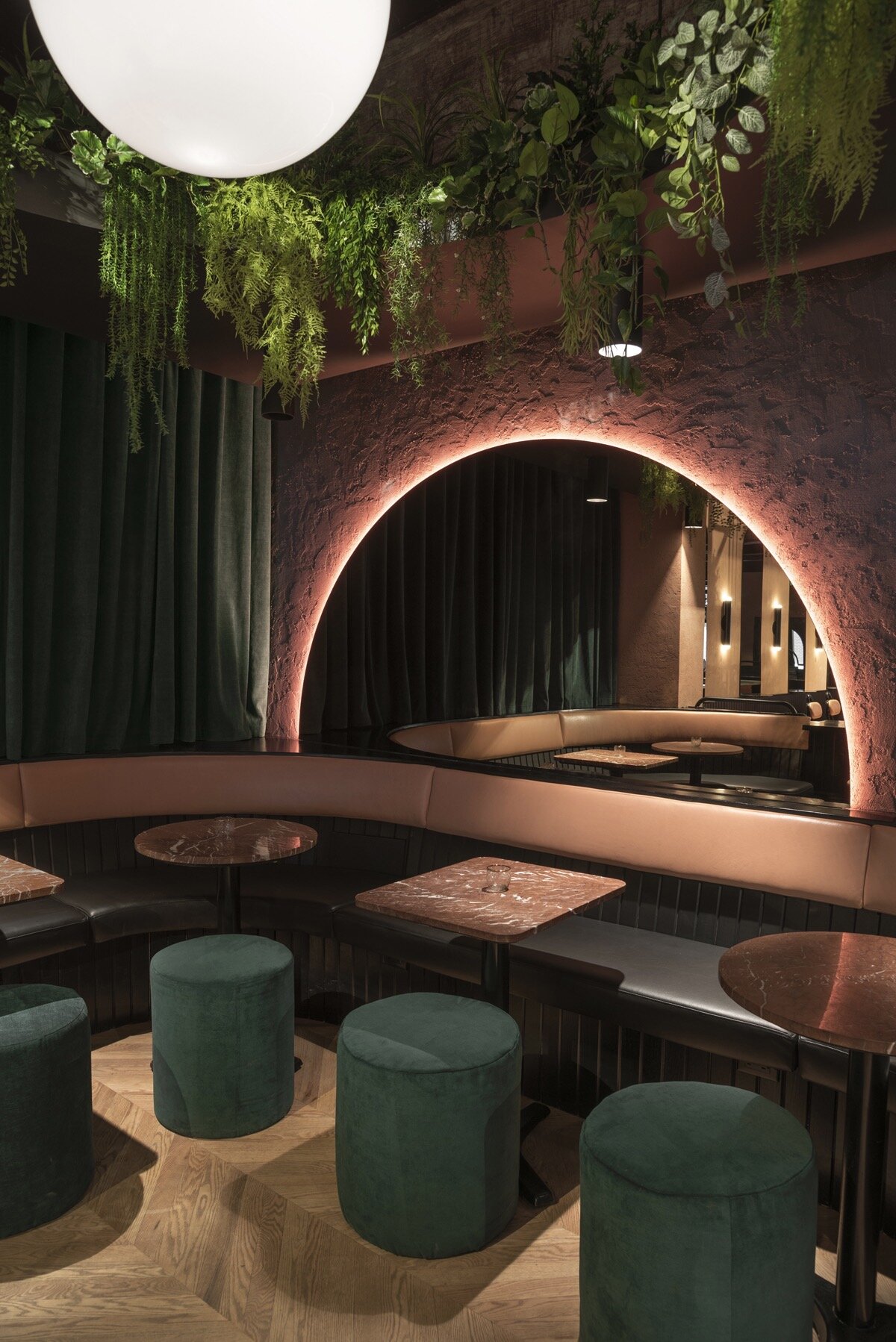
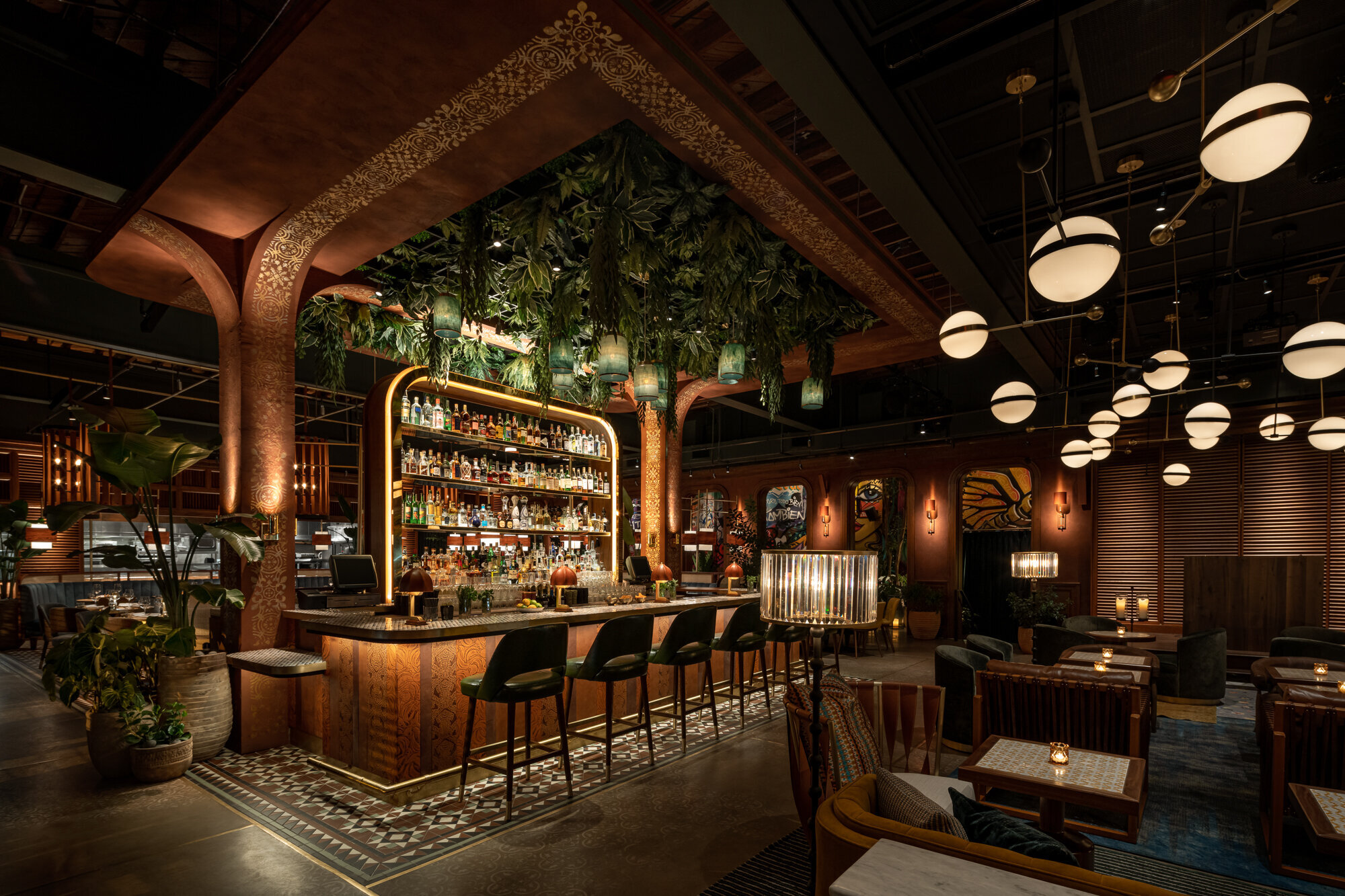
LIVING STRUCTURES + SUSPENDED GREENERY
Integrating plants into architectural wall structures or shelves adds a new texture and color to vertical design elements. Suspending greenery overhead adds drama, creating an unexpected but beautiful focal point!
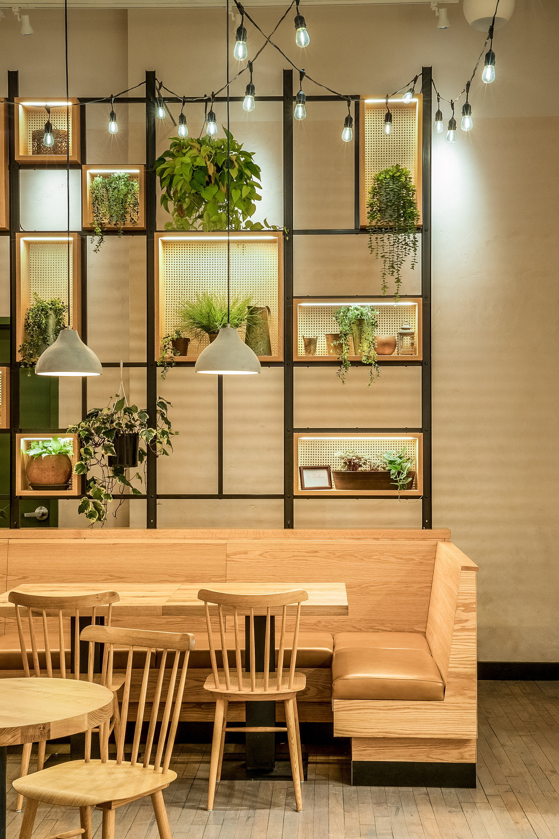
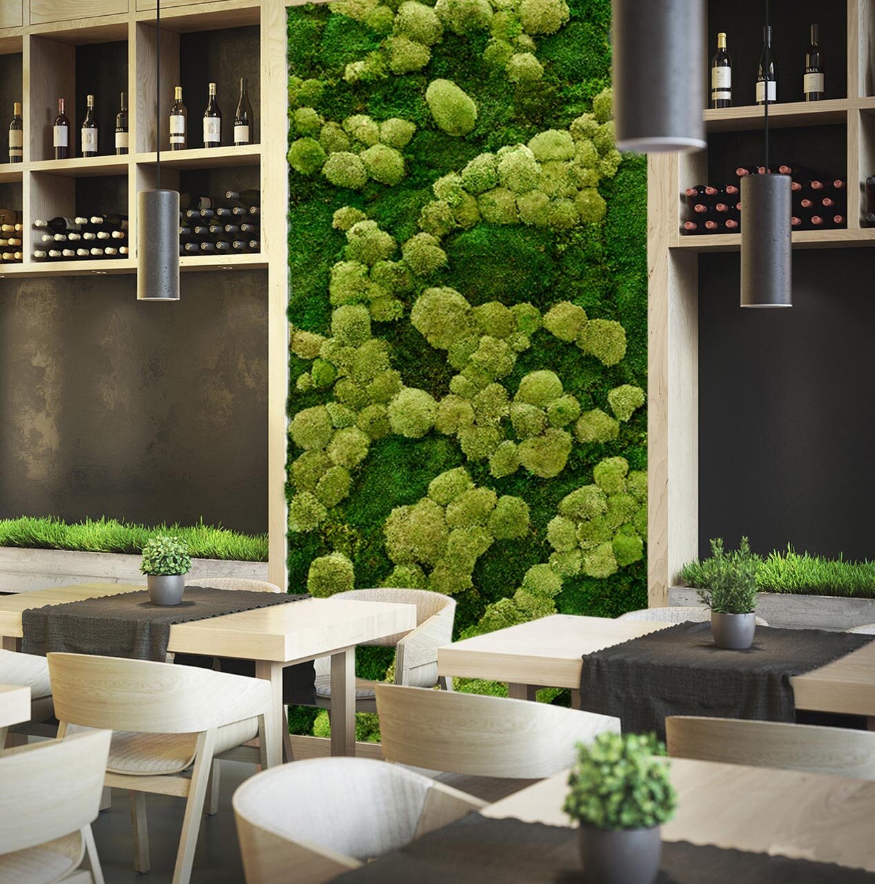
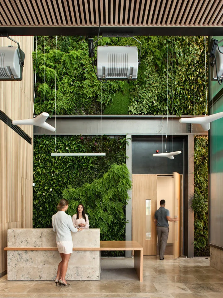
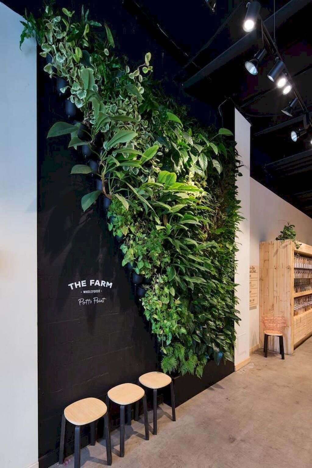
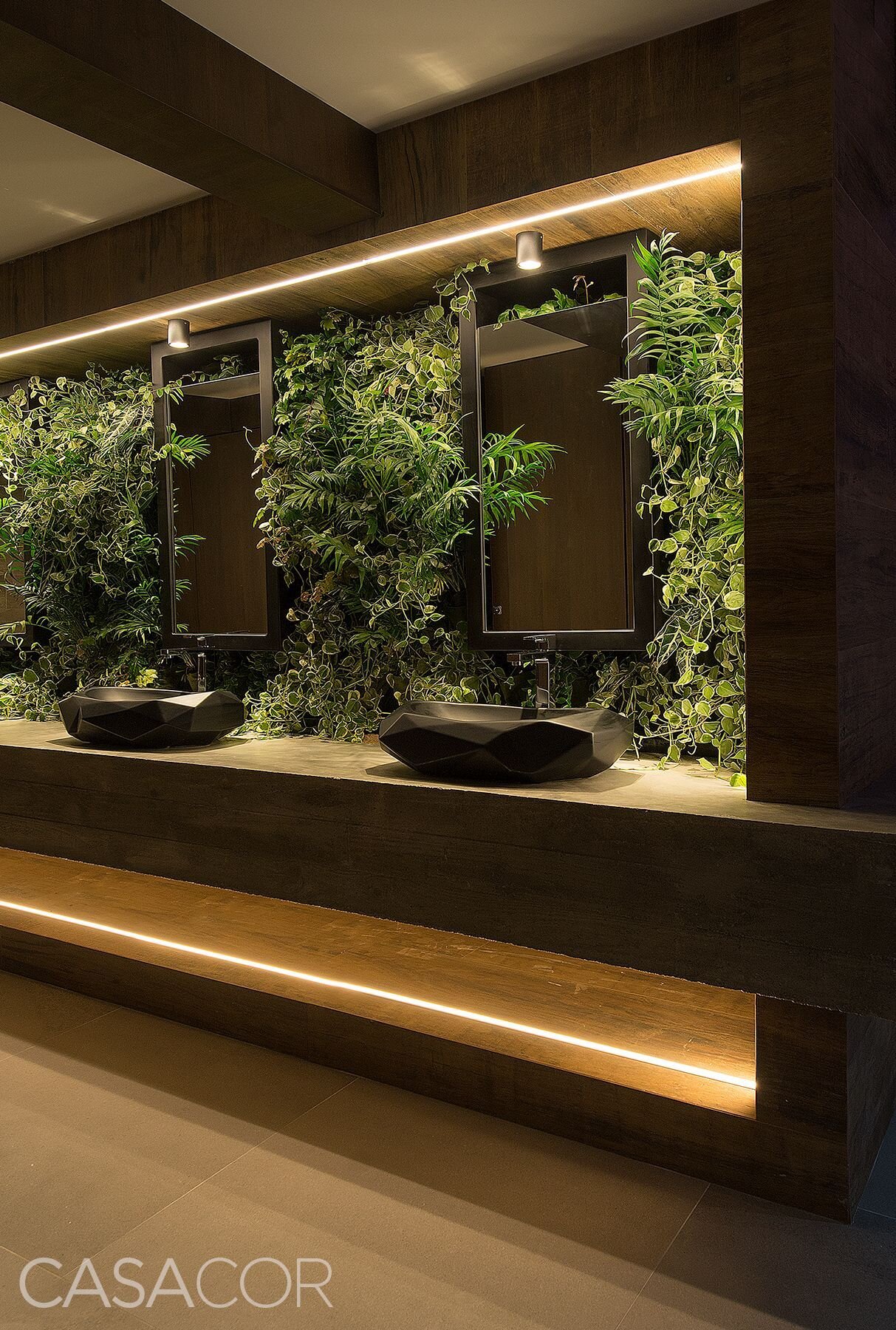
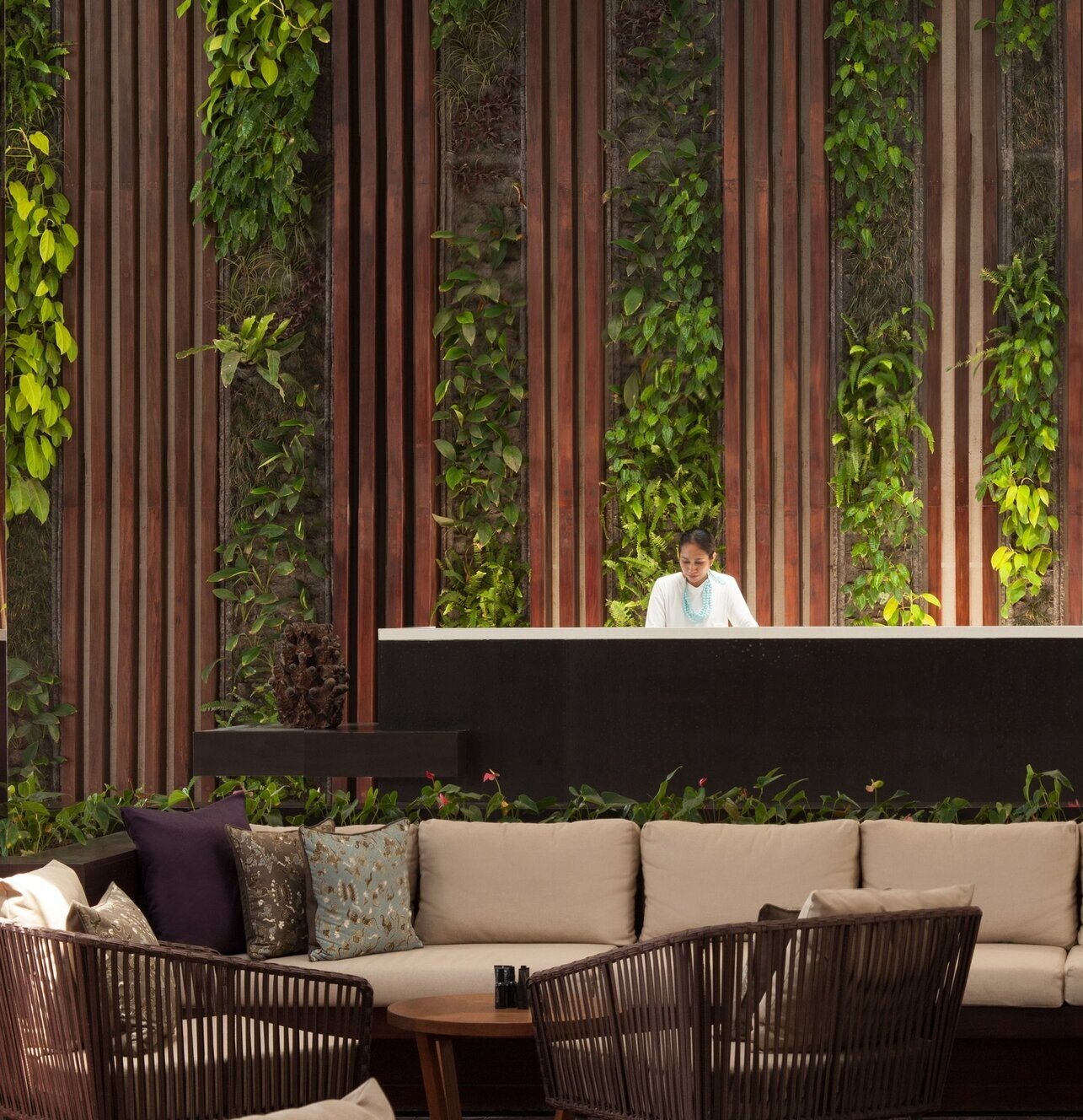
LIVE WALLS
Live walls are one of the most popular ways to turn interior spaces into living gardens! And design options for green walls are virtually endless - the ability to mix plant types, create interesting patterns, and install plants in unique shapes makes this one of the most versatile ways to add greenery to an indoor space!
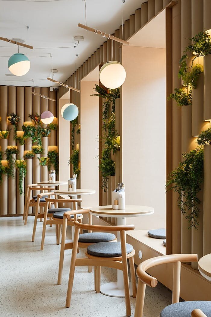
BRIGHT + COLORFUL INTERIOR GREENERY
Interior gardens can also set the tone for a space. As a natural and organic element, adding indoor plants is one of the easiest ways to make a space feel bright, vibrant, and colorful!
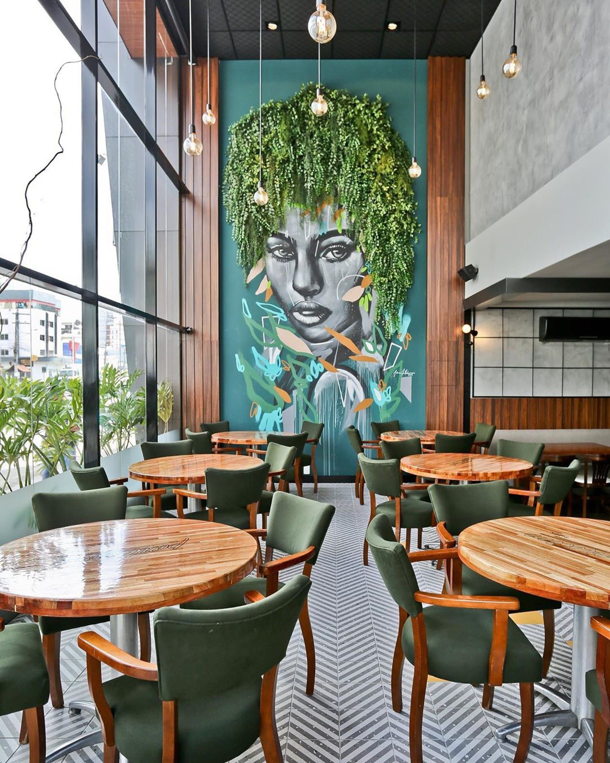
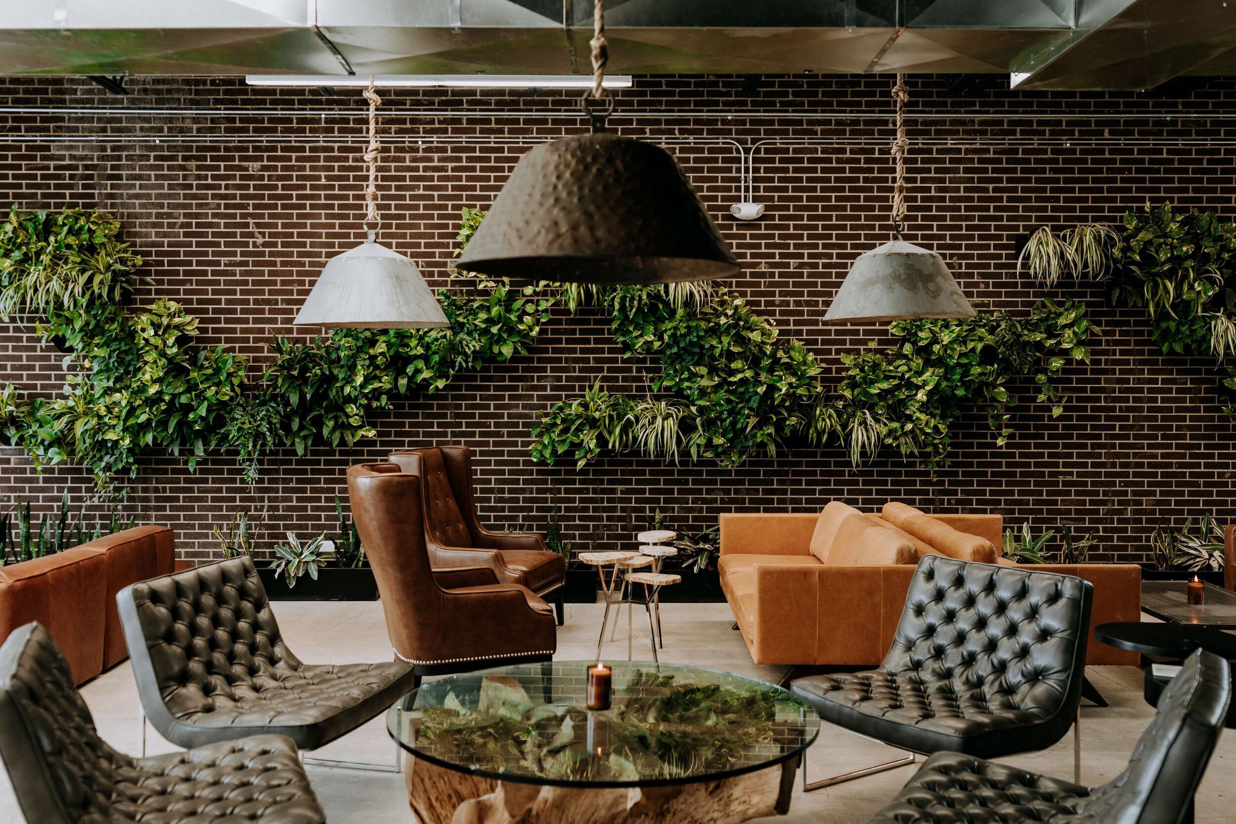
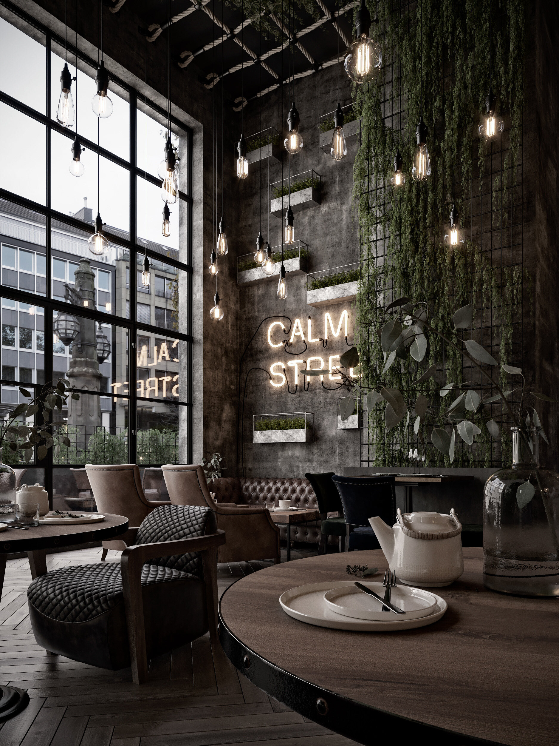
DARK + MOODY INTERIOR GARDENS
Interior greenery is also versatile - it’s not only able to make spaces brighter or more colorful, but can also fit perfectly with a dark and moody atmosphere. Adding plants can add depth and ambiance, making a space feel cozy, intimate, and intriguing.
What are some of your favorite ways to use greenery indoors?
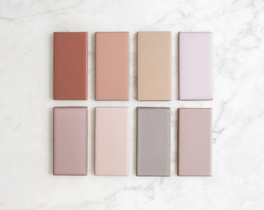
Best of Warm Neutrals | Paints

We know neutrals may seem boring, but they’re the base of any palette and an essential part of good design. Selecting the wrong neutral can throw off all other selections, but choosing the right one can tie a design together and make it great!
Options for neutrals are widespread and varied, there are lots of different color tones within the “neutral” family. Today we wanted to focus on warm neutrals and some of our favorite paints within that group - take a look below at the warm neutral paints we find most inspiring!
INSPIRATION 1 | PALE TONES

Photo: Chris Round | Paints: Benjamin Moore | Colors (top to bottom): Shoreline 1471, Taos Taupe 2111-40, Gray Huskie 1473, Lambskin 1051, Lingerie AF-200
INSPIRATION 2 | NATURE’S LANDSCAPES

Photo: Mike Irwin | Paints: Kelly Moore | Colors (top to bottom): Copper Blush KM4403, Bear Hug KM4510, Americano KM4512, Myrtle Pepper KM4406, Pink Scallop KM4408
INSPIRATION 3 | FASHION

Sweater: Stories.com | Paint: Sherwin Williams | Colors (top to bottom): Sanderling SW7513, Muslin SW6133, Arcade White SW7100, China Doll SW7517, Rockweed SW2735
INSPIRATION 4 | ARCHITECTURE

Photo: Alison Brooks | Paint: PPG | Colors (top to bottom): Molasses 1079-7, Warmstone 1015-3, Caramel Kiss 1083-6, Cotton Tail 0998-1, Warrior 1076-6
INSPIRATION 5 | (MORE) FASHION

Team Picks: 2020
As 2020 draws to a close, we can all agree that it’s been a roller coaster of a year! But while the world got turned on its head, companies still rolled up their sleeves and released amazing new product lines. We all need a little extra dose of creativity sometimes, these collections kept our team inspired - take a look at some of our favorite 2020 product launches below!
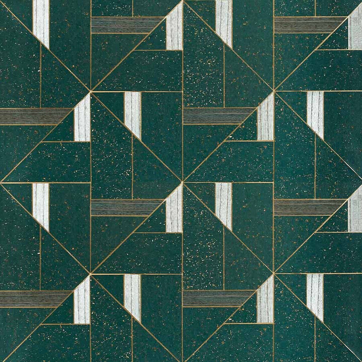
T I L E
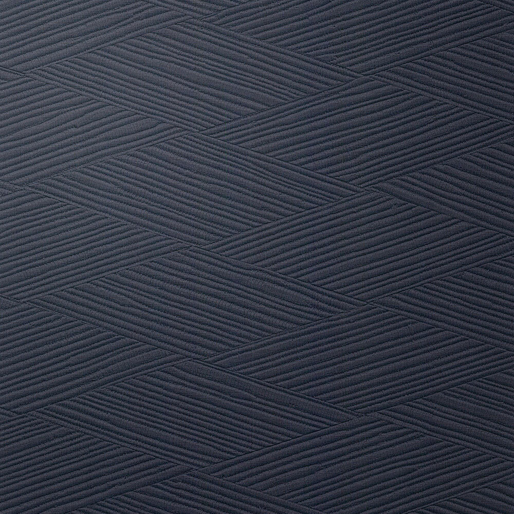
T E X T I L E S

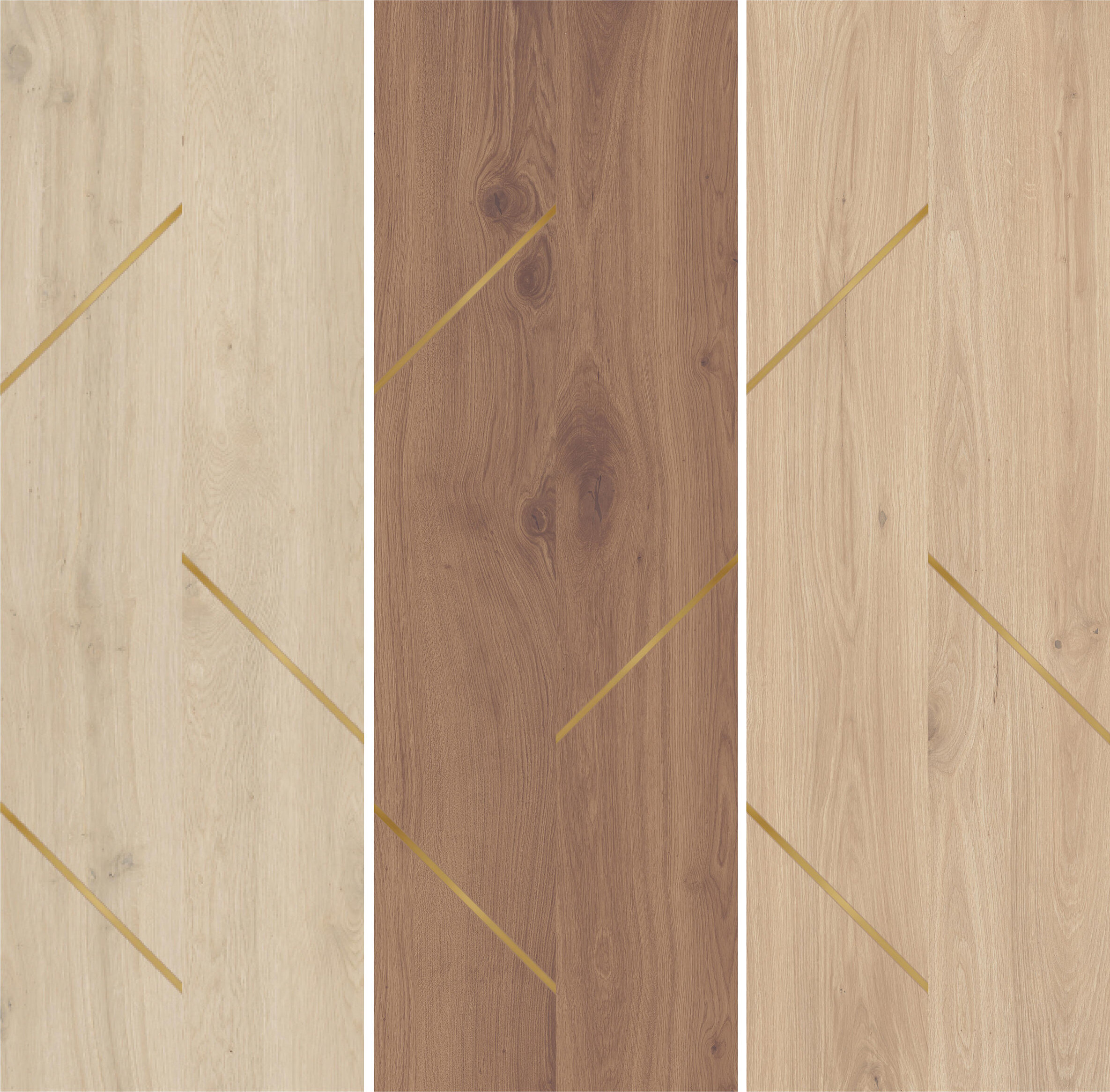
F L O O R I N G
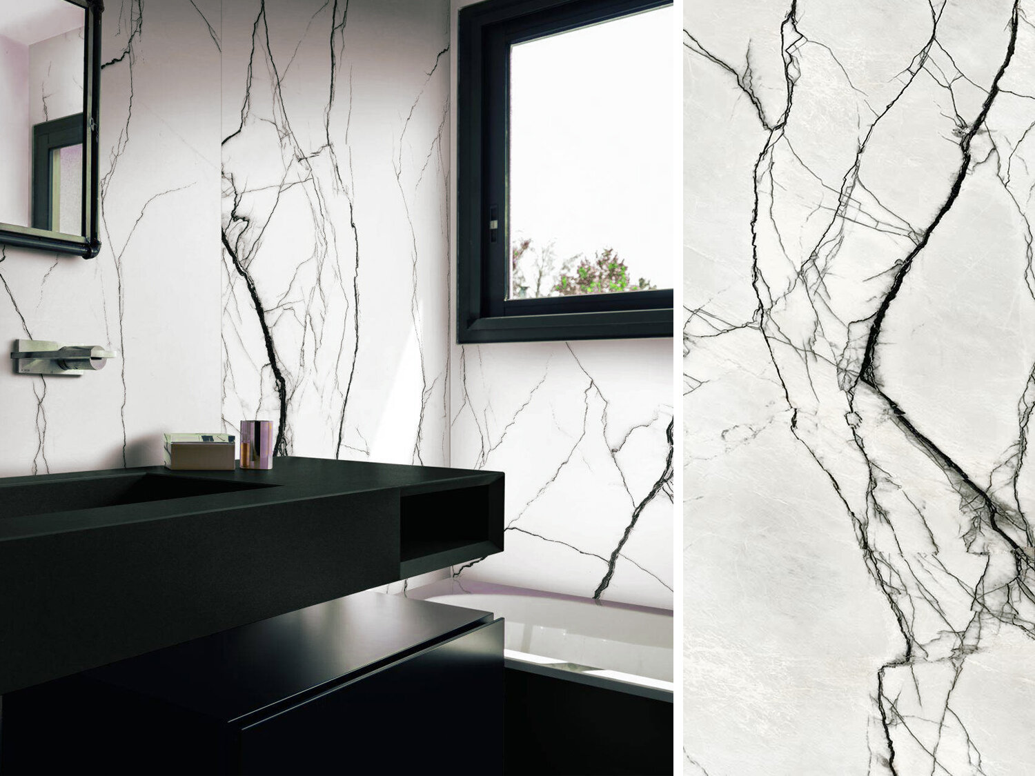
C O U N T E R T O P S
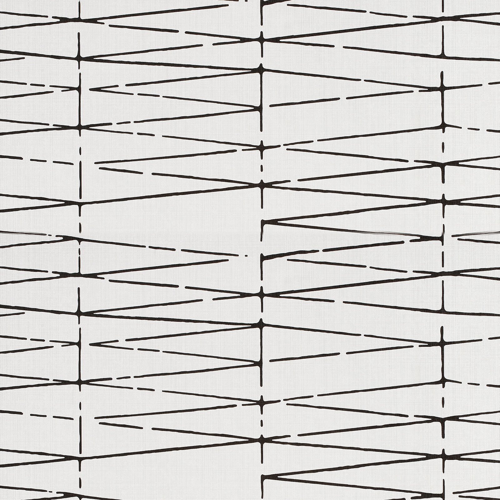
W A L L C O V E R I N G

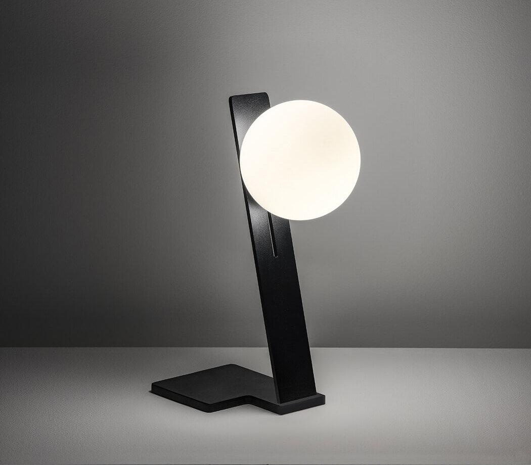
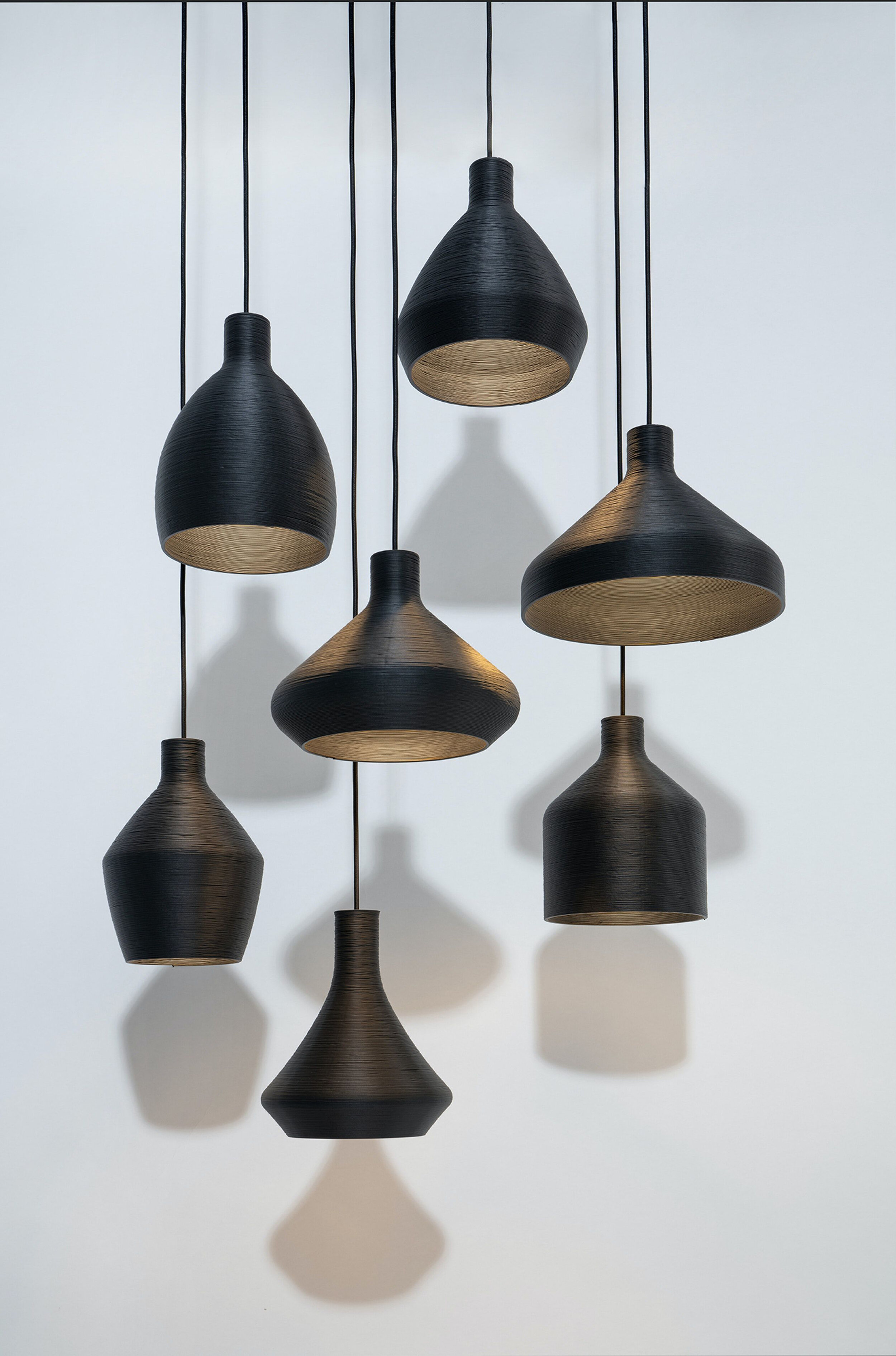
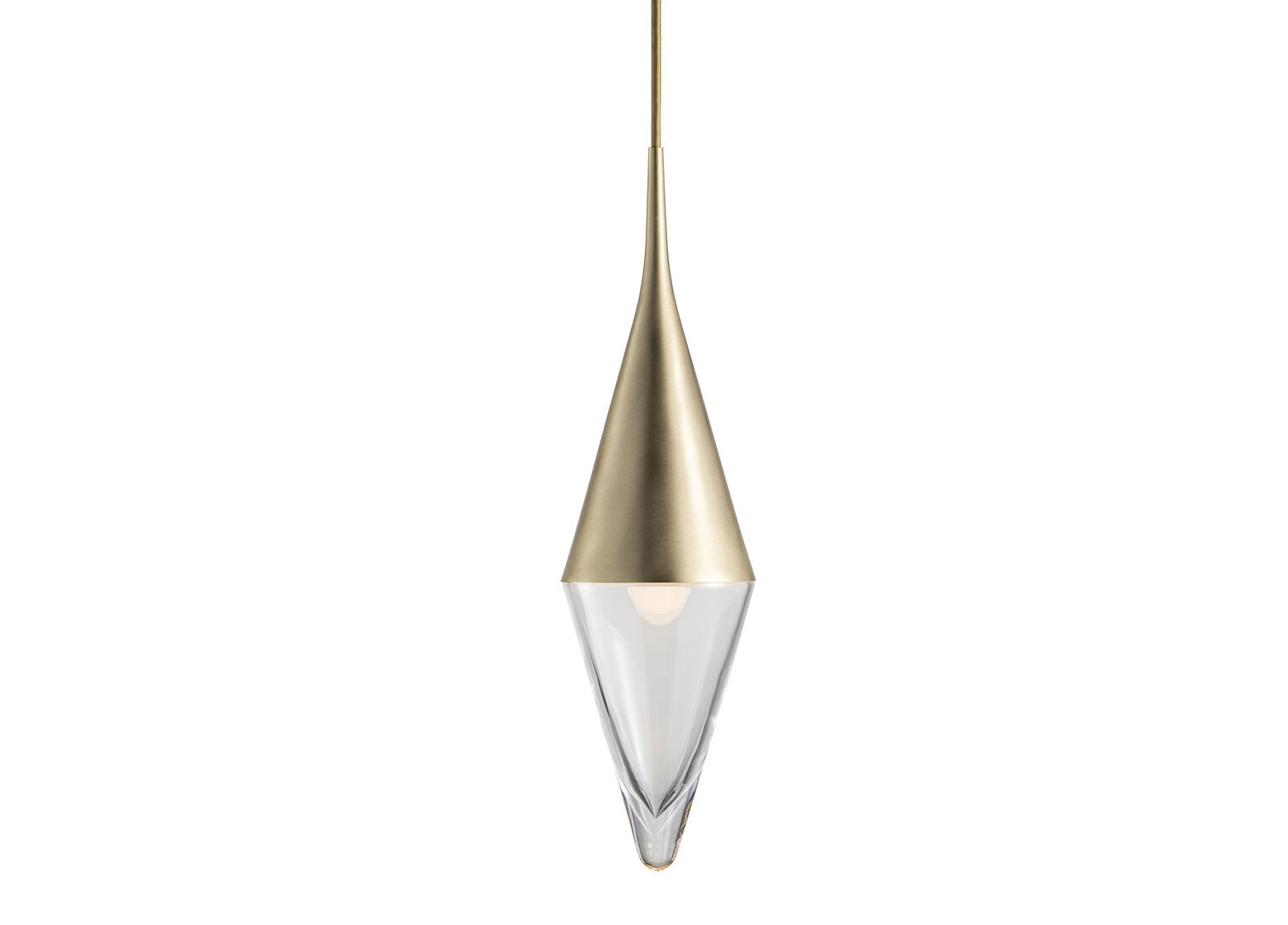
L I G H T I N G
F U R N I T U R E
What product inspirations have you found in 2020?
What Metal is Right for You?

Brass may seem like an obvious trend since we are seeing it everywhere; hotels, restaurants, homes, retail… but brass isn’t a new thing. Just because it is “in” now, doesn’t mean that it’s going out. Brass is the new normal in metal finishes. It used to be hard to find modern hardware and finishes in a timeless brass finish, but now its a standard you can find in plumbing fixtures, cabinetry hardware, door hardware, millwork, etc.
To guide you towards the finish thats best for your project, please see our breakdown below!

@apogeelounge design by blocHaus
BRASS
Pros: Adds warmth, feels classy and sophisticated. Comes in several finishes. Easily mixed with other materials. Looks like gold, but its less costly. Strong and resistant to corrosion. Very malleable - ideal for casting
Cons: Can patina with age.

Design by Crosby Studios
COPPER
Pros: Adds warmth, and element of playfulness. Strong and resistant to heat. Malleable.
Cons: Will patina with age and can be perceptible to corrosion. Challenging to mix with other materials.
Design by Shea McGee Designs
NICKEL
Pros: Comes in a polished and satin finish. Adds a transitional aesthetic. Warmer than polished chrome. Classic, doesn’t go out of style.
Cons: More expensive than chrome and stainless steel. Requires periodic maintenance.

@sparrowcoffee design by blocHaus
BLACK
Pros: Contemporary, matches everything. Adds contrast to millwork and doors.
Cons: Can be cold, dark. Depending on the material, the finish can be scratched off if not used correctly.
BENJAMIN MOORE 2021 COLOR OF THE YEAR

BM Aegean Teal 2136-40 (top left)
Benjamin Moore announced their color of the year and it is Aegean Teal 2136-40. It is a really beautiful muted teal with just a hint of green. Instead of telling you to use it, I am going to let these inspiration boards do the talking!