
Sustainability | Carpet

As a major contributor to commercial production and waste cycles, the design and construction industry is focusing ever more on sustainability in new projects. It’s an incredibly important factor, and as designers, we love companies that make it easier for us to specify environmentally-conscious products and take part in sustainability programs.
Carpet is a big industry, and it’s installed into millions of new spaces each year. With that in mind, carpet companies can make a major environmental impact based on what materials they use, how they produce their products, and what sustainability efforts they choose to make. We love companies that take eco-consciousness seriously, so today we’re looking at sustainability in the carpet industry - take a look below to see some amazing companies and their products!
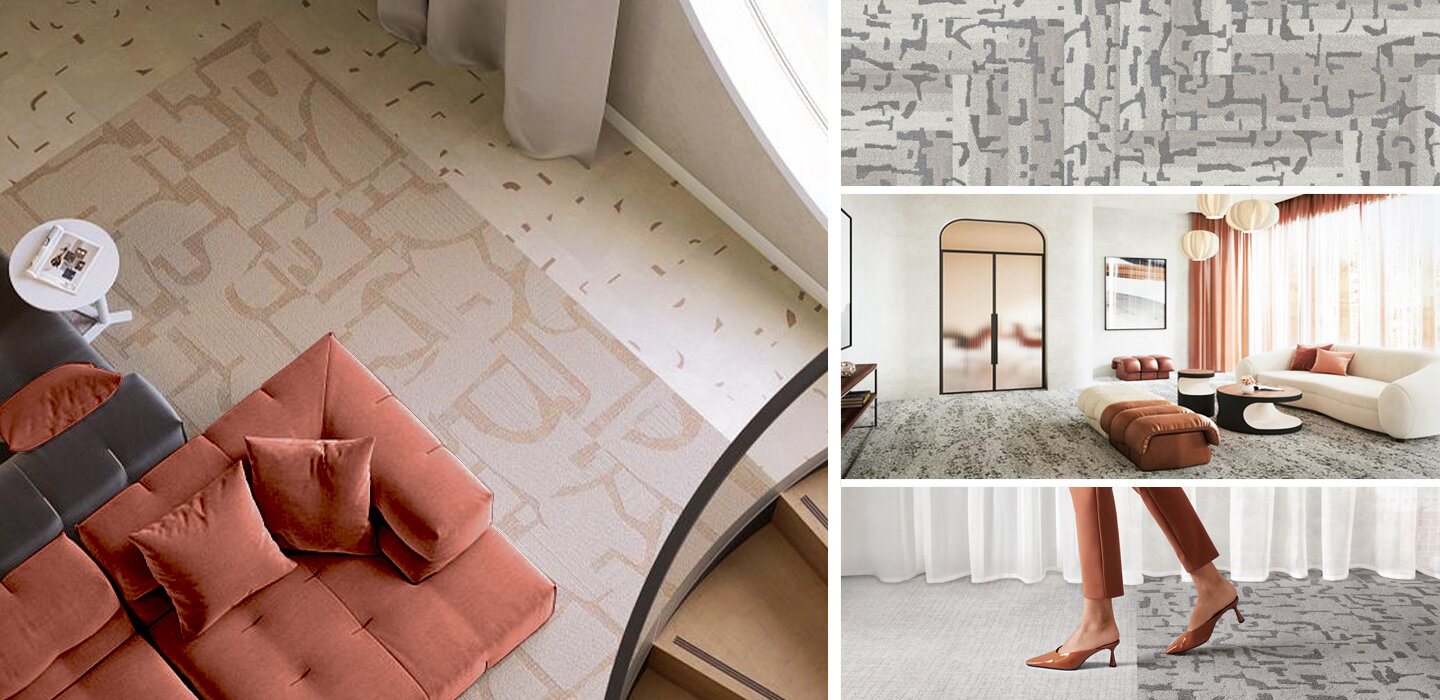

We love companies and products that are committed to reducing or eliminating post-consumer waste, and Shaw is doing just that! The company introduced the first Cradle to Cradle (C2C) flooring product more than 20 years ago, and continues to offer C2C products today. Moreover, their Re[TURN] Reclamation Program has allowed Shaw to reclaim and recycle almost 1 billion pounds of carpet since 2006, much of which has been reused in the production of new flooring products!
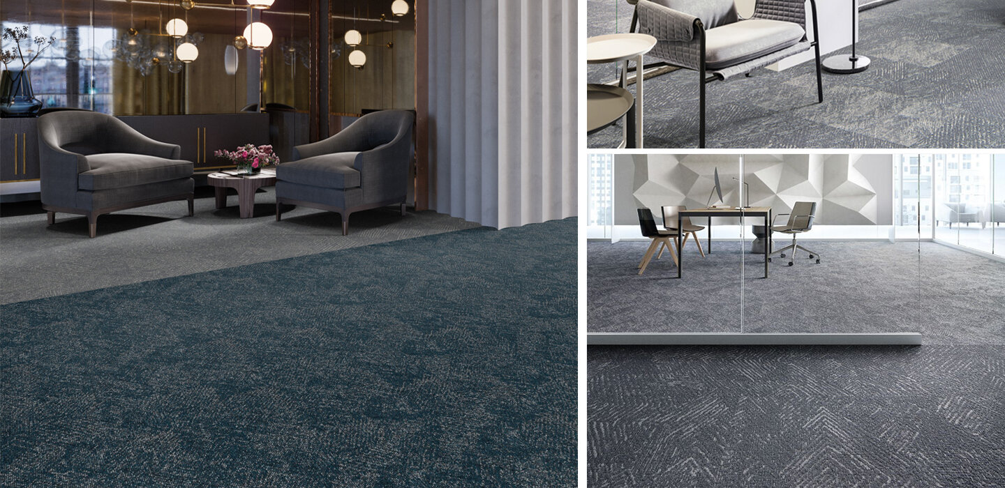

Mannington not only creates beautiful carpets, but the company produces them using less energy and resources! They are committed to reducing their environmental footprint, and were one of the original 50 Save Energy Now Leaders (now know as the Better Plants initiative). Mannington has 3.3 acres of solar arrays and has reduced energy intensity by 17% since 2007 - all while doubling their manufacturing sites!


Some of our favorite flooring is from EF Contract, and we love their commitment to reclamation! Their R4 Program was started in 2007, and focuses on the ideas of Return, Reuse, Recycle, & Reduce. Each year more than 60,000 pounds of waste are diverted from landfills through this program!
What sustainable carpets are you loving right now?
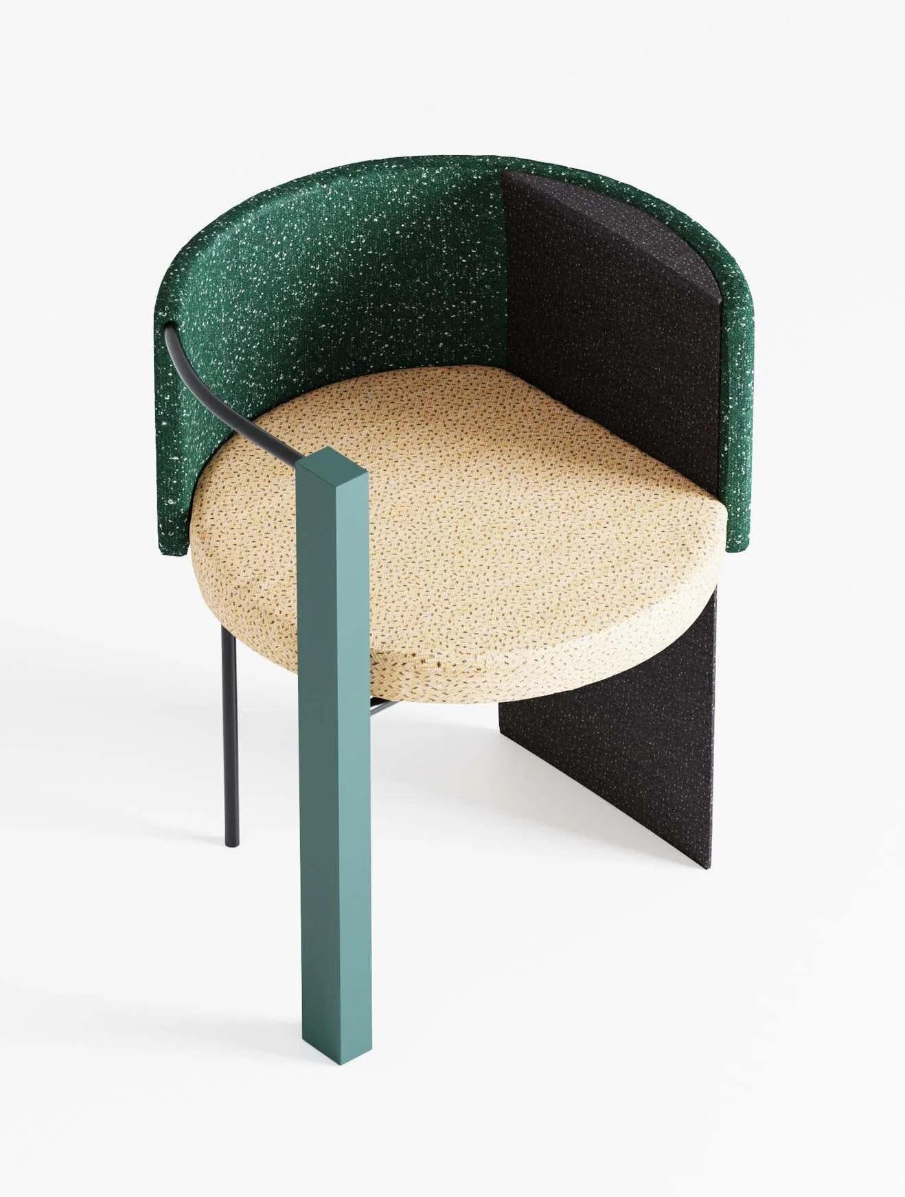
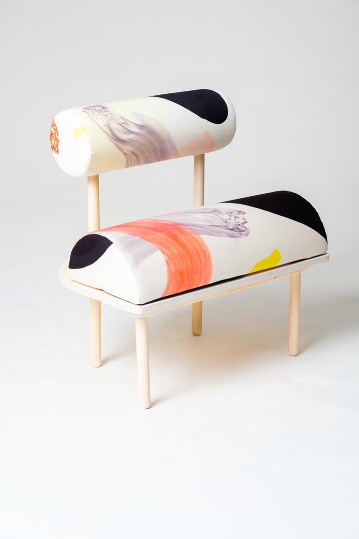
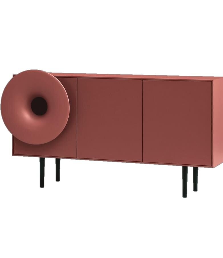
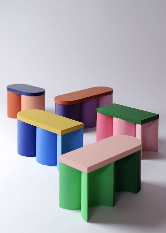
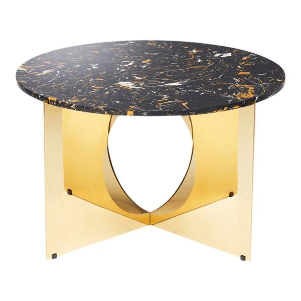
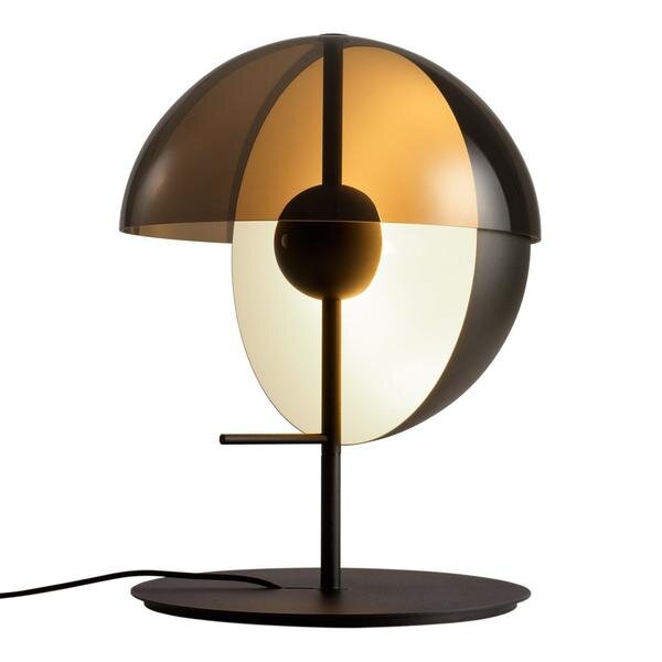
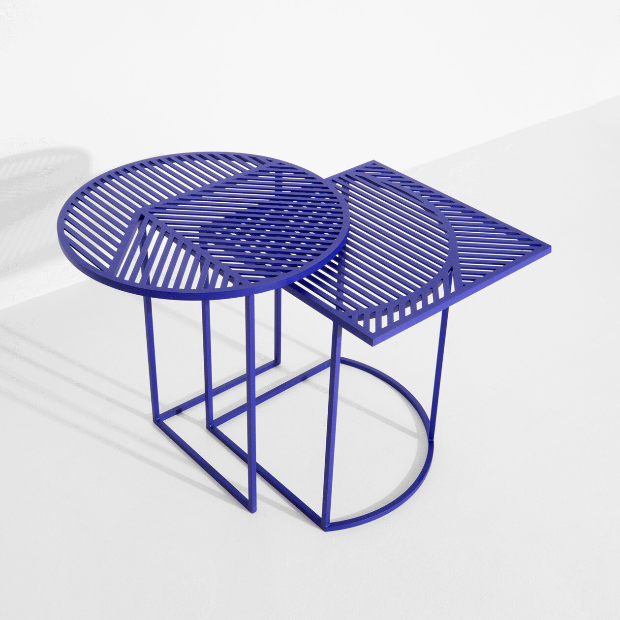
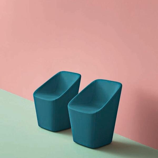
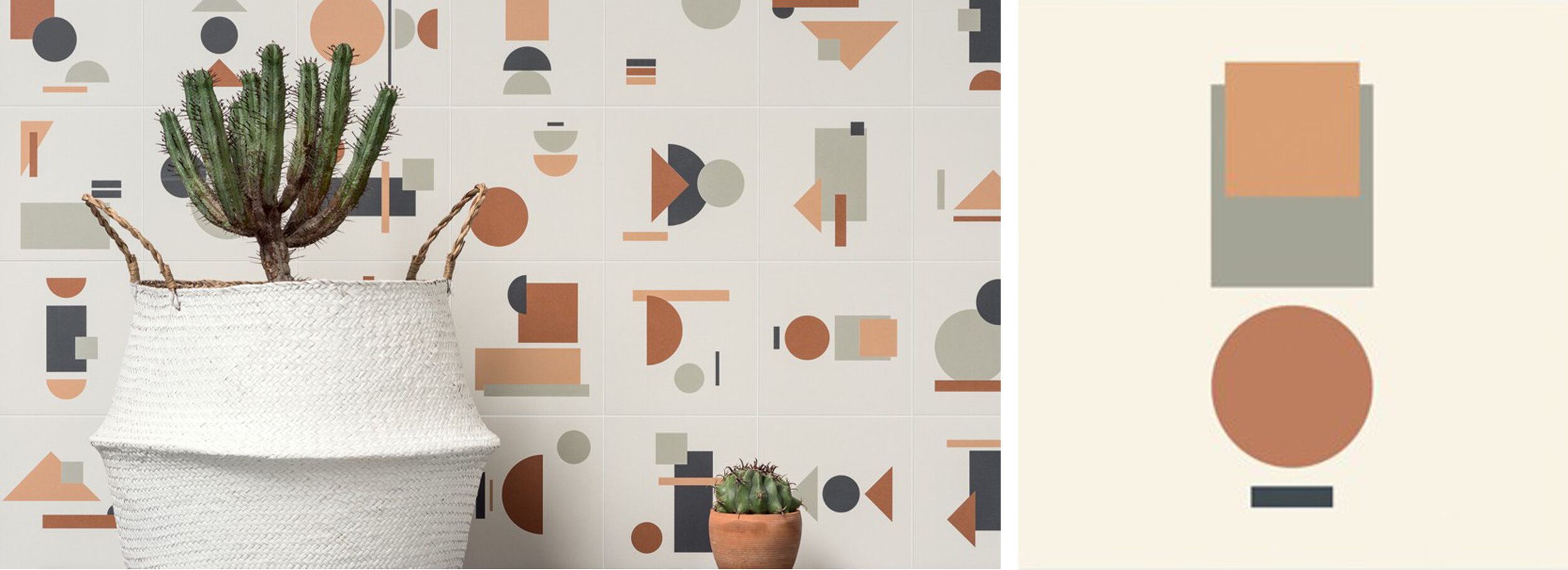
Trend Watch | Modern 80’s Furniture

@Laura Gonzalez
The 1980s are remember for many iconic cultural introductions. Legwarmers, scrunchies, high-waisted jeans - the list of 80s trends is long, and usually inspires a love or hate reaction. And as we keep an eye of emerging 2021 design trends, we can’t help but notice 80s-inspired interior design showing up more and more. Bright colors, geometric patterns, bold color-blocking - we’re seeing all this and more in new commercial design projects, and we’re loving the modern 80’s trend!
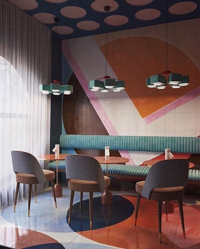
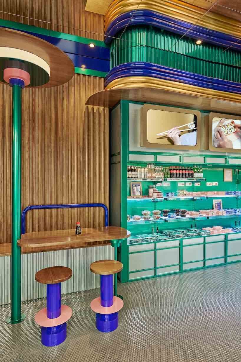
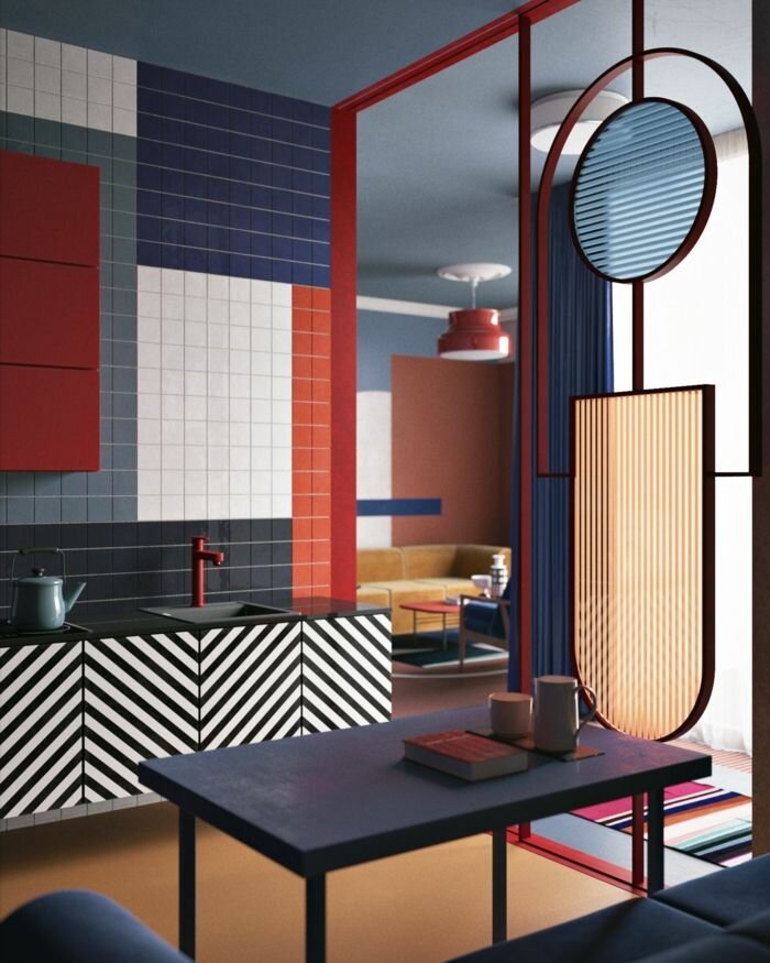
One place we’re seeing the modern influence of the 80’s is in furniture. There are a lot of amazing products reflecting this trend, and we love using these pieces to bring a bit of nostalgia and sophistication to any space. Take a look below to see some of our favorites!
Spring Colors in Tile

As the weather gets warmer and the days get longer, we find ourselves getting inspired by the new spring season! Although we love the cool and tones of winter, spring is full of bright colors and interesting textures can add new life into a design.
And one of our favorite ways to do this is through tile - it’s variety and versatility make it a great material for introducing new colors and patterns. Take a look below at some of the spring-colored tiles that are inspiring us right now!


We love the different color color combinations you can make with the Technicolor line from Specialty Tile


The Focus line from Trinity Tile is a great mix of bright, energetic colors and bold geometry

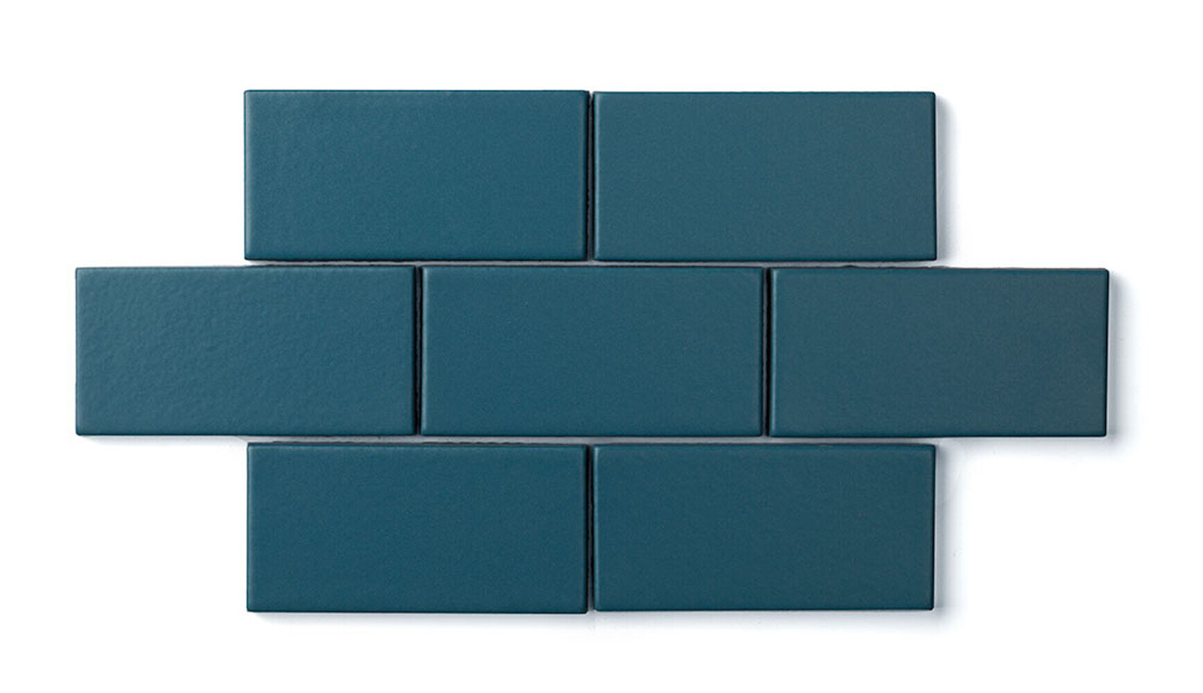
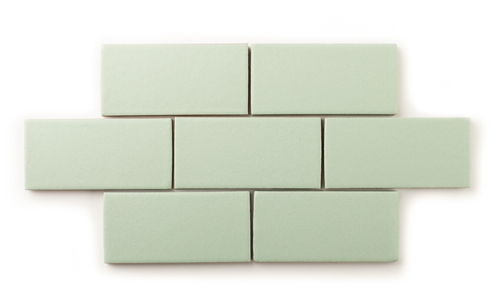
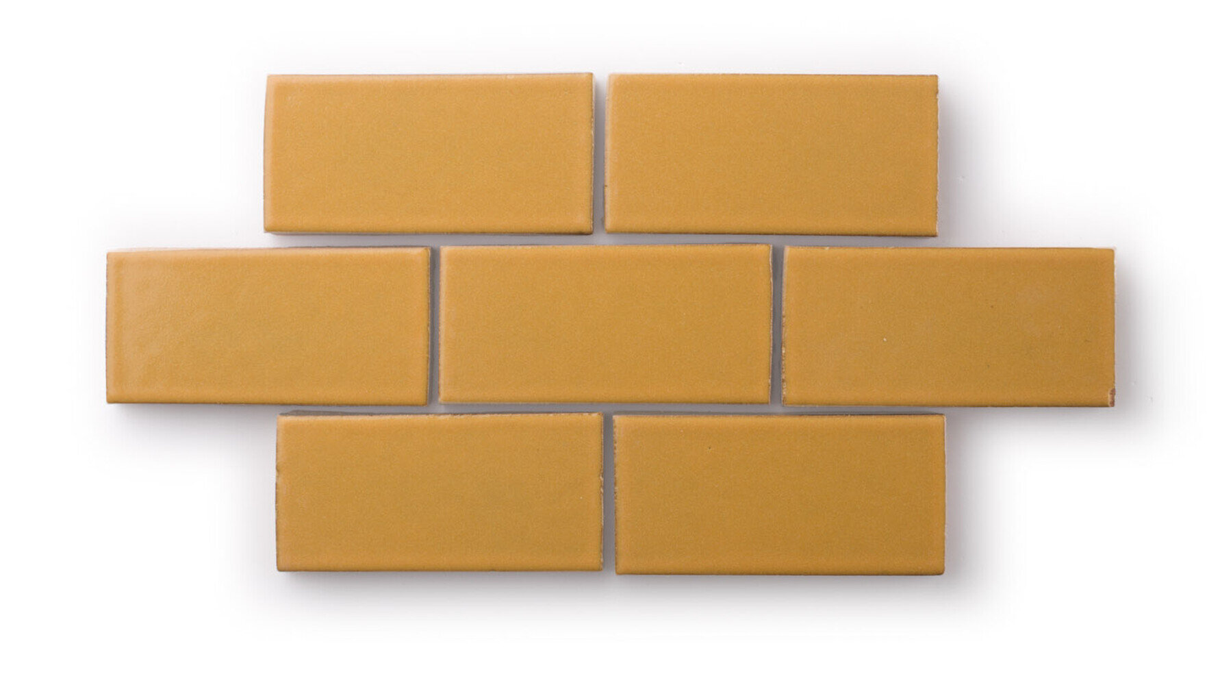
Fireclay Tile offers an amazing variety of tile shapes and hues as part of their Colors line - we love this install of spring-inspired colors!
What spring colors are inspiring you right now?
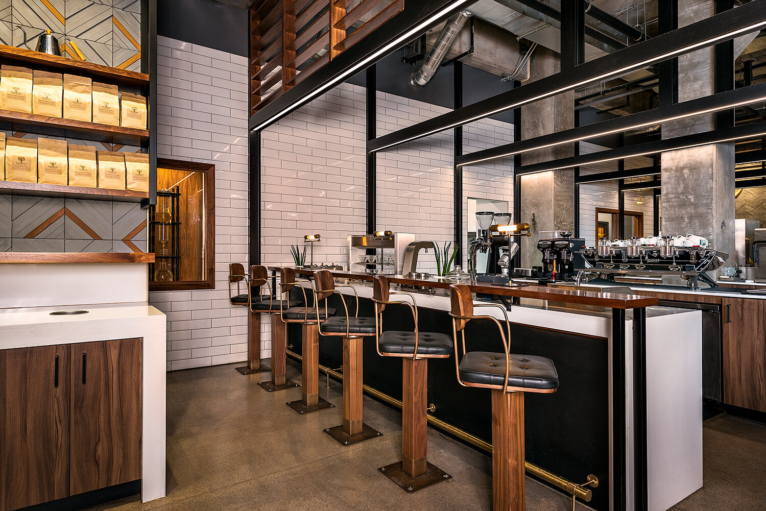
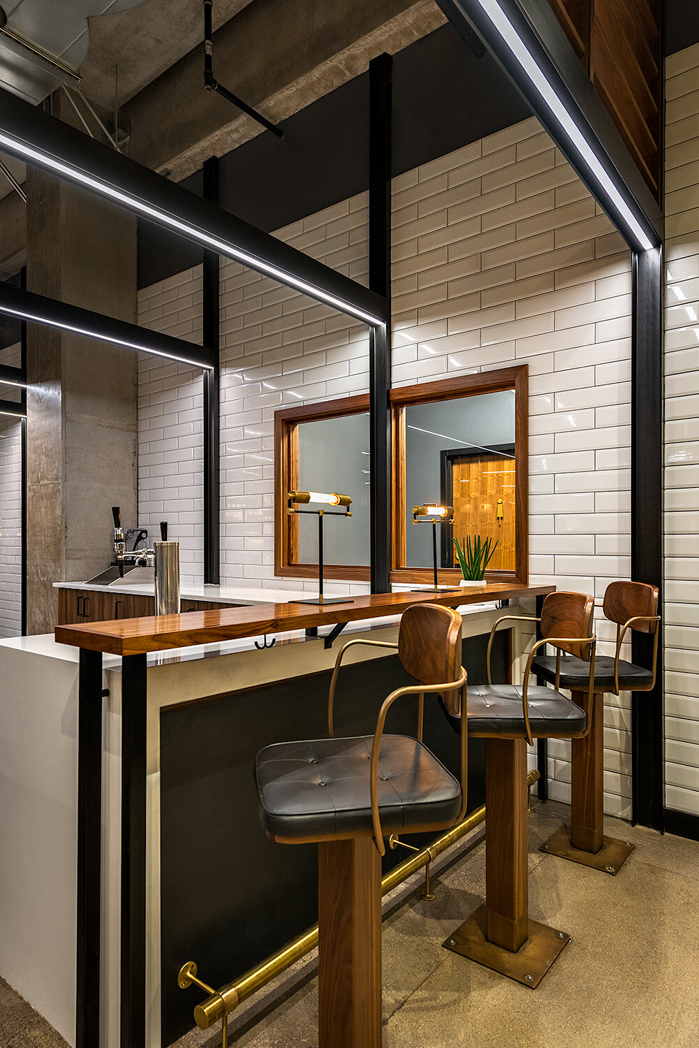
LAB | Custom Furniture

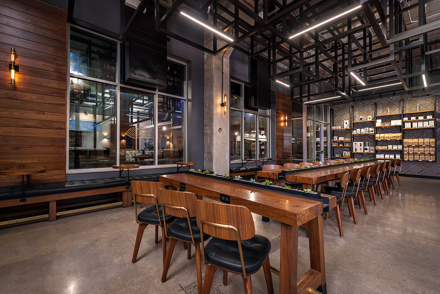
Sparrow Coffee | design by blocHaus
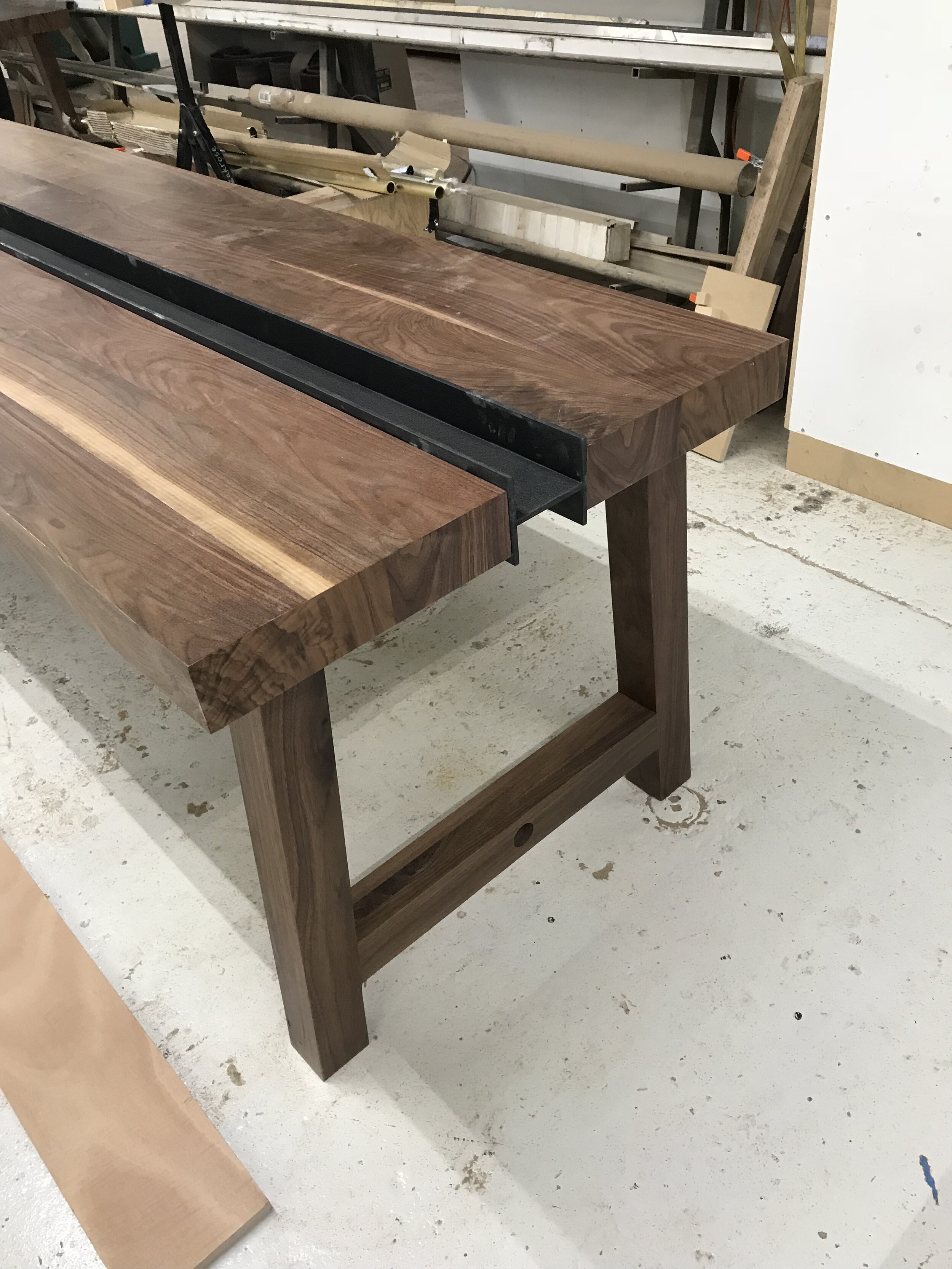
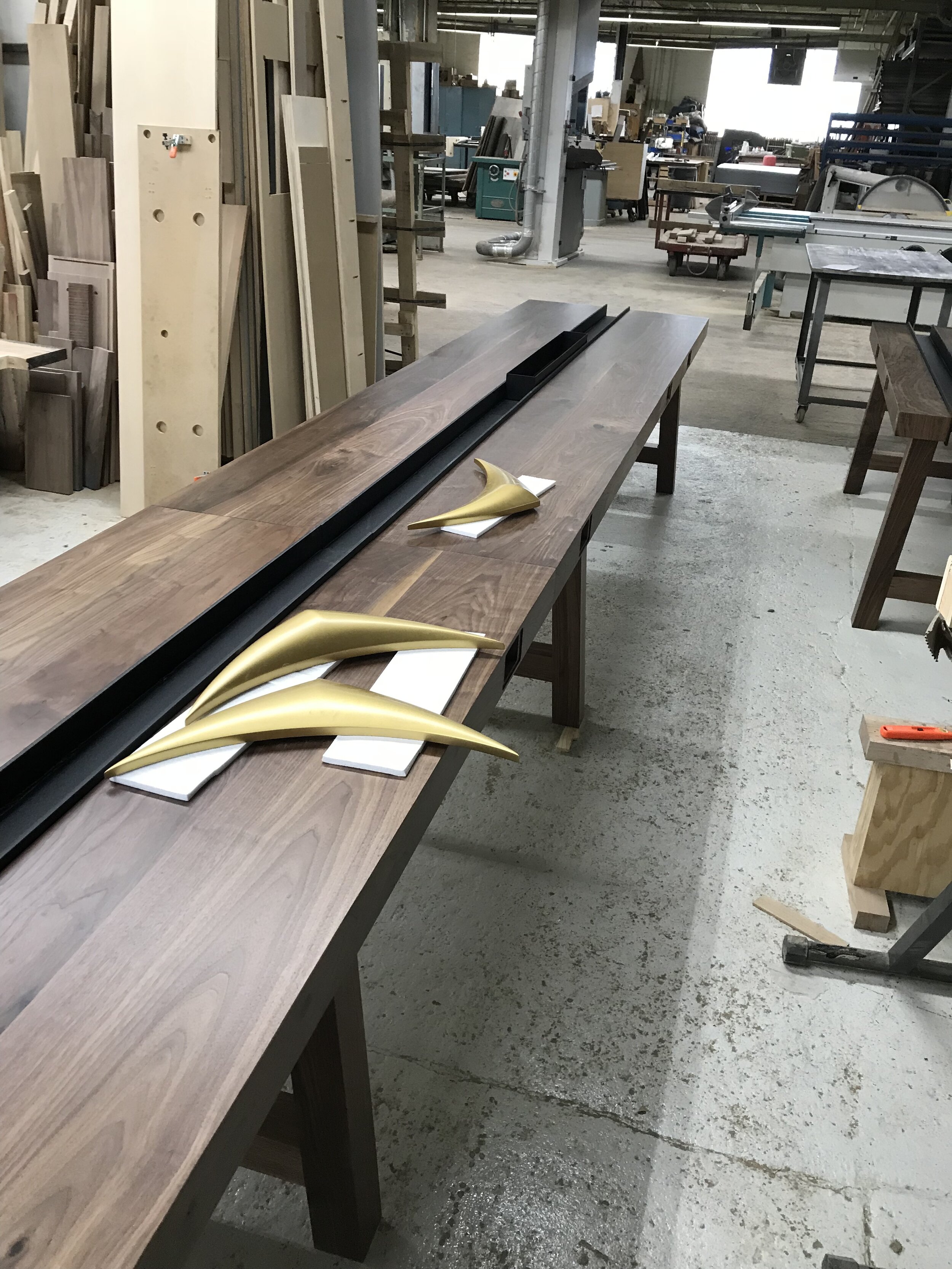
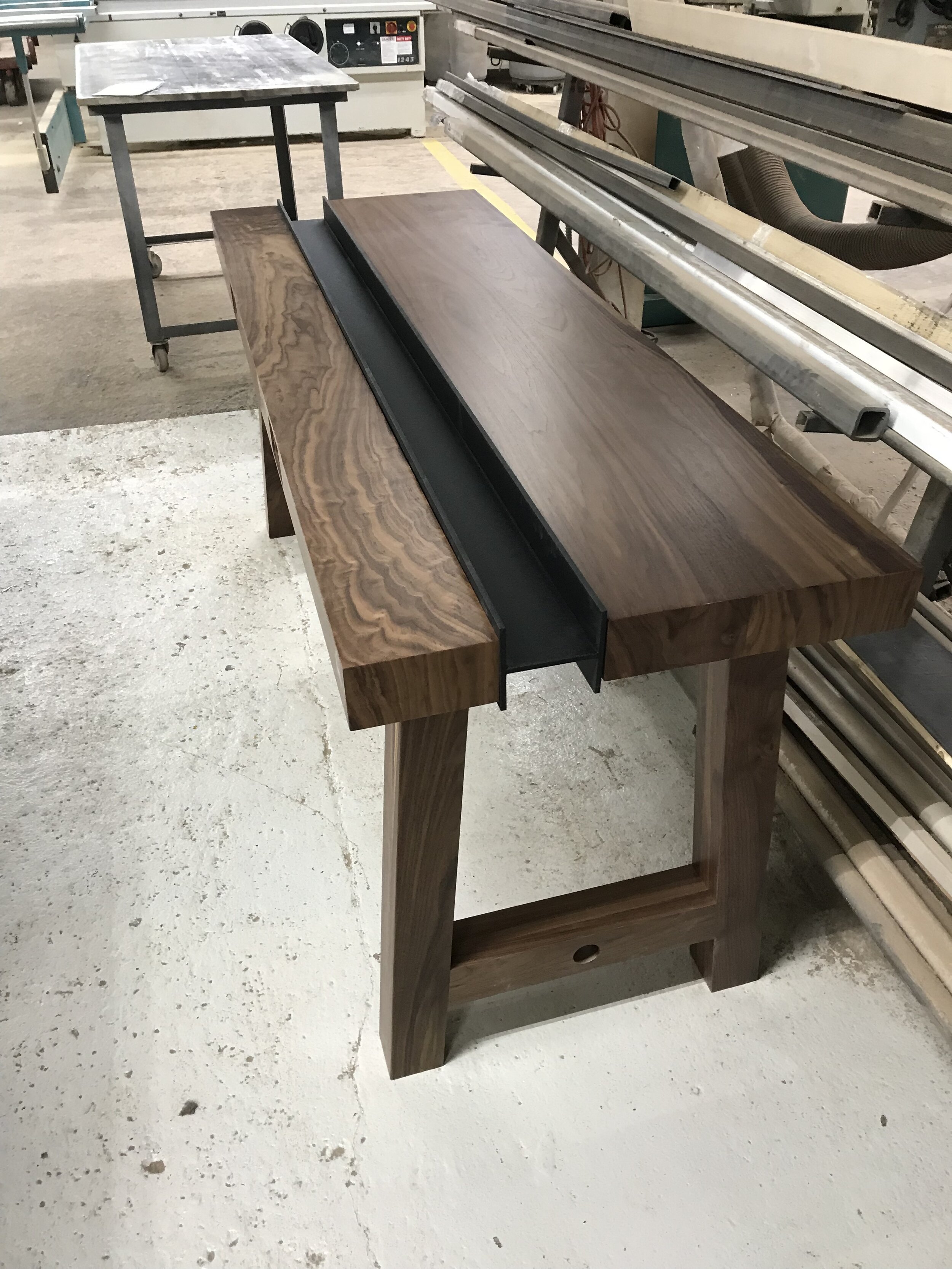
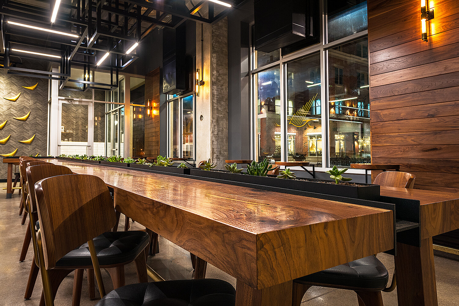
It may sound obvious, but we love working with clients to find the best solutions for their project! Sourcing materials, furnishings, and fixtures can be a challenge for unique spaces, but finding the right option is what makes these spaces both beautiful and functional to meet our clients’ needs. But sometimes, there are challenges that don’t have a ready-made solution for us to provide. At blocHaus Lab, we see that as an opportunity to create bespoke solutions that are tailored perfectly to the task at hand! We often do this through custom furniture pieces, either by modifying an existing product or by designing an original piece to meet the client’s needs.
At our Sparrow Coffee project in Naperville, we did both! blocHaus worked with a furniture manufacturer to modify an existing bar stool design, and we partnered with a local millworker to produce fully-custom communal tables. See below for an insider look at the process behind these custom furniture items!
CUSTOM STOOLS

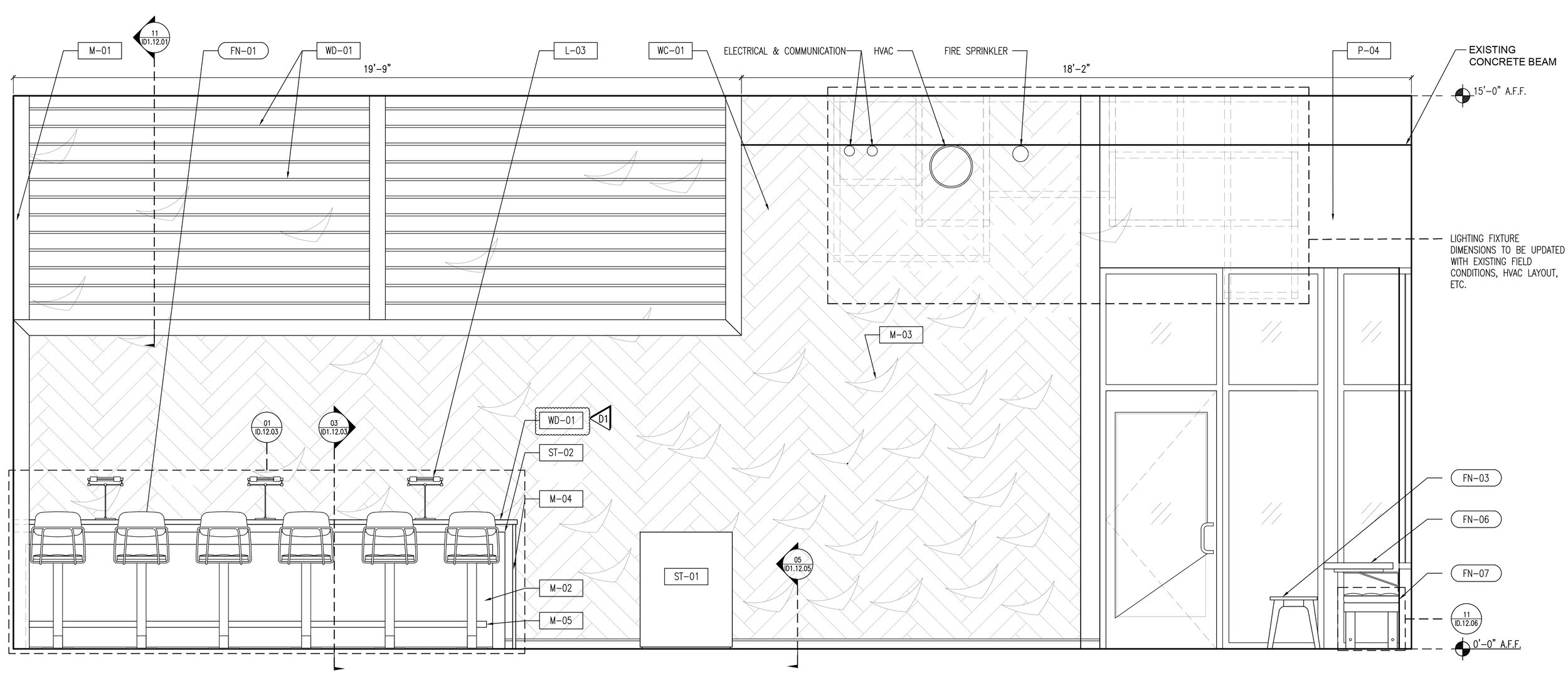
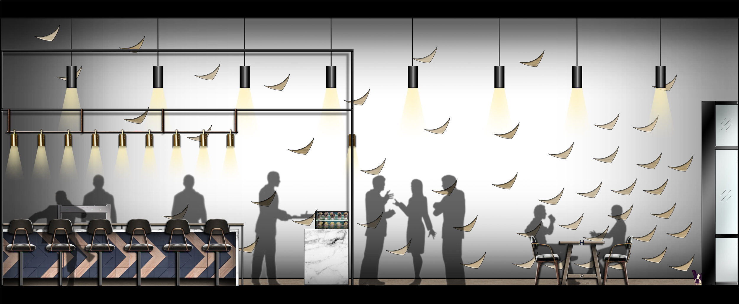
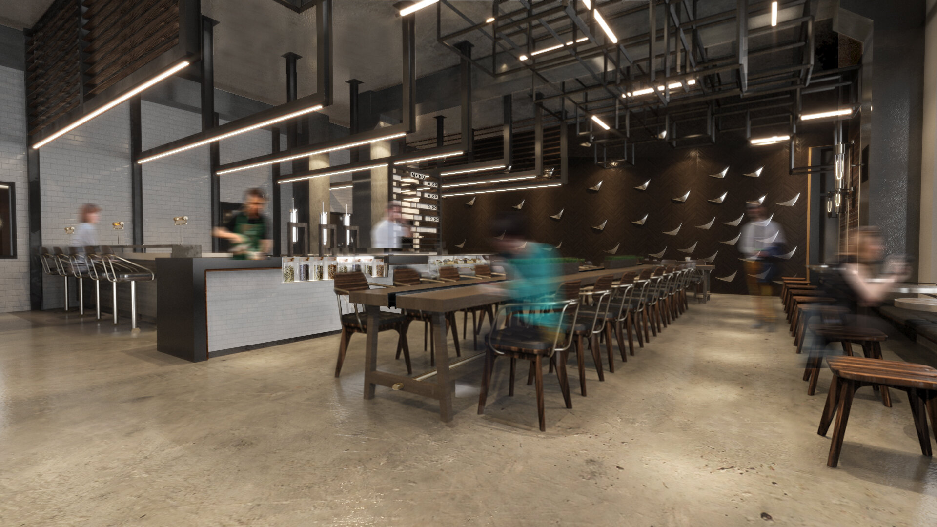
CUSTOM TABLES

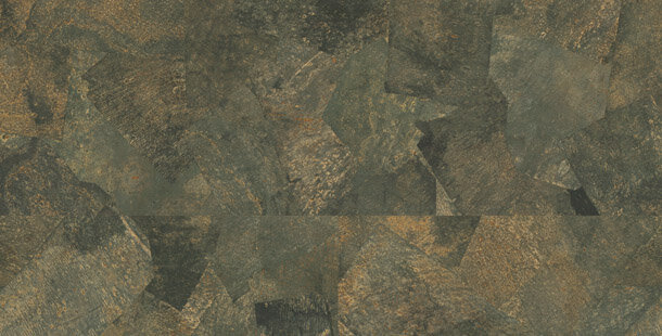
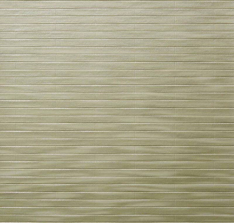
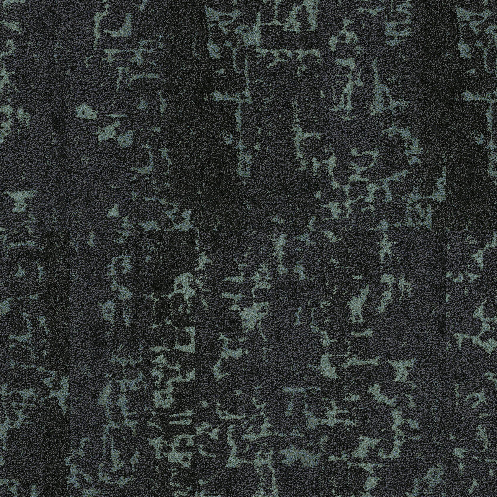
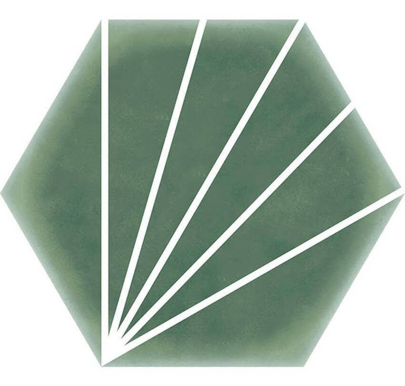
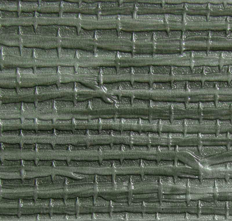
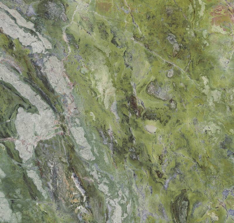
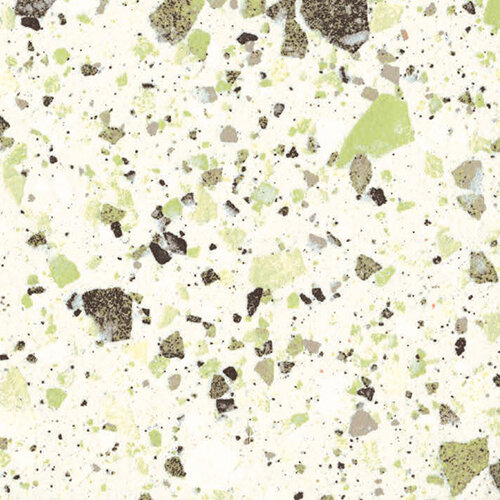
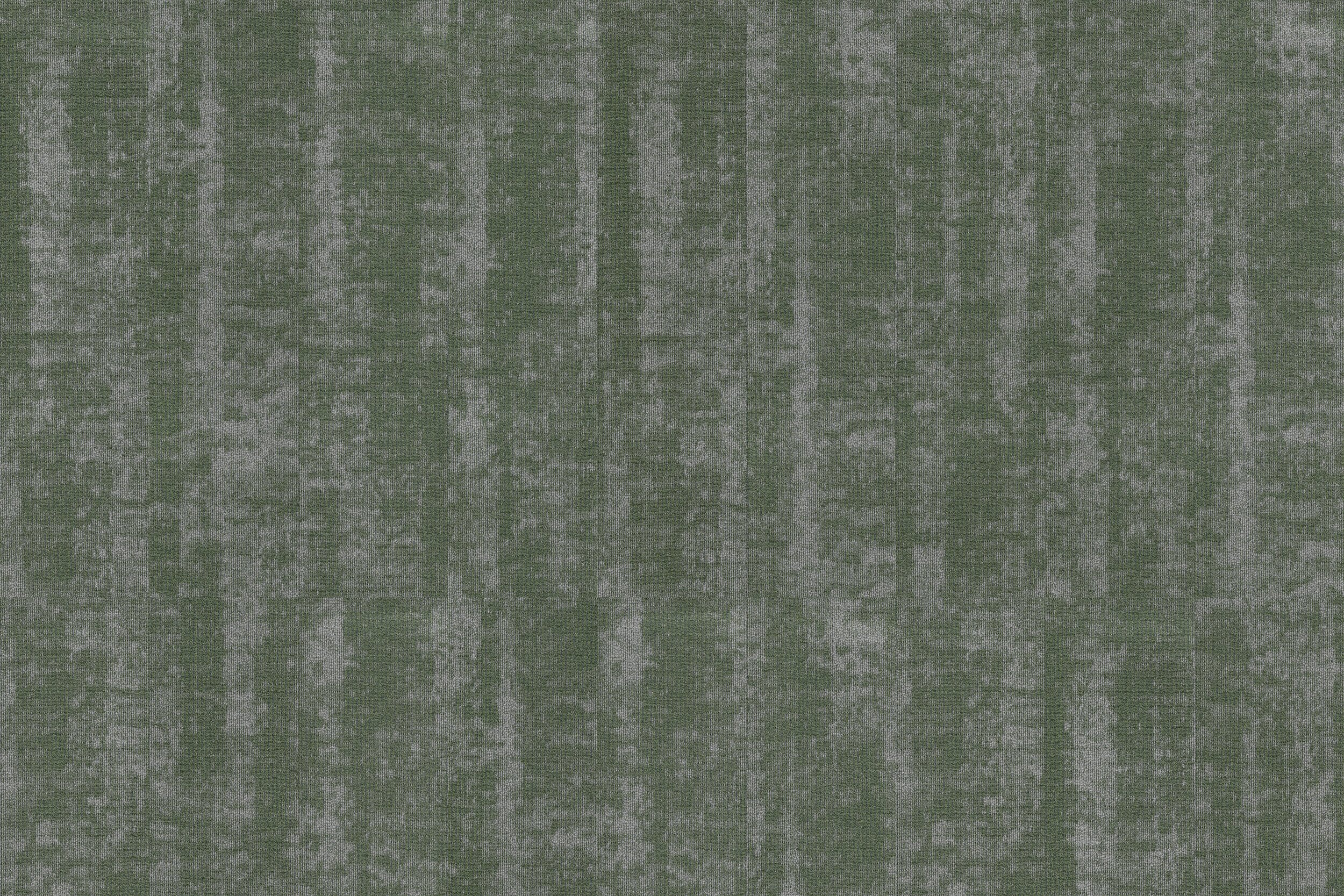
Best of Nature-Inspired Greens

As we push through the cold and snow of a Chicago winter, we find ourselves continually looking forward to the promise of spring. Growing grass, leaves budding on trees, flowers blooming - spring has no shortage of natural beauty! And even though we know that the sunlight and warmth of spring is still weeks away, we can’t help but be drawn to nature-inspired colors.
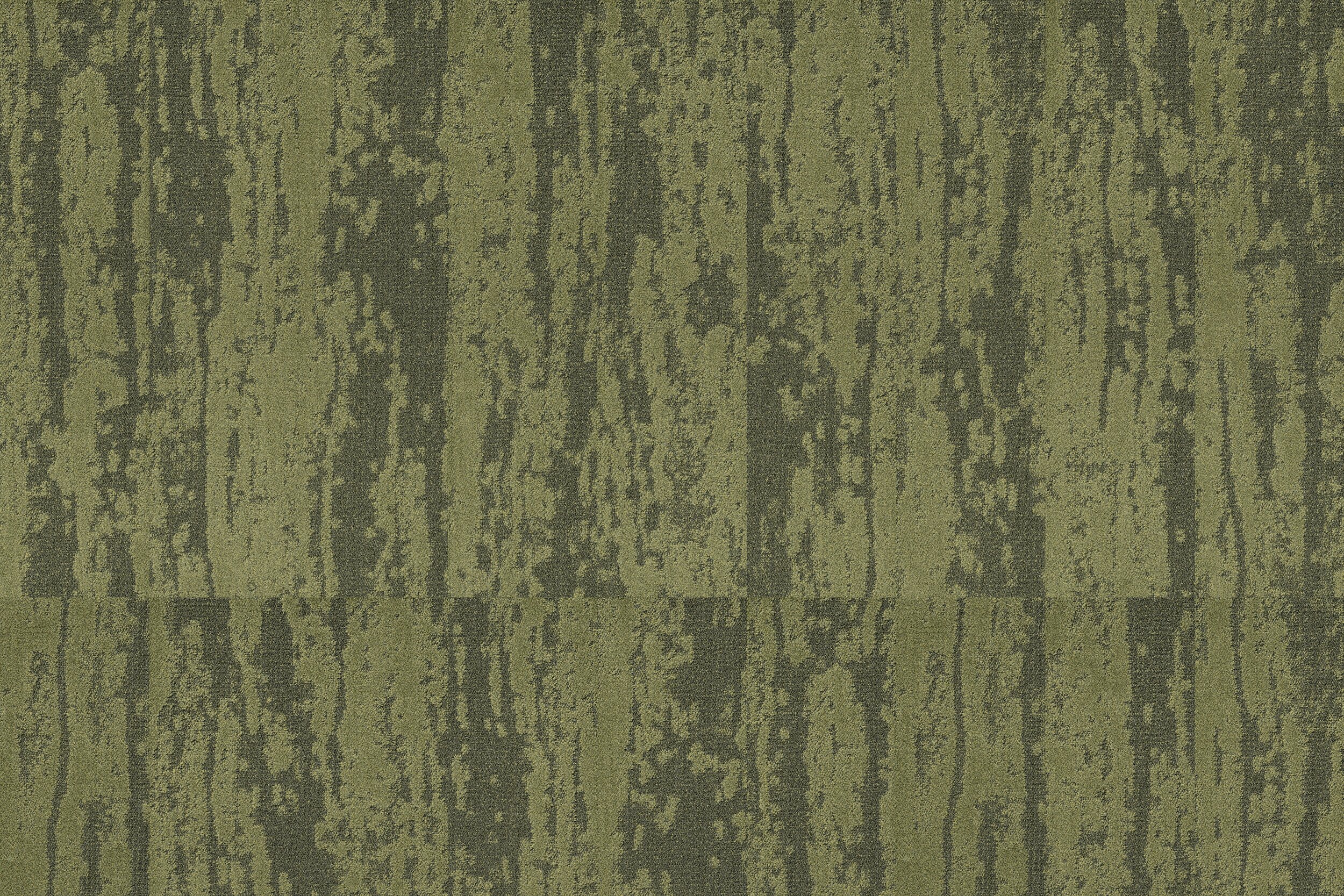
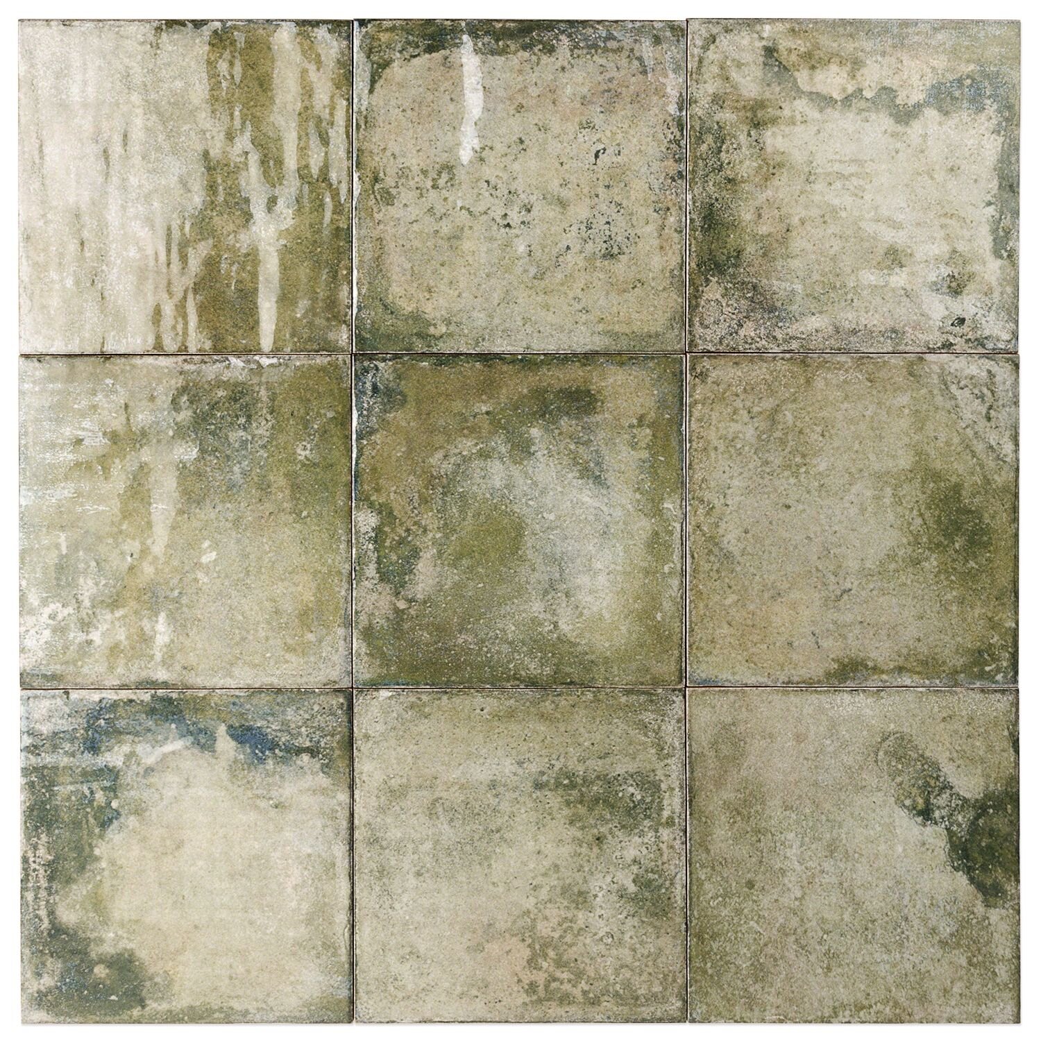
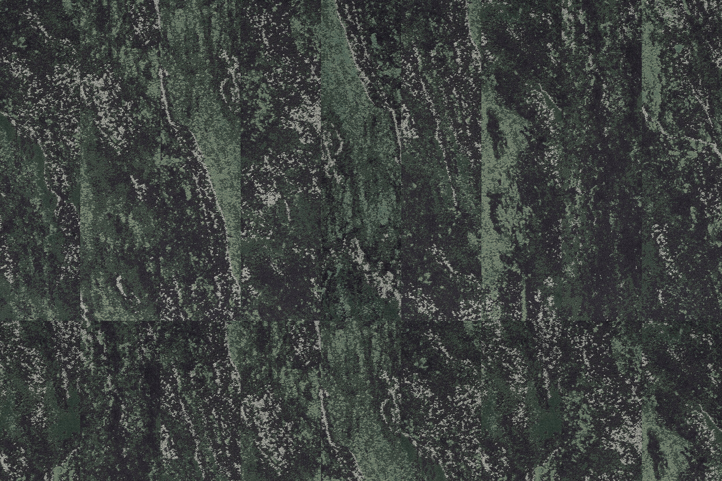
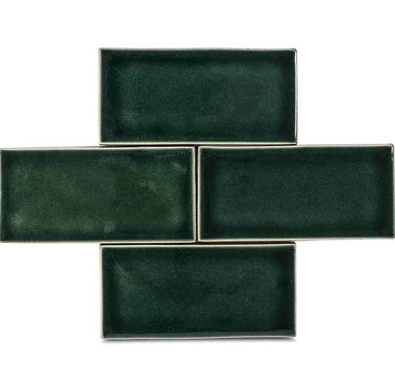
Of course, green is one of the most prominent colors of nature, signifying life and new growth. We’re looking forward to seeing it outside again once this winter is over. But in the meantime, we’ve assembled a collection of our favorite nature-inspired greens - take a look below to see the colors and products inspiring us right now!
MOSS

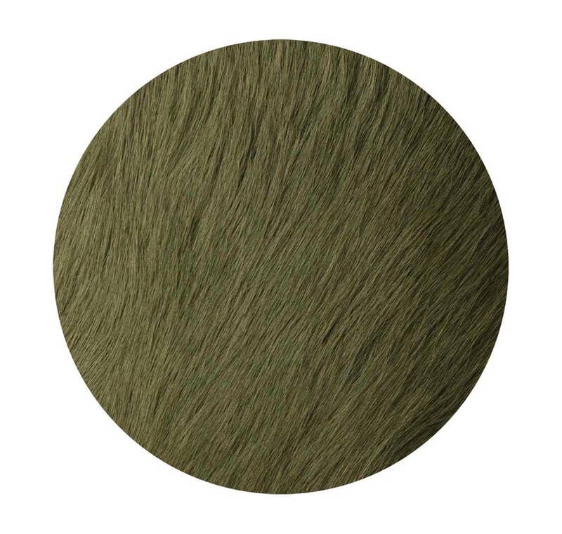
FOREST

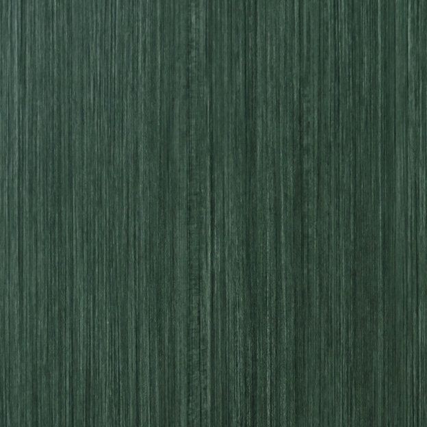
SEA GRASS

EUCALYPTUS

LEAVES

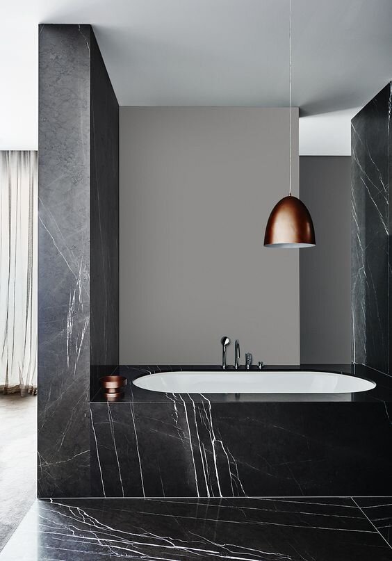
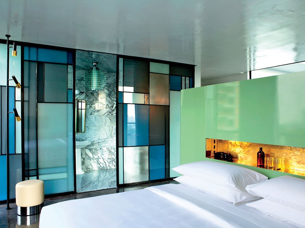
Luxury Minimalism in Hotels

Minimalism can be found in every type of design. Whether it’s residential, corporate, retail, hospitality, or even healthcare, minimalist design concepts can produce beautiful, timeless, and elegant results.
One word that doesn’t usually come to mind when thinking about minimal design is luxury; in fact, it’s easy to think that these concepts would be at odds with one another. But that doesn’t have to be the case! Fusing luxurious elements with minimalist design creates unique juxtapositions - simple and opulent, stark and soft, brutalist and glamorous.
Luxury minimalism has a classic and timeless appeal, and can be a wonderful look for hospitality spaces - hotels in particular. We’re constantly inspired by this aesthetic and love how much variety it offers! Take a look below at some of our favorite luxury minimalist design ideas for hotels!
LOBBY, LOUNGE, & RECEPTION
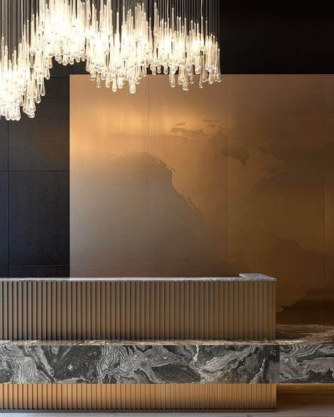
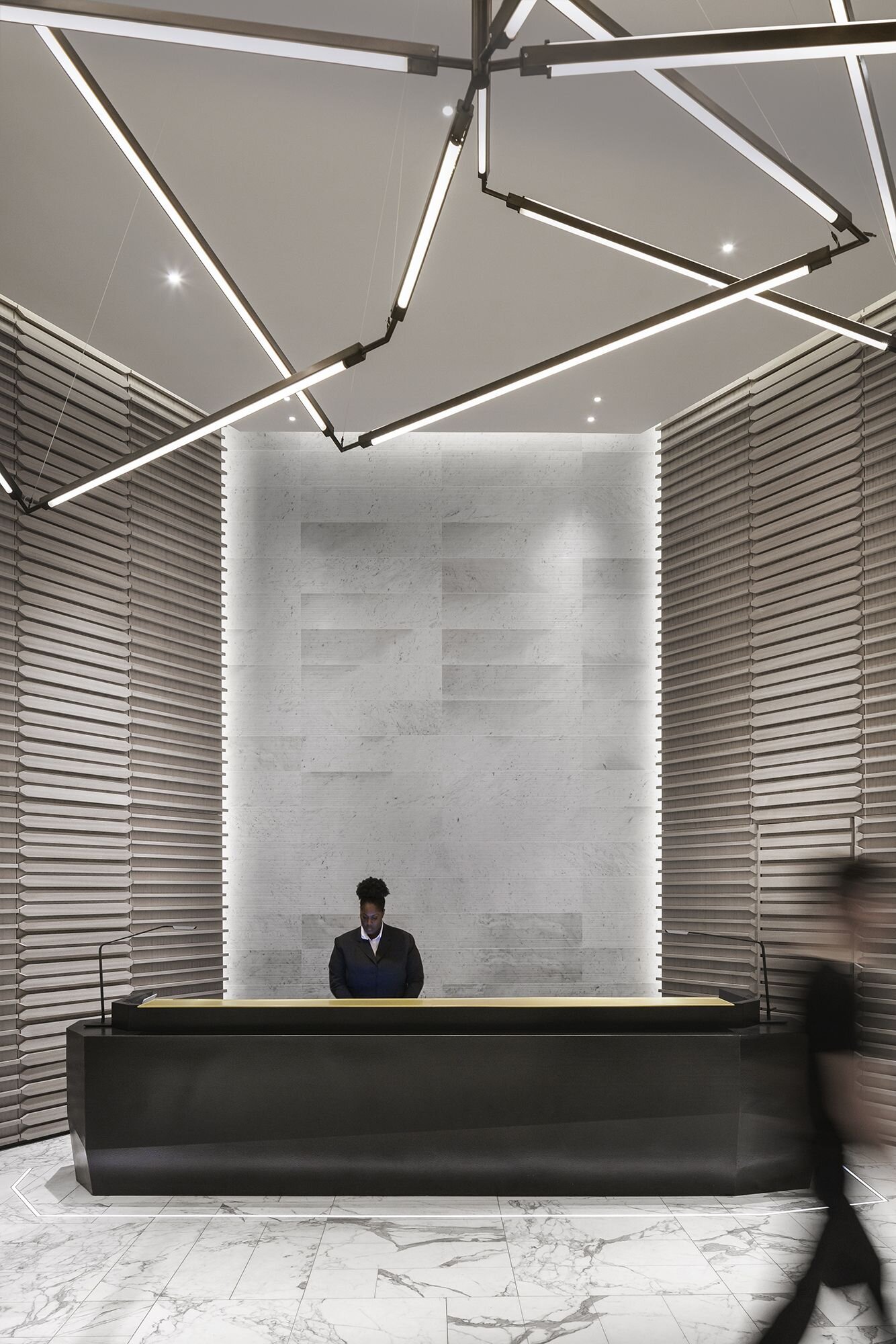
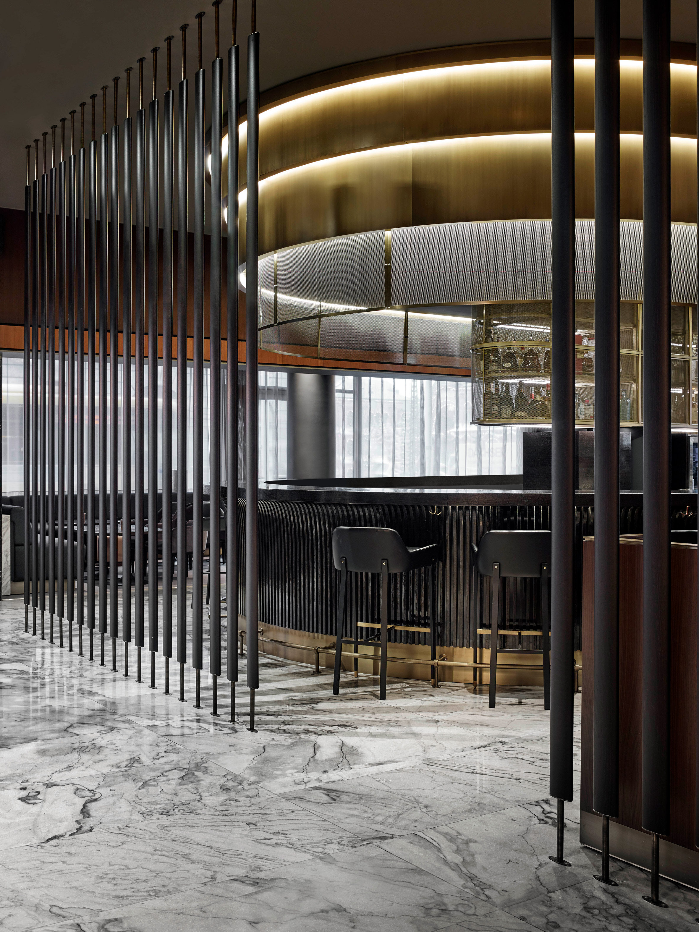

@Mechanismo
GUEST ROOMS
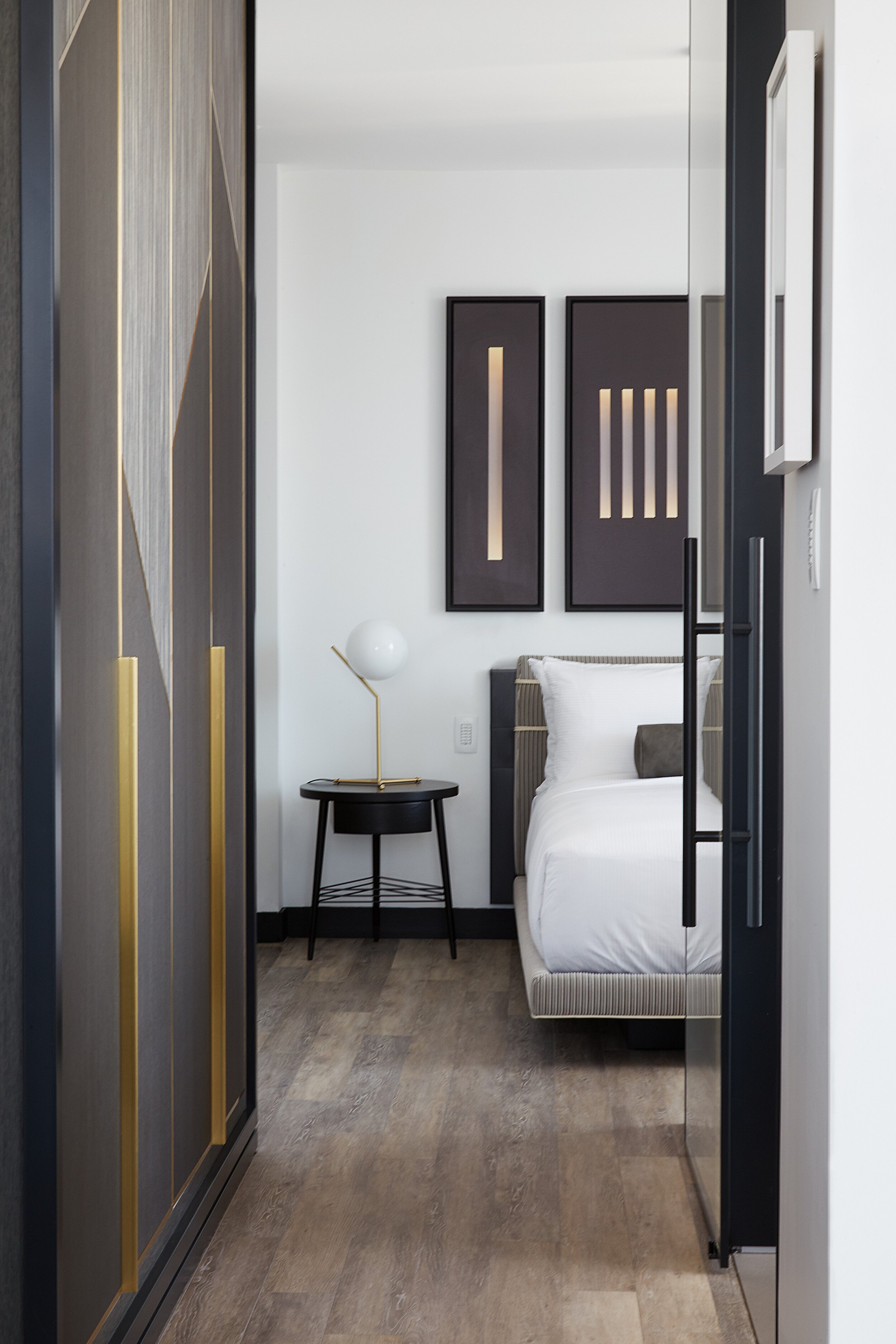
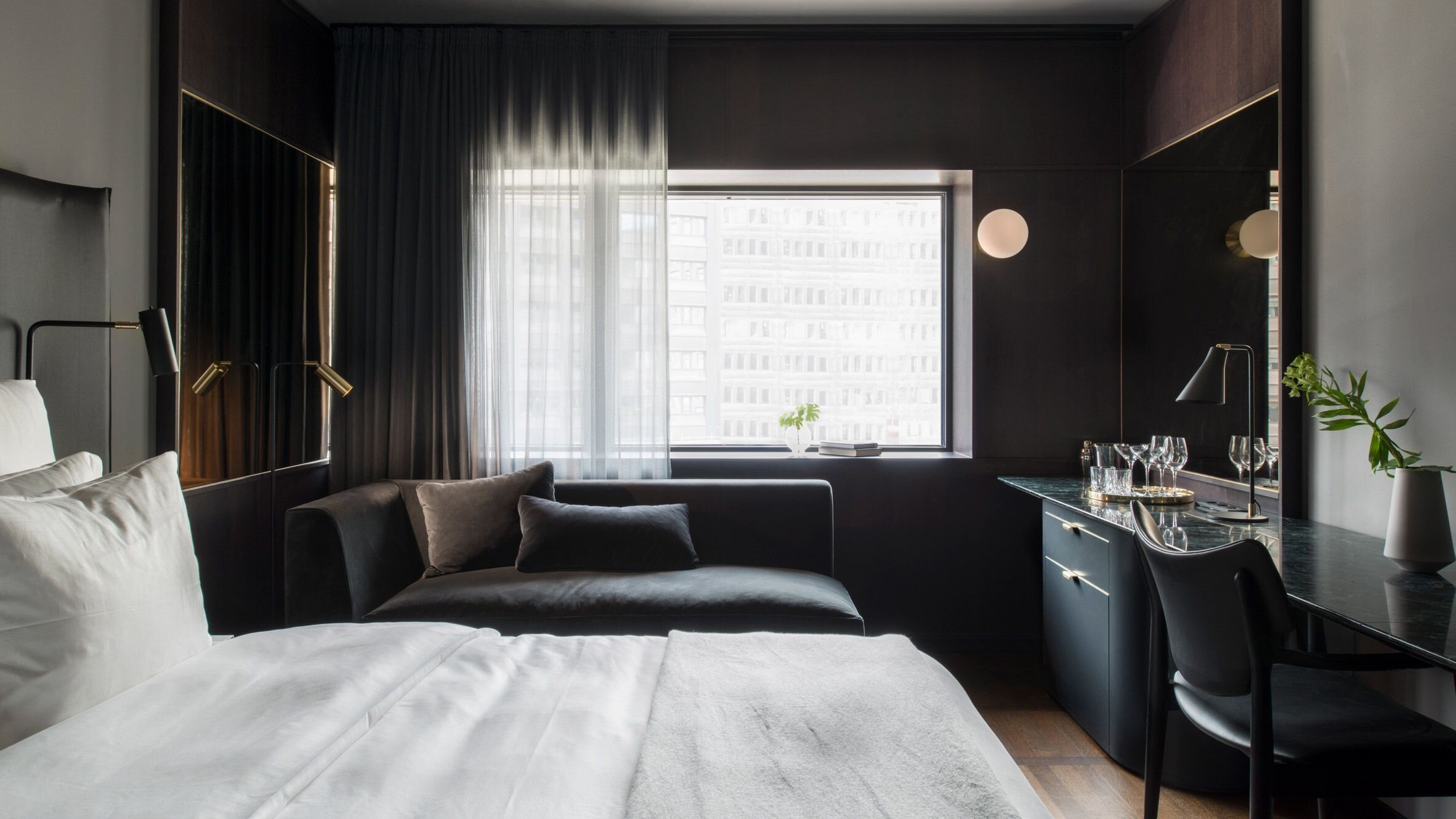
@Universal Design Studio
ELEVATORS & CORRIDORS
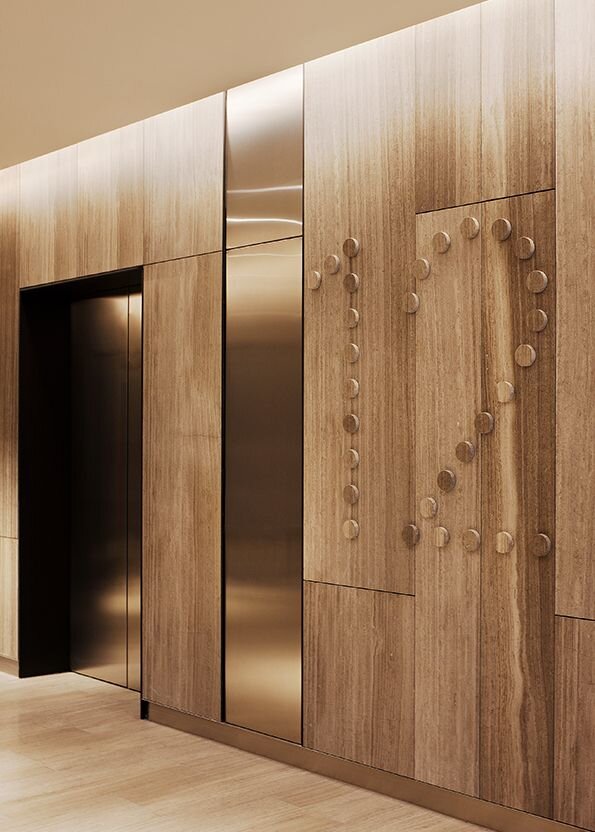
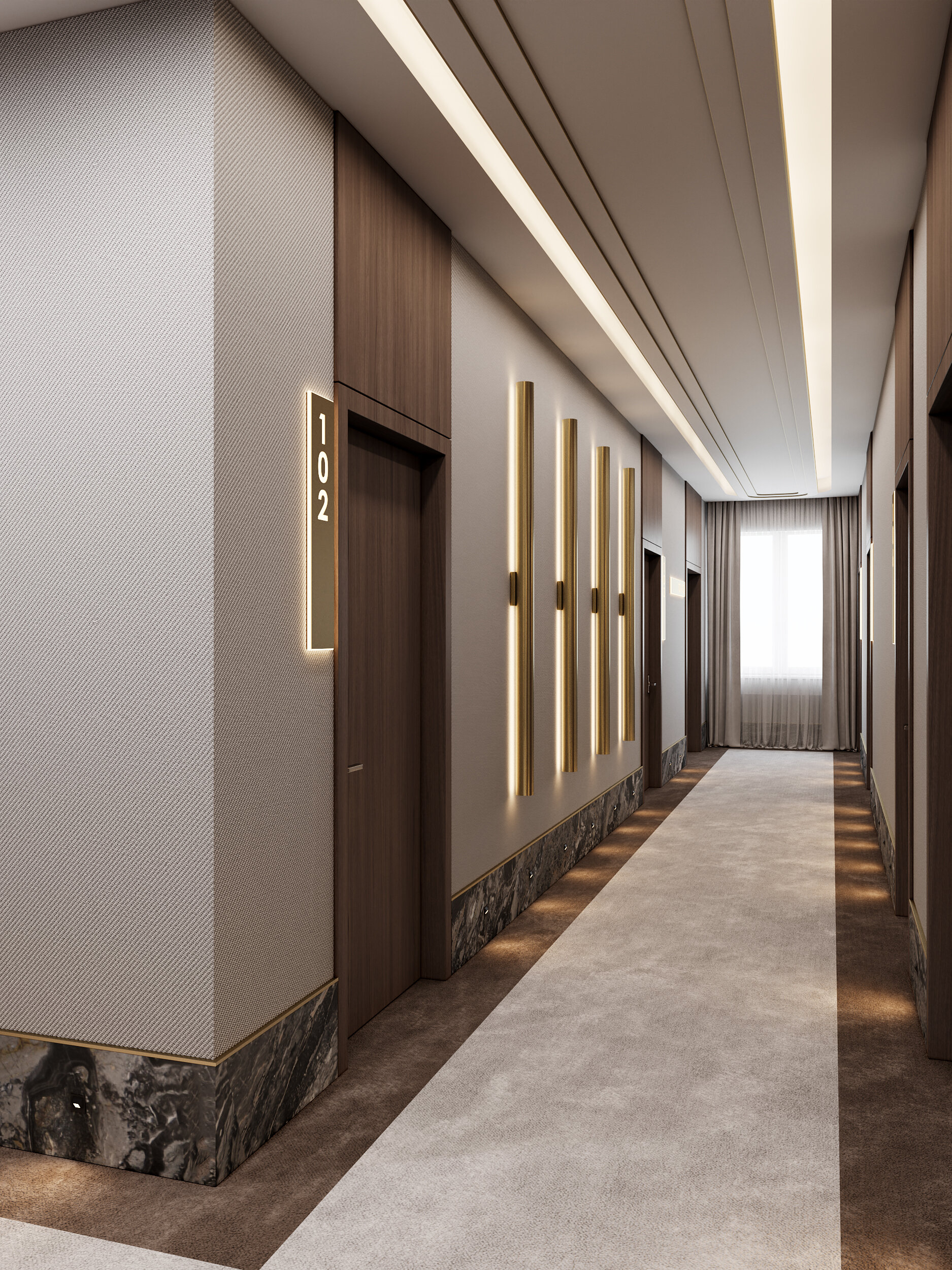
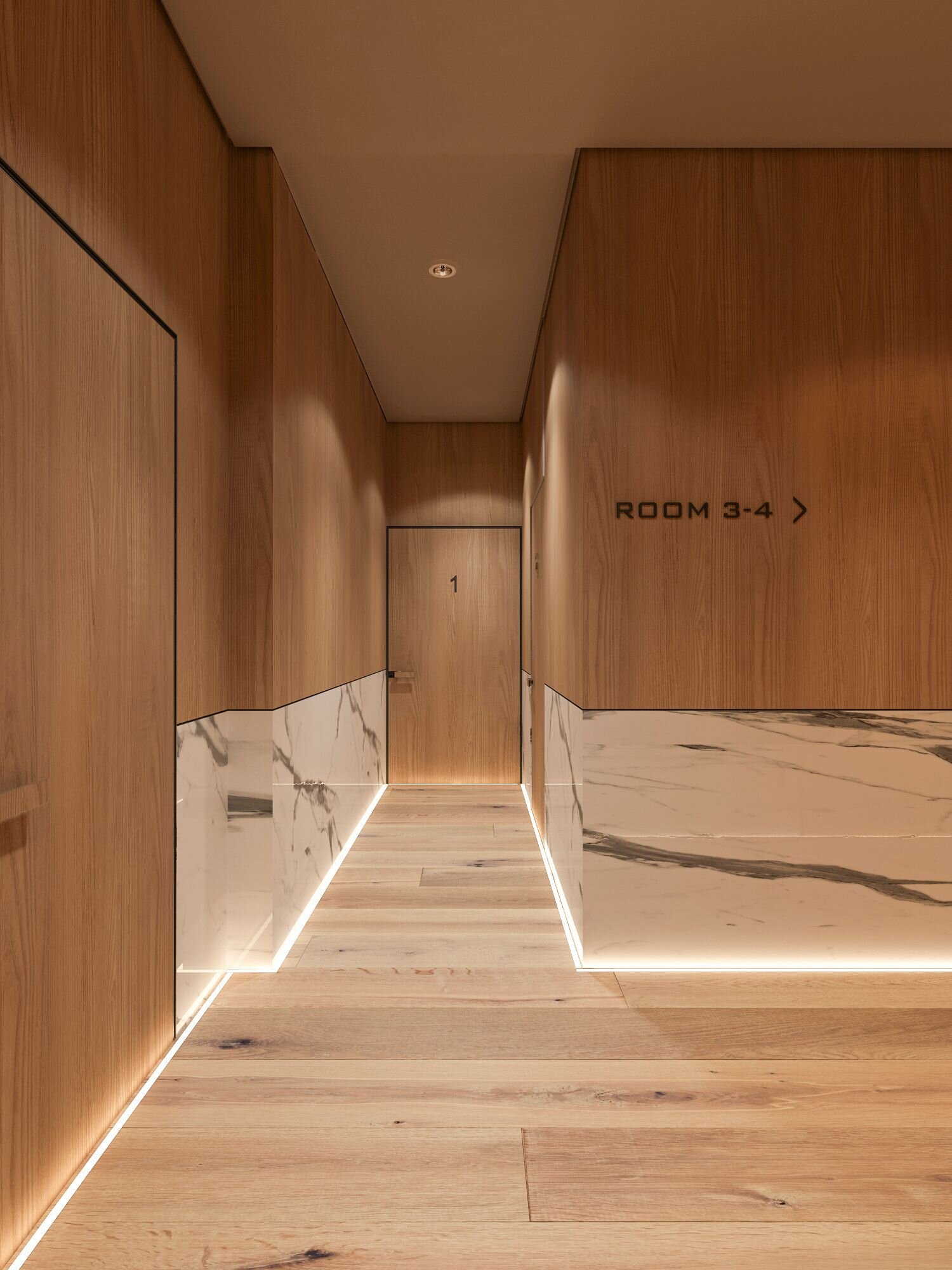
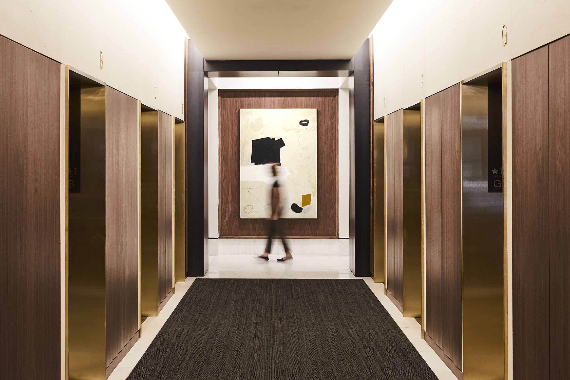
@Atelier Cho Thompson
What are your favorite ways to blend luxury and minimalism?
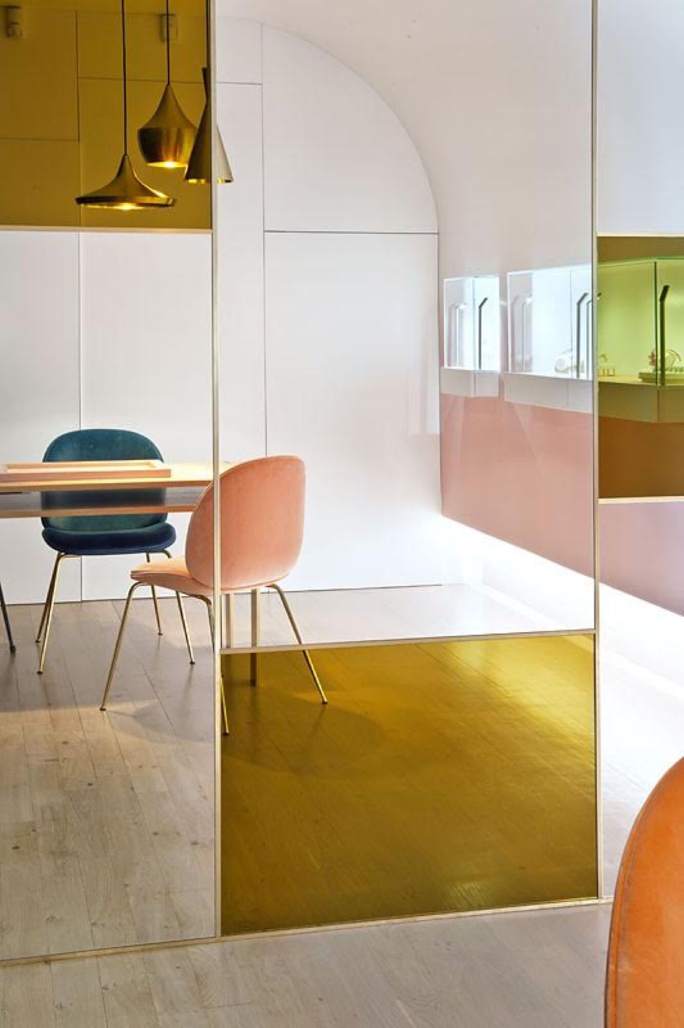
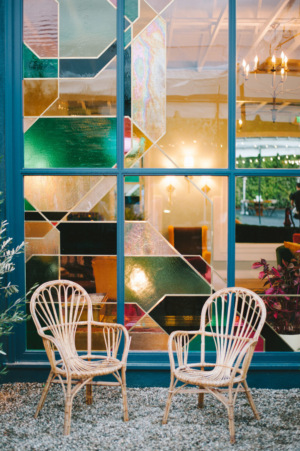
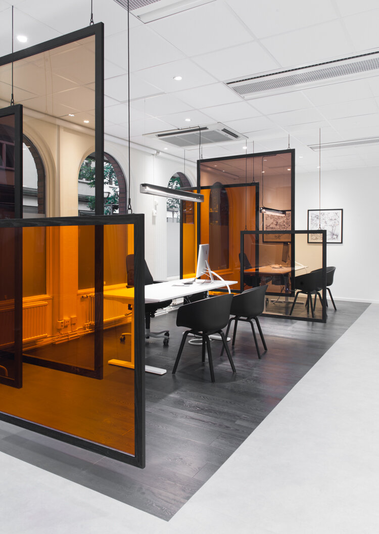
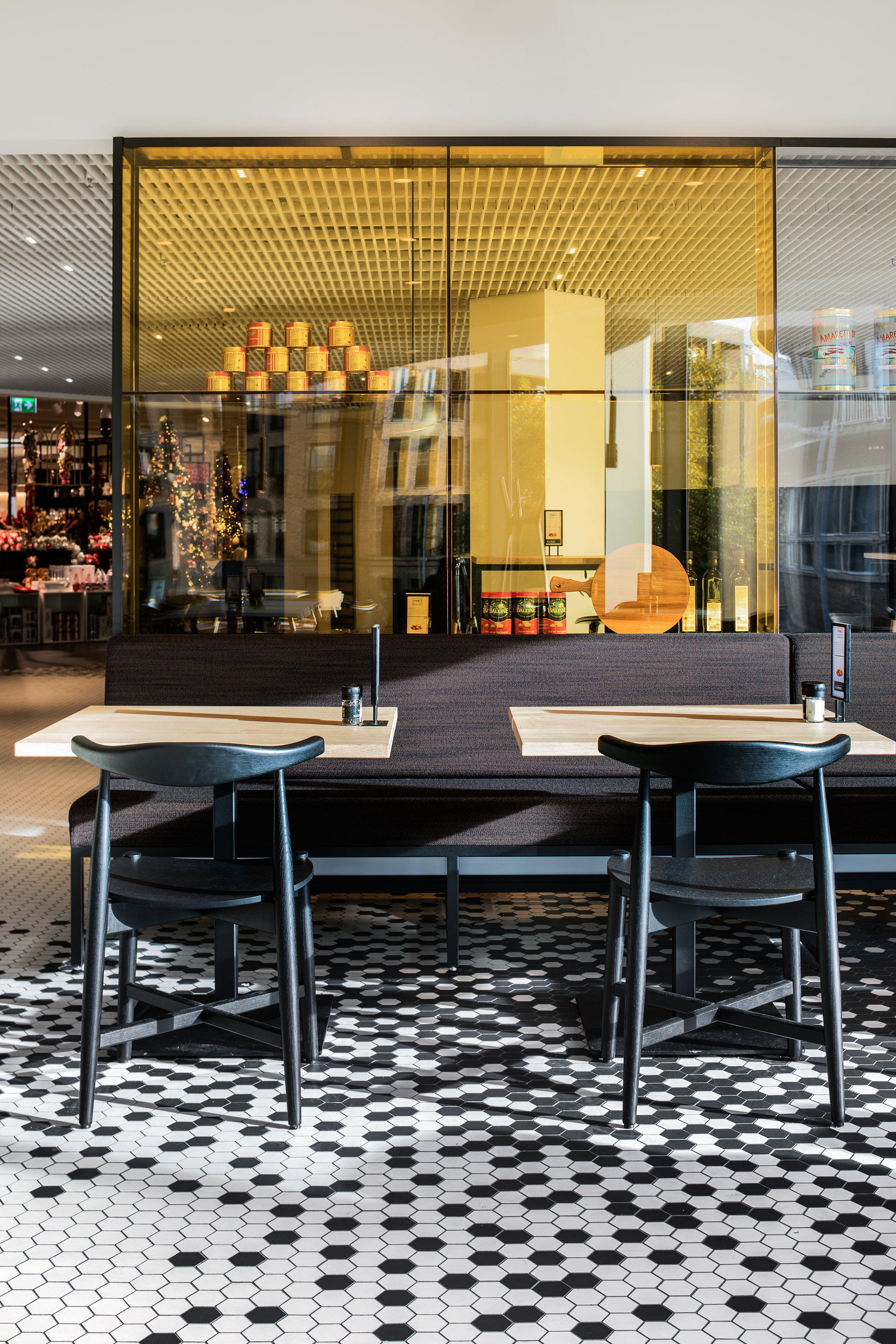
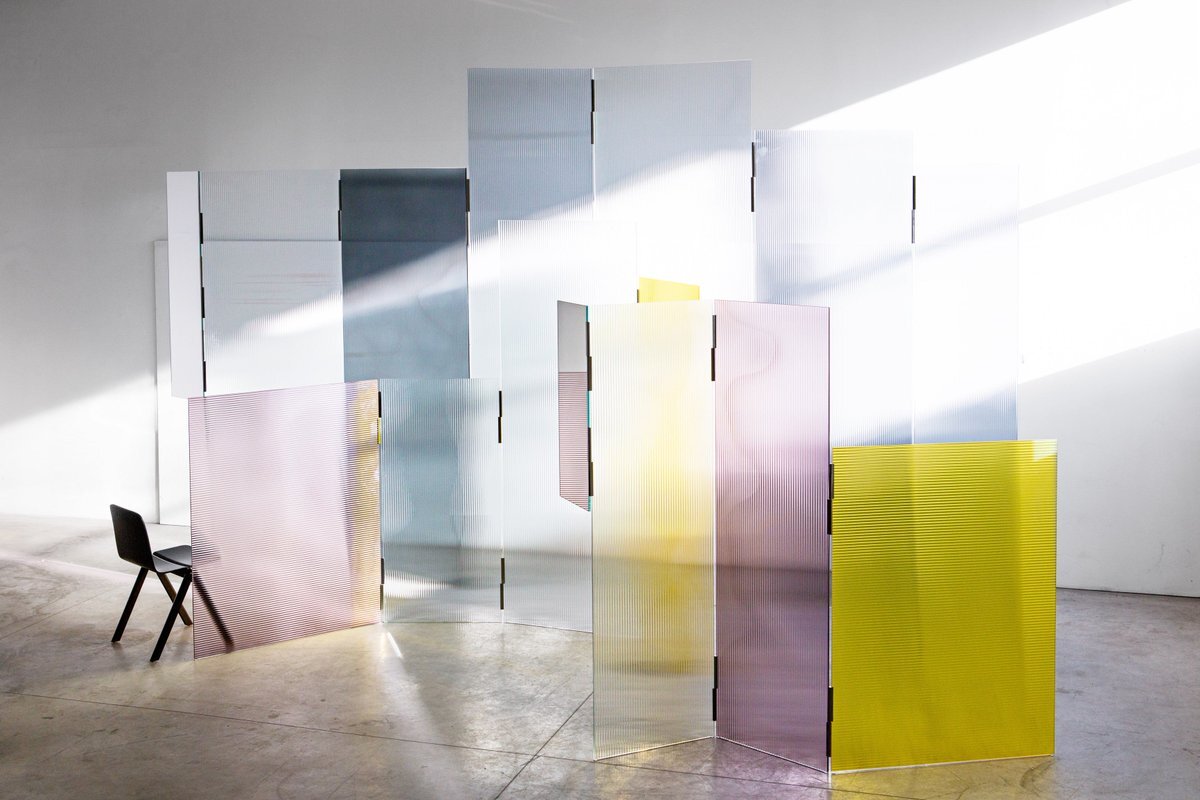
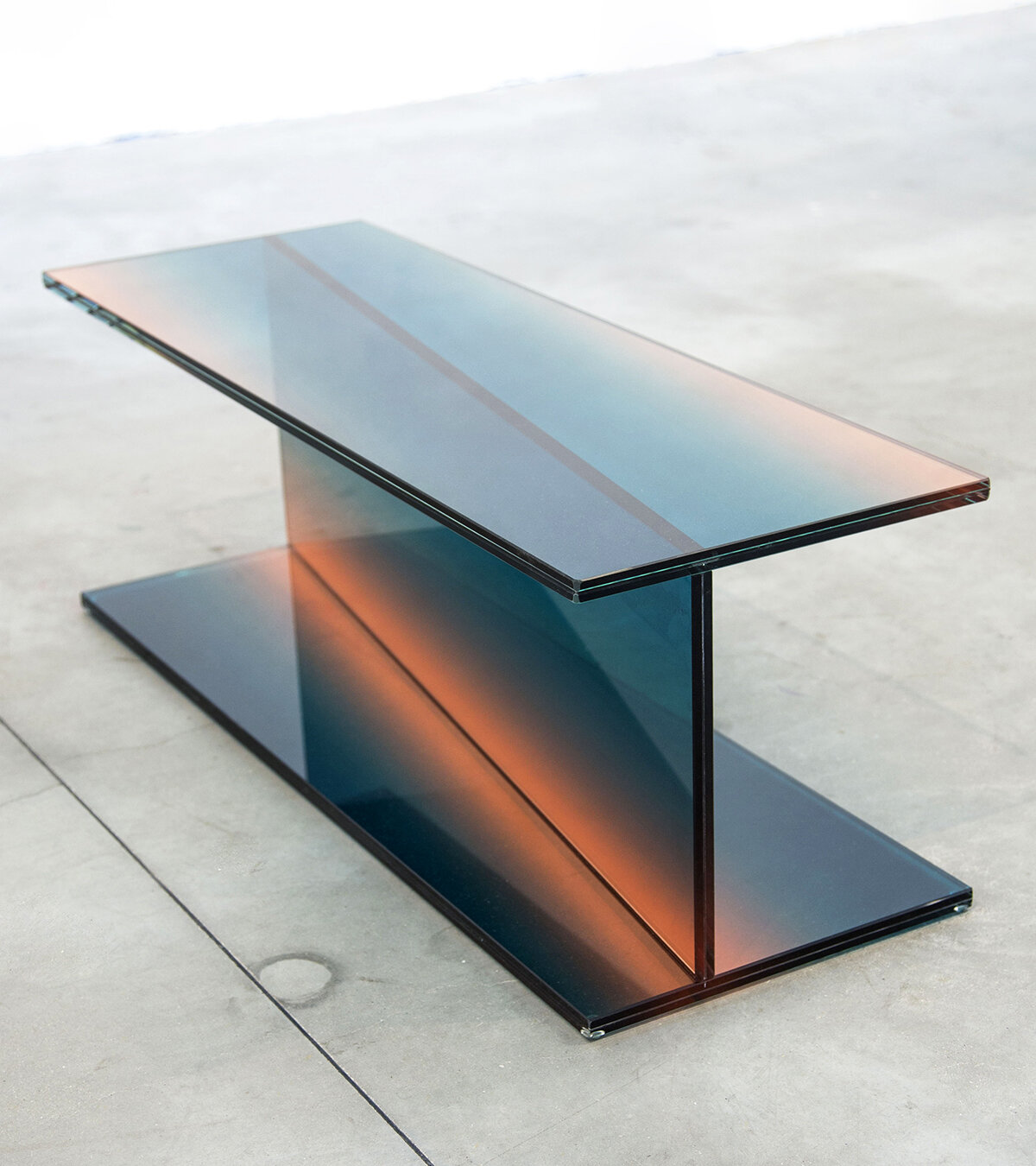
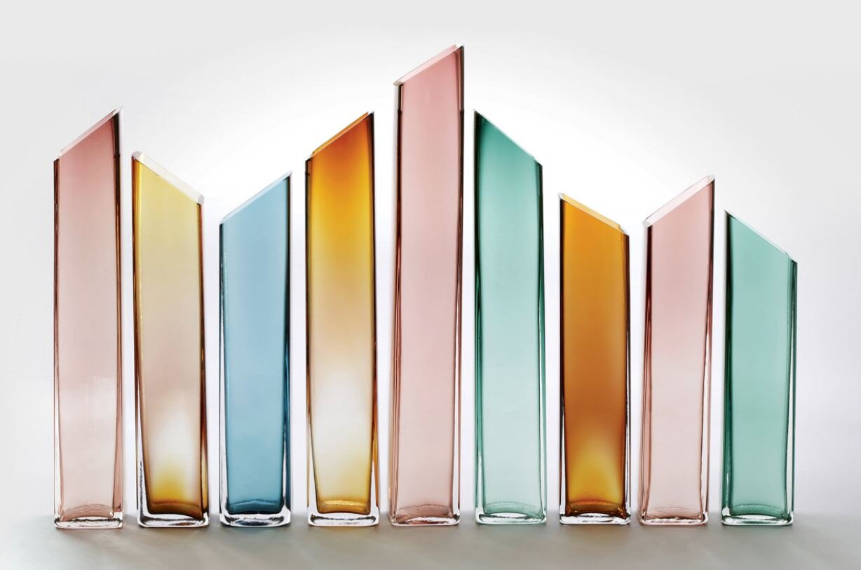
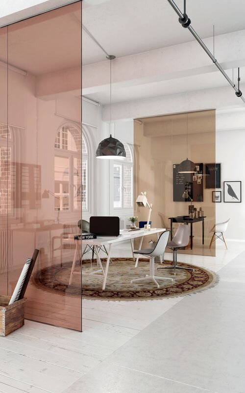
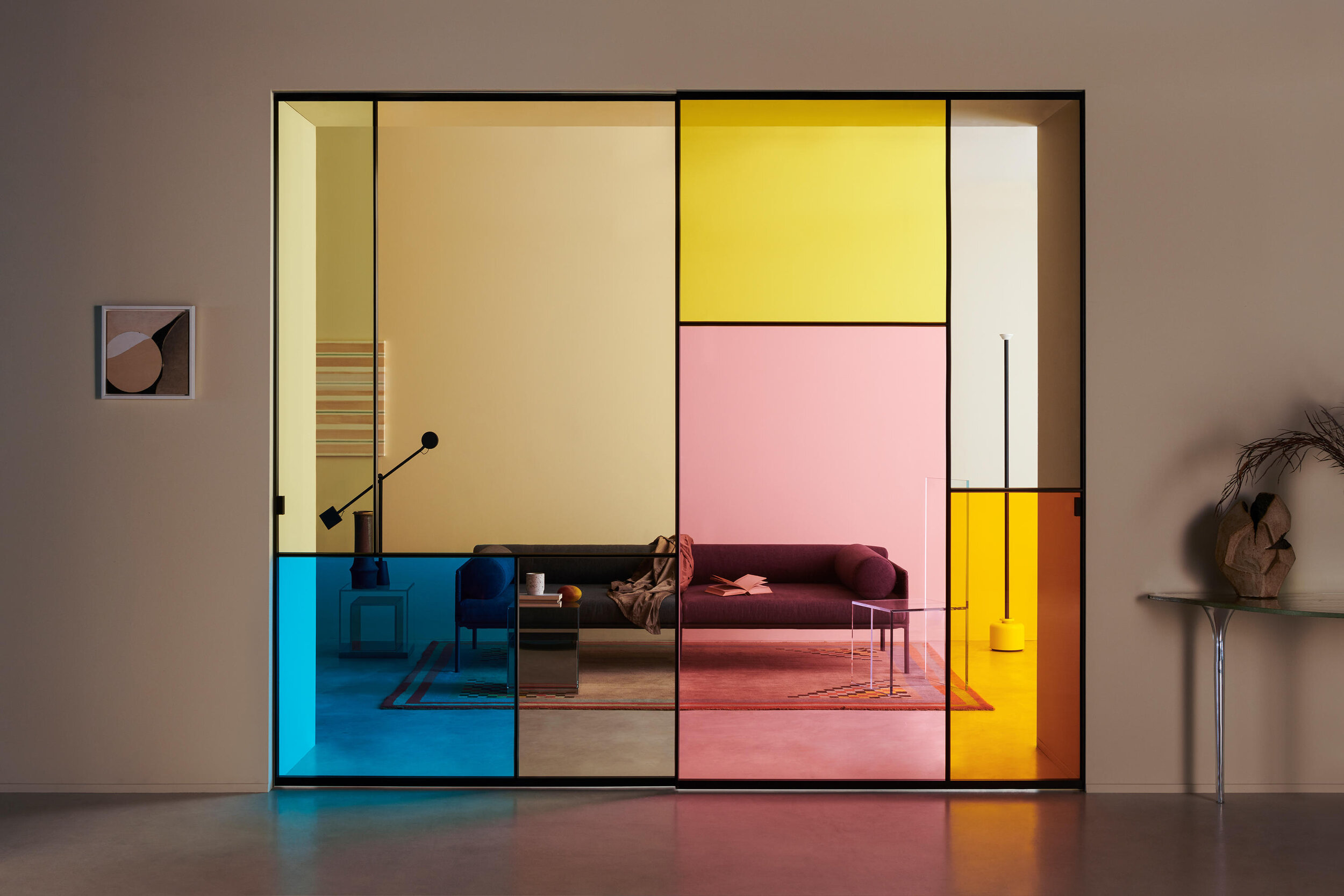
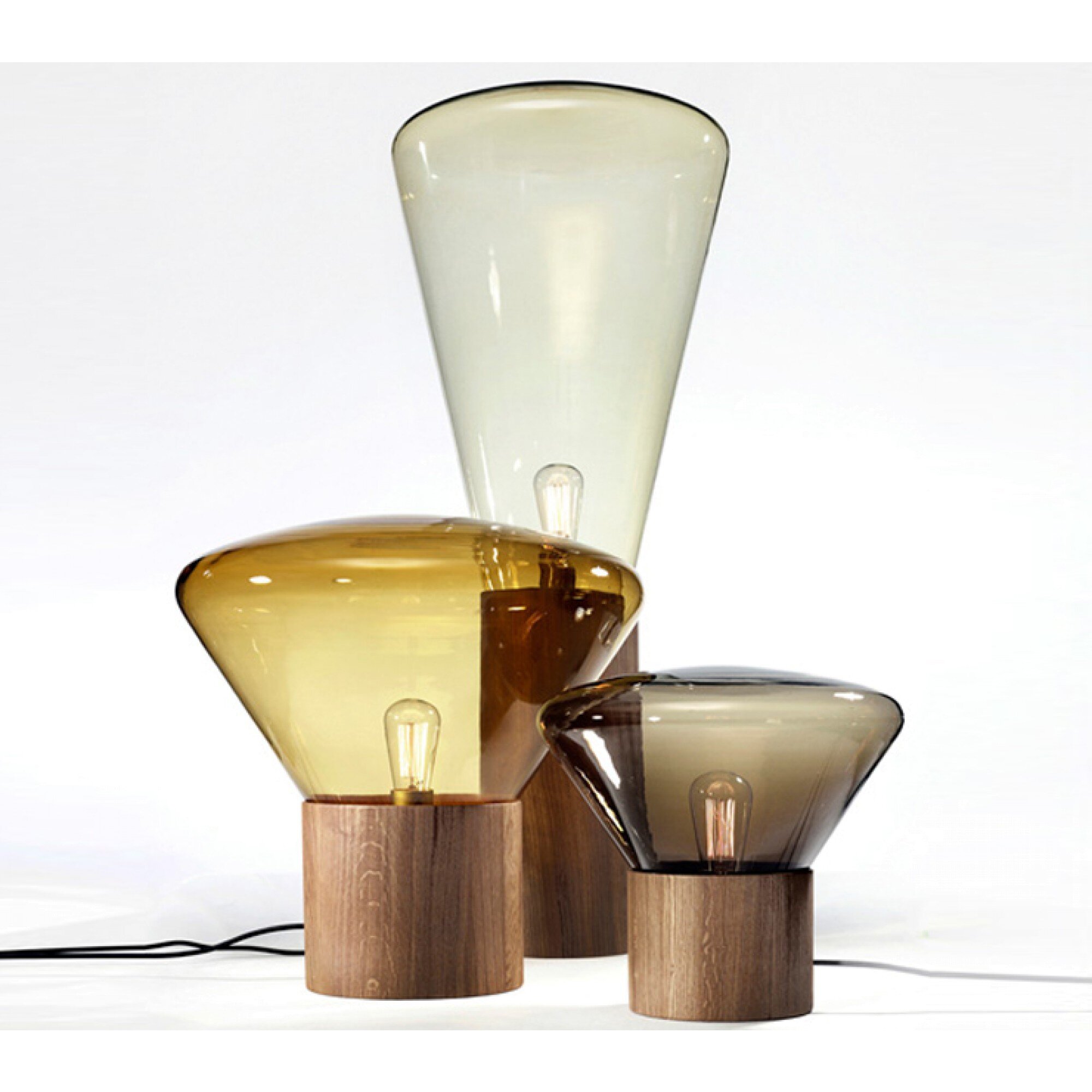
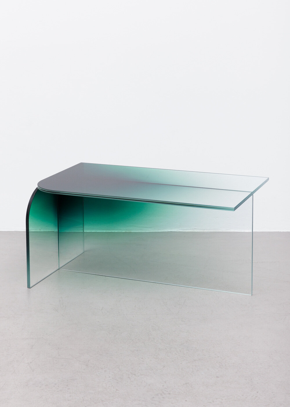
Best of Colored Glass
Colored glass is nothing new in the design world; since Medieval times, stained glass has been used to add beauty and color to the world’s grandest buildings. But colored glass is also a very modern and contemporary material. And as we look at 2021 design trends, we’re seeing colored glass more and more, applied in bold and unique ways.
We’ve reviewed inspiring projects and products designs and curated our favorites into two collections - take a look below at the best of colored glass!
BEST OF COLROED GLASS | PROJECTS
BEST OF COLORED GLASS | PRODUCTS
![Flow [T] Pendants - Nao Tamura](https://images.squarespace-cdn.com/content/v1/5eac62f289a3bf4e15a3e27c/1611344129997-25OB8YGDEBKNKJJ182CA/Flow+T+Pendant+-+Nao+Tamura.jpg)
What are your favorite ways to use colored glass?
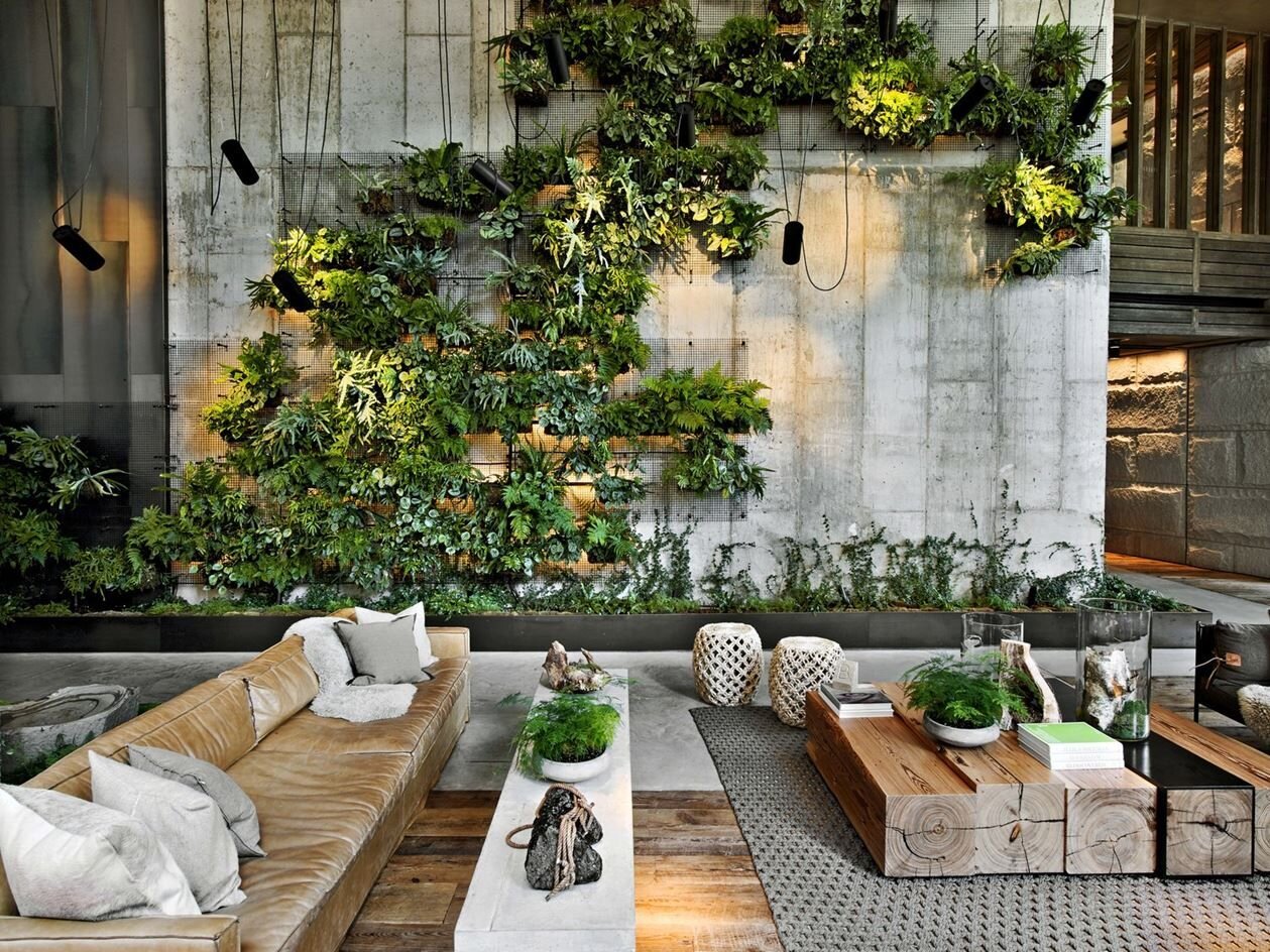
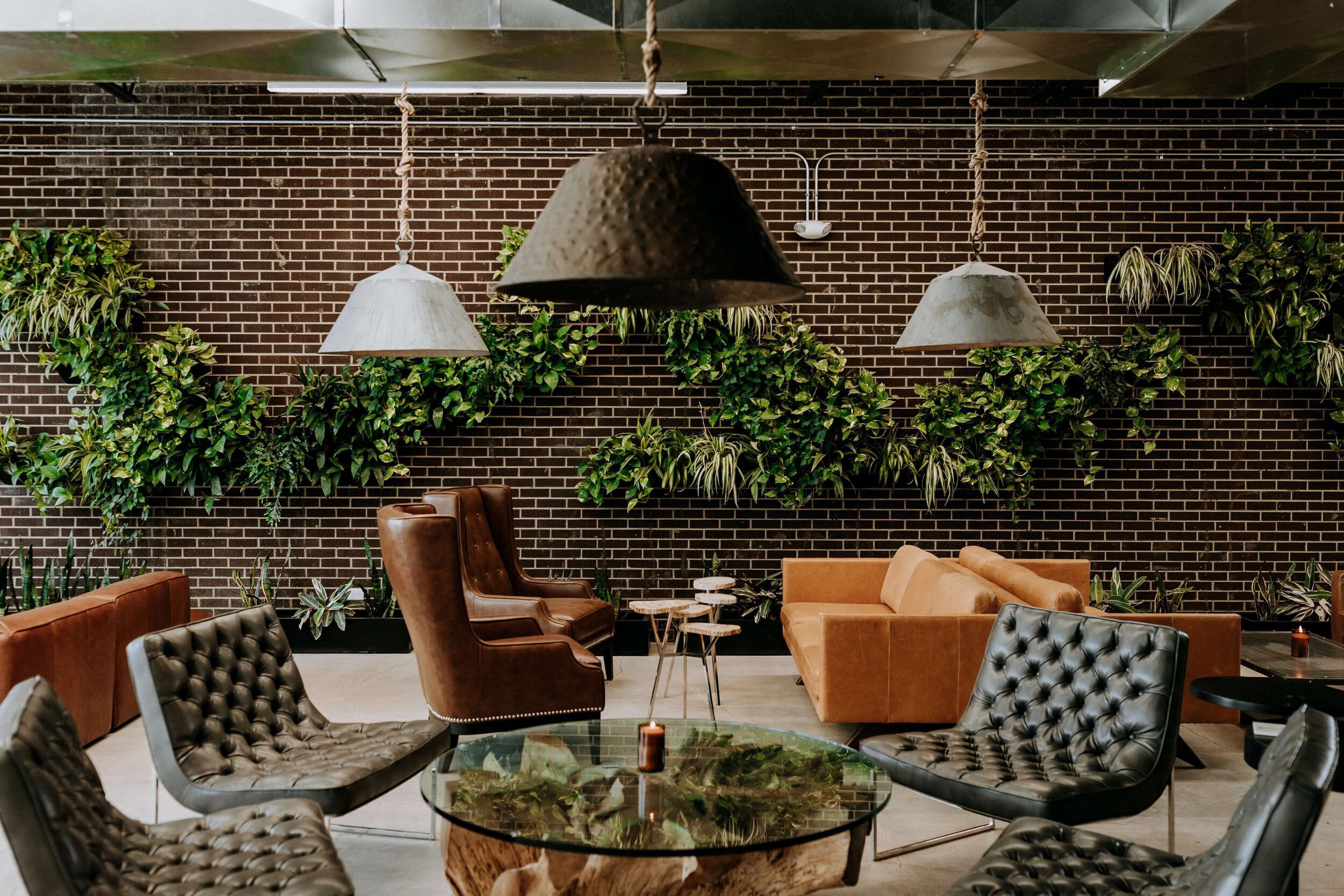
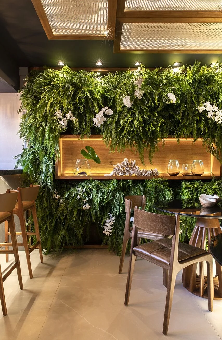
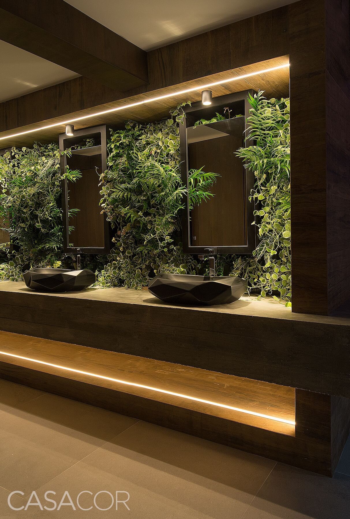
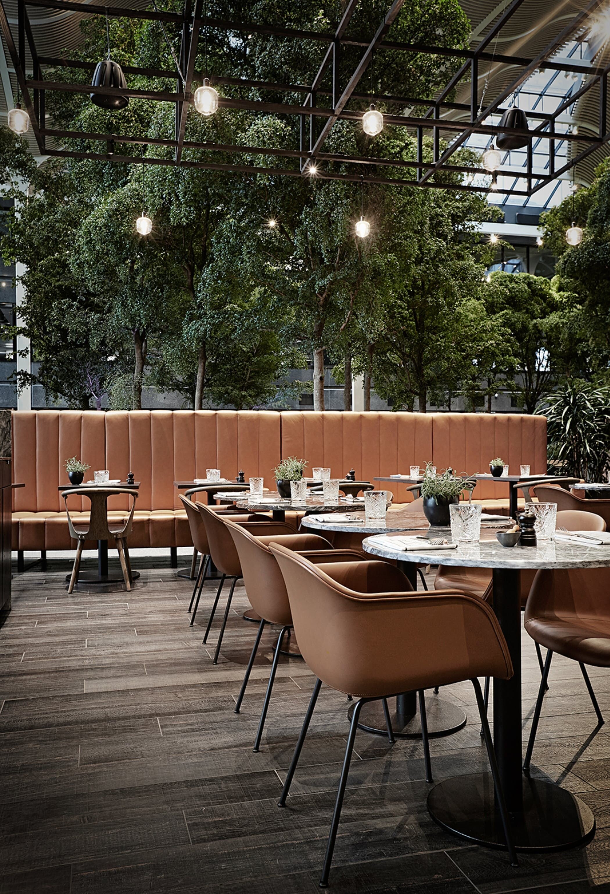
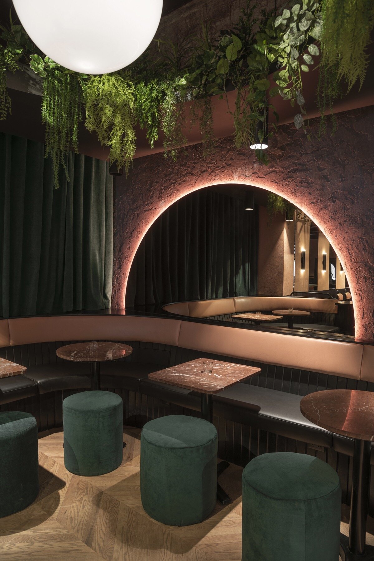
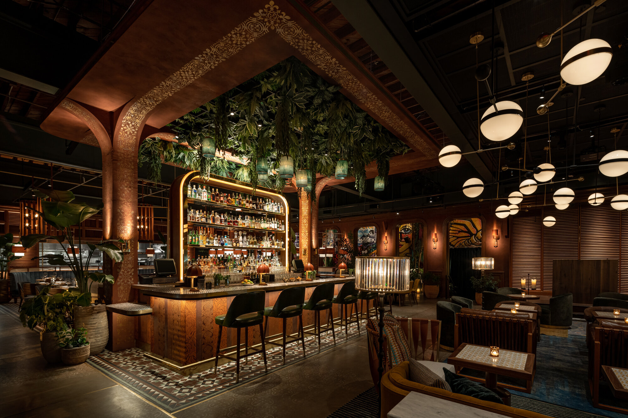
Sustainability | Interior Greenery
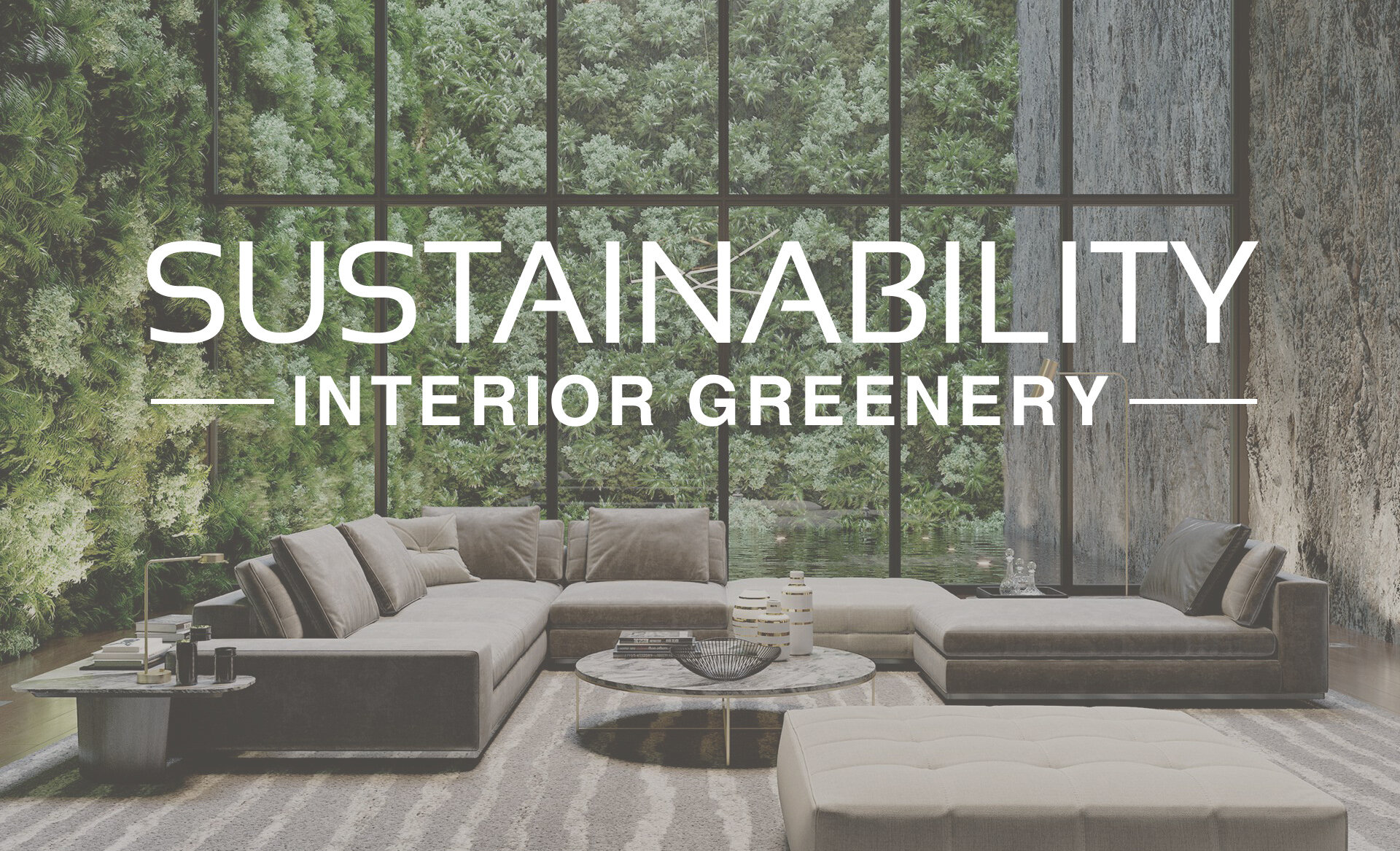
Image | PressRender
Sustainability has long been an important topic within the design industry and its significance continues to grow as part of the larger topic of wellbeing. This can be seen in the popularity of biophilic design, which incorporates nature into the built environment, creating restorative and connective spaces. There are many ways to incorporate concepts of sustainability and biophilic design into interiors. This includes using natural light, views of nature, natural textures, and of course, adding plants into a space!
Interior gardens and greenery have many health and wellness benefits! Live plants release additional oxygen, naturally purify the air, help reduce stress levels, and can brighten up a space. Take a look below to see some of our favorite ways to use greenery in interior design!
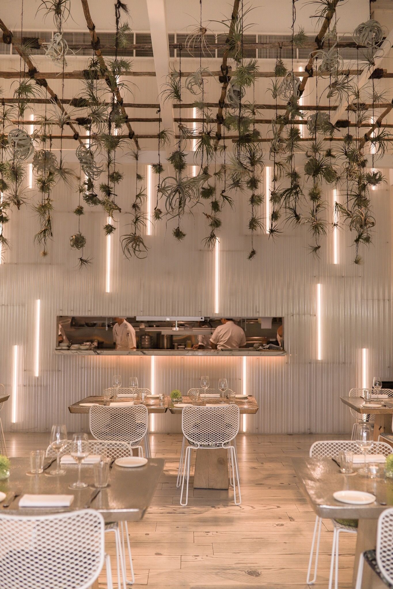
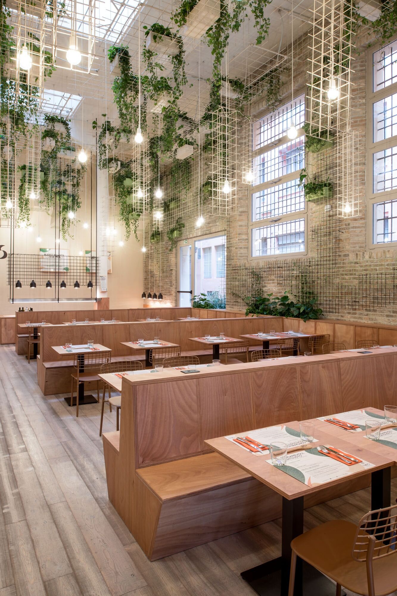
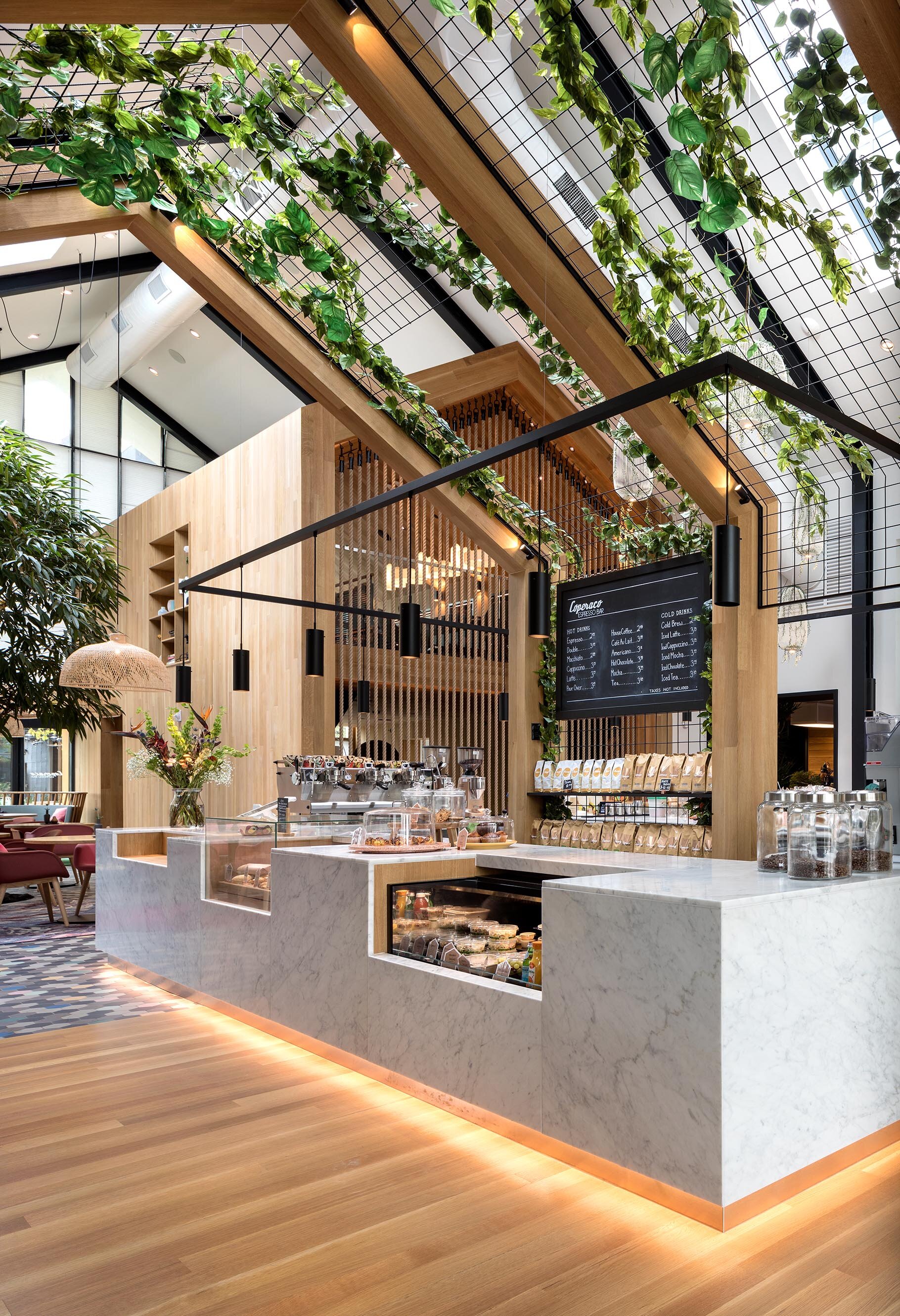
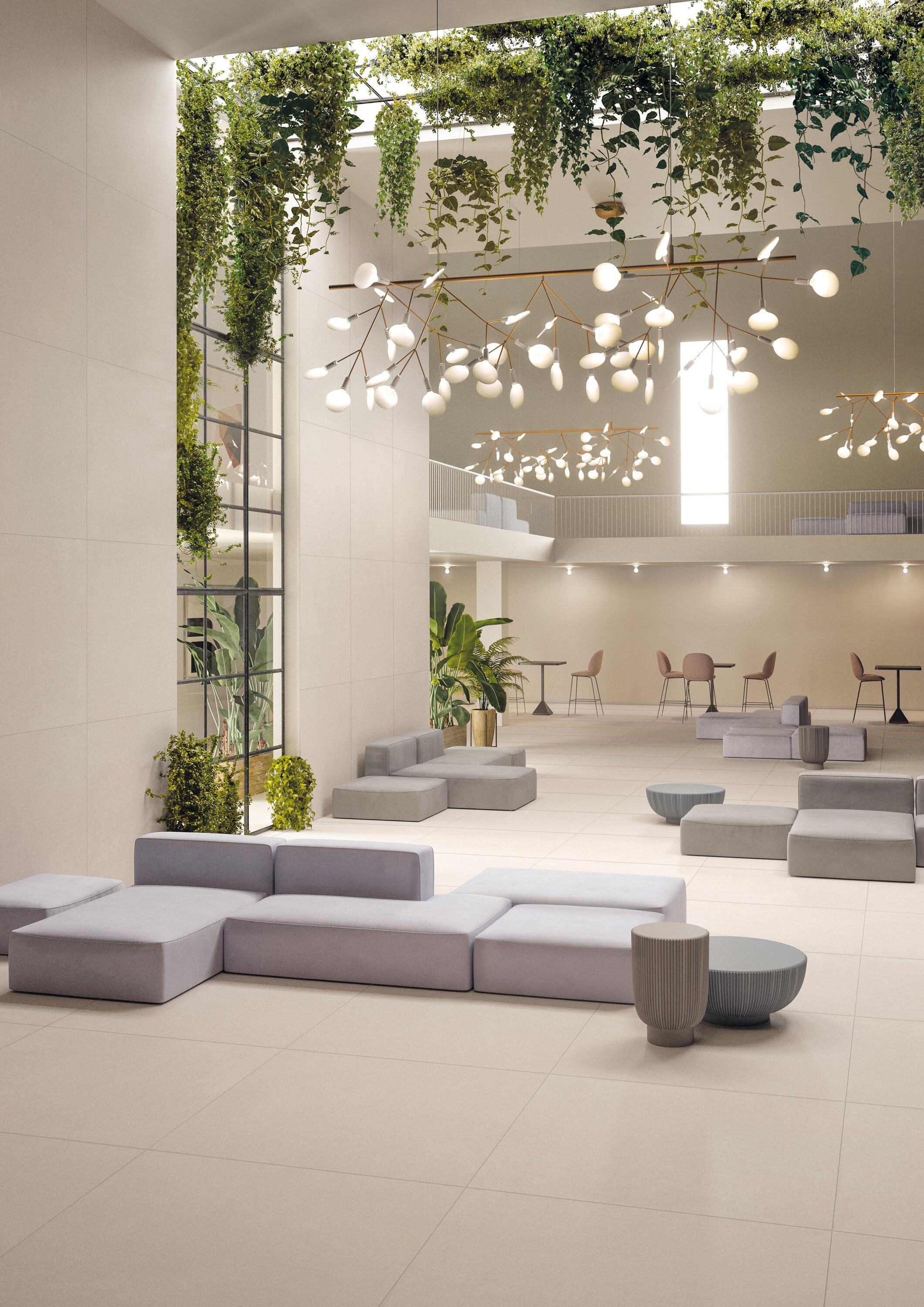
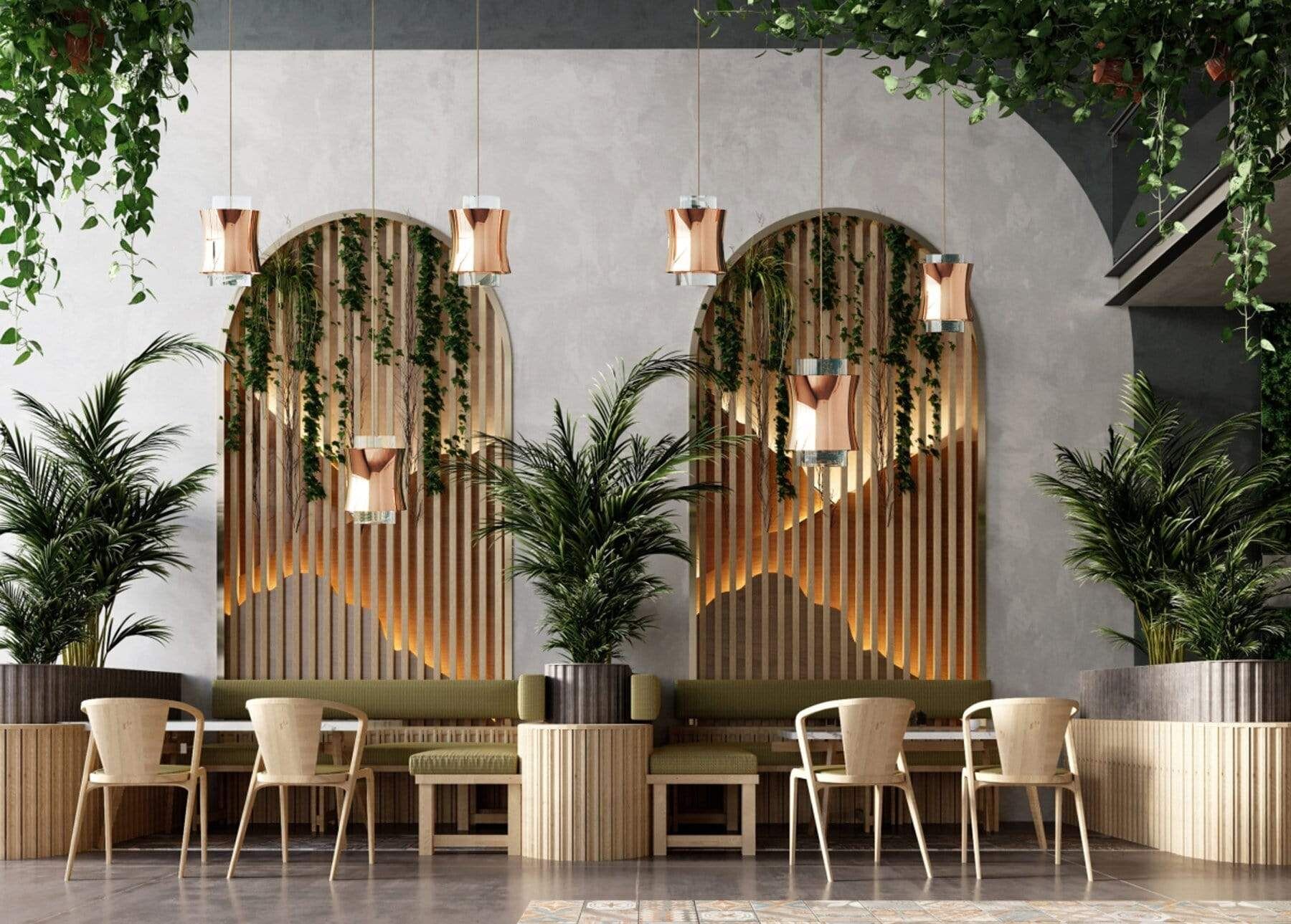
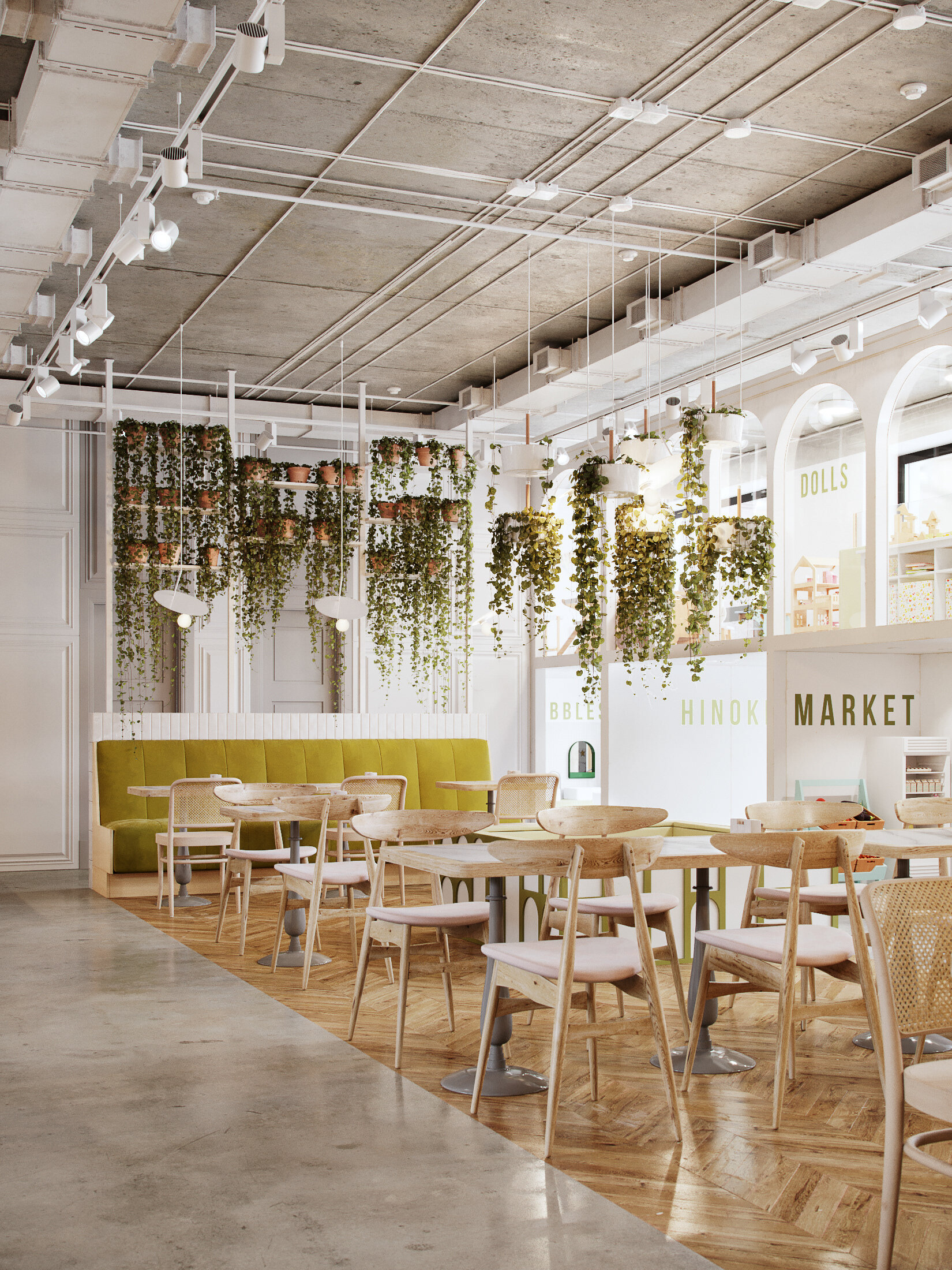
LIVING STRUCTURES + SUSPENDED GREENERY
Integrating plants into architectural wall structures or shelves adds a new texture and color to vertical design elements. Suspending greenery overhead adds drama, creating an unexpected but beautiful focal point!
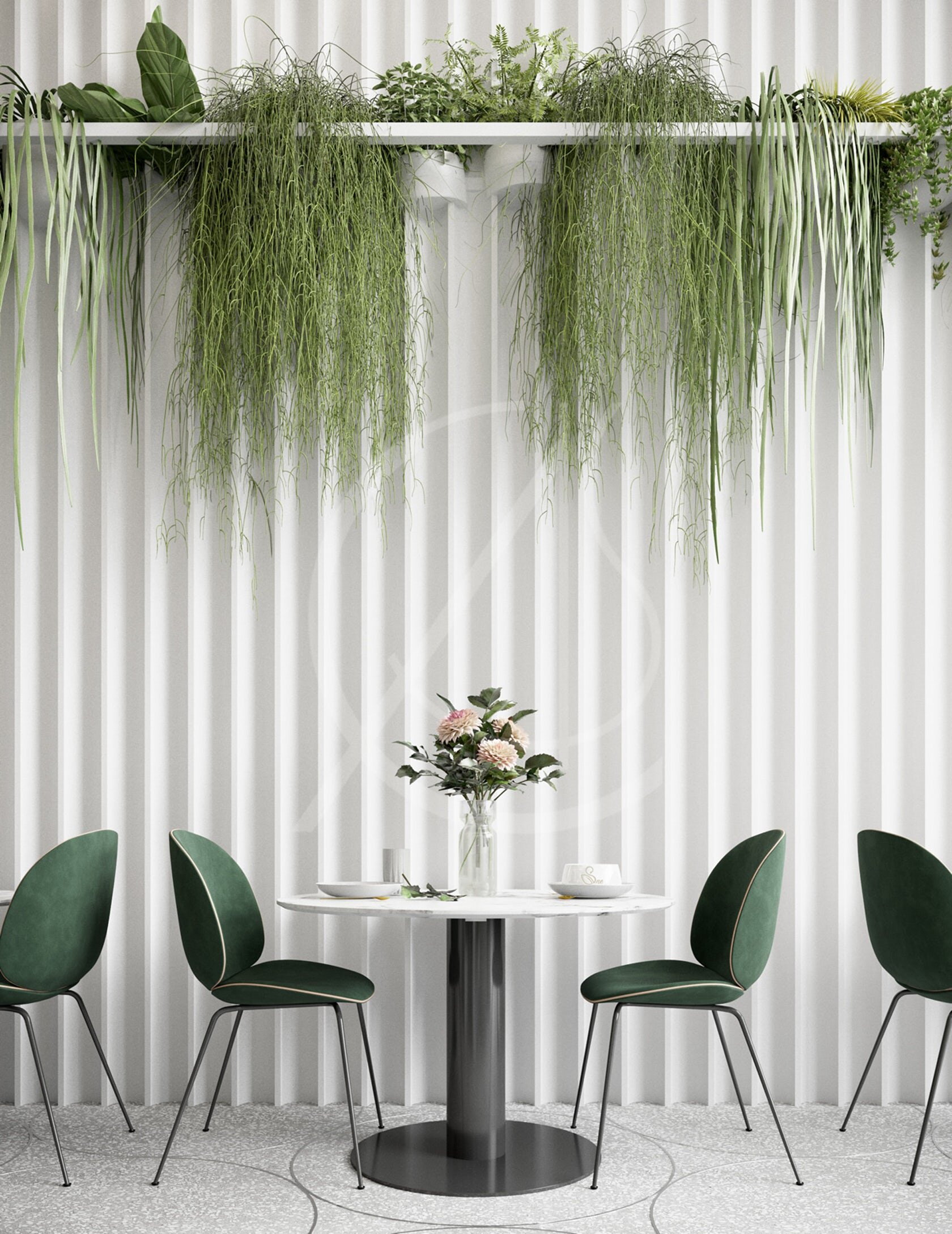
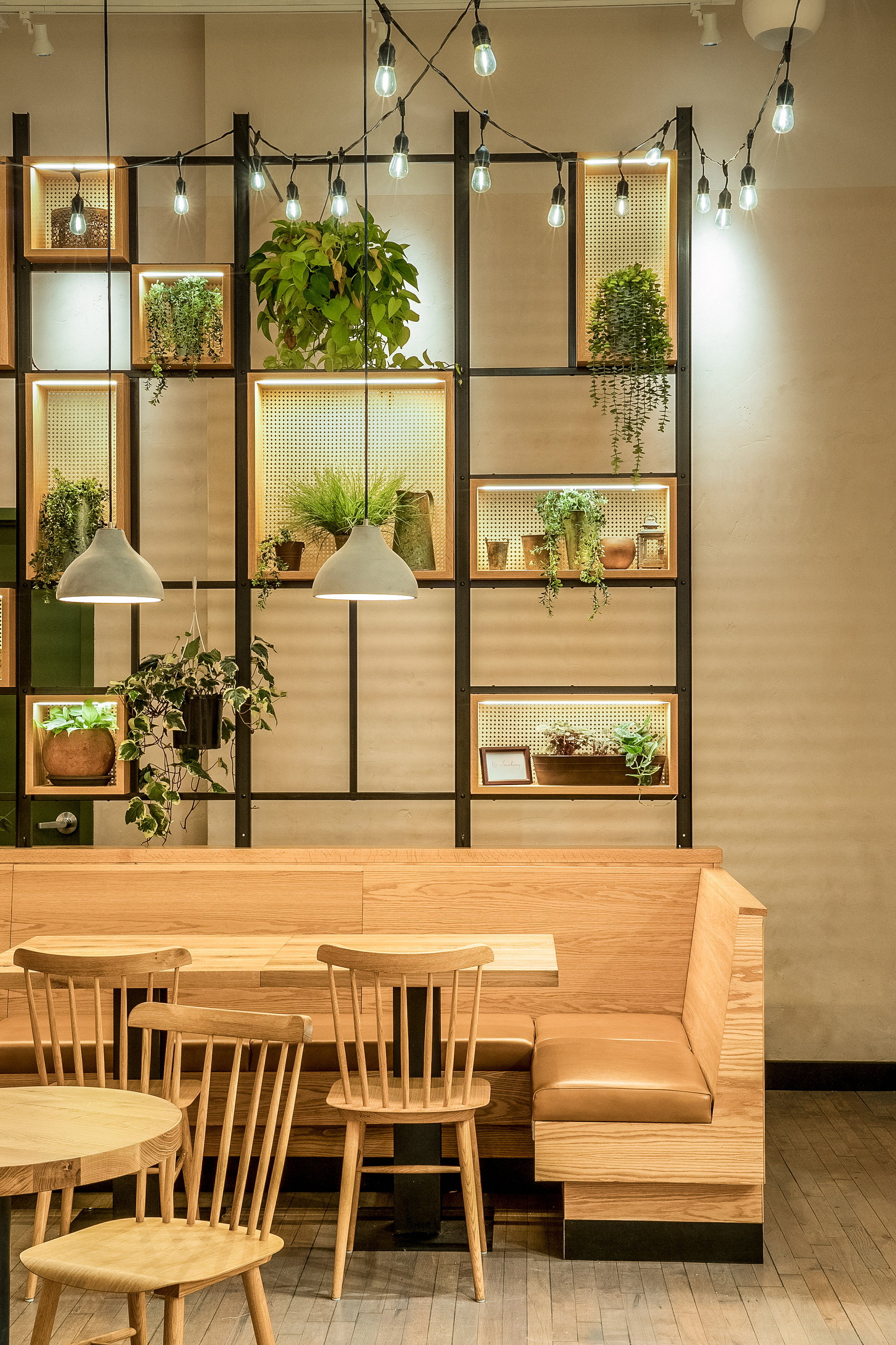
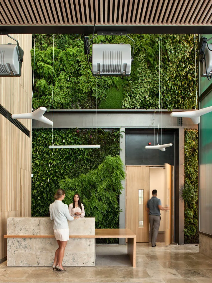
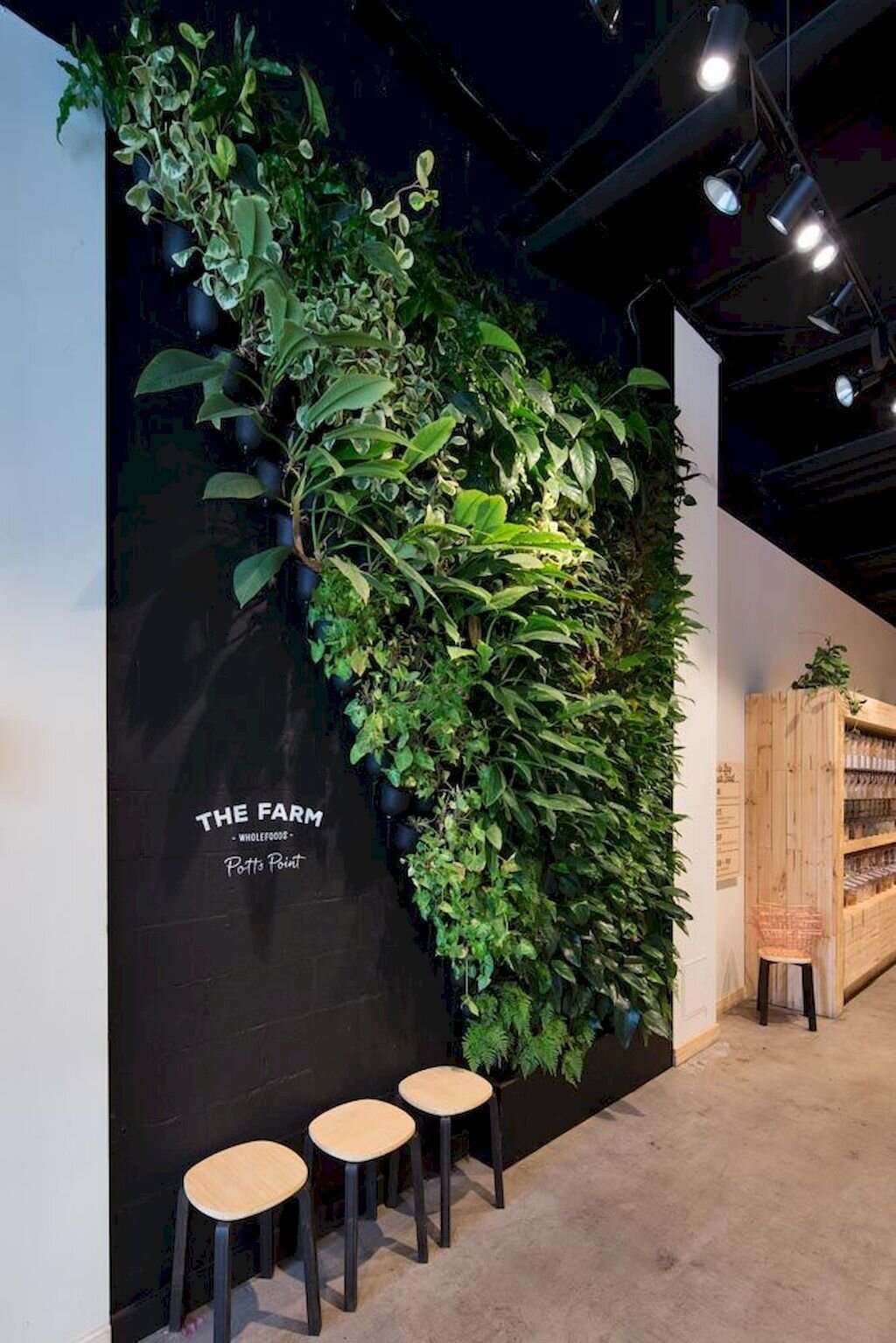
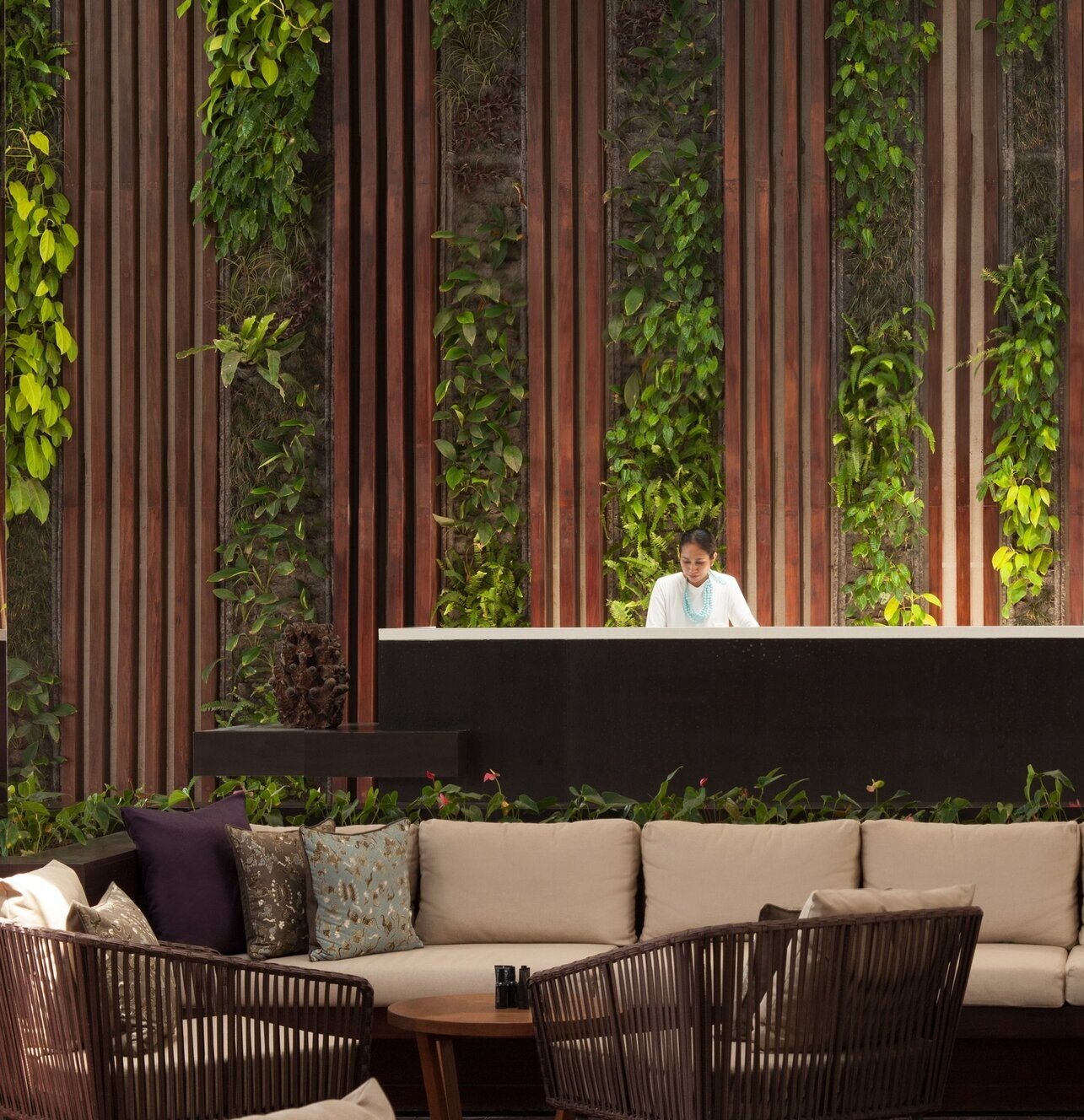
LIVE WALLS
Live walls are one of the most popular ways to turn interior spaces into living gardens! And design options for green walls are virtually endless - the ability to mix plant types, create interesting patterns, and install plants in unique shapes makes this one of the most versatile ways to add greenery to an indoor space!
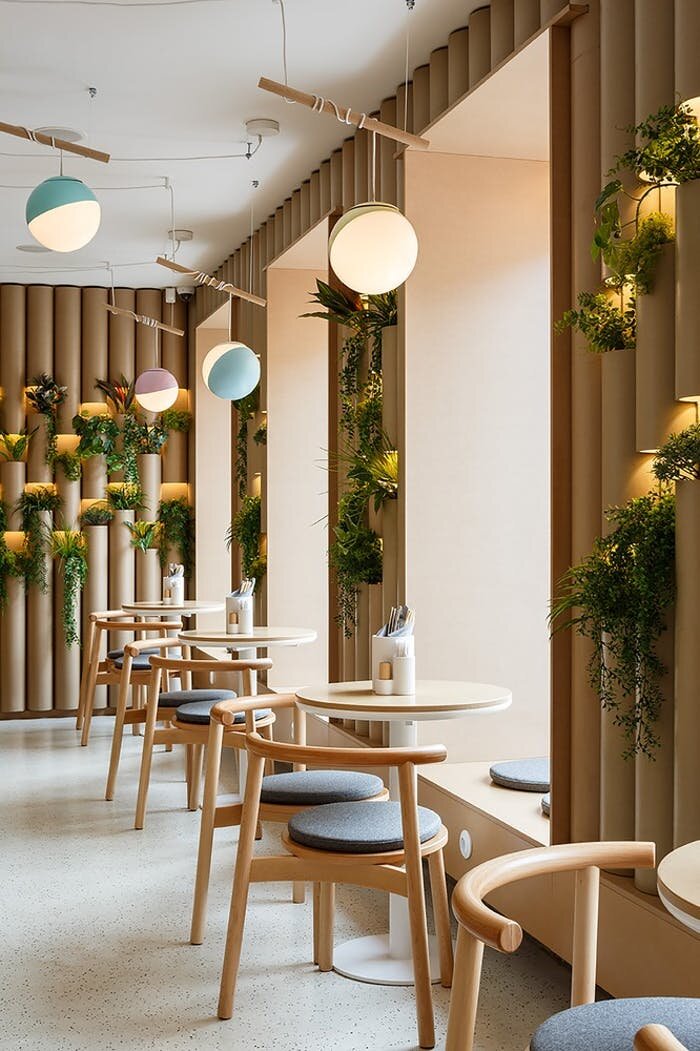
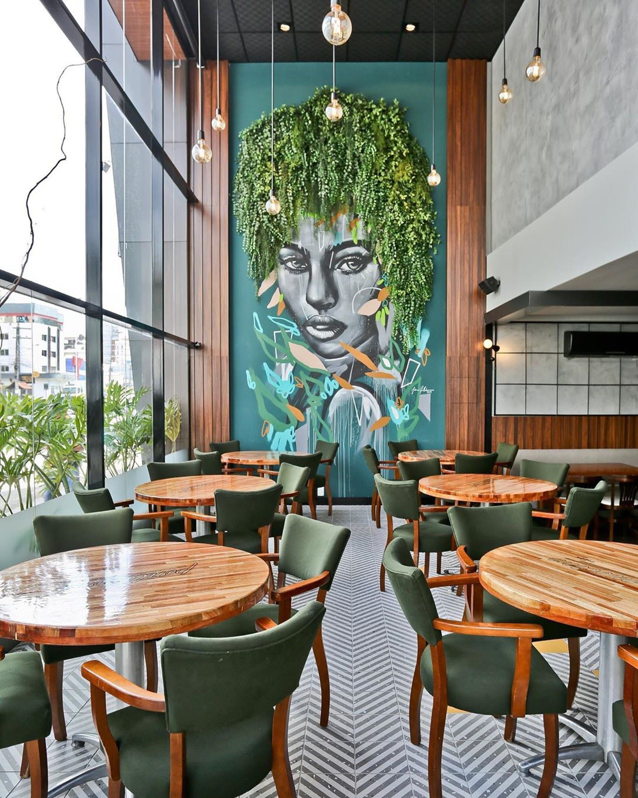
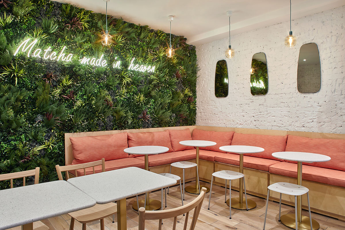
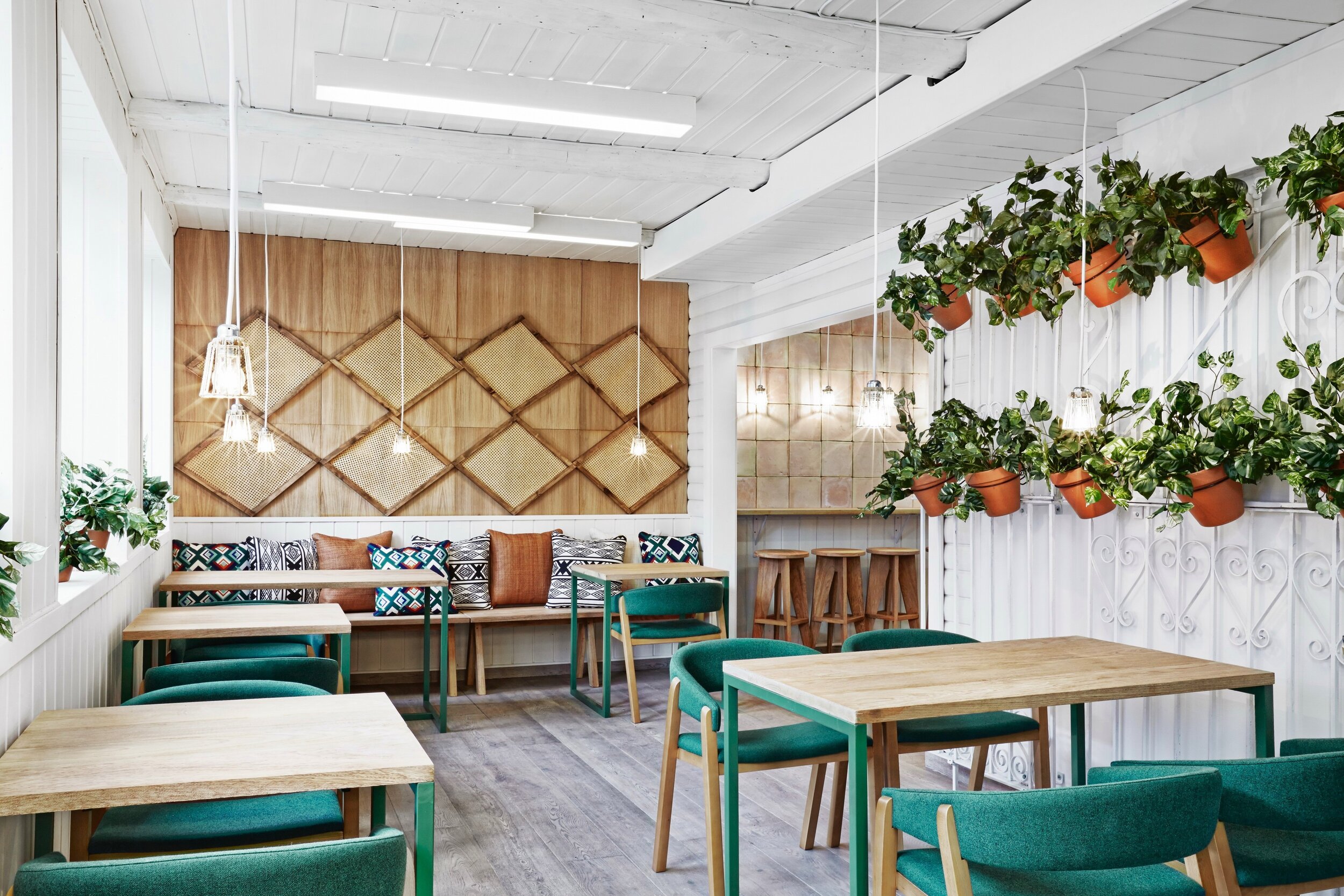
BRIGHT + COLORFUL INTERIOR GREENERY
Interior gardens can also set the tone for a space. As a natural and organic element, adding indoor plants is one of the easiest ways to make a space feel bright, vibrant, and colorful!
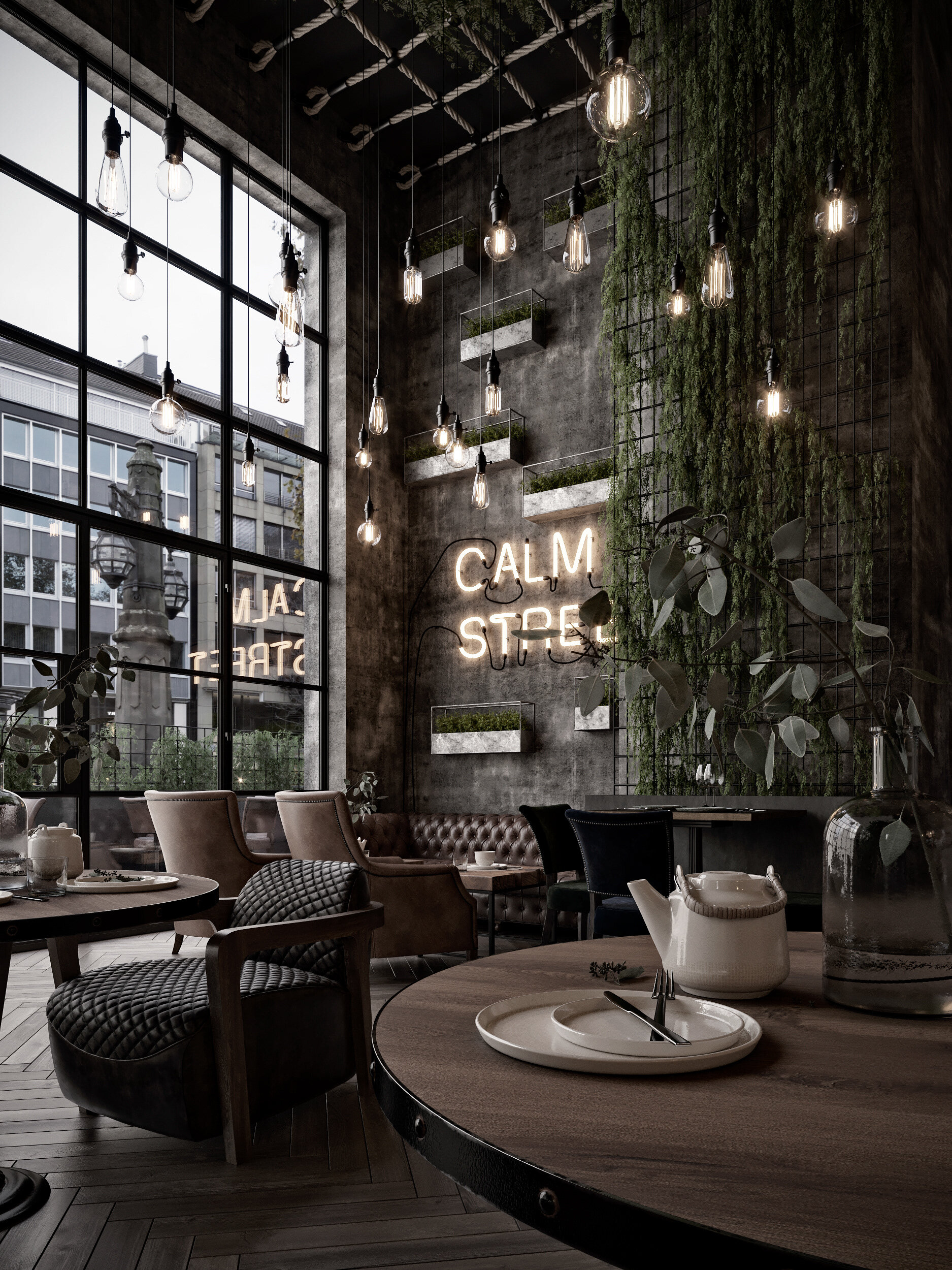
DARK + MOODY INTERIOR GARDENS
Interior greenery is also versatile - it’s not only able to make spaces brighter or more colorful, but can also fit perfectly with a dark and moody atmosphere. Adding plants can add depth and ambiance, making a space feel cozy, intimate, and intriguing.
What are some of your favorite ways to use greenery indoors?
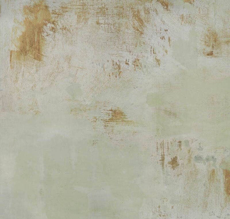
Best of Warm Neutrals | Paints

We know neutrals may seem boring, but they’re the base of any palette and an essential part of good design. Selecting the wrong neutral can throw off all other selections, but choosing the right one can tie a design together and make it great!
Options for neutrals are widespread and varied, there are lots of different color tones within the “neutral” family. Today we wanted to focus on warm neutrals and some of our favorite paints within that group - take a look below at the warm neutral paints we find most inspiring!
INSPIRATION 1 | PALE TONES

Photo: Chris Round | Paints: Benjamin Moore | Colors (top to bottom): Shoreline 1471, Taos Taupe 2111-40, Gray Huskie 1473, Lambskin 1051, Lingerie AF-200
INSPIRATION 2 | NATURE’S LANDSCAPES

Photo: Mike Irwin | Paints: Kelly Moore | Colors (top to bottom): Copper Blush KM4403, Bear Hug KM4510, Americano KM4512, Myrtle Pepper KM4406, Pink Scallop KM4408
INSPIRATION 3 | FASHION

Sweater: Stories.com | Paint: Sherwin Williams | Colors (top to bottom): Sanderling SW7513, Muslin SW6133, Arcade White SW7100, China Doll SW7517, Rockweed SW2735
INSPIRATION 4 | ARCHITECTURE

Photo: Alison Brooks | Paint: PPG | Colors (top to bottom): Molasses 1079-7, Warmstone 1015-3, Caramel Kiss 1083-6, Cotton Tail 0998-1, Warrior 1076-6
INSPIRATION 5 | (MORE) FASHION

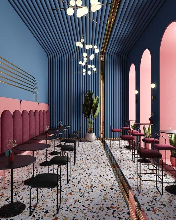
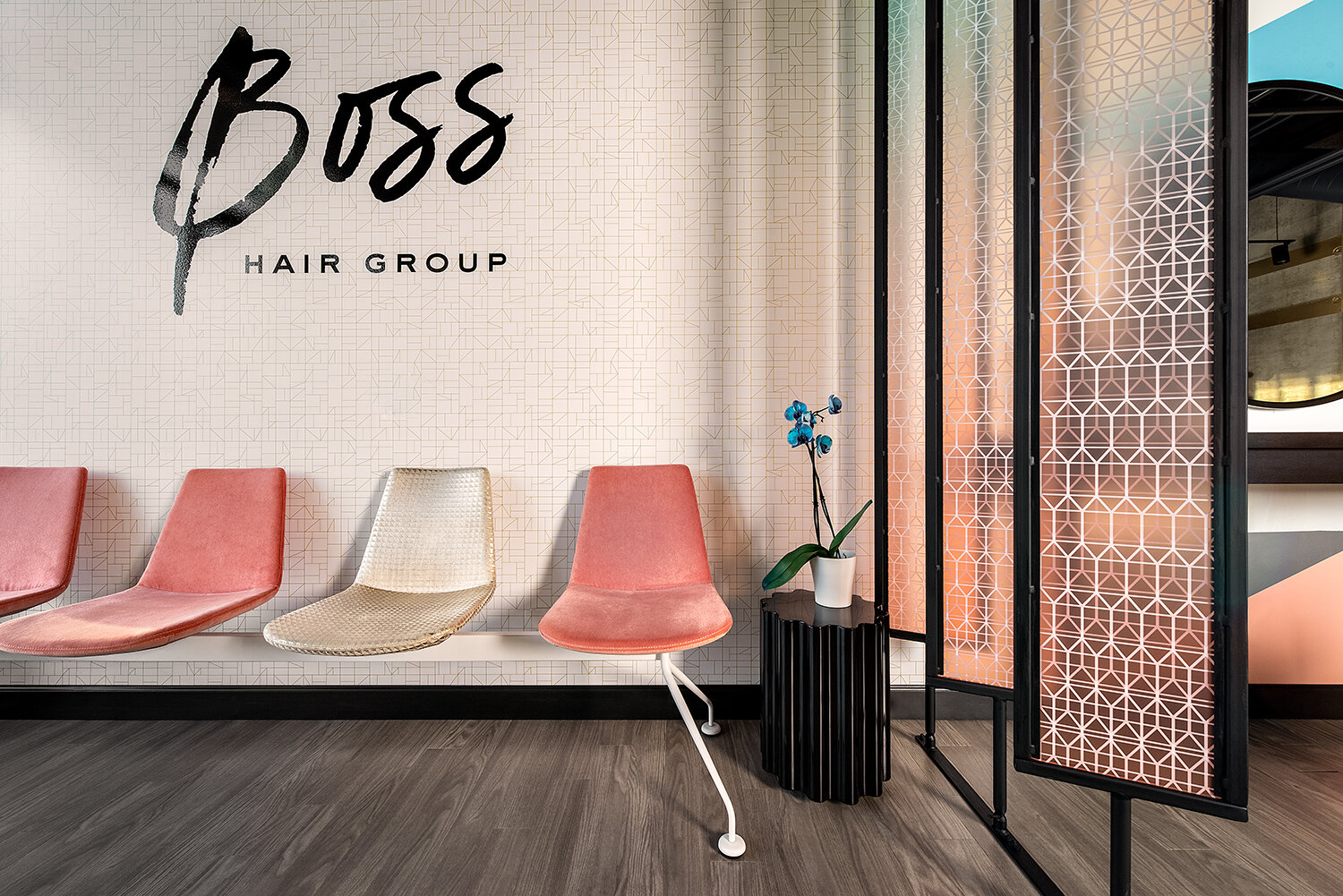
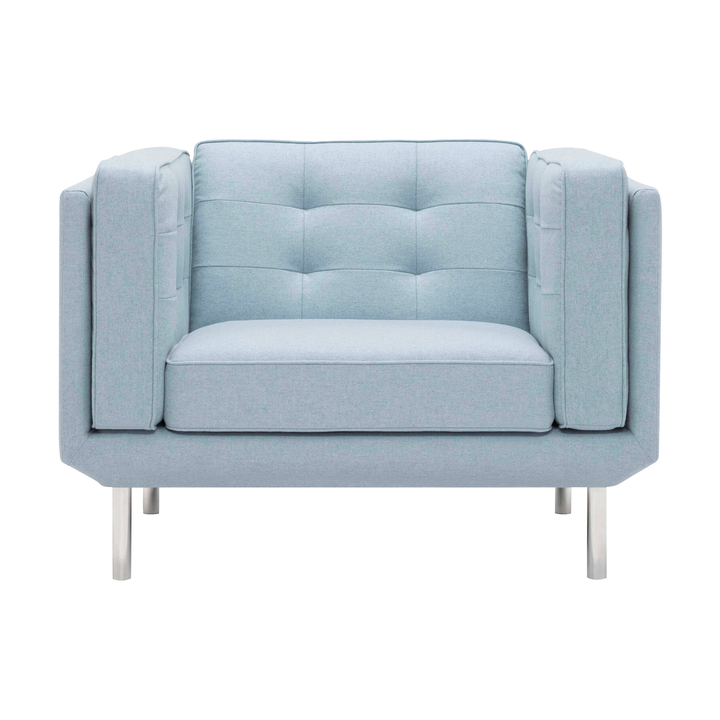
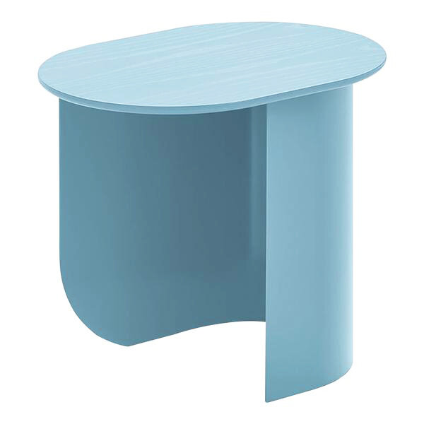
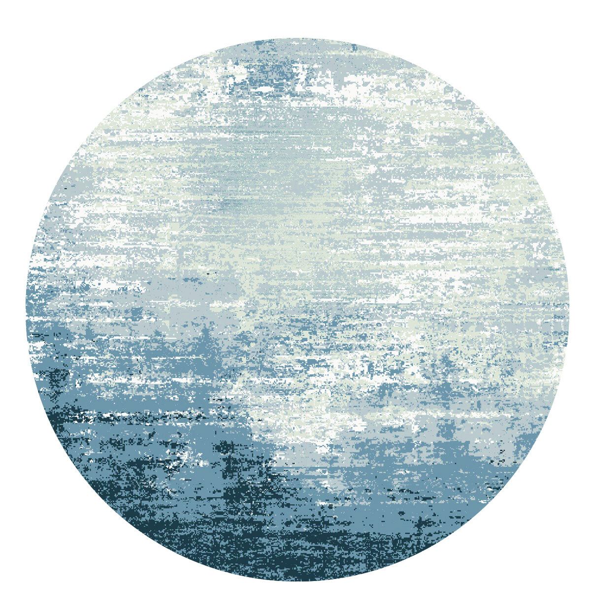
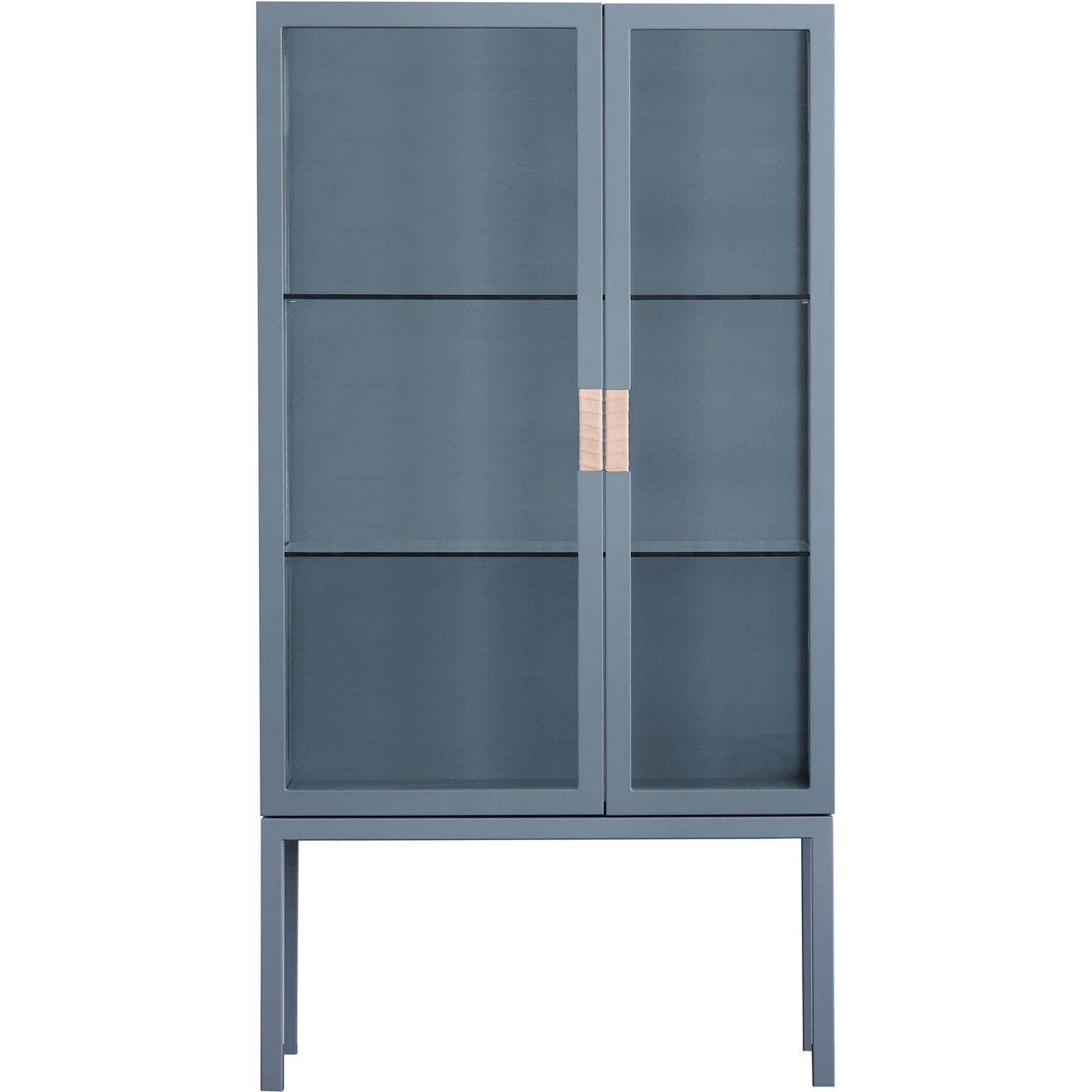
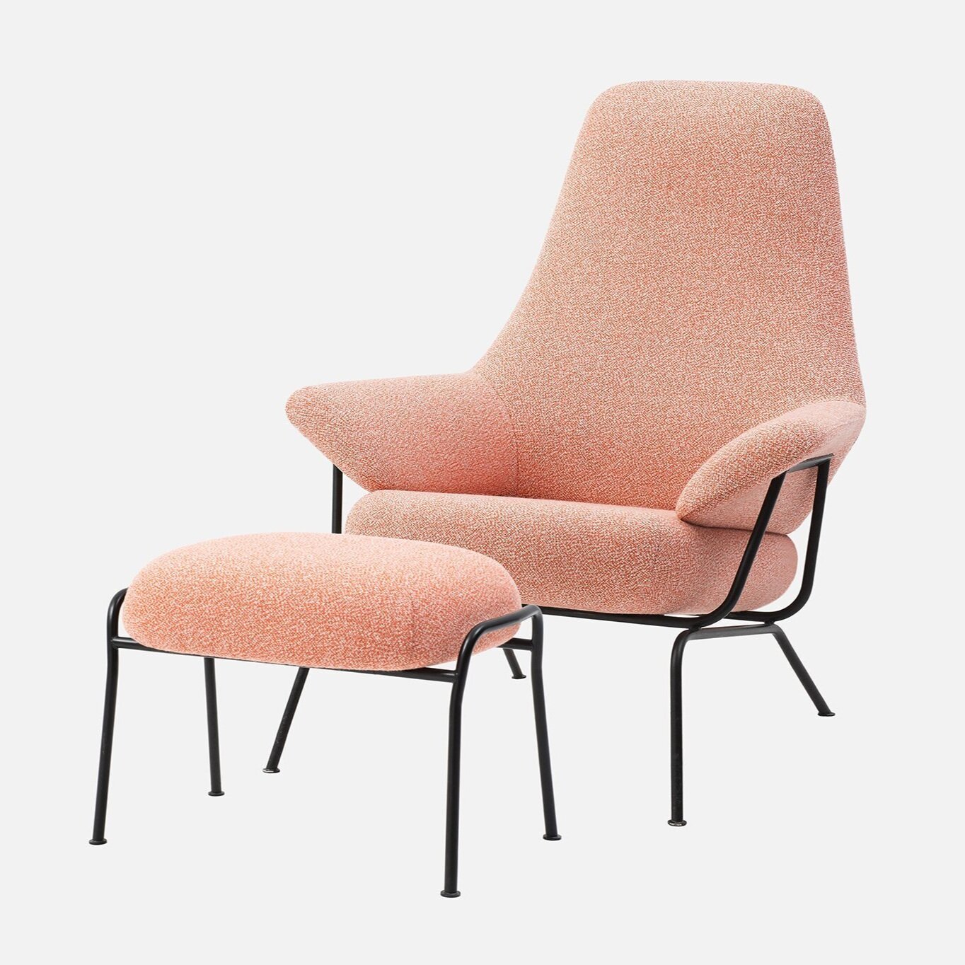
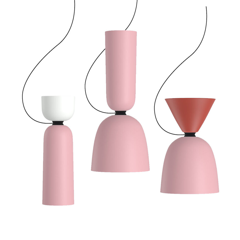
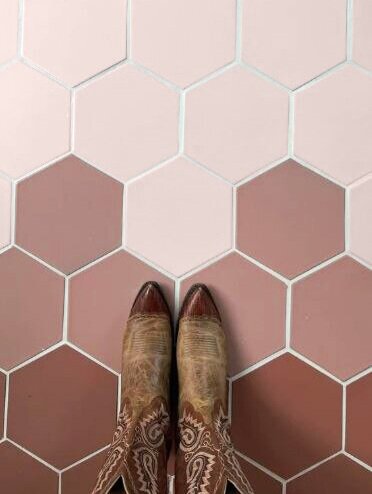
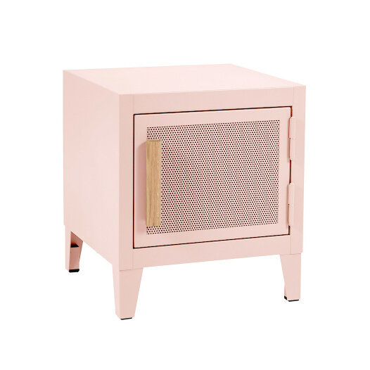
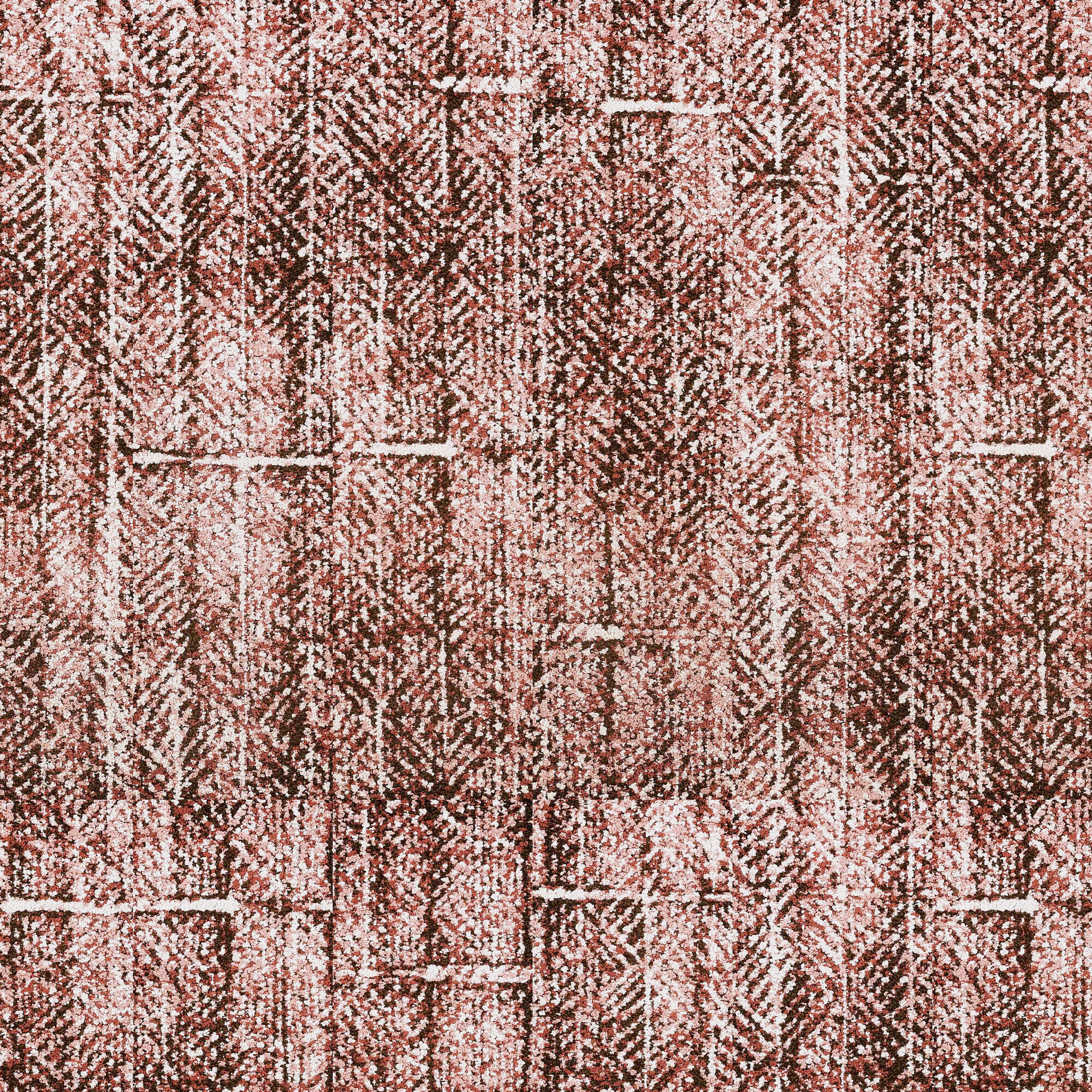
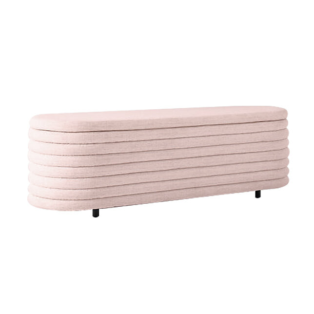
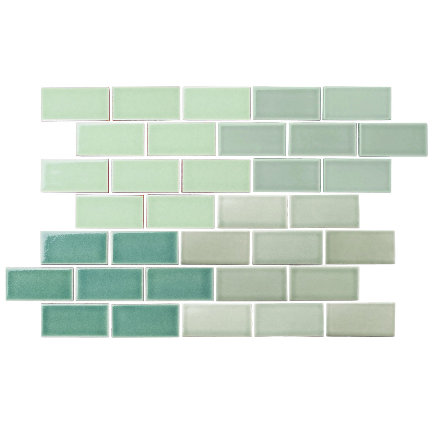
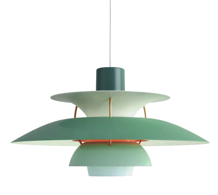
Trend Watch | Pastels

Boss Hair Group | design by blocHaus
As we move farther into 2021, new and exciting design inspirations are constantly emerging. One trend we’ve been watching closely is pastels. These colors have been steadily growing in popularity in recent years, but they’ve now exploded into one of the fastest growing color trends of the year! Take a look at the curated collections below to see some of our favorite pastel-inspired products!
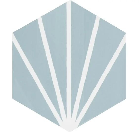
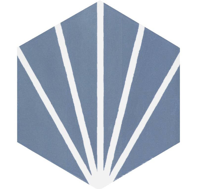
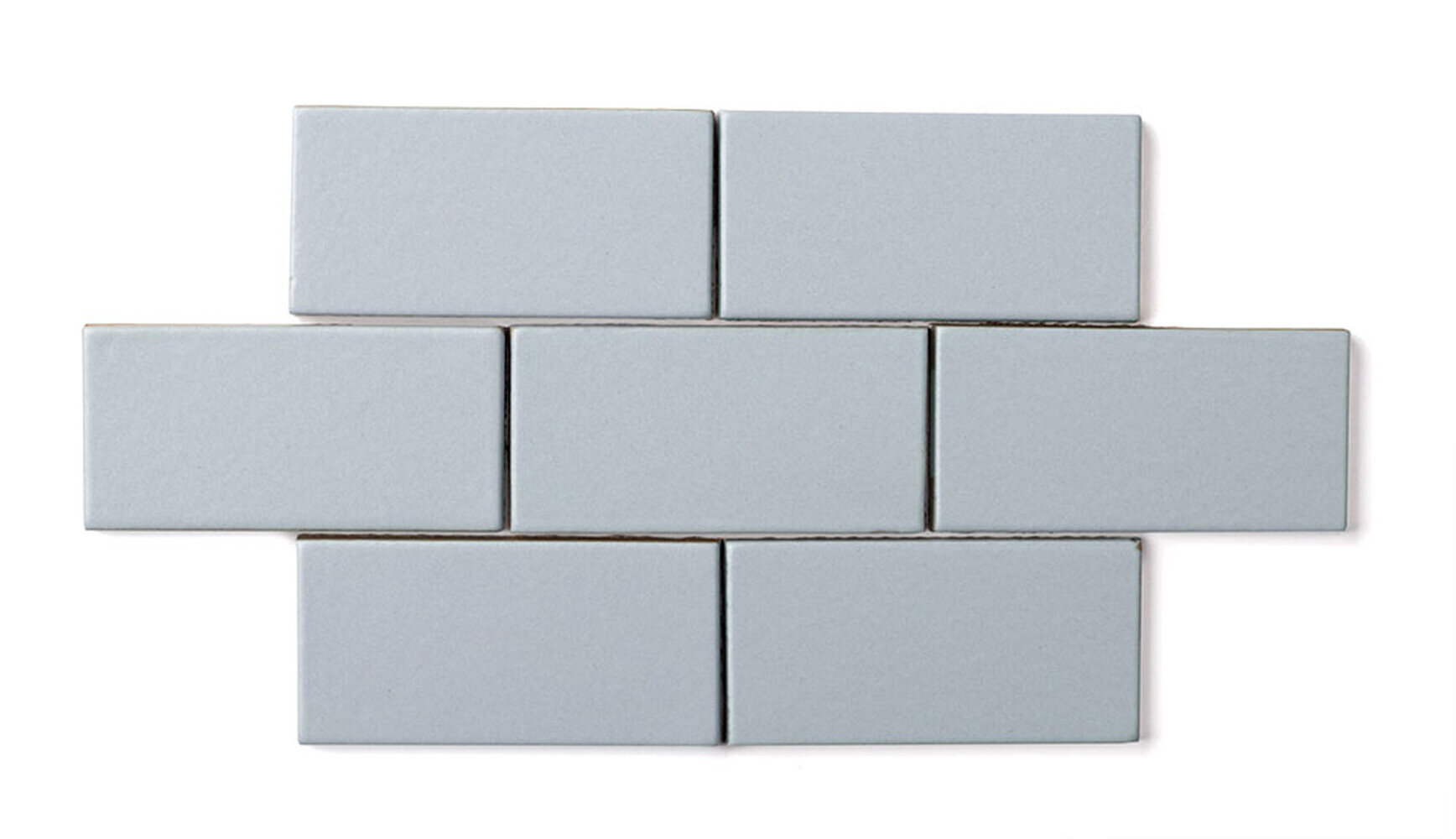
P A S T E L B L U E
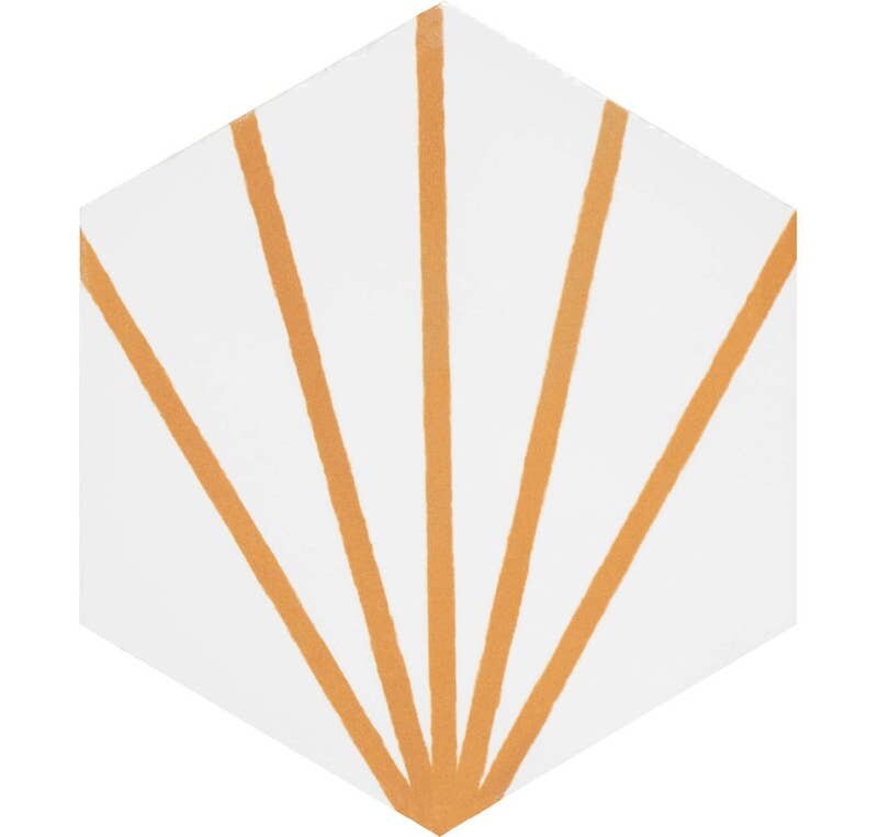
P A S T E L P I N K + P E A C H
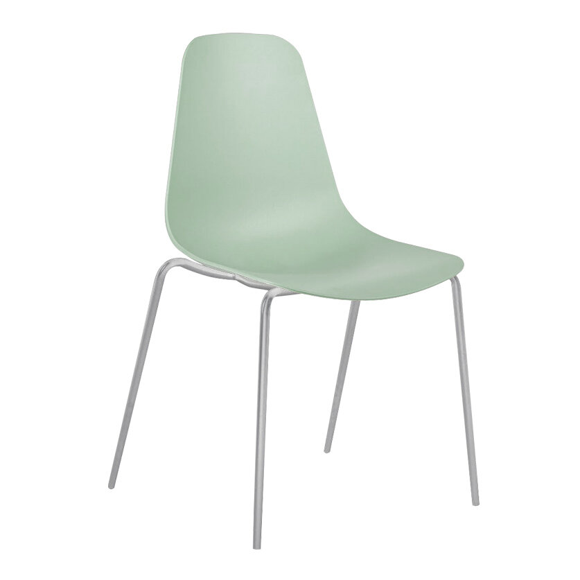
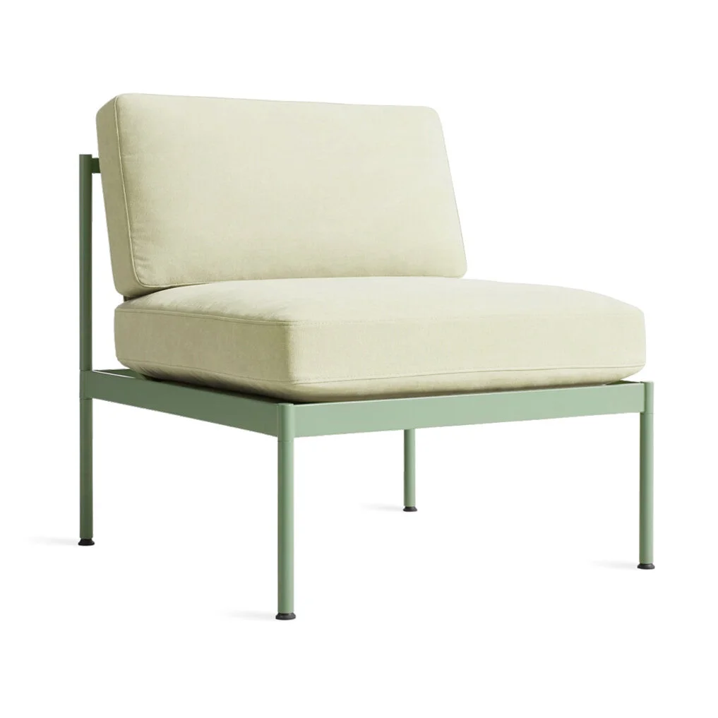
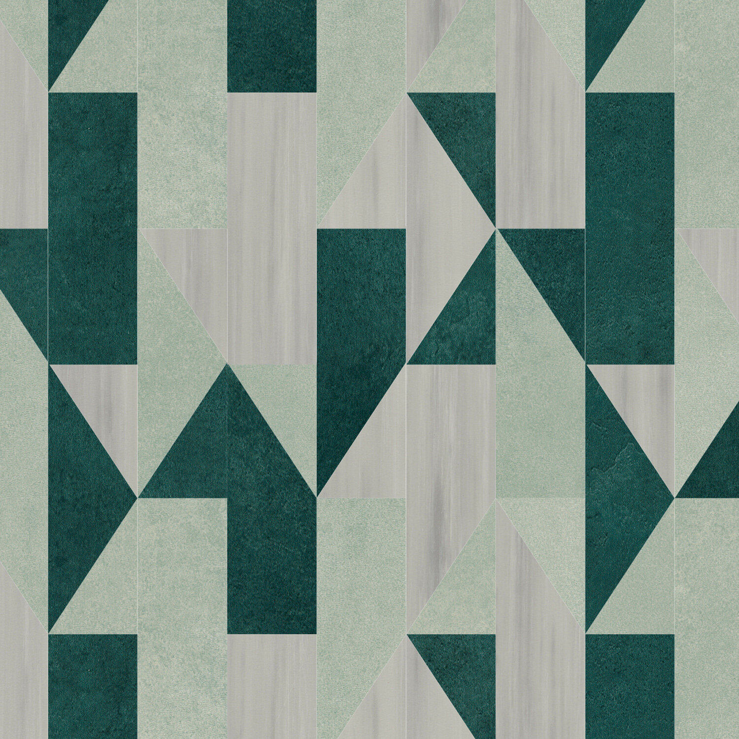
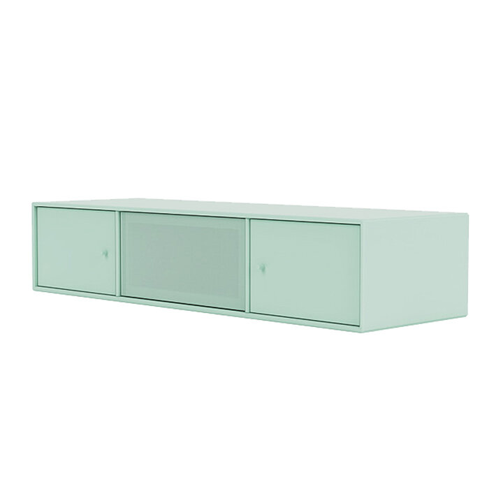
P A S T E L G R E E N
How are pastels inspiring you this year?